mirror of
https://github.com/LCTT/TranslateProject.git
synced 2025-01-25 23:11:02 +08:00
66 lines
9.3 KiB
Markdown
66 lines
9.3 KiB
Markdown
The history of Android
|
|
================================================================================
|
|
### Android 3.0 Honeycomb—tablets and a design renaissance ###
|
|
|
|
Despite all the changes made in Gingerbread, Android was still the ugly duckling of the mobile world. Compared to the iPhone, its level of polish and design just didn't hold up. On the other hand, one of the few operating systems that could stand up to iOS's aesthetic acumen was Palm's WebOS. WebOS was a cohesive, well-designed OS with several innovative features, and it was supposed to save the company from the relentless march of the iPhone.
|
|
|
|
A year after launch though, Palm was running out of cash. The company never saw the iPhone coming, and by the time WebOS was ready, it was too late. In April 2010, Hewlett-Packard purchased Palm for $1 billion. While HP bought a product with a great user interface, the lead designer of that interface, a man by the name of Matias Duarte, did not join HP. In May 2010, just before HP took control of Palm, Duarte jumped ship to Google. HP bought the bread, but Google hired the baker.
|
|
|
|

|
|
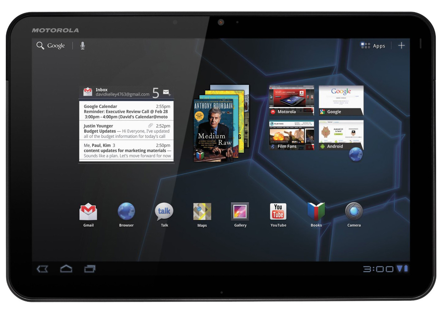
The first Honeycomb device, the Motorola Xoom 10-inch tablet.
|
|
|
|
At Google, Duarte was named the Director of Android User Experience. This was the first time someone was publicly in charge of the way Android looked. While Matias landed at Google during the launch of Android 2.2, the first version he truly impacted was Android 3.0, Honeycomb, released in February 2011.
|
|
|
|
By Google's own admission, Honeycomb was rushed out the door. Ten months prior, Apple modernized the tablet with the launch of the iPad, and Google wanted to respond as quickly as possible. Honeycomb was that response, a version of Android that ran on 10-inch touchscreens. Sadly, getting this OS to market was such a priority that corners were cut to save time.
|
|
|
|
The new OS was for tablets only—phones would not be updated to Honeycomb, which spared Google the difficult problem of making the OS work on wildly different screen sizes. But with phone support off the table, a Honeycomb source drop never happened. Previous Android versions were open source, enabling the hacking community to port the latest version to all sorts of different devices. Google didn't want app developers to feel pressured to support half-broken Honeycomb phone ports, so Google kept the source to itself and strictly controlled what could and couldn't have Honeycomb. The rushed development led to problems with the software, too. At launch, Honeycomb wasn't particularly stable, SD cards didn't work, and Adobe Flash—one of Android's big differentiators—wasn't supported.
|
|
|
|
One of the few devices that could have Honeycomb was [the Motorola Xoom][1], the flagship product for the new OS. The Xoom was a 10-inch, 16:9 tablet with 1GB of RAM and a dual-core, 1GHz Nvidia Tegra 2 processor. Despite being the launch device of a new version of Android where Google controlled the updates directly, the device wasn't called a "Nexus." The most likely reason for this was that Google didn't feel confident enough in the product to call it a flagship.
|
|
|
|
Nevertheless, Honeycomb was a major milestone for Android. With an experienced designer in charge, the entire Android user interface was rebuilt, and most of the erratic app designs were brought to heel. Android's default apps finally looked like pieces of a cohesive whole with similar layouts and theming across the board. Redesigning Android would be a multi-version project though—Honeycomb was just the start of getting Android whipped into shape. This first draft laid the groundwork for how future versions of Android would function, but it also used a heavy-handed sci-fi theme that Google would spend the next few versions toning down.
|
|
|
|

|
|
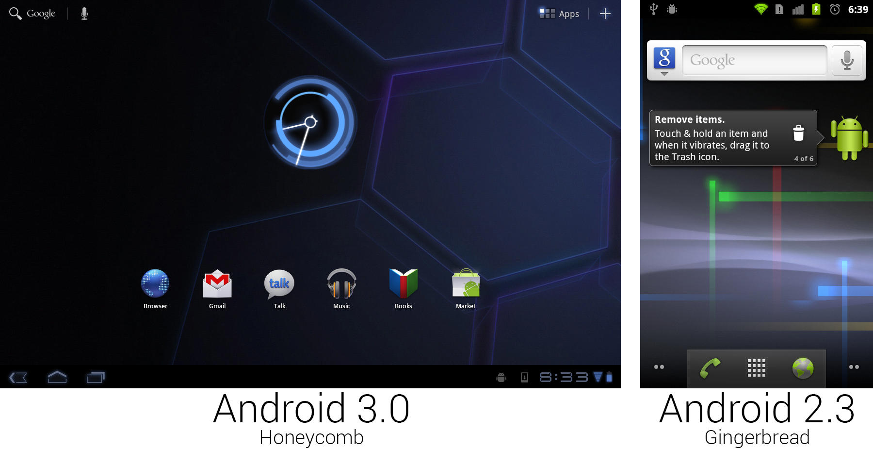
The home screens of Honeycomb and Gingerbread.
|
|
Photo by Ron Amadeo
|
|
|
|
While Gingerbread only experimented with a sci-fi look in its photon wallpaper, Honeycomb went full sci-fi with a Tron-inspired theme for the entire OS. Everything was made black, and if you needed a contrasting color, you could choose from a few different shades of blue. Everything that was made blue was also given a "glow" effect, making the entire OS look like it was powered by alien technology. The default background was a holographic grid of hexagons (a Honeycomb! get it?) that looked like it was the floor of a teleport pad on a spaceship.
|
|
|
|
The most important change of Honeycomb was the addition of the system bar. The Motorola Xoom had no hardware buttons other than power and volume, so a large black bar was added along the bottom of the screen that housed the navigational buttons. This meant the default Android interface no longer needed specialized hardware buttons. Previously, Android couldn't function without hardware Back, Menu, and Home keys. Now, with the software supplying all the necessary buttons, anything with a touch screen was able to run Android.
|
|
|
|
The biggest benefit of the new software buttons was flexibility. The new app guidelines stated that apps should no longer require a hardware menu button, but for those that do, Honeycomb detects this and adds a fourth button to the system bar that allows these apps to work. The other flexibility attribute of software buttons was that they could change orientation with the device. Other than the power and volume buttons, the Xoom's orientation really wasn't important. The system bar always sat on the "bottom" of the device from the user's perspective. The trade off was that a big bar along the bottom of the screen definitely sucked up some screen real estate. To save space on 10-inch tablets, the status bar was merged into the system bar. All the usual status duties lived on the right side—there was battery and connectivity status, the time, and notification icons.
|
|
|
|
The whole layout of the home screen changed, placing UI pieces in each of the four corners of the device. The bottom left housed the previously discussed navigational buttons, the bottom right was for status and notifications, the top left displayed text search and voice search, and the top right had buttons for the app drawer and adding widgets.
|
|
|
|

|
|
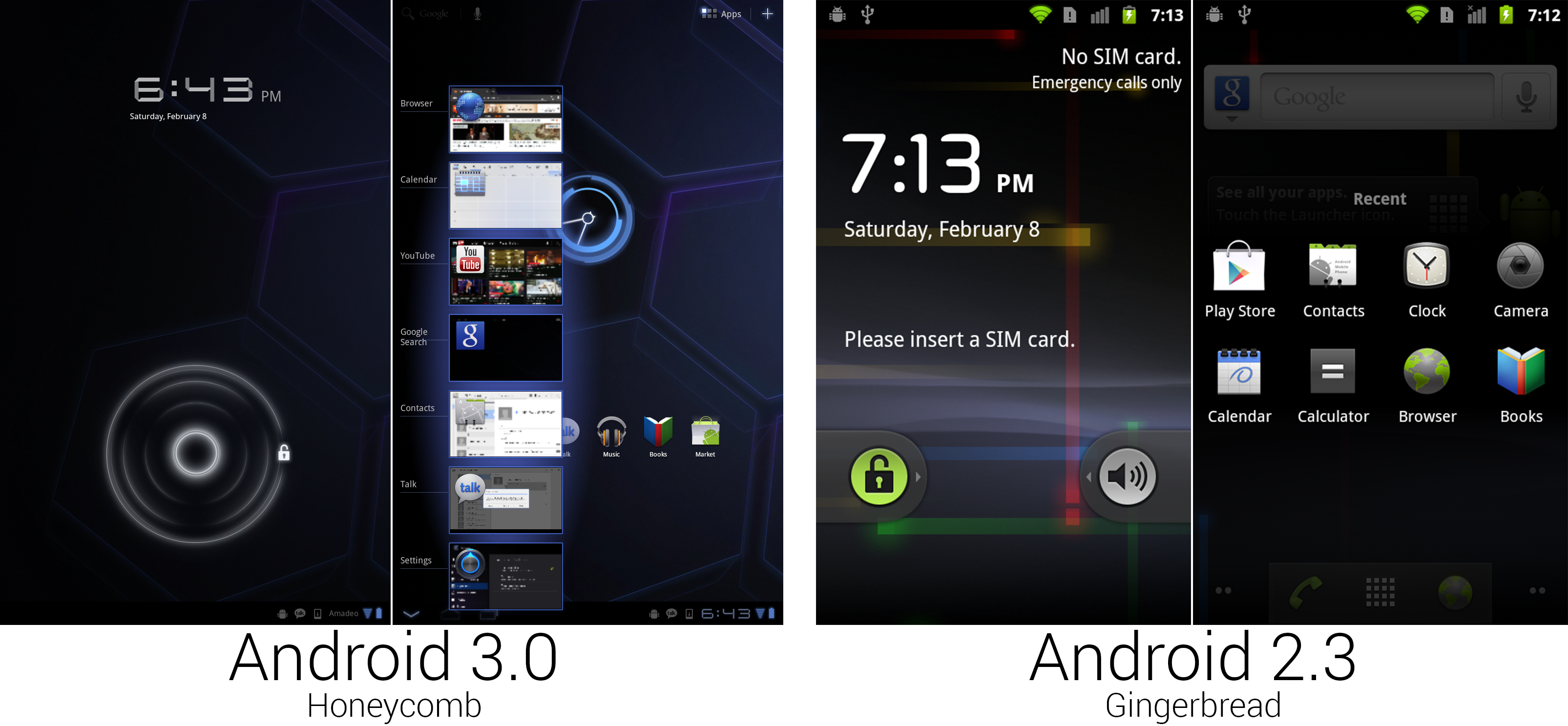
The new lock screen and Recent Apps interface.
|
|
Photo by Ron Amadeo
|
|
|
|
(Since the Xoom was a [heavy] 10-inch, 16:9 tablet, it was primarily meant to be used horizontally. Most apps also supported portrait mode, though, so for the sake of our formatting, we're using mostly portrait mode shots. Just keep in mind the Honeycomb shots come from a 10-inch tablet, and the Gingerbread shots come from a 3.7-inch phone. The densities of information are not directly comparable.)
|
|
|
|
The unlock screen—after switching from a menu button to a rotary dial to slide-to-unlock—removed any required accuracy from the unlock process by switching to a circle unlock. Swiping from the center outward in any direction would unlock the device. Like the rotary unlock, this was much nicer ergonomically than forcing your finger to follow a perfectly straight path.
|
|
|
|
The strip of thumbnails in the second picture was the interface brought up by the newly christened "Recent Apps" button, now living next to Back and Home. Rather than the group of icons brought up in Gingerbread by long-pressing on the home button, Honeycomb showed app icons and thumbnails on the screen, which made it a lot easier to switch between tasks. Recent Apps was clearly inspired by Duarte's "card" multitasking in WebOS, which used full-screen thumbnails to switch tasks. This design offered the same ease-of-recognition as WebOS's task switcher, but the smaller thumbnails allowed more apps to fit on screen at once.
|
|
|
|
While this implementation of Recent Apps may look like what you get on a current device, this version was very early. The list didn't scroll, meaning it showed seven apps in portrait mode and only five apps in horizontal mode. Anything beyond that was bumped off the list. You also couldn't swipe away thumbnails to close apps—this was just a static list.
|
|
|
|
Here we see the Tron influence in full effect: the thumbnails had blue outlines and an eerie glow around them. This screenshot also shows a benefit of software buttons—context. The back button closed the list of thumbnails, so instead of the normal arrow, this pointed down.
|
|
|
|
----------
|
|
|
|

|
|
|
|
[Ron Amadeo][a] / Ron is the Reviews Editor at Ars Technica, where he specializes in Android OS and Google products. He is always on the hunt for a new gadget and loves to rip things apart to see how they work.
|
|
|
|
[@RonAmadeo][t]
|
|
|
|
--------------------------------------------------------------------------------
|
|
|
|
via: http://arstechnica.com/gadgets/2014/06/building-android-a-40000-word-history-of-googles-mobile-os/16/
|
|
|
|
译者:[译者ID](https://github.com/译者ID) 校对:[校对者ID](https://github.com/校对者ID)
|
|
|
|
本文由 [LCTT](https://github.com/LCTT/TranslateProject) 原创翻译,[Linux中国](http://linux.cn/) 荣誉推出
|
|
|
|
[1]:http://arstechnica.com/gadgets/2011/03/ars-reviews-the-motorola-xoom/
|
|
[a]:http://arstechnica.com/author/ronamadeo
|
|
[t]:https://twitter.com/RonAmadeo |