11 KiB
The history of Android
Follow the endless iterations from Android 0.5 to Android 7 and beyond.
ART—The Android Runtime provides a platform for the future
There aren't too many components that can trace their lineage all the way back to Android 1.0, but in 2014 one of them was Dalvik, the runtime that powers Android apps. Dalvik was originally designed for single-core, low-performance devices, and it prioritized storage and memory usage over performance. Over the years, Google bolted on more and more upgrades to Dalvik, like JIT support, concurrent garbage collection, and multi-process support. But with the advent of multi-core phones that were many times faster than the T-Mobile G1, upgrades could only take Android so far.
The solution was to replace Dalvik with ART, the Android RunTime, a new app engine written from the ground up for modern smartphone hardware. ART brought an emphasis on performance and UI smoothness. ART brought a switch from JIT (Just-in-time) compilation to AOT (Ahead-of-time) compilation. JIT would compile an app every time it was run, saving storage space since compiled code was never written to disk, but instead it took up more CPU and RAM. AOT would save the compiled code to disk, making app start faster and reducing memory usage. Rather than shipping precompiled code, ART would compile code on the device as part of installation, giving the compiler access to device-specific optimizations. ART also brought support for 64-bit which, in addition to more addressable memory, brings better performance from the 64-bit instruction set (particularly in media and cryptography apps).
The best part was this change brought these performance improvements and 64-bit support to every java Android app. ART generates code for every java app, thus any improvements to ART automatically come to these apps. ART was also written with future upgrades in mind, so it would be able to evolve along with Android.
A system-wide interface refresh
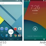
Material Design brought a complete overhaul to nearly every interface in Android. For starters, the entire core System UI was changed. Android got a revamped set of buttons that look a bit like a PlayStation controller: triangle, circle, and square buttons now represented back, home, and recent apps, respectively. The status bar was all new thanks to a set of redesigned icons.
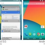
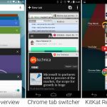
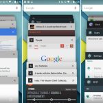
Recent apps got a big revamp, switching from a vertical list of small thumbnails to a cascading view of large, almost fullscreen thumbnails. It also got a new name (which didn't really stick) called "Overview." This definitely seems like something that was inspired by Chrome's tab switcher in past versions.
Chrome's tab switcher was gone in this release, by the way. In an attempt to put Web apps on even ground with installed apps, Chrome tabs were merged into the Overview list. That's right: the list of recent "apps" now showed recently opened apps mixed in with recently opened websites. In Lollipop, the recent apps list also took a "document centric" approach, meaning apps could put more than one listing into the recent apps list. For instance if you opened two documents in Google Docs, both would be shown in recent apps, allowing you to easily switch between them rather than having to switch back and forth via the app's file list.
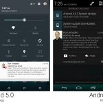
The notification panel was all new. Google brought the "card" motif to the notification panel, storing each item in its own rectangle. Individual notifications changed from a dark background to a white one with better typography and round icons. These new notifications came to the lock screen, changing it from a mostly-useless interstitial screen to a very useful "here's what happened while your were gone" screen.
Full screen notifications for calls and alarms were banished, replaced with a "heads up" notification that would pop into the top part of the screen. Heads-up notifications also came to "high-priority" app notifications, which were originally intended for IM messages. It was up to developers to decide what was a high-priority notification though, and after developers realized this would make their notifications more noticeable, everyone started forcing them on users. Later versions of Android would fix this by giving users control over the "high-priority" setting.
Google also added a separate-but-similarly-named "priority" notification system to Lollipop. "Priority" notification was a mode in-between completely silent and "beep for everything" allowing users to flag certain people and apps as "important." Priority mode would only beep for these important people. In the UI, this took the form of a set of notification priority controls attached to the volume popup and a new settings screen for priority notifications. And whenever you were in priority mode, there was a little star in the status bar.
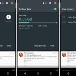
Quick Settings got a huge series of improvements The controls were now a panel above the notification panel, so that it could be opened with a "double swipe down" gesture. The first pull down would open the notification panel, and the second pull down gesture would shrink the notification panel and open Quick Settings. The layout of the Quick Settings controls changed, dumping the tile layout for a series of buttons floating on a single panel. The top was a very handy brightness slider, followed by buttons for connectivity, auto rotate, the flashlight, GPS, and Chromecast.
There were also actual in-line panels now in the Quick Settings. It would display Wi-Fi access points, Bluetooth device, and data usage right in the main interface.
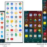
The Material Design revamp gave nearly every app a new icon and brought a brighter, white background to the app drawer. There were lots of changes to the default apps loadout. Say "hello" to the new apps: Contacts, Docs, Fit, Messenger, Photos, Play Newsstand, Sheets, and Slides. Say "goodbye" to the dead apps: Gallery, G+ Photos, People, Play Magazines, Email, and Quickoffice.
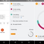
Many of these new apps came from Google Drive, which split up from a monolithic app into an app for each product. There was now Drive, Docs, Sheets, and Slides, all from the Drive team. Drive is also responsible for the death of Quickoffice, which was consumed by the Drive team. In the "Google can never make up its mind" category: "People" got renamed back to "Contacts" again, and an SMS app called "Messenger" was reinstated at the behest of cellular carriers. (Those carriers did not like Google Hangouts taking over SMS duties.) We got one genuinely new service: Google Fit, a fitness tracking app that worked on Android phones and Android Wear watches. There was also a revamp of Play Magazines to include websites, so it changes names to "Play Newsstand."
There were more cases of proprietary Google apps taking over for AOSP.
- "G+ Photos" became "Google Photos" and took over default picture duties from the AOSP Gallery, which became a dead app. The name change to "Google Photos" was in preparation for Photos being pulled out of Google+ and launching as a standalone service. The Google Photos launch would happen about six months after the launch of Lollipop—for now, this is just the Google+ app spawning a new icon and interface.
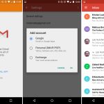
- Gmail took over POP3, IMAP, and Exchange e-mail duties from the "Email" app. Despite being dead Email still had an app icon, which was a fake—it only displayed a message that told users to setup all e-mail accounts in the Gmail app.
- The "People" to "Contacts" change was actually to "Google Contacts" another AOSP replacement app.
作者:RON AMADEO 译者:译者ID 校对:校对者ID
