9.8 KiB
The history of Android
Follow the endless iterations from Android 0.5 to Android 7 and beyond.
Android Wear
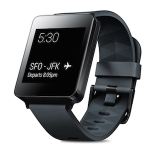
June 2014 saw Android tackle a new form factor: smartwatches. Google launched "Android Wear" at Google I/O 2014 with the intention of putting a tiny computer on your wrist. Designing for a 1.6-inch screens meant having to rethink the entire interface from the ground up, so Google stripped down Android 4.4 KitKat and created a tiny smartwatch OS. Android Wear devices weren't standalone computers. They depended on an Android smartphone running the Android Wear companion app for connectivity, authentication, and app data.
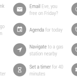
Android Wear smartwatches were mostly notification machines. With new APIs built into Android 4.3 and up, any notification your phone received would also be shown on the watch—no app support required. The notification action buttons were shipped to the watch as well, giving users a small way to interact with notifications from the watch. Dismissing a notification on the watch would clear it from the phone, allowing users to manage notifications without having to whip out another device. There was also a voice command system and a microphone included in every watch, allowing users to just lift their wrist to wake the watch, say "OK Google," and then issue a command. You could reply-by-voice to messages, too. There was even an app drawer for native watch apps.
The home screen, of course, showed the time and allowed users to swap home screen looks with tons of different watch styles. The interface used a card motif for notifications. A vertically-scrolling list of notifications would pile up on the watch, included some Google Now cards showing the weather or traffic into. Swiping to the left would dismiss a notification, and swiping to the right would bring up the action buttons one at a time. Tapping on the home screen would bring up the voice command system, and from there you could activate the settings or app drawer. There wasn't much to the initial Android Wear home screen other than that.
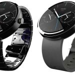
Only 720,000 Android Wear devices shipped in 2014, and since then we haven't seen much growth from the software or hardware. Today, smartphone sales are falling year-over-year, and even after the release of the Apple Watch, no one is really sure what they want their little wrist computers to do. It's apparently going to take until 2017 before Android Wear 2.0 hits the market. Since the Moto 360 brought round devices to the market, we haven't seen much new from hardware vendors.
Android 5.0 Lollipop—The most important Android release ever
In November 2014, Google launched Android 5.0 Lollipop. Lots of OS updates get called "the biggest release ever," but that cliche actually holds true for Android 5.0 Lollipop. For starters, it changed the way Android was released. With this version of Android, Google started the "Developer Preview" program, which saw the new OS released in beta form months before the release. With the code name and version number now used as marketing tools, the final name was kept secret during the beta and referred to only by letter. At Google I/O 2014, Google announced the "Android L Developer Preview."
FURTHER READING
Android 5.0 Lollipop, thoroughly reviewed
Giving developers (and the rest of the world) four months to wrap their head around this release was definitely needed. Android L contained wide-ranging changes that debuted in this OS and are still being felt today. Lollipop introduced Material Design, which was used a guideline to revamp every single interface of Android. A new runtime called "ART" represented a complete overhaul of the engine that powers Android apps. Google's "OK Google" voice command system was upgraded to work on any screen, and on some devices it could even work when the phone was asleep. Multi-user was brought from tablets to phones. Lollipop also laid the foundation for Android for Work, an enterprise-focused dual persona feature.
Material Design gives Android (and all of Google) an identity
When Matias Duarte took to the I/O stage and announced Material Design, he unveiled a unified design blueprint for not just Android, but all of Google and the third-party app ecosystem. The idea was that the Android, iOS, Chrome OS, and Web versions of a Google app should all look the same and that all Google products should have consistent iconography, fonts, and behavior. They didn't necessarily need identical layouts across screen sizes, but Material Design offered building blocks with consistent behavior that could be rearranged based on the screen size.
Duarte and his team had experimented with a "Tron" aesthetic in Honeycomb, and a "Card" motif in Jelly Bean, but Material Design finally represented a cohesive design system for all of Google. Material Design went beyond UI guidelines and became an identity for Google as a company.
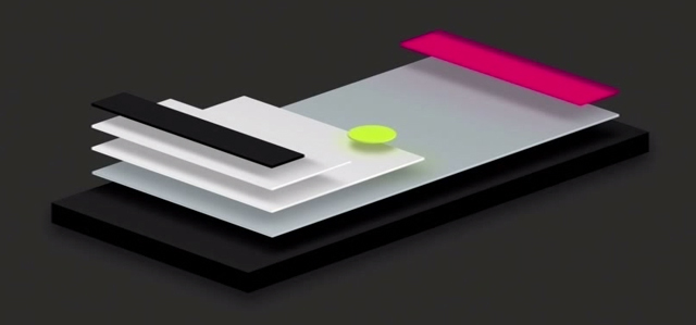
The primary metaphor for Material Design is "paper and ink." All UI surfaces were sheets of "paper" that floated above a bottom surface. Shadows were used to provide hierarchy to the interface—each layer of the UI occupied a position in Z space and casted a shadow on the elements below it. This was a clear evolution of the "Card" style used in Google Now on Android 4.1. "Ink" was used to refer to the bold splashes of color that Google recommended to developers for important items in the UI. These concepts also referenced real world things, which went against the anti-skeuomorphic "flat at any cost" trend that was brought about by things like Windows 8 and iOS 7.
Anination was a big focus, too, with the idea that nothing should "pop" onto the screen. Components should slide in, shrink, or grow. The "paper" surfaces didn't quite work like real world paper, either they could shrink, expand, merge, and grow. To make the animation system work with image assets, shadows weren't baked into the UI widgets the way they were in previous versions—Google actually created a real-time, 3D shadowing system so that shadows would be correctly rendered during these animations and transitions.
To bring Material Design to the rest of Google and the app ecosystem, Google created and still maintains a cohesive set of design guidelines describing how everything should work. There are DOs and DON'Ts, keylines, baseline grids, color swatches, stock iconography, fonts, libraries, layout suggestions, and more. Google even started regularly holding design-focused conferencesto hear from and educate designers, and the company founded the Material Design awards. Shortly after the launch of Material Design, Duarte left the Android team and became VP of Material Design at Google, creating a whole design-focused division of the company.
作者:RON AMADEO 译者:译者ID 校对:校对者ID
