mirror of
https://github.com/LCTT/TranslateProject.git
synced 2025-01-07 22:11:09 +08:00
82 lines
11 KiB
Markdown
82 lines
11 KiB
Markdown
The history of Android
|
||
================================================================================
|
||

|
||
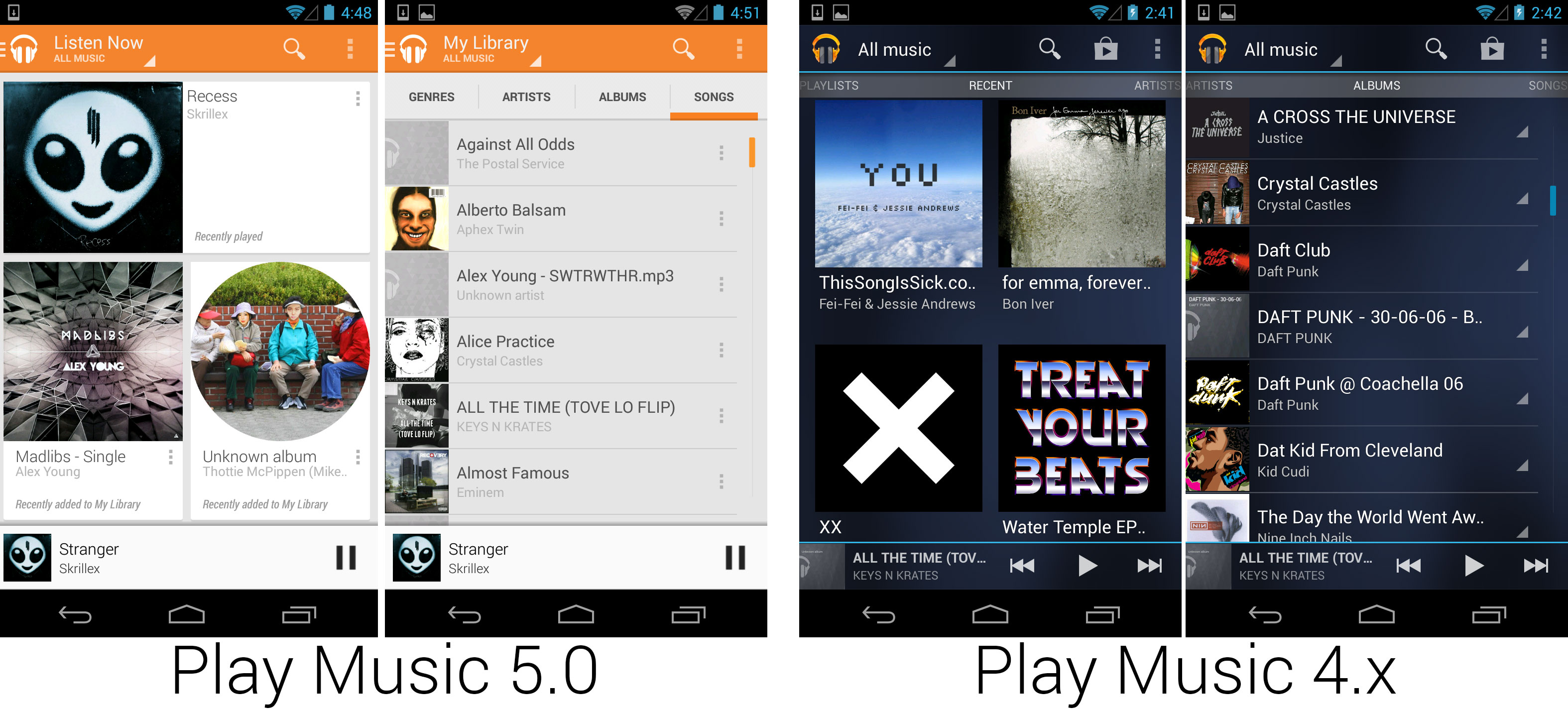
The slick new Google Play Music app, which changed from Tron to a perfect match for the Play Store.
|
||
Photo by Ron Amadeo
|
||
|
||
Another app update pushed out at I/O was a new Google Music app. The app was completely redesigned, finally doing away with the blue-on-blue design introduced in Honeycomb. Play Music's design was unified with the new Play Store released a few months earlier, with a responsive white card layout. Music was also one of the first major apps to take advantage of the new navigation drawer style. Along with the new app, Google launched Google Play Music All Access, an all-you-can-eat subscription service for $10 a month. Google Music now had a subscription plan, à la carte purchasing, and a cloud music locker. This version also introduced "Instant Mix," a mode where Google would cloud-compute a playlist of similar songs.
|
||
|
||

|
||
A game showing support for Google Play Games. This lineup shows the Play Store game feature descriptions, the permissions box triggered by signing into the game, a Play Games notification, and the achievements screen.
|
||
Photo by Ron Amadeo
|
||
|
||
Google also introduced "Google Play Games," a back-end service that developers could plug into their games. The service was basically an Android version of Xbox Live or Apple's Game Center. Developers could build Play Games support into their game, which would easily let them integrate achievements, leaderboards, multiplayer, matchmaking, user accounts, and cloud saves by using Google's back-end services.
|
||
|
||
Play Games was the start of Google's big push into gaming. Just like standalone GPS units, flip phones, and MP3 players, smartphone makers were hoping standalone gaming devices would be turned into nothing more than a smartphone feature bullet point. Why buy a Nintendo DS or PS Vita when you had a smartphone with you? An easy-to-use multiplayer service would be a big part of this, and we've still yet to see the final consequence of this move. Today, Google and Apple are both rumored to be planning living room gaming devices.
|
||
|
||

|
||
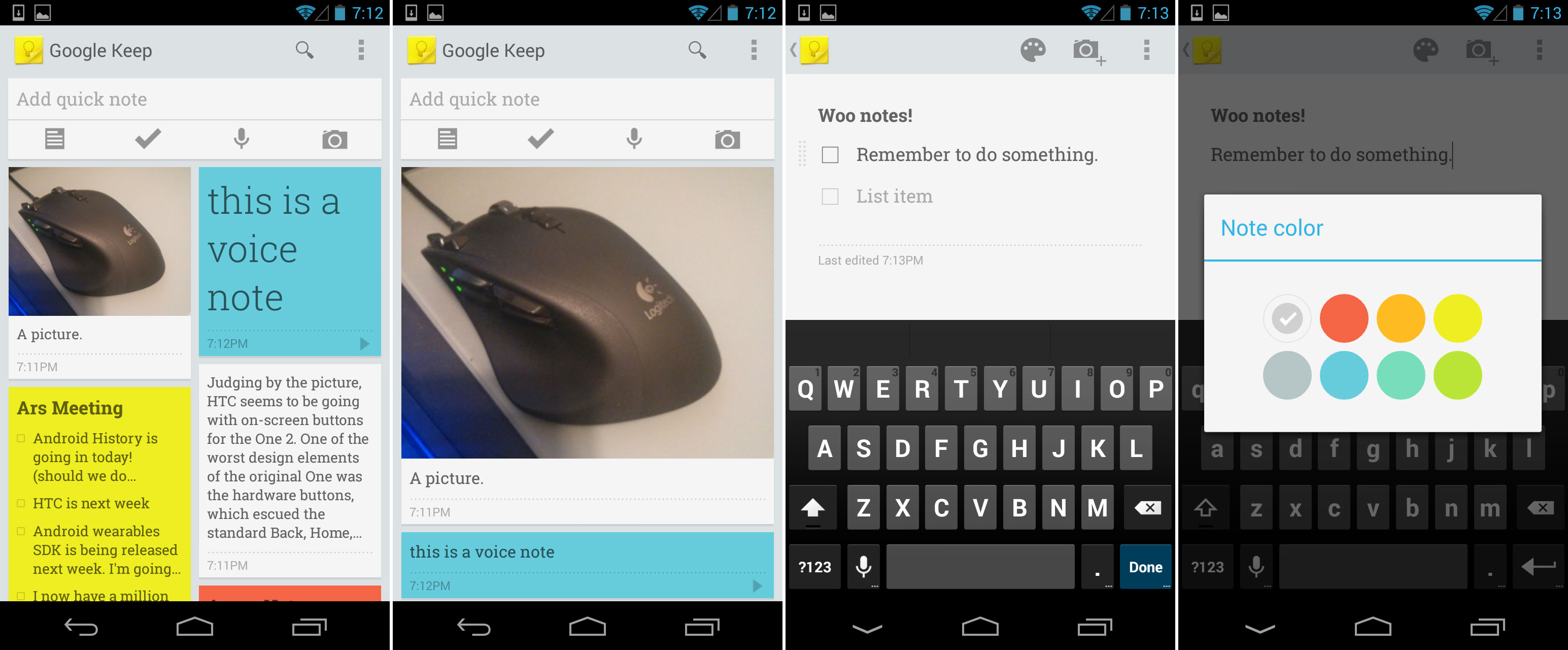
Google Keep, Google's first note taking service since Google Notebook.
|
||
Photo by Ron Amadeo
|
||
|
||
It was clear some products were developed in time for presentation at Google I/O, [but the three-and-a-half hour keynote][1] was already so massive, some things were cut from being announced. Once the smoke cleared three days after Google I/O, Google introduced Google Keep, a note taking app for Android and the Web. Keep was a fairly straightforward affair, applying the responsive Google Now-style design to a note taking app. Users could change the size of the cards from a multi-column layout to a single column view. Notes could consist of plain text, checklists, voice note with automatic transcription, or pictures. Note cards could be dragged around and rearranged on the main screen, and you could even assign a color to a note.
|
||
|
||

|
||
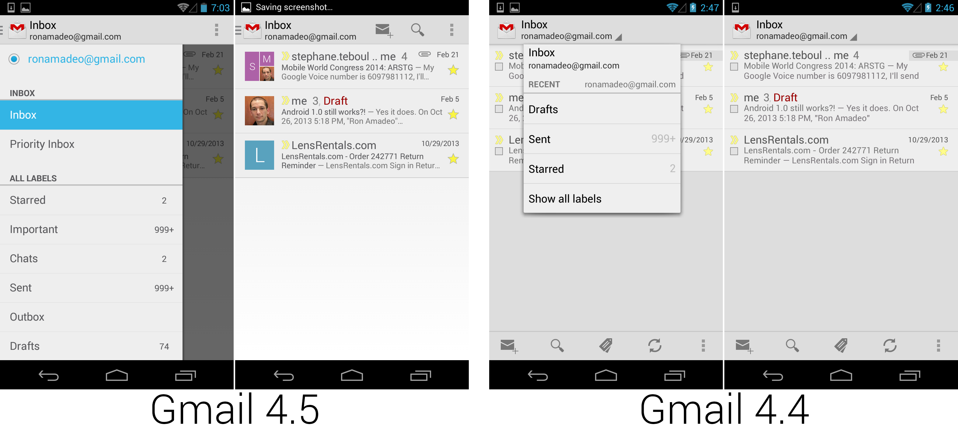
Gmail 4.5, which switched to the new navigation drawer design and merged the action bars, thanks to some clever button elimination.
|
||
Photo by Ron Amadeo
|
||
|
||
After I/O, not much was safe from Google's out-of-cycle updating. In June 2013, Google released a redesigned version of Gmail. The headline feature of the new design was the new navigation drawer interface that was introduced a month earlier at Google I/O. The most eye catching change was the addition of Google+ profile pictures instead of checkboxes. While the checkboxes were visibly removed, they were still there, just tap on a picture.
|
||
|
||

|
||
The new Google Maps, which switched to an all-white Google Now-style theme.
|
||
Photo by Ron Amadeo
|
||
|
||
One month later, Google released a completely overhauled version of Google Maps to the Play Store. It was the first ground-up redesign of Google Maps since Ice Cream Sandwich. The new version fully adopted the Google Now white card aesthetic, and it greatly reduced the amount of stuff on the screen. The new Google Maps seemed to have a design mandate to always show a map on the screen somewhere, as you’ll be hard pressed to find something other than the settings that fully covers the map.
|
||
|
||
This version of Google Maps seemed to live in its own little design world. The white search bar “floated" above the map, with maps showing on the sides and top of the bar. That didn't really make it seem like the traditional Action Bar design. The navigation drawer, in the top left on every other app, was in the bottom left. There was no up button, app icon, or overflow button on the main screen.
|
||
|
||

|
||
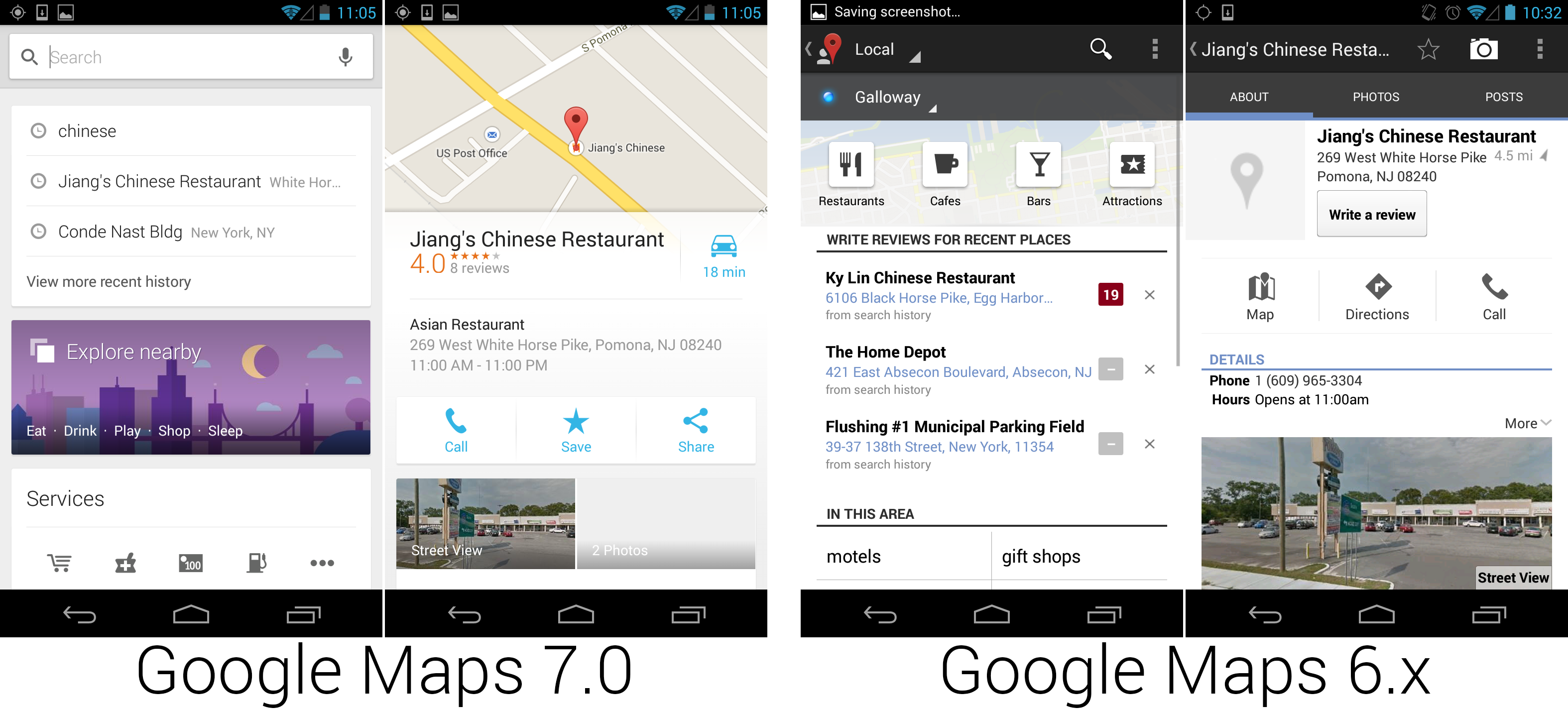
The new Google Maps cut a lot of fat and displayed more information on a single screen.
|
||
Photo by Ron Amadeo
|
||
|
||
The left picture shows what popped up when you tapped on the search bar (along with the keyboard, which had been closed). In the past, Google would show an empty page below a blank search bar, but in Maps, Google used that space to link to the new “Local" page. The “blank" search results displayed links to common, browsable results like restaurant listings, gas stations, and attractions. At the bottom of the results page was a list of nearby results from your search history and an option to manually cache parts of the map.
|
||
|
||
The right set of images shows location page. The map shown in the top of the Maps 7 screenshot isn’t a thumbnail; that’s the full map view. In the new version of Google Maps, a location was displayed as a card that “floats" overtop of the main map, and the map was repositioned to center on the location. Scrolling up would move the card up and cover the map, and scrolling down would show the whole map with the result reduced to a small strip at the bottom. If the location was part of a list of search results, swiping left and right would move through the results.
|
||
|
||
The location pages were redesigned to be much more useful at a glance. On the first page, the new version added critical information, like the location on a map, the review score, and the number of reviews. Since this is a phone, and the software will be dialing for you, the phone number was deemed pointless and was removed. The old version showed the distance to the location in miles, while the new version of Google Maps showed the distance in terms of time, based on traffic and preferred mode of transportation—a much more useful metric. The new version also put a share button front and center, which made coordination over IM or text messaging a lot easier.
|
||
|
||
### Android 4.3, Jelly Bean—getting wearable support out early ###
|
||
|
||
Android 4.3 would have been an incredible update if Google had done the traditional thing and not released updates between 4.3 and 4.2 through the Play Store. If the new Play Store, Gmail, Maps, Books, Music, Hangouts, Keep, and Play Games were bundled into a big brick as a new version of Android, it would have been hailed as the biggest release ever. Google didn't need to do hold back features anymore though. With very little left that required an OS update, at the end of July 2013, Google released the seemingly insignificant update called "Android 4.3."
|
||
|
||

|
||
Android Wear plugging into Android 4.3's Notification access screen.
|
||
Photo by Ron Amadeo
|
||
|
||
Google made no qualms about the low importance of 4.3, calling the newest release "Jelly Bean" (the third one in a row). Android 4.3's feature list read like a laundry list of things Google couldn't update from the Play Store or through Google Play Services, mostly consisting of low-level framework changes for developers.
|
||
|
||
Many of the additions seemed to fit a singular purpose, though—Android 4.3 was Google's trojan horse for wearable computing support. 4.3 added support for Bluetooth Low Energy, a way to wirelessly connect Android to another device and pass data back and forth while using a very small amount of power—an integral feature to a wearable device. Android 4.3 also added a "Notification Access" API, which allowed apps to completely replicate and control the notification panel. Apps could display notification text and pictures and interact with the notification the same way users do—namely pressing action buttons and dismissing notifications. Doing this from an on-board app when you have the notification panel is useless, but on a device that is separate from your phone, replicating the information in the notification panel becomes much more useful. One of the few apps that plugged into this was "Android Wear Preview," which used the notification API to power most of the interface for Android Wear.
|
||
|
||
The "4.3 is for wearables" theory explained the relatively low number of features in 4.3: it was pushed out the door to give OEMs time to update devices in time for the launch of [Android Wear][2]. The plan seems to have worked. Android Wear requires Android 4.3 and up, which has been out for so long now that most major flagships have updated.
|
||
|
||
Android 4.3 was not all that exciting, but Android releases from here on out didn't need to be all that exciting. Everything became so modularized that Google could push updates out as soon as they were done through Google Play, rather than drop everything in one huge brick as an OS update.
|
||
|
||
----------
|
||
|
||

|
||
|
||
[Ron Amadeo][a] / Ron is the Reviews Editor at Ars Technica, where he specializes in Android OS and Google products. He is always on the hunt for a new gadget and loves to rip things apart to see how they work.
|
||
|
||
[@RonAmadeo][t]
|
||
|
||
--------------------------------------------------------------------------------
|
||
|
||
via: http://arstechnica.com/gadgets/2014/06/building-android-a-40000-word-history-of-googles-mobile-os/24/
|
||
|
||
译者:[译者ID](https://github.com/译者ID) 校对:[校对者ID](https://github.com/校对者ID)
|
||
|
||
本文由 [LCTT](https://github.com/LCTT/TranslateProject) 原创翻译,[Linux中国](http://linux.cn/) 荣誉推出
|
||
|
||
[1]:http://live.arstechnica.com/liveblog-google-io-2013-keynote/
|
||
[2]:http://arstechnica.com/gadgets/2014/03/in-depth-with-android-wear-googles-quantum-leap-of-a-smartwatch-os/
|
||
[a]:http://arstechnica.com/author/ronamadeo
|
||
[t]:https://twitter.com/RonAmadeo |