mirror of
https://github.com/LCTT/TranslateProject.git
synced 2025-01-01 21:50:13 +08:00
33 lines
3.0 KiB
Markdown
33 lines
3.0 KiB
Markdown
New Ubuntu 14.04 Icons Are Drop-Dead Gorgeous, Might Not Arrive in Desktop Version
|
||
================================================================================
|
||
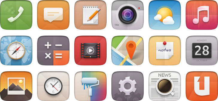
**Canonical is preparing a facelift for the Ubuntu 14.04 LTS and the new icons that are being designed right now surpass anything that's been done before.**
|
||
|
||
During the last UDS (Ubuntu developer summit), James Mathieu, a designer who has been working fervently on a new look for Ubuntu, presented a set of icons that were simply beautiful, for lack of a better word. Now he is showing us in much greater detail the work he has been doing.
|
||
|
||
“This project’s main goal is to create a single modern, high-resolution icon theme for desktop and touch devices that can adapt to various screen densities and reinforces the Ubuntu user experience. We want our icons to express our values and convey Ubuntu’s personality in a unique way.”
|
||
|
||
“We already had mobile icons for the applications and symbols, but, because they evolved over time without strong guidelines, did not form a consistent set. On the desktop, even though the style is clean and consistent, the icons looked dated and needed to be replaced too,” said James Mathieu in a post on the official Ubuntu website.
|
||
|
||
Canonical's goal right now is to update the old icons for all the platforms which now include phone and tablet, and get them up to today's standards, without losing their identity. Users must be able to identify an Ubuntu system just by looking at the icons and nothing more.
|
||
|
||
The old set that has been used so far doesn't look half-bad, but the ones that have been presented so far are drop-dead gorgeous.
|
||
|
||
“We’ve been working on this on-going project for the past year. We’ve done extensive research on the subject with a focus on learning how best to classify the icons; and we’ve gone through several design iterations and explorations,” [also][1] said Mathieu in his post.
|
||
|
||
These are not the final versions of the icons and the design might change. There’s also a chance that the new icons might not be ready in time for the desktop version, but we can only hope.
|
||
|
||

|
||
|
||

|
||
|
||

|
||
|
||
--------------------------------------------------------------------------------
|
||
|
||
via: http://news.softpedia.com/news/New-Ubuntu-14-04-Icons-Are-Drop-dead-Gorgeous-Might-Not-Arrive-in-Desktop-Version-410435.shtml
|
||
|
||
译者:[译者ID](https://github.com/译者ID) 校对:[校对者ID](https://github.com/校对者ID)
|
||
|
||
本文由 [LCTT](https://github.com/LCTT/TranslateProject) 原创翻译,[Linux中国](http://linux.cn/) 荣誉推出
|
||
|
||
[1]:http://design.canonical.com/2013/12/the-new-ubuntu-icons/ |