mirror of
https://github.com/LCTT/TranslateProject.git
synced 2025-01-25 23:11:02 +08:00
109 lines
12 KiB
Markdown
109 lines
12 KiB
Markdown
The history of Android
|
||
================================================================================
|
||
|
||
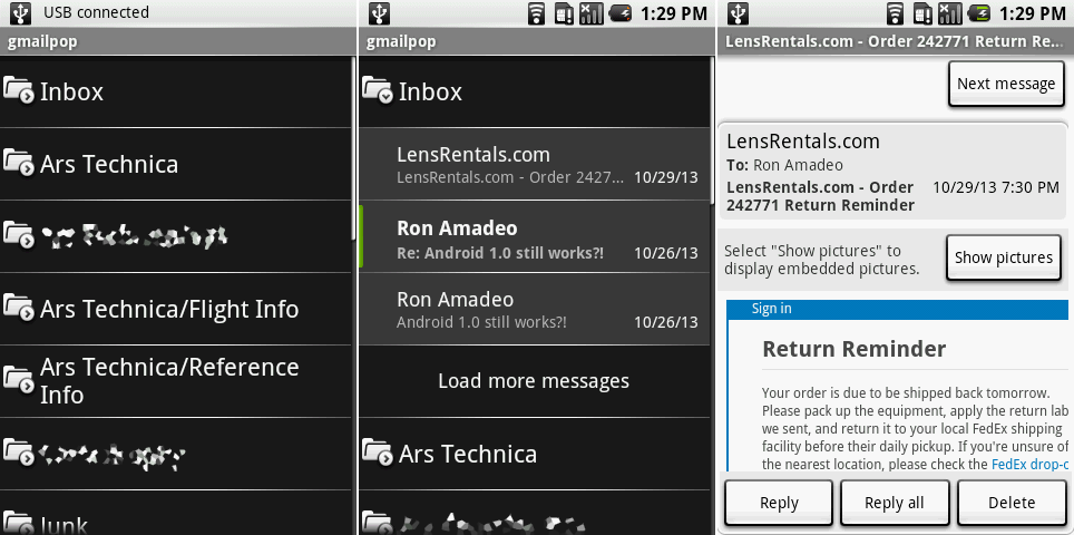
Both screens of the Email app. The first two screenshots show the combined label/inbox view, and the last shows a message.
|
||
Photo by Ron Amadeo
|
||
|
||
The message view was—surprise!—white. Android's e-mail app has historically been a watered-down version of the Gmail app, and you can see that close connection here. The message and compose views were taken directly from Gmail with almost no modifications.
|
||
|
||
|
||
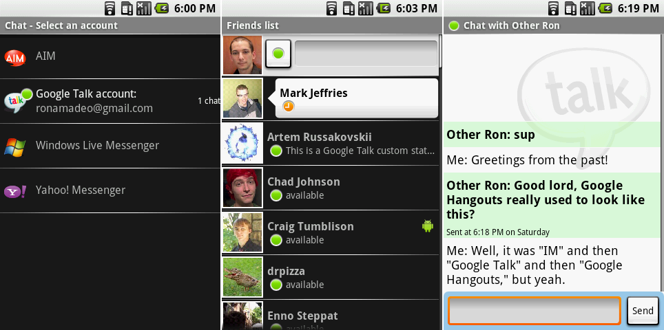
The “IM" applications. Screenshots show the short-lived provider selection screen, the friends list, and a chat.
|
||
Photo by Ron Amadeo
|
||
|
||
Before Google Hangouts and even before Google Talk, there was "IM"—the only instant messaging client that shipped on Android 1.0. Surprisingly, multiple IM services were supported: users could pick from AIM, Google Talk, Windows Live Messenger, and Yahoo. Remember when OS creators cared about interoperability?
|
||
|
||
The friends list was a black background with white speech bubbles for open chats. Presence was indicated with colored circles, and a little Android on the right hand side would indicate that a person was mobile. It's amazing how much more communicative the IM app was than Google Hangouts. Green means the person is using a device they are signed into, yellow means they are signed in but idle, red means they have manually set busy and don't want to be bothered, and gray is offline. Today, Hangouts only shows when a user has the app open or closed.
|
||
|
||
The chats interface was clearly based on the Messaging program, and the chat backgrounds were changed from white and blue to white and green. No one changed the color of the blue text entry box, though, so along with the orange highlight effect, this screen used white, green, blue, and orange.
|
||
|
||
|
||
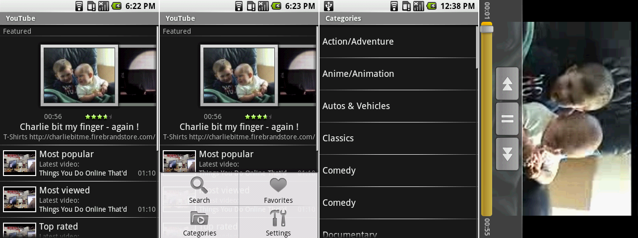
YouTube on Android 1.0. The screens show the main page, the main page with the menu open, the categories screen, and the videos screen.
|
||
Photo by Ron Amadeo
|
||
|
||
YouTube might not have been the mobile sensation it is today with the 320p screen and 3G data speeds of the G1, but Google's video service was present and accounted for on Android 1.0. The main screen looked like a tweaked version of the Android Market, with a horizontally scrolling featured section along the top and vertically scrolling categories along the bottom. Some of Google's category choices were pretty strange: what would the difference be between "Most popular" and "Most viewed?"
|
||
|
||
In a sign that Google had no idea how big YouTube would eventually become, one of the video categories was "Most recent." Today, with [100 hours of video][1] uploaded to the site every minute, if this section actually worked it would be an unreadable blur of rapidly scrolling videos.
|
||
|
||
The menu housed search, favorites, categories, and settings. Settings (not pictured) was the lamest screen ever, housing one option to clear the search history. Categories was equally barren, showing only a black list of text.
|
||
|
||
The last screen shows a video, which only supported horizontal mode. The auto-hiding video controls weirdly had rewind and fast forward buttons, even though there was a seek bar.
|
||
|
||

|
||
YouTube’s video menu, description page, and comments.
|
||
Photo by Ron Amadeo
|
||
|
||
Additional sections for each video could be brought up by hitting the menu button. Here you could favorite the video, access details, and read comments. All of these screens, like the videos, were locked to horizontal mode.
|
||
|
||
"Share" didn't bring up a share dialog yet; it just kicked the link out to a Gmail message. Texting or IMing someone a link wasn't possible. Comments could be read, but you couldn't rate them or post your own. You couldn't rate or like a video either.
|
||
|
||

|
||
The camera app’s picture taking interface, menu, and photo review mode.
|
||
Photo by Ron Amadeo
|
||
|
||
Real Android on real hardware meant a functional camera app, even if there wasn't much to look at. That black square on the left was the camera interface, which should be showing a viewfinder image, but the SDK screenshot utility can't capture it. The G1 had a hardware camera button (remember those?), so there wasn't a need for an on-screen shutter button. There were no settings for exposure, white balance, or HDR—you could take a picture and that was about it.
|
||
|
||
The menu button revealed a meager two options: a way to jump to the Pictures app and Settings screen with two options. The first settings option was whether or not to enable geotagging for pictures, and the second was for a dialog prompt after every capture, which you can see on the right. Also, you could only take pictures—there was no video support yet.
|
||
|
||
|
||
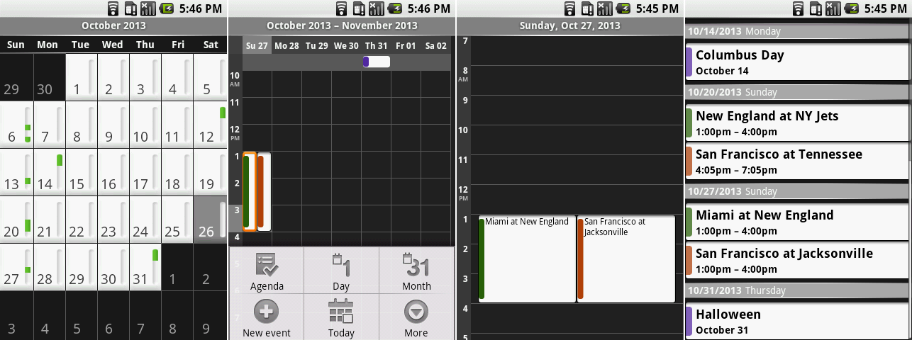
The Calendar’s month view, week view with the menu open, day view, and agenda.
|
||
Photo by Ron Amadeo
|
||
|
||
Like most apps of this era, the primary command interface for the calendar was the menu. It was used to switch views, add a new event, navigate to the current day, pick visible calendars, and go to the settings. The menu functioned as a catch-all for every single button.
|
||
|
||
The month view couldn't show appointment text. Every date had a bar next to it, and appointments were displayed as green sections in the bar denoting what time of day an appointment was. Week view couldn't show text either—the 320×480 display of the G1 just wasn't dense enough—so you got a white block with a strip of color indicating which calendar it was from. The only views that provided text were the agenda and day views. You could move through dates by swiping—week and day used left and right, and month and agenda used up and down.
|
||
|
||
|
||
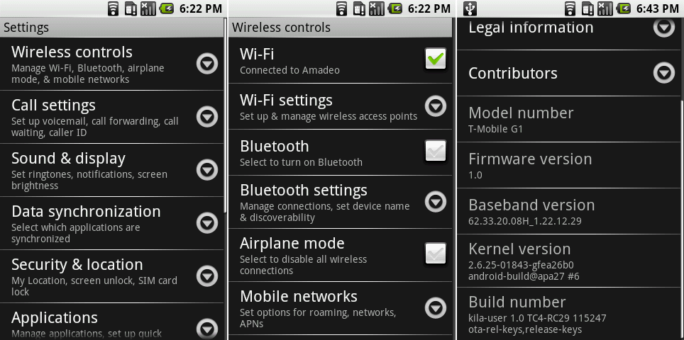
The main settings page, the Wireless section, and the bottom of the about page.
|
||
Photo by Ron Amadeo
|
||
|
||
Android 1.0 finally brought a settings screen to the party. It was a black and white wall of text that was roughly broken down into sections. Down arrows next to each list item confusingly look like they would expand line-in to show more of something, but touching anywhere on the list item would just load the next screen. All the screens were pretty boring and samey looking, but hey, it's a settings screen.
|
||
|
||
Any option with an on/off state used a cartoony-looking checkbox. The original checkboxes in Android 1.0 were pretty strange—even when they were "unchecked," they still had a gray check mark in them. Android treated the check mark like a light bulb that would light up when on and be dim when off, but that's not how checkboxes work. We did finally get an "About" page, though. Android 1.0 ran Linux kernel 2.6.25.
|
||
|
||
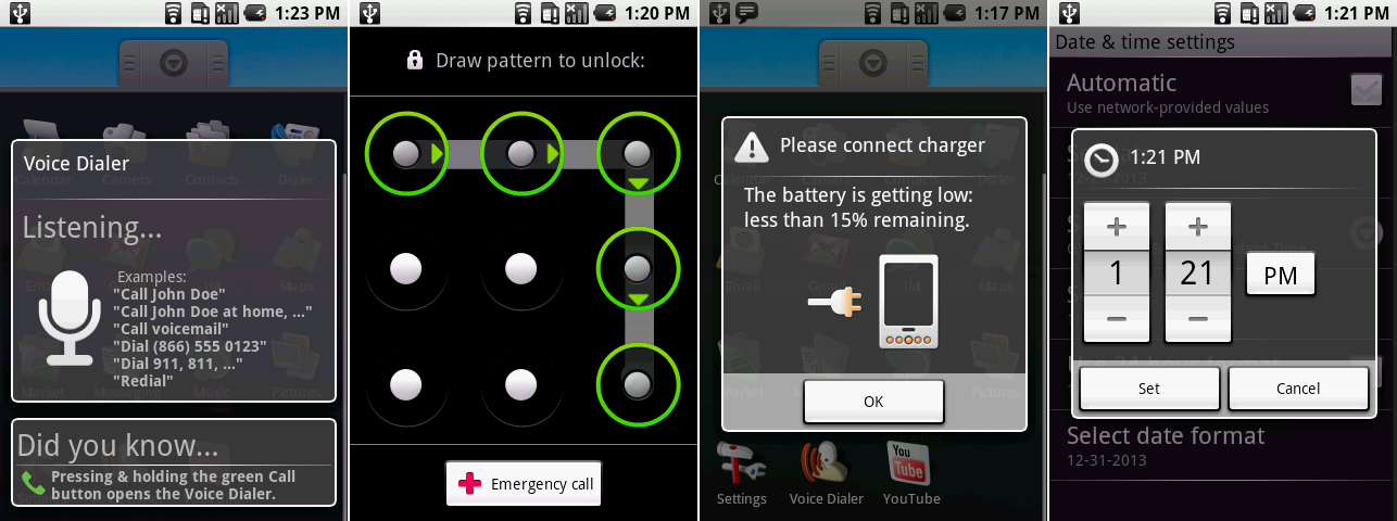
A settings screen means we can finally open the security settings and change lock screens. Android 1.0 only had two styles, the gray square lock screen pictured in the Android 0.9 section, and pattern unlock, which required you to draw a pattern over a grid of 9 dots. A swipe pattern like this was easier to remember and input than a PIN even if it did not add any more security.
|
||
|
||
|
||
The Voice Dialer, pattern lock screen, low battery warning, and time picker.
|
||
Photo by Ron Amadeo
|
||
|
||
oice functions arrived in 1.0 with Voice Dialer. This feature hung around in various capacities in AOSP for a while, as it was a simple voice command app for calling numbers and contacts. Voice Dialer was completely unrelated to Google's future voice products, however, and it worked the same way a voice dialer on a dumbphone would work.
|
||
|
||
As for a final note, low battery popup would occur when the battery dropped below 15 percent. It was a funny graphic, depicting plugging the wrong end of the power cord into the phone. That wasn't (and still isn't) how phones work, Google.
|
||
|
||
Android 1.0 was a great first start, but there were still so many gaps in functionality. Physical keyboards and tons of hardware buttons were mandatory, as Android devices were still not allowed to be sold without a d-pad or trackball. Base smartphone functionality like auto-rotate wasn't here yet, either. Updates for built-in apps weren't possible through the Android Market the way they were today. All the Google Apps were interwoven with the operating system. If Google wanted to update a single app, an update for the entire operating system needed to be pushed out through the carriers. There was still a lot of work to do.
|
||
|
||
### Android 1.1—the first truly incremental update ###
|
||
|
||
|
||
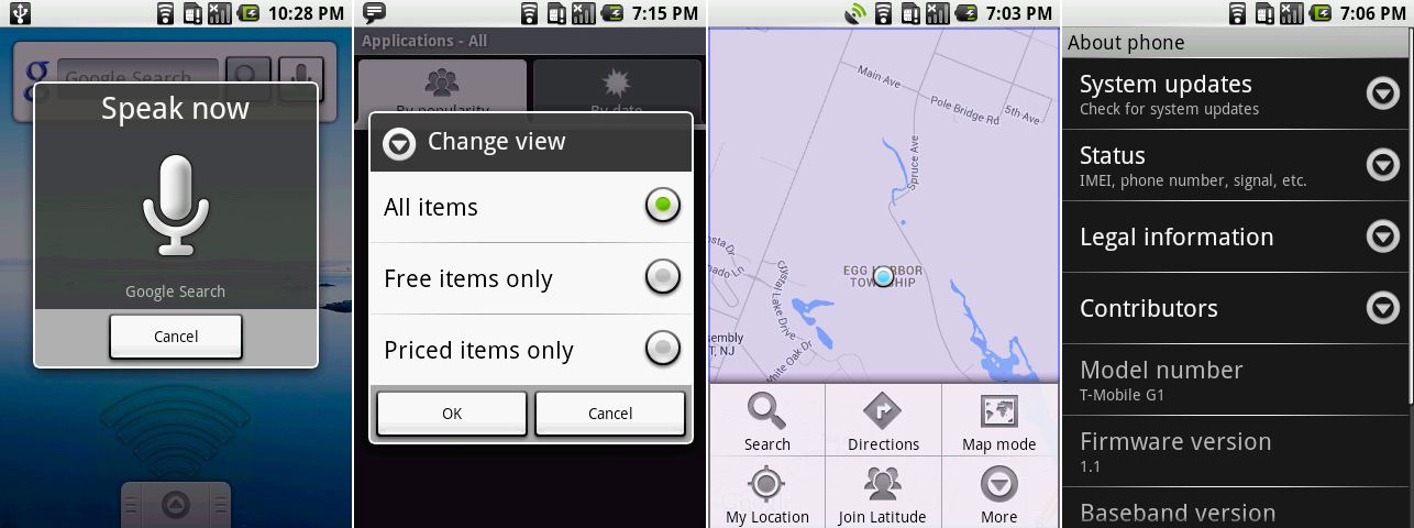
All of Android 1.1’s new features: Search by voice, the Android Market showing paid app support, Google Latitude, and the new “system updates" option in the settings.
|
||
Photo by Ron Amadeo
|
||
|
||
Four and a half months after Android 1.0, in February 2009, Android got its first public update in Android 1.1. Not much changed in the OS, and just about every new thing Google added with 1.1 has been shut down by now. Google Voice Search was Android's first foray into cloud-powered voice search, and it had its own icon in the app drawer. While the app can't communicate with Google's servers anymore, you can check out how it used to work [on the iPhone][2]. It wasn't yet Voice Actions, but you could speak and the results would go to a simple Google Search.
|
||
|
||
Support for paid apps was added to the Android Market, but just like the beta client, this version of the Android Market could no longer connect to the Google Play servers. The most that we could get to work was this sorting screen, which lets you pick between displaying free apps, paid apps, or a mix of both.
|
||
|
||
Maps added [Google Latitude][3], a way to share your location with friends. Latitude was shut down in favor of Google+ a few months ago and no longer works. There was an option for it in the Maps menu, but tapping on it just brings up a loading spinner forever.
|
||
|
||
Given that system updates come quickly in the Android world—or at least, that was the plan before carriers and OEMs got in the way—Google also added a button to the "About Phone" screen to check for system updates.
|
||
|
||
----------
|
||
|
||

|
||
|
||
[Ron Amadeo][a] / Ron is the Reviews Editor at Ars Technica, where he specializes in Android OS and Google products. He is always on the hunt for a new gadget and loves to rip things apart to see how they work.
|
||
|
||
[@RonAmadeo][t]
|
||
|
||
--------------------------------------------------------------------------------
|
||
|
||
via: http://arstechnica.com/gadgets/2014/06/building-android-a-40000-word-history-of-googles-mobile-os/7/
|
||
|
||
译者:[译者ID](https://github.com/译者ID) 校对:[校对者ID](https://github.com/校对者ID)
|
||
|
||
本文由 [LCTT](https://github.com/LCTT/TranslateProject) 原创翻译,[Linux中国](http://linux.cn/) 荣誉推出
|
||
|
||
[1]:http://www.youtube.com/yt/press/statistics.html
|
||
[2]:http://www.youtube.com/watch?v=y3z7Tw1K17A
|
||
[3]:http://arstechnica.com/information-technology/2009/02/google-tries-location-based-social-networking-with-latitude/
|
||
[a]:http://arstechnica.com/author/ronamadeo
|
||
[t]:https://twitter.com/RonAmadeo |