mirror of
https://github.com/LCTT/TranslateProject.git
synced 2025-01-07 22:11:09 +08:00
104 lines
14 KiB
Markdown
104 lines
14 KiB
Markdown
The history of Android
|
||
================================================================================
|
||
|
||
|
||
### Android 2.1, update 1—the start of an endless war ###
|
||
|
||
Google was a major launch partner for the first iPhone—the company provided Google Maps, Search, and YouTube for Apple’s mobile operating system. At the time, Google CEO Eric Schmidt was a member of Apple’s board of directors. In fact, during the original iPhone presentation, [Schmidt was the first person on stage][] after Steve Jobs, and he joked that the two companies were so close they could merge into “AppleGoo."
|
||
|
||
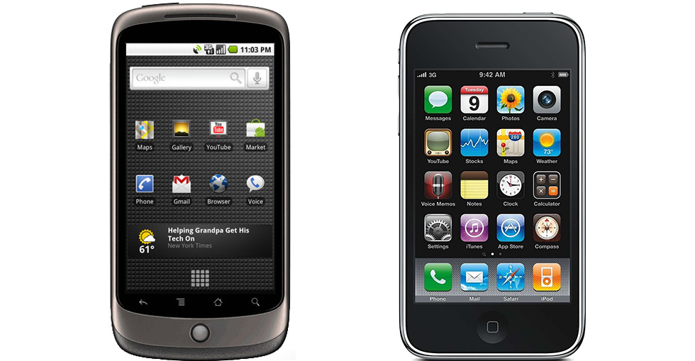
While Google was developing Android, the relationship between the two companies slowly became contentious. Still, Google largely kept Apple happy by keeping key iPhone features, like pinch zoom, out of Android. The Nexus One, though, was the first slate-style Android flagship without a keyboard, which gave the device the same form factor as the iPhone. Combined with the newer software and Google branding, this was the last straw for Apple. According to Walter Isaacson’s biography on Steve Jobs, after seeing the Nexus One in January 2010, the Apple CEO was furious, saying "I will spend my last dying breath if I need to, and I will spend every penny of Apple's $40 billion in the bank, to right this wrong... I'm going to destroy Android, because it's a stolen product. I'm willing to go thermonuclear war on this."
|
||
|
||
All of this happened behind closed doors, only coming out years after the Nexus One was released. The public first caught wind of this growing rift between Google and Apple when, a month after the release of Android 2.1, an update shipped for the Nexus One called “[2.1 update 1.][2]" The updated added one feature, something iOS long held over the head of Android: pinch-zoom.
|
||
|
||
While Android supported multi-touch APIs since version 2.0, the default operating system apps stayed clear of this useful feature at the behest of Jobs. After reconciliation meetings over the Nexus One failed, there was no longer a reason to keep pinch zoom out of Android. Google pushed all their chips into the middle of the table, hit the update button, and was finally “all-in" with Android.
|
||
|
||
With pinch zoom enabled in Google Maps, the Browser, and the Gallery, the Google-Apple smartphone war was on. In the coming years, the two companies would become bitter enemies. A month after the pinch zoom update, Apple went on the warpath, suing everyone and everything that used Android. HTC, Motorola, and Samsung were all brought to court, and some of them are still in court. Schmidt resigned from Apple’s board of directors. Google Maps and YouTube were kicked off of the iPhone, and Apple even started a rival mapping service. Today, the two players that were almost "AppleGoo" compete in smartphones, tablets, laptops, movies, TV shows, music, books, apps, e-mail, productivity software, browsers, personal assistants, cloud storage, mobile advertising, instant messaging, mapping, and set-top-boxes... and soon the two will be competing in car computers, wearables, mobile payments, and living room gaming.
|
||
|
||
### Android 2.2 Froyo—faster and Flash-ier ###
|
||
|
||
[Android 2.2][3] came out four months after the release of 2.1, in May 2010. Froyo featured major under-the-hood improvements for Android, all made in the name of speed. The biggest addition was just-in-time (JIT) compilation. JIT automatically converted java bytecode into native code at runtime, which led to drastic performance improvements across the board.
|
||
|
||
The Browser got a performance boost, too, thanks to the integration of the V8 javascript engine from Chrome. This was the first of many features the Android browser would borrow from Chrome, and eventually the stock browser would be completely replaced by a mobile version of Chrome. Until that day came, though, the Android team needed to ship a browser. Pulling in Chrome parts was an easy way to upgrade.
|
||
|
||
While Google was focusing on making its platform faster, Apple was making its platform bigger. Google's rival released the 10-inch iPad a month earlier, ushering in the modern era of tablets. While some large Froyo and Gingerbread tablets were released, Google's official response—Android 3.0 Honeycomb and the Motorola Xoom—would not arrive for nine months.
|
||
|
||
|
||
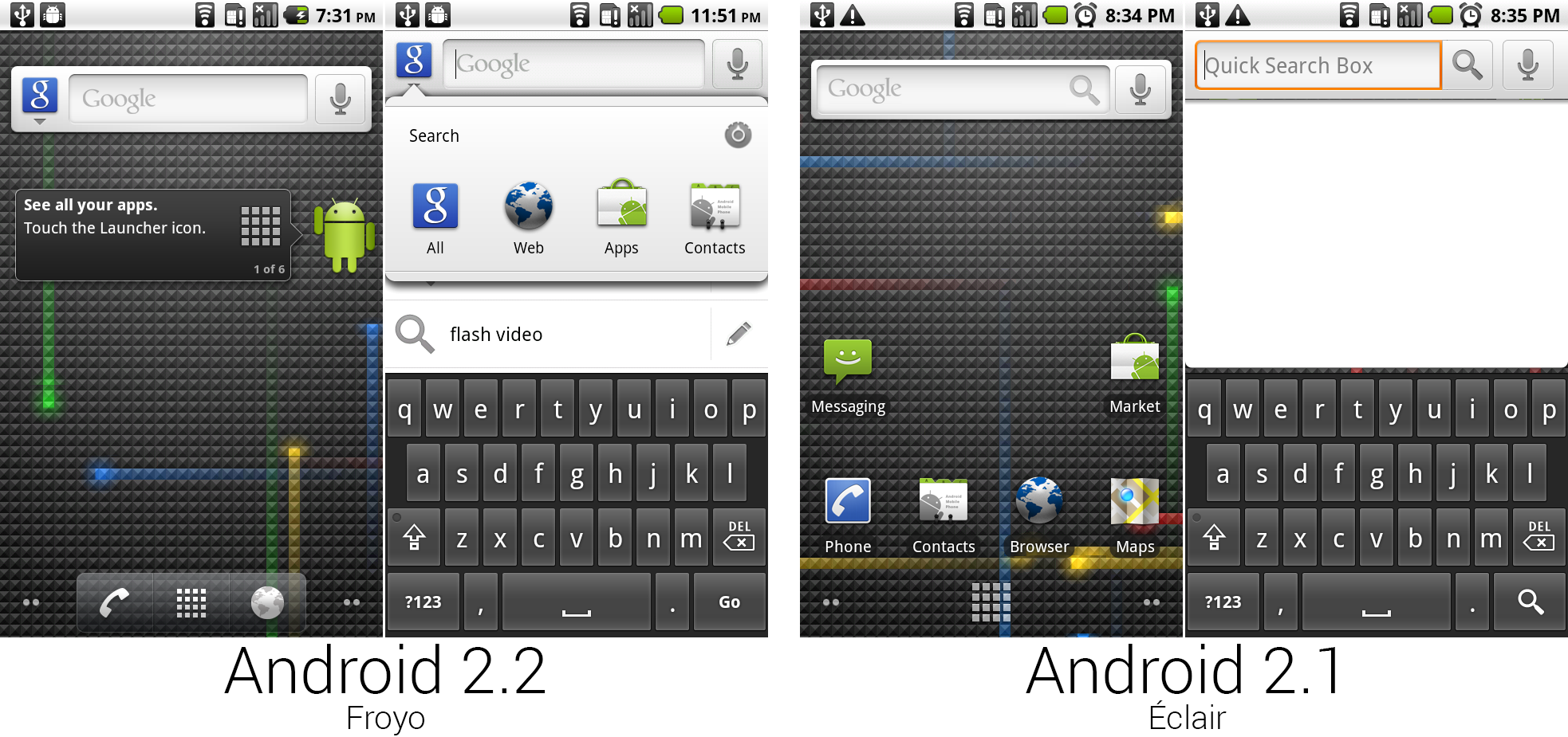
Froyo added a two-icon dock at the bottom and universal search.
|
||
Photo by Ron Amadeo
|
||
|
||
The biggest change on the Froyo homescreen was the new dock at the bottom, which filled the previously empty space to the left and right of the app drawer with phone and browser icons. Both of these icons were custom-designed white versions of the stock icons, and they were not user-configurable.
|
||
|
||
The default layout removed all the icons, and it only stuck the new tips widget on the screen, which directed you to click on the launcher icon to access your apps. The Google Search widget gained a Google logo which doubled as a button. Tapping it would open the search interface and allow you to restrict a search by Web, apps, or contacts.
|
||
|
||
|
||
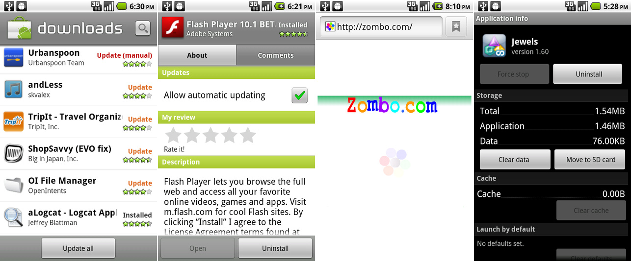
The downloads page showing the “update all" button, the Flash app, a flash-powered site where anything is possible, and the “move to SD" button.
|
||
Photo by [Ryan Paul][4]
|
||
|
||
Some of the best additions to Froyo were more download controls for the Android Market. There was now an “Update all" button pinned to the bottom of the Downloads page. Google also added an automatic updating feature, which would automatically install apps as long as the permissions hadn't changed; automatic updating was off by default, though.
|
||
|
||
The second picture shows Adobe Flash Player, which was exclusive to Froyo. The app plugged in to the browser and allowed for a “full Web" experience. In 2010, this meant pages heavy with Flash navigation and video. Flash was one of Android's big differentiators compared to the iPhone. Steve Jobs started a holy war against Flash, declaring it an obsolete, buggy piece of software, and Apple would not allow it on iOS. So Android picked up the Flash ball and ran with it, giving users the option of having a semi-workable implementation on Android.
|
||
|
||
At the time, Flash could bring even a desktop computer to its knees, so keeping it on all the time on a mobile phone delivered terrible performance. To fix this, Flash on Android's browser could be set to "on-demand"—Flash content would not load until users clicked on the Flash placeholder icon. Flash support would last on Android until 4.1, when Adobe gave up and killed the project. Ultimately Flash never really worked well on Android. The lack of Flash on the iPhone, the most popular mobile device, pushed the Internet to eventually dump the platform.
|
||
|
||
The last picture shows the newly added ability to move apps to the SD card, which, in an era when phones came with 512MB of internal storage, was sorely needed.
|
||
|
||
|
||
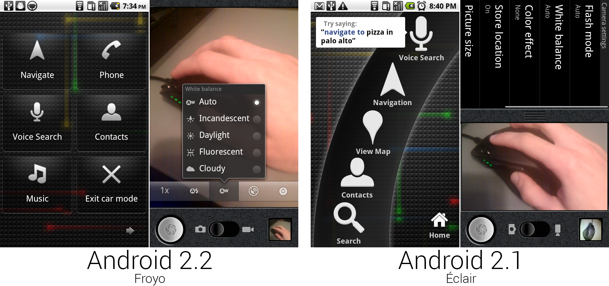
The car app and camera app. The camera could now rotate.
|
||
Photo by Ron Amadeo
|
||
|
||
The camera app was finally updated to support portrait mode. The camera settings were moved out of the drawer and into a semi-transparent strip of buttons next to the shutter button and other controls. This new design seemed to take a lot of inspiration from the Cooliris Gallery app, with transparent, springy speech bubble popups. It was quite strange to see the high-tech Cooliris-style UI design grafted on to the leather-bound camera app—the aesthetics didn't match at all.
|
||
|
||
|
||
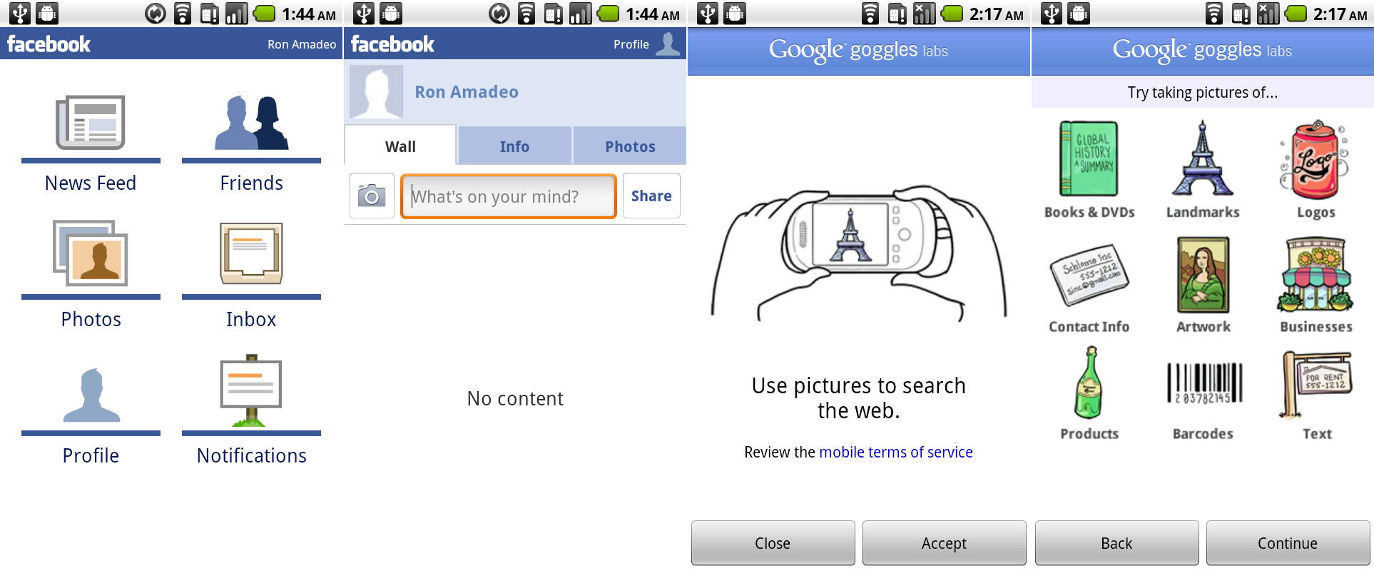
The semi-broken Facebook app is a good example of the common 2x3 navigation page. Google Goggles was included but also broken.
|
||
Photo by Ron Amadeo
|
||
|
||
Unlike the Facebook client included in Android 2.0 and 2.1, the 2.2 version still sort of works and can sign in to Facebook's servers. The Facebook app is a good example of Google's design guidelines for apps at the time, which suggested having a navigational page consisting of a 3x2 grid of icons as the main page of an app.
|
||
|
||
This was Google's first standardized attempt at getting navigational elements out of the menu button and onto the screen, where users could find them. This design was usable, but it added an extra roadblock between launching an app and using an app. Google would later realize that when users launch an app, it was a better idea to show them content instead of an interstitial navigational screen. In Facebook for instance, opening to the news feed would be much more appropriate. And later app designs would relegate navigation to a second-tier location—first as tabs at the top of the screen, and later Google would settle on the "Navigation Drawer," a slide-out panel containing all the locations in an app.
|
||
|
||
Also packed in with Froyo was Google Goggles, a visual search app which would try to identify the subject of a picture. It was useful for identifying works of art, landmarks, and barcodes, but not much else. These first two setup screens, along with the camera interface, are all that work in the app anymore. Today, you can't actually complete a search with a client this old. There wasn't much to see anyway; it was a camera interface that returned a search results page.
|
||
|
||
|
||
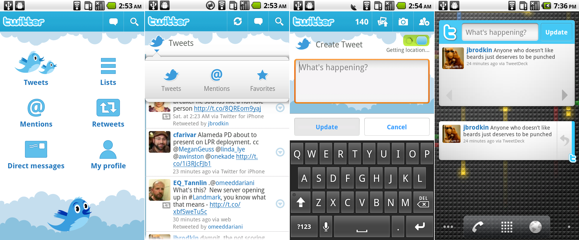
The Twitter app, which was an animation-filled collaboration between Google and Twitter.
|
||
Photo by Ron Amadeo
|
||
|
||
Froyo included the first Android Twitter app, which was actually a collaboration between Google and Twitter. At the time, a Twitter app was one of the big holes in Android's app lineup. Developers favored the iPhone, and with Apple's head start and stringent design requirements, the App Store's app selection was far superior to Android's. But Google needed a Twitter app, so it teamed up with the company to get the first version out the door.
|
||
|
||
This represented Google's newer design language, which meant it had an interstitial navigation page and a "tech-demo" approach to animations. The Twitter app was even more heavy-handed with animation effects than the Cooliris Gallery—everything moved all the time. The clouds at the top and bottom of every page continually scrolled at varying speeds, and the Twitter bird at the bottom flapped its wings and moved its head left and right.
|
||
|
||
The Twitter app actually featured an early precursor to the Action Bar, a persistent strip of top-aligned controls that was introduced in Android 3.0 . Along the top of every screen was a blue bar containing the Twitter logo and buttons like search, refresh, and compose tweet. The big difference between this and the later action bars was that the Twitter/Google design lacks an "Up" button in the top right corner, and it actually uses an entire second bar to show your current location within the app. In the second picture above, you can see a whole bar dedicated to the location label "Tweets" (and, of course, the continuously scrolling clouds). The Twitter logo in the second bar acted as another navigational element, sometimes showing additional drill down areas within the current section and sometimes showing the entire top-level shortcut group.
|
||
|
||
The 2.3 Tweet stream didn't look much different from what it does today, save for the hidden action buttons (reply, retweet, etc), which were all under the right-aligned arrow buttons. They popped up in a speech bubble menu that looked just like the navigational popup. The faux-action bar was doing serious work on the create tweet page. It housed the twitter logo, remaining character count, and buttons to attach a picture, take a picture, and a contact mention button.
|
||
|
||
The Twitter app even came with a pair of home screen widgets. The big one took up eight slots and gave you a compose bar, update button, one tweet, and left and right arrows to view more tweets. The little one showed a tweet and reply button. Tapping on the compose bar on the large widget immediately launched the main "Create Tweet," rendering the "update" button worthless.
|
||
|
||
|
||
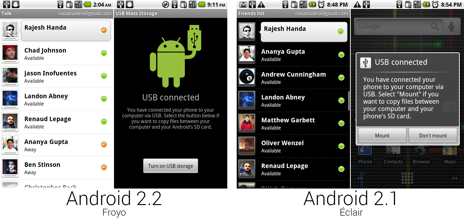
Google Talk and the new USB dialog.
|
||
Photo by Ron Amadeo
|
||
|
||
Elsewhere, Google Talk (and the unpictured SMS app) changed from a dark theme to a light theme, which made both of them look a lot closer to the current, modern apps. The USB storage screen that popped up when you plugged into a computer changed from a simple dialog box to a full screen interface. Instead of a text-only design, the screen now had a mutant Android/USB-stick hybrid.
|
||
|
||
While Android 2.2 didn’t feature much in the way of user-facing features, a major UI overhaul was coming in the next two versions. Before all the UI work, though, Google wanted to revamp the core of Android. Android 2.2 accomplished that.
|
||
|
||
----------
|
||
|
||

|
||
|
||
[Ron Amadeo][a] / Ron is the Reviews Editor at Ars Technica, where he specializes in Android OS and Google products. He is always on the hunt for a new gadget and loves to rip things apart to see how they work.
|
||
|
||
[@RonAmadeo][t]
|
||
|
||
--------------------------------------------------------------------------------
|
||
|
||
via: http://arstechnica.com/gadgets/2014/06/building-android-a-40000-word-history-of-googles-mobile-os/13/
|
||
|
||
译者:[译者ID](https://github.com/译者ID) 校对:[校对者ID](https://github.com/校对者ID)
|
||
|
||
本文由 [LCTT](https://github.com/LCTT/TranslateProject) 原创翻译,[Linux中国](http://linux.cn/) 荣誉推出
|
||
|
||
[1]:http://www.youtube.com/watch?v=9hUIxyE2Ns8#t=3016
|
||
[2]:http://arstechnica.com/gadgets/2010/02/googles-nexus-one-gets-multitouch/
|
||
[3]:http://arstechnica.com/information-technology/2010/07/android-22-froyo/
|
||
[4]:http://arstechnica.com/information-technology/2010/07/android-22-froyo/
|
||
[a]:http://arstechnica.com/author/ronamadeo
|
||
[t]:https://twitter.com/RonAmadeo |