12 KiB
安卓编年史
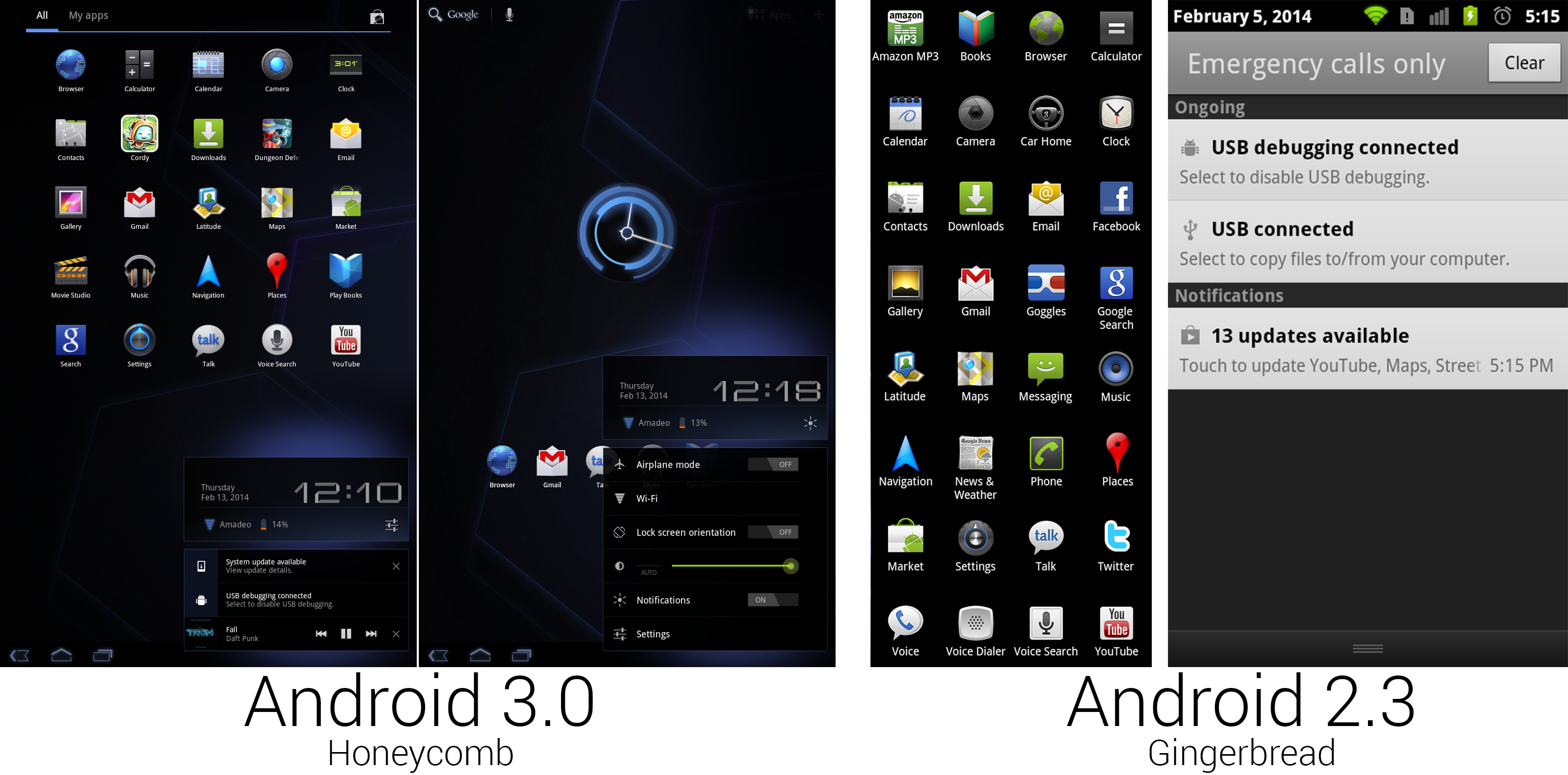 蜂巢的应用列表少了很多应用。上图还展示了通知中心和新的快速设置。
Ron Amadeo 供图
蜂巢的应用列表少了很多应用。上图还展示了通知中心和新的快速设置。
Ron Amadeo 供图
默认的应用图标从32个减少到了25个,其中还有两个是第三方的游戏。因为蜂巢不是为手机设计的,而且谷歌希望默认应用都是为平板优化的,很多应用因此没有成为默认应用。被去掉的应用有亚马逊 MP3 商店,Car Home,Facebook,Google Goggles,信息,新闻与天气,电话,Twitter,谷歌语音,以及语音拨号。谷歌正在悄悄打造的音乐服务将于不久后面世,所以亚马逊 MP3 商店需要为它让路。Car Home,信息以及电话对一部不是手机的设备来说没有多大意义,Facebook 和 Twitter还没有平板版应用,Goggles,新闻与天气以及语音拨号几乎没什么人注意,就算移除了大多数人也不会想念它们的。
几乎每个应用图标都是全新设计的。就像是从 G1 切换到摩托罗拉 Droid,变化的最大动力是分辨率的提高。Nexus S 有一块800×480分辨率的显示屏,姜饼重新设计了图标等资源来适应它。Xoom 巨大的1280×800 10英寸显示屏意味着几乎所有设计都要重做。但是再说一次,这次是有真正的设计师在负责,所有东西看起来更有整体性了。蜂巢的应用列表从纵向滚动变为了横向分页式。这个变化对横屏设备有意义,而对手机来说,查找一个应用还是纵向滚动列表比较快。
第二张蜂巢截图展示的是新通知中心。姜饼中的灰色和黑色设计已经被抛弃了,现在是黑色面板带蓝色光晕。上面一块显示着日期时间,连接状态,电量和打开快速设置的按钮,下面是实际的通知。非持续性通知现在可以通过通知右侧的“X”来关闭。蜂巢是第一个支持通知内控制的版本。第一个(也是蜂巢发布时唯一一个)利用了此特性的应用是新的谷歌音乐,在它的通知上有上一曲,播放/暂停,下一曲按钮。这些控制可以在任何应用中访问到,这让控制音乐播放变成了一件轻而易举的事情。
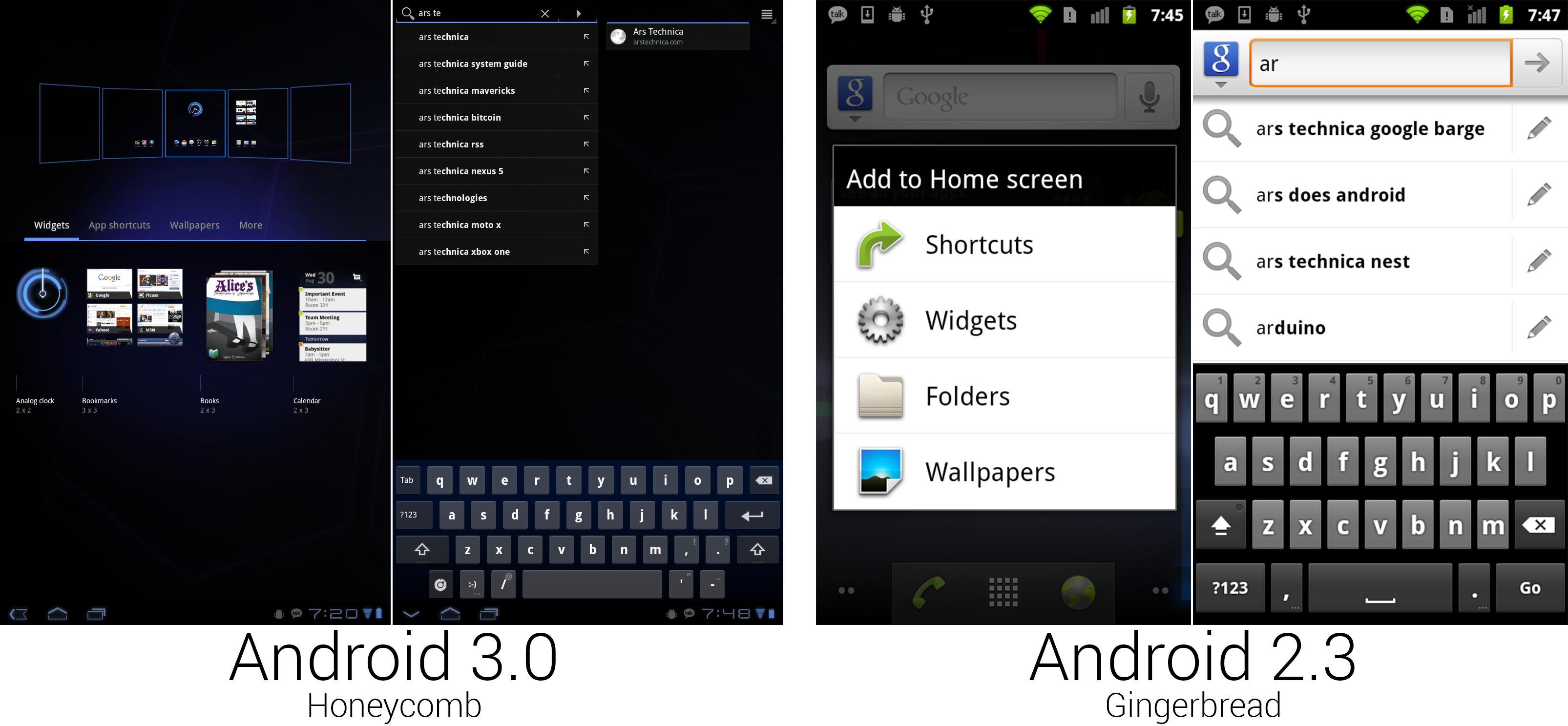 "Add to home screen" was given a zoomed-out interface for easy organizing. The search interface split auto suggest and universal search into different panes.
Ron Amadeo 供图
"Add to home screen" was given a zoomed-out interface for easy organizing. The search interface split auto suggest and universal search into different panes.
Ron Amadeo 供图
Pressing the plus button in the top right corner of the home screen or long pressing on the background would open the new home screen configuration interface. Honeycomb showed a zoomed-out view of all the home screens along the top of the screen, and it filled the bottom half of the screen with a tabbed drawer containing widgets and shortcuts. Items could be dragged out of the bottom drawer and into any of the five home screens. Gingerbread would just show a list of text, but Honeycomb showed full thumbnail previews of the widgets. This gave you a much better idea of what a widget would look like instead of an app-name-only description like "calendar."
The larger screen of the Motorola Xoom allowed the keyboard to take on a more PC-style layout, with keys like backspace, enter, shift, and tab put in the traditional locations. The keyboard took on a blueish tint and gained even more spacing between the keys. Google also added a dedicated smiley-face button. :-)
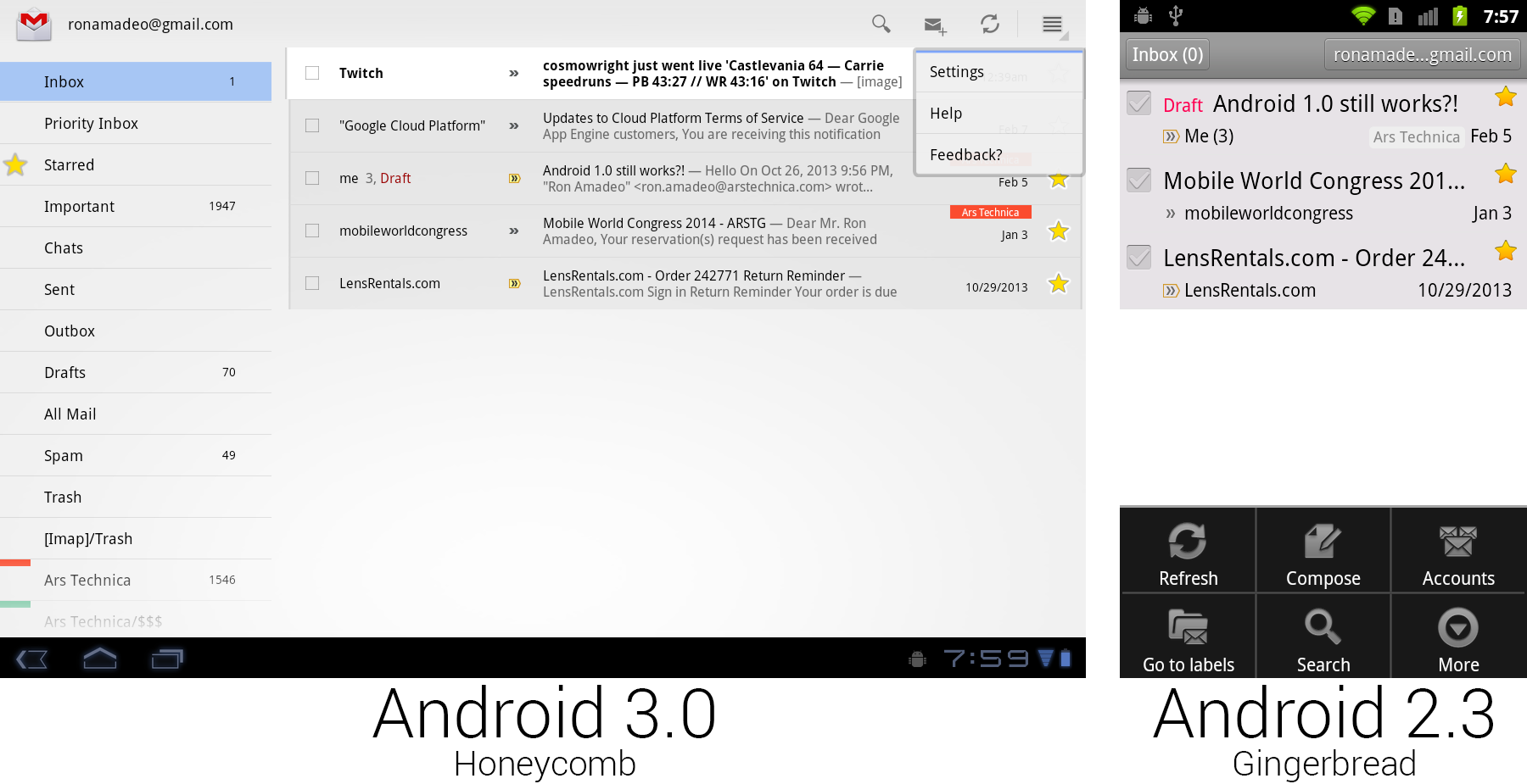 Gmail on Honeycomb versus Gmail on Gingerbread with the menu open. Buttons were placed on the main screen for easier discovery.
Ron Amadeo 供图
Gmail on Honeycomb versus Gmail on Gingerbread with the menu open. Buttons were placed on the main screen for easier discovery.
Ron Amadeo 供图
Gmail demonstrated all the new UI concepts in Honeycomb. Android 3.0 did away with hiding all the controls behind a menu button. There was now a strip of icons along the top of the screen called the Action Bar, which lifted many useful controls to the main screen where users could see them. Gmail showed buttons for search, compose, and refresh, and it put less useful controls like settings, help, and feedback in a dropdown called the "overflow" button. Tapping checkboxes or selecting text would cause the entire action bar to change to icons relating to those actions—for instance, selecting text would bring up cut, copy, and select all buttons.
The app icon displayed in the top left corner doubled as a navigation button called "Up." While "Back" worked similarly to a browser back button, navigating to previously visited screens, "Up" would navigate up the app hierarchy. For instance, if you were in the Android Market, pressed the "Email developer" button, and Gmail opened, "Back" would take you back to the Android Market, but "Up" would take you to the Gmail inbox. "Back" might close the current app, but "Up" never would. Apps could control the "Back" button, and they usually reprogrammed it to replicate the "Up" functionality. In practice, there was rarely a difference between the two buttons.
Honeycomb also introduced the "Fragments" API, which allowed developers to use a single app for tablets and phones. A "Fragment" was a single pane of a user interface. In the Gmail picture above, the left folder list was one fragment and the inbox was another fragment. Phones would show one fragment per screen, and tablets could show two side-by-side. The developer defined the look of individual fragments, and Android would decide how they should be displayed based on the current device.
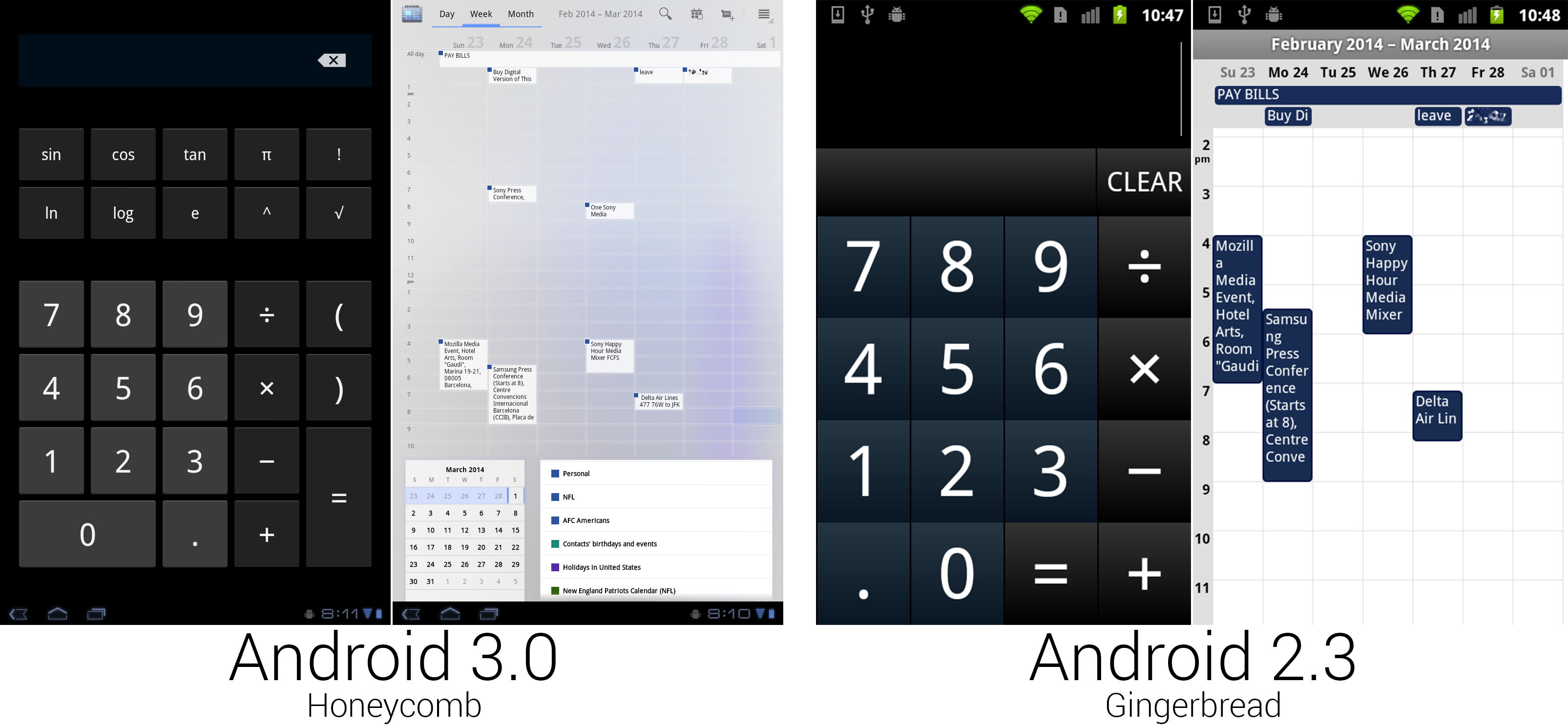 The calculator finally used regular Android buttons, but someone spilled blue ink on the calendar.
Ron Amadeo 供图
The calculator finally used regular Android buttons, but someone spilled blue ink on the calendar.
Ron Amadeo 供图
For the first time in Android's history, the calculator got a makeover with non-custom buttons, so it actually looked like part of the OS. The bigger screen made room for more buttons, enough that all the calculator functionality could fit on one screen. The calendar greatly benefited from the extra space, gaining much more room for appointment text and controls. The action bar at the top of the screen held buttons to switch views, along with showing the current time span and common controls. Appointment blocks switched to a white background with the calendar corner only showing in the top right corner. At the bottom (or side, in horizontal view) were boxes showing the month calendar and a list of displayed calendars.
The scale of the calendar could be adjusted, too. By performing a pinch zoom gesture, portrait week and day views could show between five and 19 hours of appointments on a single screen. The background of the calendar was made up of an uneven blue splotch, which didn't look particularly great and was tossed on later versions.
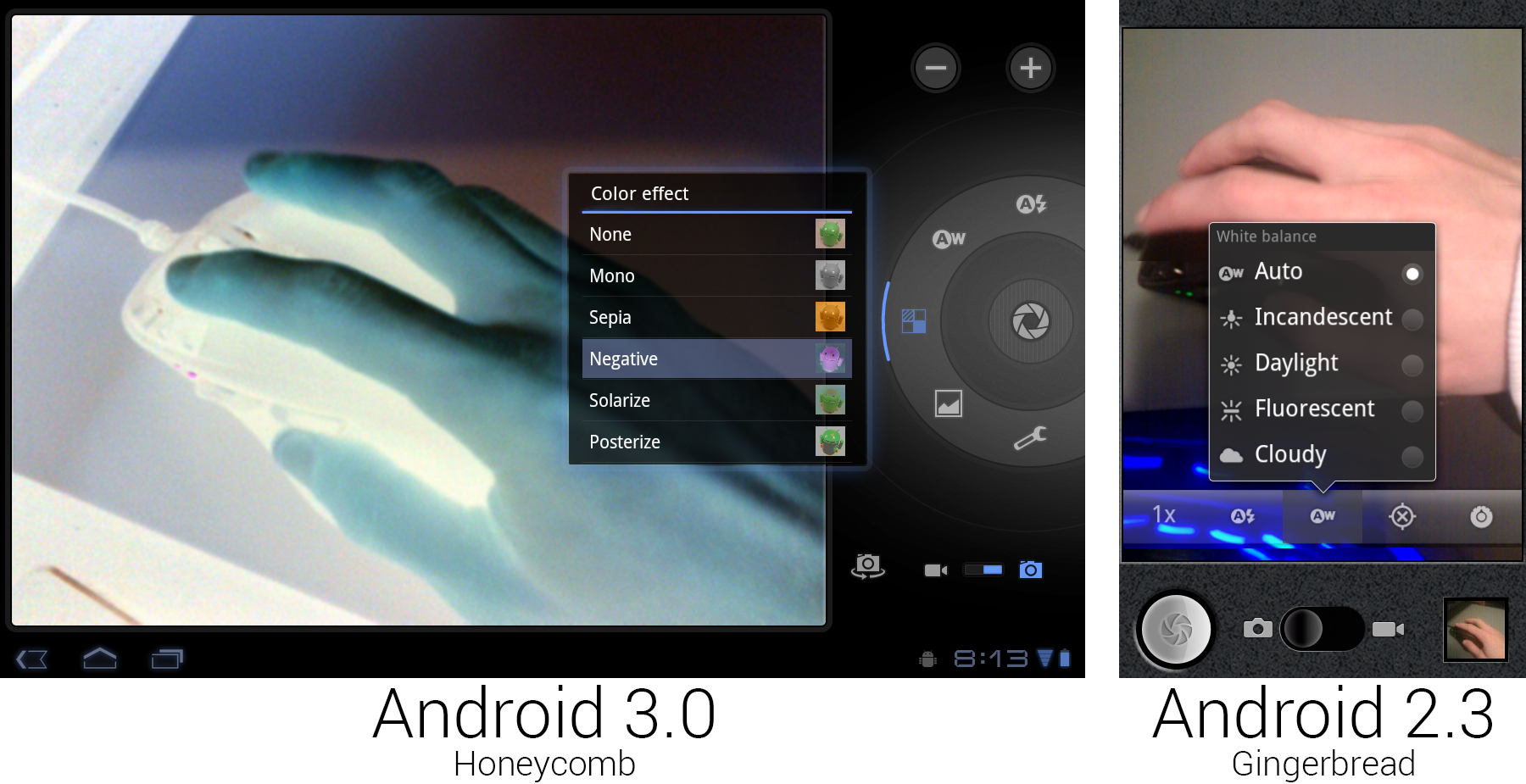 The new camera interface, showing off the live "Negative" effect.
Ron Amadeo 供图
The new camera interface, showing off the live "Negative" effect.
Ron Amadeo 供图
The giant 10-inch Xoom tablet did have a camera, which meant that it also had a camera app. The Tron redesign finally got rid of the old faux-leather look that Google came up with in Android 1.6. The controls were laid out in a circle around the shutter button, bringing to mind the circular controls and dials on a real camera. The Cooliris-derived speech bubble popups were changed to glowing, semi-transparent black boxes. The Honeycomb screenshot shows the new "color effect" functionality, which applied a filter to the viewfinder in real time. Unlike the Gingerbread camera app, this didn't support a portrait orientation—it was limited to landscape only. Taking a portrait picture with a 10-inch tablet doesn't make much sense, but then neither does taking a landscape one.
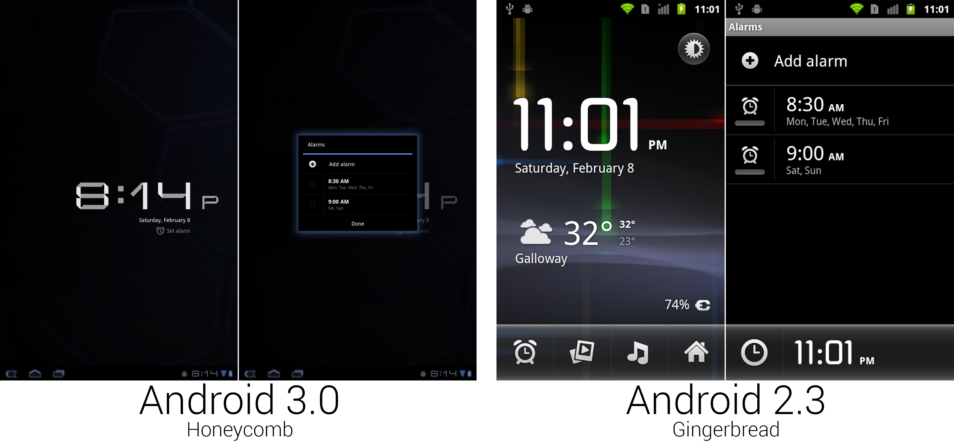 The clock app didn't get quite as much love as other areas. Google just threw it into a tiny box and called it a day.
Ron Amadeo 供图
The clock app didn't get quite as much love as other areas. Google just threw it into a tiny box and called it a day.
Ron Amadeo 供图
Tons of functionality went out the door when it came time to remake the clock app. The entire "Deskclock" concept was kicked out the door, replaced with a simple large display of the time against a plain black background. The ability to launch other apps and view the weather was gone, as was the ability of the clock app to use your wallpaper. Google sometimes gave up when it came time to design a tablet-sized interface, like here, where it just threw the alarm interface into a tiny, centered dialog box.
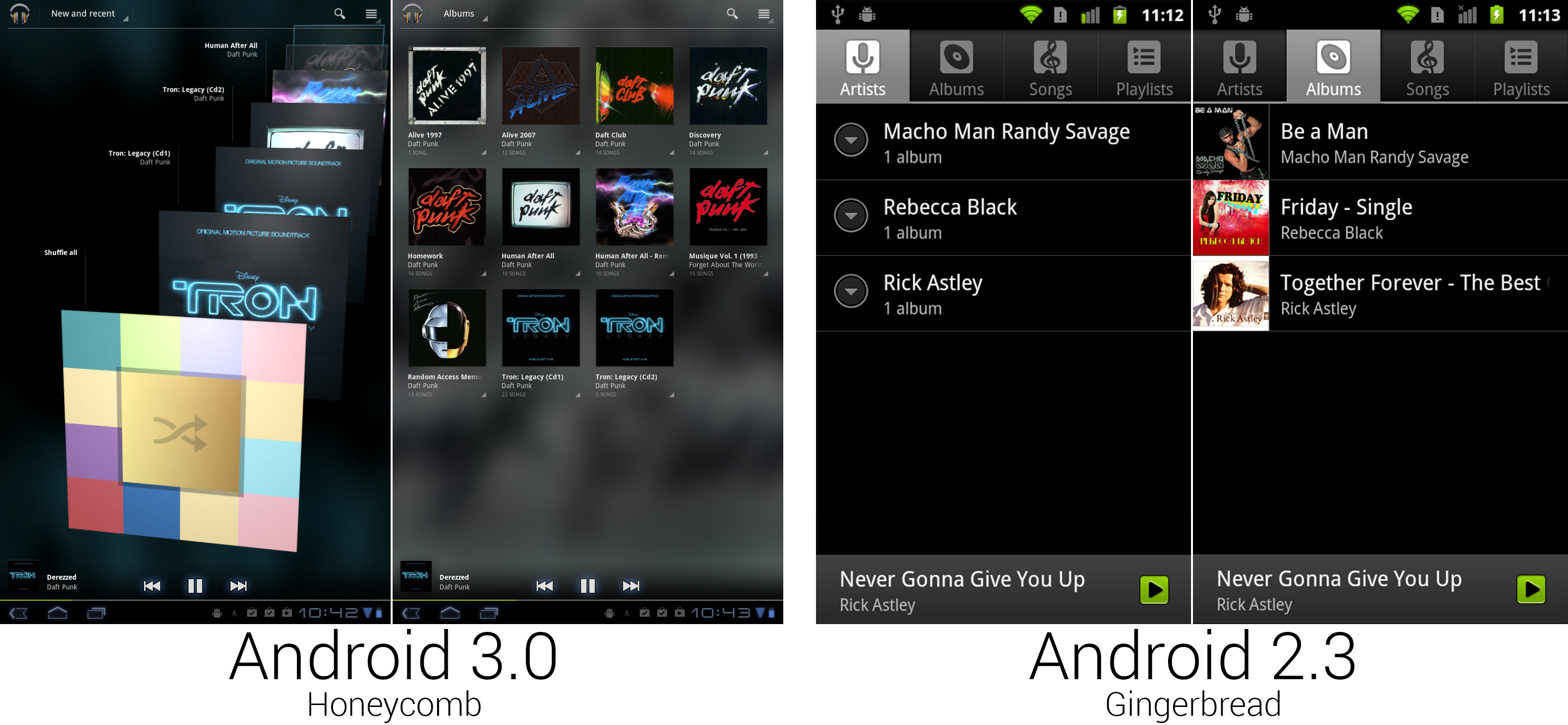 The Music app finally got the ground-up redesign it has needed forever.
Ron Amadeo 供图
The Music app finally got the ground-up redesign it has needed forever.
Ron Amadeo 供图
While music received a few minor additions during its life, this was really the first time since Android 0.9 that it received serious attention. The highlight of the redesign was a don't-call-it-coverflow scrolling 3D album art view, called "New and Recent." Instead of the tabs added in Android 2.1, navigation was handled by a Dropbox box in the Action Bar. While "New and Recent" had 3D scrolling album art, "Albums" used a flat grid of albums thumbnails. The other sections had totally different designs, too. "Songs" used a vertically scrolling list of text, and "Playlists," "Genres," and "Artists" used stacked album art.
In nearly every view, every single item had its own individual menu, usually little arrows in the bottom right corner of an item. For now, these would only show "Play" and "add to Playlist," but this version of Google Music was built for the future. Google was launching a Music service soon, and those individual menus would be needed for things like viewing other content from that artist in the Music Store and managing the cloud storage versus local storage options.
Just like the Cooliris Gallery in Android 2.1, Google Music would blow up one of your thumbnails and use it as a background. The bottom "Now Playing" bar now displayed the album art, playback controls, and a song progress bar.
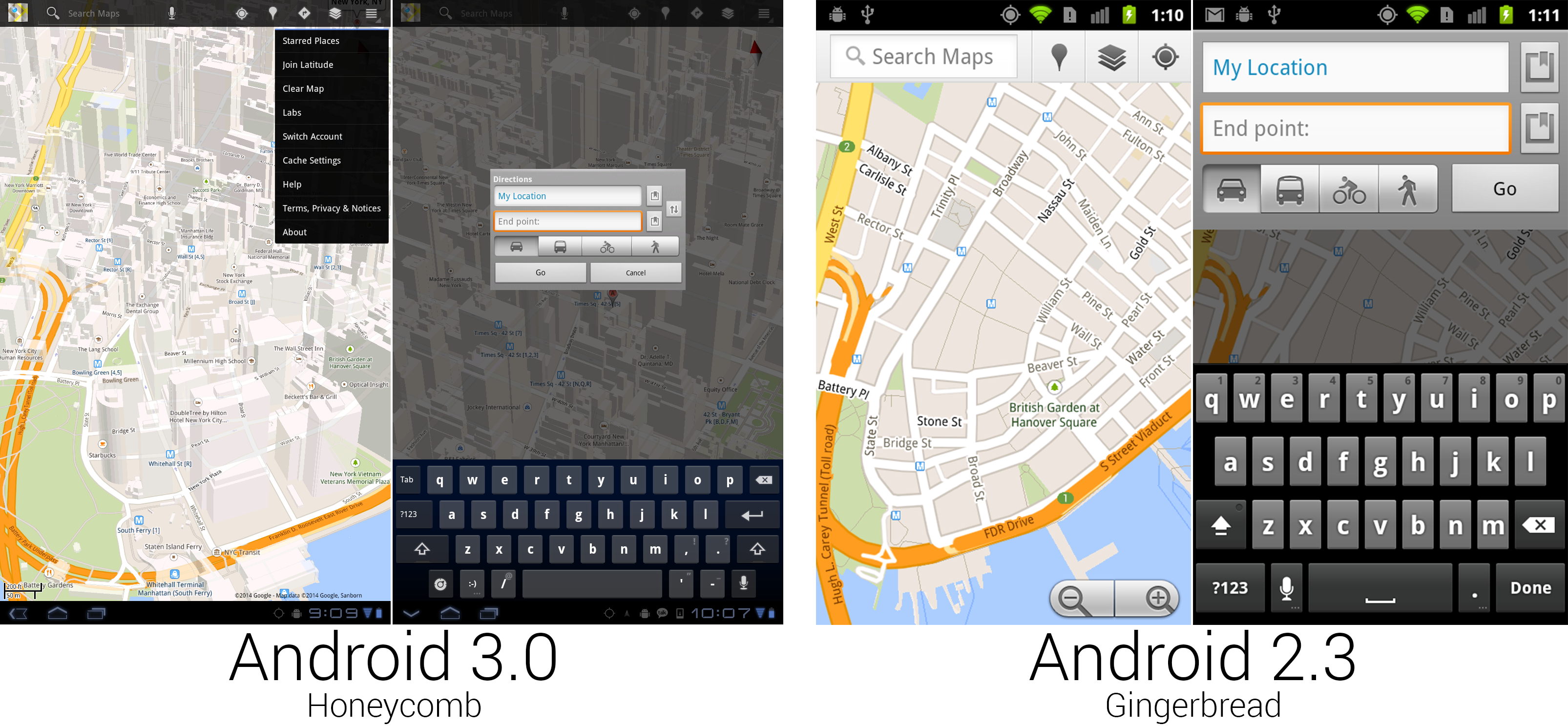 Some of the new Google Maps was really nice, and some of it was from Android 1.5.
Ron Amadeo 供图
Some of the new Google Maps was really nice, and some of it was from Android 1.5.
Ron Amadeo 供图
Google Maps received another redesign for the big screen. This one would stick around for a while and used a semi-transparent black action bar for all the controls. Search was again the primary function, given the first spot in the action bar, but this time it was an actual search bar you could type in, instead of a search bar-shaped button that launched a completely different interface. Google finally gave up on dedicating screen space to actual zoom buttons, relying on only gestures to control the map view. While the feature has since been ported to all old versions of Maps, Honeycomb was the first version to feature 3D building outlines on the map. Dragging two fingers down on the map would "tilt" the map view and show the sides of the buildings. You could freely rotate and the buildings would adjust, too.
Not every part of Maps was redesigned. Navigation was untouched from Gingerbread, and some core parts of the interface, like directions, were pulled straight from Android 1.6 and centered in a tiny box.

Ron Amadeo / Ron is the Reviews Editor at Ars Technica, where he specializes in Android OS and Google products. He is always on the hunt for a new gadget and loves to rip things apart to see how they work.