20 KiB
5 alerting and visualization tools for sysadmins
These open source tools help users understand system behavior and output, and provide alerts for potential problems.
You probably know (or can guess) what alerting and visualization tools are used for. Why would we discuss them as observability tools, especially since some systems include visualization as a feature?
Observability comes from control theory and describes our ability to understand a system based on its inputs and outputs. This article focuses on the output component of observability.
Alerting and visualization tools analyze the outputs of other systems and provide structured representations of these outputs. Alerts are basically a synthesized understanding of negative system outputs, and visualizations are disambiguated structured representations that facilitate user comprehension.
Common types of alerts and visualizations
Alerts
Let’s first cover what alerts are not. Alerts should not be sent if the human responder can’t do anything about the problem. This includes alerts that are sent to multiple individuals with only a few who can respond, or situations where every anomaly in the system triggers an alert. This leads to alert fatigue and receivers ignoring all alerts within a specific medium until the system escalates to a medium that isn’t already saturated.
For example, if an operator receives hundreds of emails a day from the alerting system, that operator will soon ignore all emails from the alerting system. The operator will respond to a real incident only when he or she is experiencing the problem, emailed by a customer, or called by the boss. In this case, alerts have lost their meaning and usefulness.
Alerts are not a constant stream of information or a status update. They are meant to convey a problem from which the system can’t automatically recover, and they are sent only to the individual most likely to be able to recover the system. Everything that falls outside this definition isn’t an alert and will only damage your employees and company culture.
Everyone has a different set of alert types, so I won't discuss things like priority levels (P1-P5) or models that use words like "Informational," "Warning," and "Critical." Instead, I’ll describe the generic categories emergent in complex systems’ incident response.
You might have noticed I mentioned an “Informational” alert type right after I wrote that alerts shouldn’t be informational. Well, not everyone agrees, but I don’t consider something an alert if it isn’t sent to anyone. It is a data point that many systems refer to as an alert. It represents some event that should be known but not responded to. It is generally part of the visualization system of the alerting tool and not an event that triggers actual notifications. Mike Julian covers this and other aspects of alerting in his book Practical Monitoring. It's a must read for work in this area.
Non-informational alerts consist of types that can be responded to or require action. I group these into two categories: internal outage and external outage. (Most companies have more than two levels for prioritizing their response efforts.) Degraded system performance is considered an outage in this model, as the impact to each user is usually unknown.
Internal outages are a lower priority than external outages, but they still need to be responded to quickly. They often include internal systems that company employees use or components of applications that are visible only to company employees.
External outages consist of any system outage that would immediately impact a customer. These don’t include a system outage that prevents releasing updates to the system. They do include customer-facing application failures, database outages, and networking partitions that hurt availability or consistency if either can impact a user. They also include outages of tools that may not have a direct impact on users, as the application continues to run but this transparent dependency impacts performance. This is common when the system uses some external service or data source that isn’t necessary for full functionality but may cause delays as the application performs retries or handles errors from this external dependency.
Visualizations
There are many visualization types, and I won’t cover them all here. It’s a fascinating area of research. On the data analytics side of my career, learning and applying that knowledge is a constant challenge. We need to provide simple representations of complex system outputs for the widest dissemination of information. Google Charts and Tableau have a wide selection of visualization types. We’ll cover the most common visualizations and some innovative solutions for quickly understanding systems.
Line chart
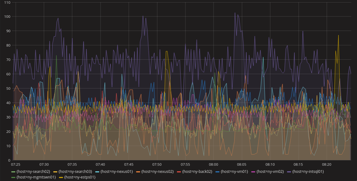
The line chart is probably the most common visualization. It does a pretty good job of producing an understanding of a system over time. A line chart in a metrics system would have a line for each unique metric or some aggregation of metrics. This can get confusing when there are a lot of metrics in the same dashboard (as shown below), but most systems can select specific metrics to view rather than having all of them visible. Also, anomalous behavior is easy to spot if it’s significant enough to escape the noise of normal operations. Below we can see purple, yellow, and light blue lines that might indicate anomalous behavior.
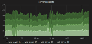
Another feature of a line chart is that you can often stack them to show relationships. For example, you might want to look at requests on each server individually, but also in aggregate. This allows you to understand the overall system as well as each instance in the same graph.
Heatmaps
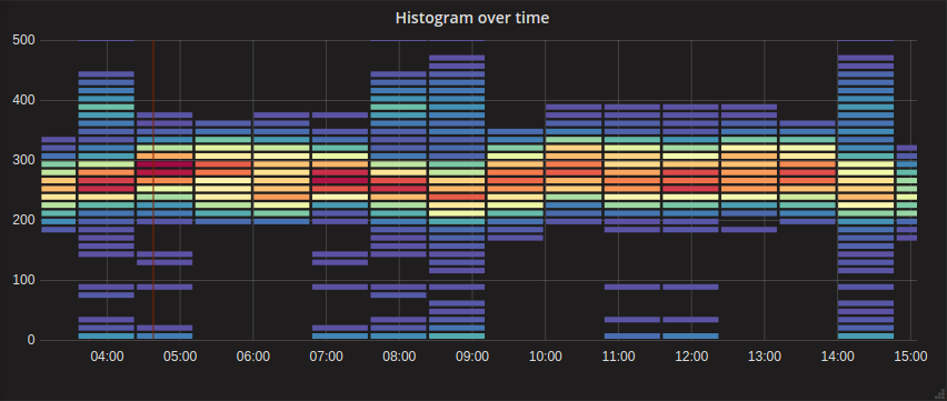
Another common visualization is the heatmap. It is useful when looking at histograms. This type of visualization is similar to a bar chart but can show gradients within the bars representing the different percentiles of the overall metric. For example, suppose you’re looking at request latencies and you want to quickly understand the overall trend as well as the distribution of all requests. A heatmap is great for this, and it can use color to disambiguate the quantity of each section with a quick glance.
The heatmap below shows the higher concentration around the centerline of the graph with an easy-to-understand visualization of the distribution vertically for each time bucket. We might want to review a couple of points in time where the distribution gets wide while the others are fairly tight like at 14:00. This distribution might be a negative performance indicator.
Gauges
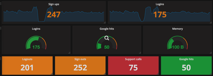
The last common visualization I’ll cover here is the gauge, which helps users understand a single metric quickly. Gauges can represent a single metric, like your speedometer represents your driving speed or your gas gauge represents the amount of gas in your car. Similar to the gas gauge, most monitoring gauges clearly indicate what is good and what isn’t. Often (as is shown below), good is represented by green, getting worse by orange, and “everything is breaking” by red. The middle row below shows traditional gauges.
This image shows more than just traditional gauges. The other gauges are single stat representations that are similar to the function of the classic gauge. They all use the same color scheme to quickly indicate system health with just a glance. Arguably, the bottom row is probably the best example of a gauge that allows you to glance at a dashboard and know that everything is healthy (or not). This type of visualization is usually what I put on a top-level dashboard. It offers a full, high-level understanding of system health in seconds.
Flame graphs
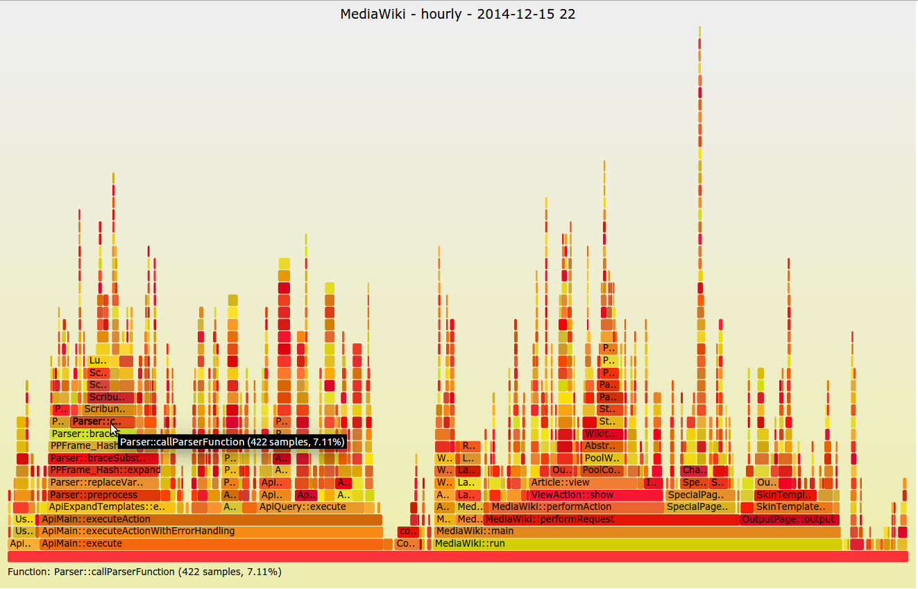
A less common visualization is the flame graph, introduced by Netflix’s Brendan Gregg in 2011. It’s not ideal for dashboarding or quickly observing high-level system concerns; it’s normally seen when trying to understand a specific application problem. This visualization focuses on CPU and memory and the associated frames. The X-axis lists the frames alphabetically, and the Y-axis shows stack depth. Each rectangle is a stack frame and includes the function being called. The wider the rectangle, the more it appears in the stack. This method is invaluable when trying to diagnose system performance at the application level and I urge everyone to give it a try.
Tool options
There are several commercial options for alerting, but since this is Opensource.com, I’ll cover only systems that are being used at scale by real companies that you can use at no cost. Hopefully, you’ll be able to contribute new and innovative features to make these systems even better.
Alerting tools
Bosun
If you’ve ever done anything with computers and gotten stuck, the help you received was probably thanks to a Stack Exchange system. Stack Exchange runs many different websites around a crowdsourced question-and-answer model. Stack Overflow is very popular with developers, and Super User is popular with operations. However, there are now hundreds of sites ranging from parenting to sci-fi and philosophy to bicycles.
Stack Exchange open-sourced its alert management system, Bosun, around the same time Prometheus and its AlertManager system were released. There were many similarities in the two systems, and that’s a really good thing. Like Prometheus, Bosun is written in Golang. Bosun’s scope is more extensive than Prometheus’ as it can interact with systems beyond metrics aggregation. It can also ingest data from log and event aggregation systems. It supports Graphite, InfluxDB, OpenTSDB, and Elasticsearch.
Bosun’s architecture consists of a single server binary, a backend like OpenTSDB, Redis, and scollector agents. The scollector agents automatically detect services on a host and report metrics for those processes and other system resources. This data is sent to a metrics backend. The Bosun server binary then queries the backends to determine if any alerts need to be fired. Bosun can also be used by tools like Grafana to query the underlying backends through one common interface. Redis is used to store state and metadata for Bosun.
A really neat feature of Bosun is that it lets you test your alerts against historical data. This was something I missed in Prometheus several years ago, when I had data for an issue I wanted alerts on but no easy way to test it. To make sure my alerts were working, I had to create and insert dummy data. This system alleviates that very time-consuming process.
Bosun also has the usual features like showing simple graphs and creating alerts. It has a powerful expression language for writing alerting rules. However, it only has email and HTTP notification configurations, which means connecting to Slack and other tools requires a bit more customization (which its documentation covers). Similar to Prometheus, Bosun can use templates for these notifications, which means they can look as awesome as you want them to. You can use all your HTML and CSS skills to create the baddest email alert anyone has ever seen.
Cabot
Cabot was created by a company called Arachnys. You may not know who Arachnys is or what it does, but you have probably felt its impact: It built the leading cloud-based solution for fighting financial crimes. That sounds pretty cool, right? At a previous company, I was involved in similar functions around “know your customer" laws. Most companies would consider it a very bad thing to be linked to a terrorist group, for example, funneling money through their systems. These solutions also help defend against less-atrocious offenders like fraudsters who could also pose a risk to the institution.
So why did Arachnys create Cabot? Well, it is kind of a Christmas present to everyone, as it was a Christmas project built because its developers couldn’t wrap their heads around Nagios. And really, who can blame them? Cabot was written with Django and Bootstrap, so it should be easy for most to contribute to the project. (Another interesting factoid: The name comes from the creator’s dog.)
The Cabot architecture is similar to Bosun in that it doesn’t collect any data. Instead, it accesses data through the APIs of the tools it is alerting for. Therefore, Cabot uses a pull (rather than a push) model for alerting. It reaches out into each system’s API and retrieves the information it needs to make a decision based on a specific check. Cabot stores the alerting data in a Postgres database and also has a cache using Redis.
Cabot natively supports Graphite, but it also supports Jenkins, which is rare in this area. Arachnys uses Jenkins like a centralized cron, but I like this idea of treating build failures like outages. Obviously, a build failure isn’t as critical as a production outage, but it could still alert the team and escalate if the failure isn’t resolved. Who actually checks Jenkins every time an email comes in about a build failure? Yeah, me too!
Another interesting feature is that Cabot can integrate with Google Calendar for on-call rotations. Cabot calls this feature Rota, which is a British term for a roster or rotation. This makes a lot of sense, and I wish other systems would take this idea further. Cabot doesn’t support anything more complex than primary and backup personnel, but there is certainly room for additional features. The docs say if you want something more advanced, you should look at a commercial option.
StatsAgg
StatsAgg? How did that make the list? Well, it’s not every day you come across a publishing company that has created an alerting platform. I think that deserves recognition. Of course, Pearson isn’t just a publishing company anymore; it has several web presences and a joint venture with O’Reilly Media. However, I still think of it as the company that published my schoolbooks and tests.
StatsAgg isn’t just an alerting platform; it’s also a metrics aggregation platform. And it’s kind of like a proxy for other systems. It supports Graphite, StatsD, InfluxDB, and OpenTSDB as inputs, but it can also forward those metrics to their respective platforms. This is an interesting concept, but potentially risky as loads increase on a central service. However, if the StatsAgg infrastructure is robust enough, it can still produce alerts even when a backend storage platform has an outage.
StatsAgg is written in Java and consists only of the main server and UI, which keeps complexity to a minimum. It can send alerts based on regular expression matching and is focused on alerting by service rather than host or instance. Its goal is to fill a void in the open source observability stack, and I think it does that quite well.
Visualization tools
Grafana
Almost everyone knows about Grafana, and many have used it. I have used it for years whenever I need a simple dashboard. The tool I used before was deprecated, and I was fairly distraught about that until Grafana made it okay. Grafana was gifted to us by Torkel Ödegaard. Like Cabot, Grafana was also created around Christmastime, and released in January 2014. It has come a long way in just a few years. It started life as a Kibana dashboarding system, and Torkel forked it into what became Grafana.
Grafana’s sole focus is presenting monitoring data in a more usable and pleasing way. It can natively gather data from Graphite, Elasticsearch, OpenTSDB, Prometheus, and InfluxDB. There’s an Enterprise version that uses plugins for more data sources, but there’s no reason those other data source plugins couldn’t be created as open source, as the Grafana plugin ecosystem already offers many other data sources.
What does Grafana do for me? It provides a central location for understanding my system. It is web-based, so anyone can access the information, although it can be restricted using different authentication methods. Grafana can provide knowledge at a glance using many different types of visualizations. However, it has started integrating alerting and other features that aren’t traditionally combined with visualizations.
Now you can set alerts visually. That means you can look at a graph, maybe even one showing where an alert should have triggered due to some degradation of the system, click on the graph where you want the alert to trigger, and then tell Grafana where to send the alert. That’s a pretty powerful addition that won’t necessarily replace an alerting platform, but it can certainly help augment it by providing a different perspective on alerting criteria.
Grafana has also introduced more collaboration features. Users have been able to share dashboards for a long time, meaning you don’t have to create your own dashboard for your Kubernetes cluster because there are several already available—with some maintained by Kubernetes developers and others by Grafana developers.
The most significant addition around collaboration is annotations. Annotations allow a user to add context to part of a graph. Other users can then use this context to understand the system better. This is an invaluable tool when a team is in the middle of an incident and communication and common understanding are critical. Having all the information right where you’re already looking makes it much more likely that knowledge will be shared across the team quickly. It’s also a nice feature to use during blameless postmortems when the team is trying to understand how the failure occurred and learn more about their system.
Vizceral
Netflix created Vizceral to understand its traffic patterns better when performing a traffic failover. Unlike Grafana, which is a more general tool, Vizceral serves a very specific use case. Netflix no longer uses this tool internally and says it is no longer actively maintained, but it still updates the tool periodically. I highlight it here primarily to point out an interesting visualization mechanism and how it can help solve a problem. It’s worth running it in a demo environment just to better grasp the concepts and witness what’s possible with these systems.
What to read next
via: https://opensource.com/article/18/10/alerting-and-visualization-tools-sysadmins
作者:Dan Barker 选题:lujun9972 译者:译者ID 校对:校对者ID

