mirror of
https://github.com/LCTT/TranslateProject.git
synced 2025-01-16 22:42:21 +08:00
56 lines
6.3 KiB
Markdown
56 lines
6.3 KiB
Markdown
Translating by XLCYun.
|
||
A Week With GNOME As My Linux Desktop: What They Get Right & Wrong - Page 1 - Introduction
|
||
================================================================================
|
||
*Author's Note: If by some miracle you managed to click this article without reading the title then I want to re-iterate something... This is an editorial. These are my opinions. They are not representative of Phoronix, or Michael, these are my own thoughts.*
|
||
|
||
Additionally, yes... This is quite possibly a flame-bait article. I hope the community is better than that, because I do want to start a discussion and give feedback to both the KDE and Gnome communities. For that reason when I point out, what I see as, a flaw I will try to be specific and direct so that any discussion can be equally specific and direct. For the record: The alternative title for this article was "Death By A Thousand [Paper Cuts][1]".
|
||
|
||
Now, with that out of the way... Onto the article.
|
||
|
||

|
||
|
||
When I sent the [Fedora 22 KDE Review][2] off to Michael I did it with a bit of a bad taste in my mouth. It wasn't because I didn't like KDE, or hadn't been enjoying Fedora, far from it. In fact, I started to transition my T450s over to Arch Linux but quickly decided against that, as I enjoyed the level of convenience that Fedora brings to me for many things.
|
||
|
||
The reason I had a bad taste in my mouth was because the Fedora developers put a lot of time and effort into their "Workstation" product and I wasn't seeing any of it. I wasn't using Fedora the way the main developers had intended it to be used and therefore wasn't getting the "Fedora Experience." It felt like someone reviewing Ubuntu by using Kubuntu, using a Hackintosh to review OS X, or reviewing Gentoo by using Sabayon. A lot of readers in the forums bash on Michael for reviewing distributions in their default configurations-- myself included. While I still do believe that reviews should be done under 'real-world' configurations, I do see the value in reviewing something in the condition it was given to you-- for better or worse.
|
||
|
||
It was with that attitude in mind that I decided to take a dip in the Gnome pool.
|
||
|
||
I do, however, need to add one more disclaimer... I am looking at KDE and Gnome as they are packaged in Fedora. OpenSUSE, Kubuntu, Arch, etc, might all have different implementations of each desktop that will change whether my specific 'pain points' are relevant to your distribution. Furthermore, despite the title, this is going to be a VERY KDE heavy article. I called the article what I did because it was actually USING Gnome that made me realize how many "paper cuts" KDE actually has.
|
||
|
||
### Login Screen ###
|
||
|
||

|
||
|
||
I normally don't mind Distributions shipping distro-specific themes, because most of them make the desktop look nicer. I finally found my exception.
|
||
|
||
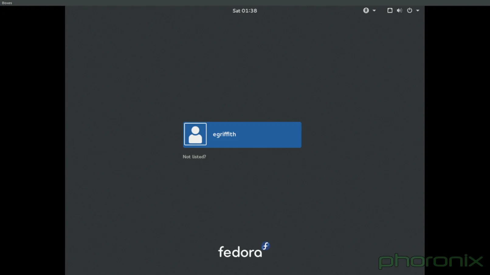
First impression's count for a lot, right? Well, GDM definitely gets this one right. The login screen is incredibly clean with consistent design language through every single part of it. The use of common-language icons instead of text boxes helps in that regard.
|
||
|
||

|
||
|
||
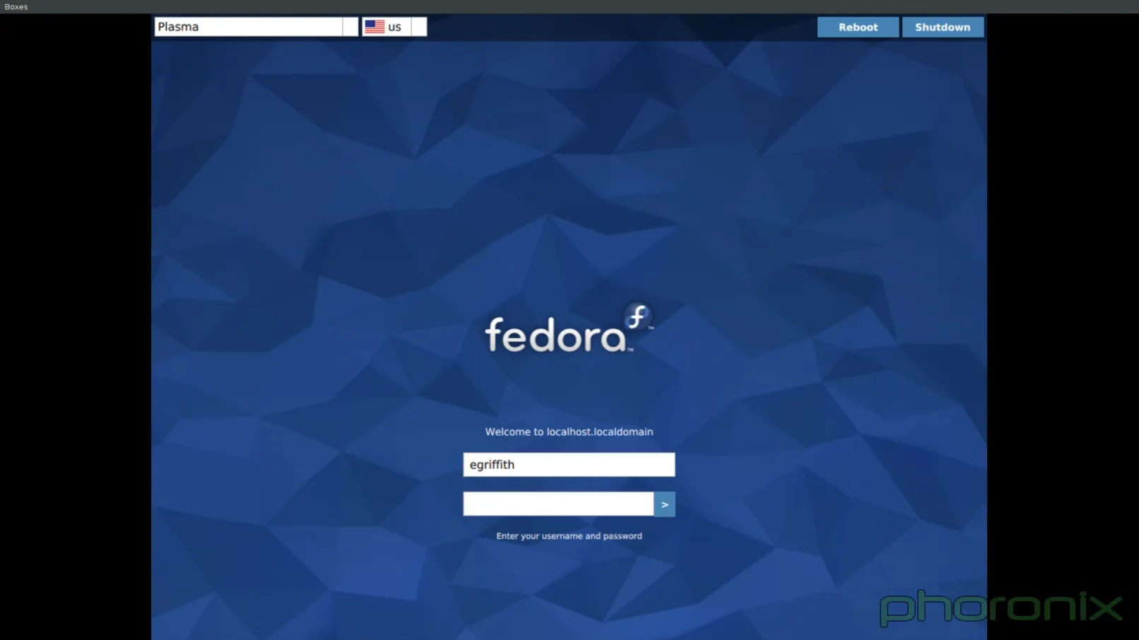
That is not to say that the Fedora 22 KDE login screen-- now SDDM rather than KDM-- looks 'bad' per say but its definitely more jarring.
|
||
|
||
Where's the fault? The top bar. Look at the Gnome screenshot-- you select a user and you get a tiny little gear simple for selecting what session you want to log into. The design is clean, it gets out of your way, you could honestly miss it completely if you weren't paying attention. Now look at the blue KDE screenshot, the bar doesn't look it was even rendered using the same widgets, and its entire placement feels like an after thought of "Well shit, we need to throw this option somewhere..."
|
||
|
||
The same can be said for the Reboot and Shutdown options in the top right. Why not just a power button that creates a drop down menu that has a drop down for Reboot, Shutdown, Suspend? Having the buttons be different colors than the background certainly makes them stick out and be noticeable... but I don't think in a good way. Again, they feel like an after thought.
|
||
|
||
GDM is also far more useful from a practical standpoint, look again along the top row. The time is listed, there's a volume control so that if you are trying to be quiet you can mute all sounds before you even login, there's an accessibility button for things like high contrast, zooming, test to speech, etc, all available via simple toggle buttons.
|
||
|
||

|
||
|
||
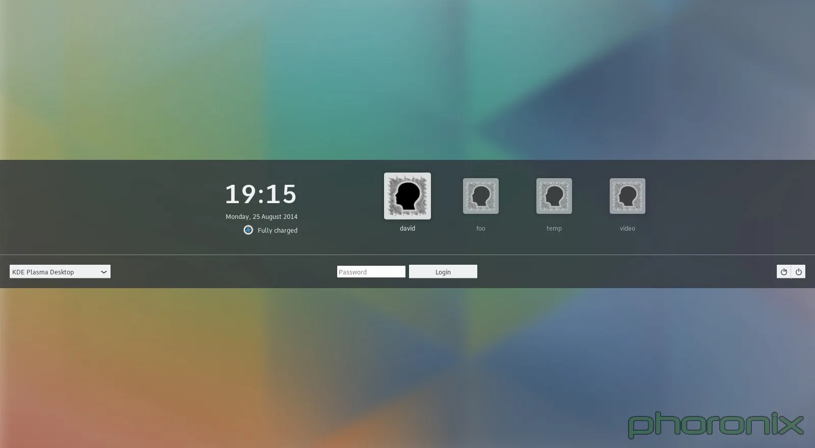
Swap it to upstream's Breeze theme and... suddenly most of my complaints are fixed. Common-language icons, everything is in the center of the screen, but the less important stuff is off to the sides. This creates a nice harmony between the top and bottom of the screen since they are equally empty. You still have a text box for the session switcher, but I can forgive that since the power buttons are now common language icons. Current time is available which is a nice touch, as is a battery life indicator. Sure gnome still has a few nice additions, such as the volume applet and the accessibility buttons, but Breeze is a step up from Fedora's KDE theme.
|
||
|
||
Go to Windows (pre-Windows 8 & 10...) or OS X and you will see similar things – very clean, get-out-of-your-way lock screens and login screens that are devoid of text boxes or other widgets that distract the eye. It's a design that works and that is non-distracting. Fedora... Ship Breeze by default. VDG got the design of the Breeze theme right. Don't mess it up.
|
||
|
||
--------------------------------------------------------------------------------
|
||
|
||
via: http://www.phoronix.com/scan.php?page=article&item=gnome-week-editorial&num=1
|
||
|
||
作者:Eric Griffith
|
||
译者:[译者ID](https://github.com/译者ID)
|
||
校对:[校对者ID](https://github.com/校对者ID)
|
||
|
||
本文由 [LCTT](https://github.com/LCTT/TranslateProject) 原创翻译,[Linux中国](https://linux.cn/) 荣誉推出
|
||
|
||
[1]:https://wiki.ubuntu.com/One%20Hundred%20Papercuts
|
||
[2]:http://www.phoronix.com/scan.php?page=article&item=fedora-22-kde&num=1
|