mirror of
https://github.com/LCTT/TranslateProject.git
synced 2025-01-07 22:11:09 +08:00
98 lines
12 KiB
Markdown
98 lines
12 KiB
Markdown
The history of Android
|
||
================================================================================
|
||
### Android 2.1—the discovery (and abuse) of animations ###
|
||
|
||
Android 2.1 came out with the launch of the Nexus One, which was only three months after the release of 2.0. The new OS wasn't a huge release, so it still kept the codename "Éclair." Android development was chugging along at an unheard-of pace, with Google averaging a new OS release every two-and-a-half months over the last 15 months.
|
||
|
||
Thanks mostly to the marketing efforts of Verizon and the "Droid" line of phones, Android was gaining in popularity. The OS was still considered ugly, though, and while the Android engineers at the time seemed to have almost no formal design training, in Android 2.1 they tried to spruce things up a bit by slathering on heavy-handed animation effects wherever they could. The result was an OS that seemed to be desperately trying to prove that it could do animation effects. Many of the new additions felt more like tech demos than user-experience improvements.
|
||
|
||
|
||
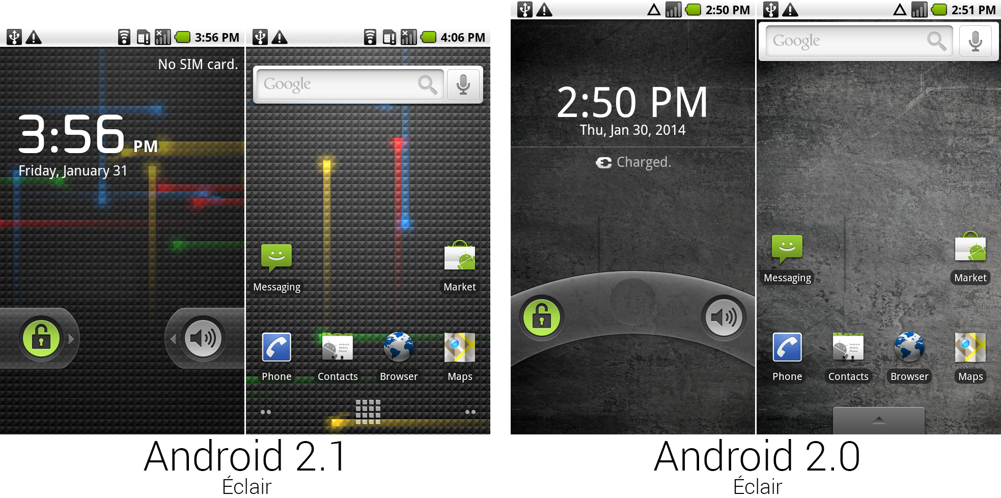
The lock and home screens from Android 2.1 and 2.0.
|
||
Photo by Ron Amadeo
|
||
|
||
Android 2.0's rotary dial lock screen was kicked to the curb after only one version and replaced with the same pull tabs the incoming call screen used. The lock screen clock was an attempt at a uniquely Android font, but as typefaces go, it was pretty hideous looking.
|
||
|
||
One of the biggest features in Android 2.1 was "Live Wallpapers"—interactive or moving images that could be set as the wallpaper. The default Live Wallpaper was a grid of squares with blue, red, yellow, and green lights continually streaking across it. Tapping on the screen would send lights firing out in all four directions from the center of your tap. While Live Wallpapers looked neat (and was a unique feature over the iPhone), the animated backgrounds sucked up battery power and CPU cycles. It seemed to make the whole phone run a little slower.
|
||
|
||
On the home screen, the default Google Search widget was given a lot more padding and now sits centered in its row. Page indicators now lived in the bottom left and right corners of the screen, and the number of home screen pages jumped from three to five. The app drawer tab at the bottom was replaced with an icon showing a grid of squares, a metaphor that Google still uses today.
|
||
|
||
|
||
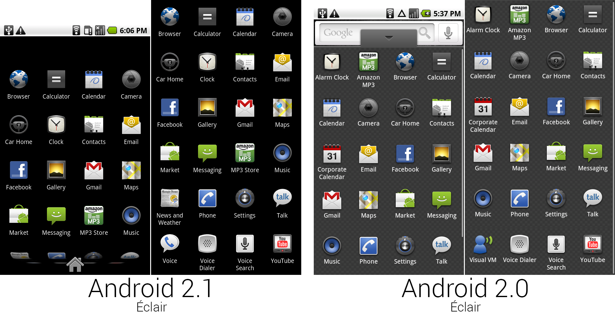
A picture showing the app drawer design and a composite image showing the app selection for Android 2.1 and 2.0.
|
||
Photo by Ron Amadeo
|
||
|
||
With the new app drawer icon came a totally new app drawer. Instead of a tabbed container that lifted up from the bottom of the screen, the app drawer displayed as a full-screen interface. The carbon fiber weave was removed, and the background switched to a plain black background—a decision that would stick around all the way up to KitKat.
|
||
|
||
Google decided to add a floating, semi-transparent home icon to the bottom of the app drawer to give people an easy way out of the full-screen tab interface. This could be seen as a precursor to the on-screen home button that was introduced in Android 4.0.
|
||
|
||
The app drawer was given a tacky graphics effect, too. While scrolling, the icons at the top and bottom of the list would bend inward and appear to move deeper into the phone, sort of like the opening scroll in Star Wars.
|
||
|
||
There were a few changes to the icons. "Amazon MP3" and "Alarm Clock" both lost their first names, along with their premium alphabetical real-estate at the top of the app drawer. Two new apps showed up: News and Weather, and Google Voice, which was Google's telecommunication service. Since the Nexus One was not a Verizon phone, Verizon's Visual Voicemail app was dumped.
|
||
|
||
|
||
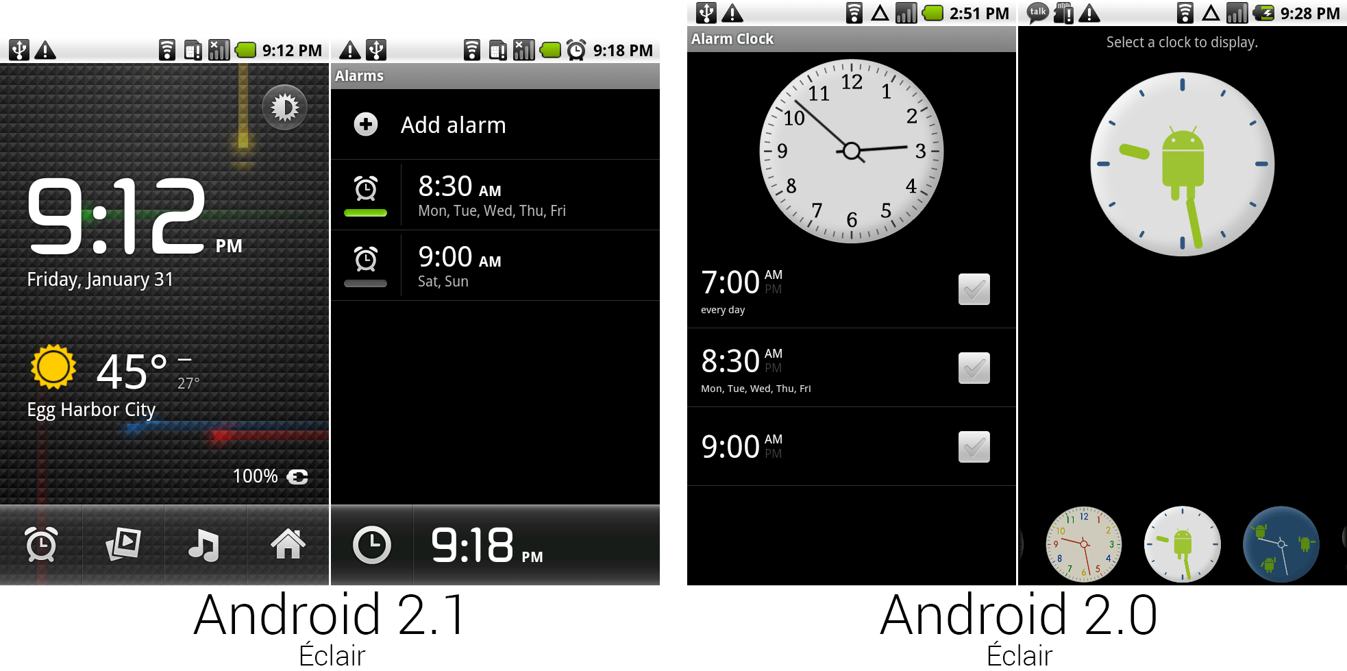
The revamped clock app.
|
||
Photo by Ron Amadeo
|
||
|
||
Along with the name change, the clock app got a total revamp. Tapping on the clock shortcut no longer opened the alarms page; instead it went to a "desk clock" interface (left picture, above) with a background that matched the wallpaper. The clock used the same font from the lock screen, pulling in weather from the new News And Weather app.
|
||
|
||
The new alarm page cleaned up a lot of the weirder design decisions made in the old version. The analog clock and selectable clock designs were dead. The checkboxes were replaced with a green on/off light, which was much easier to parse than "gray check/green check." While it might be hard to see from the thumbnail (click for a bigger version), the old alarm design displayed AM and PM next to the time. The 2.1 design did away with that, only showing the relevant meridian. A digital clock was placed at the bottom, and the clock icon took you back to the desk clock interface.
|
||
|
||
|
||
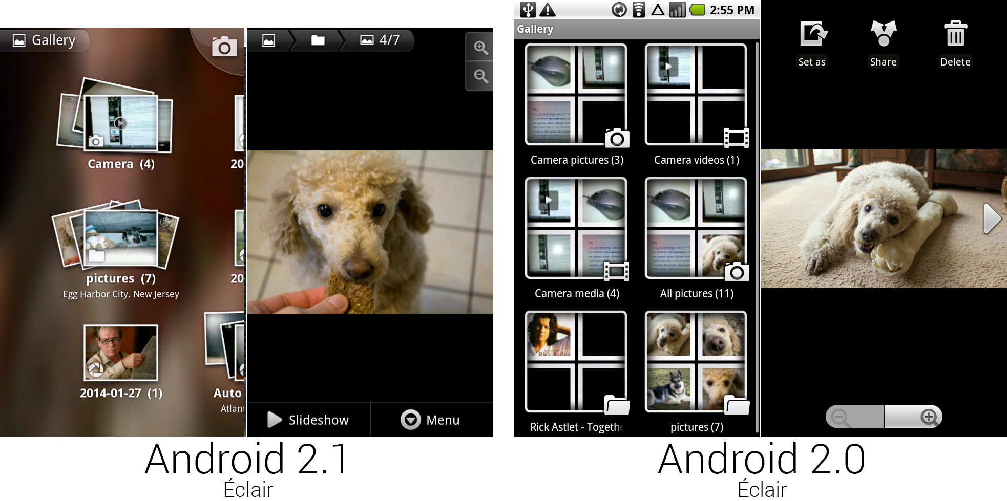
The Gallery and individual image screens from 2.1 and 2.0.
|
||
Photo by Ron Amadeo
|
||
|
||
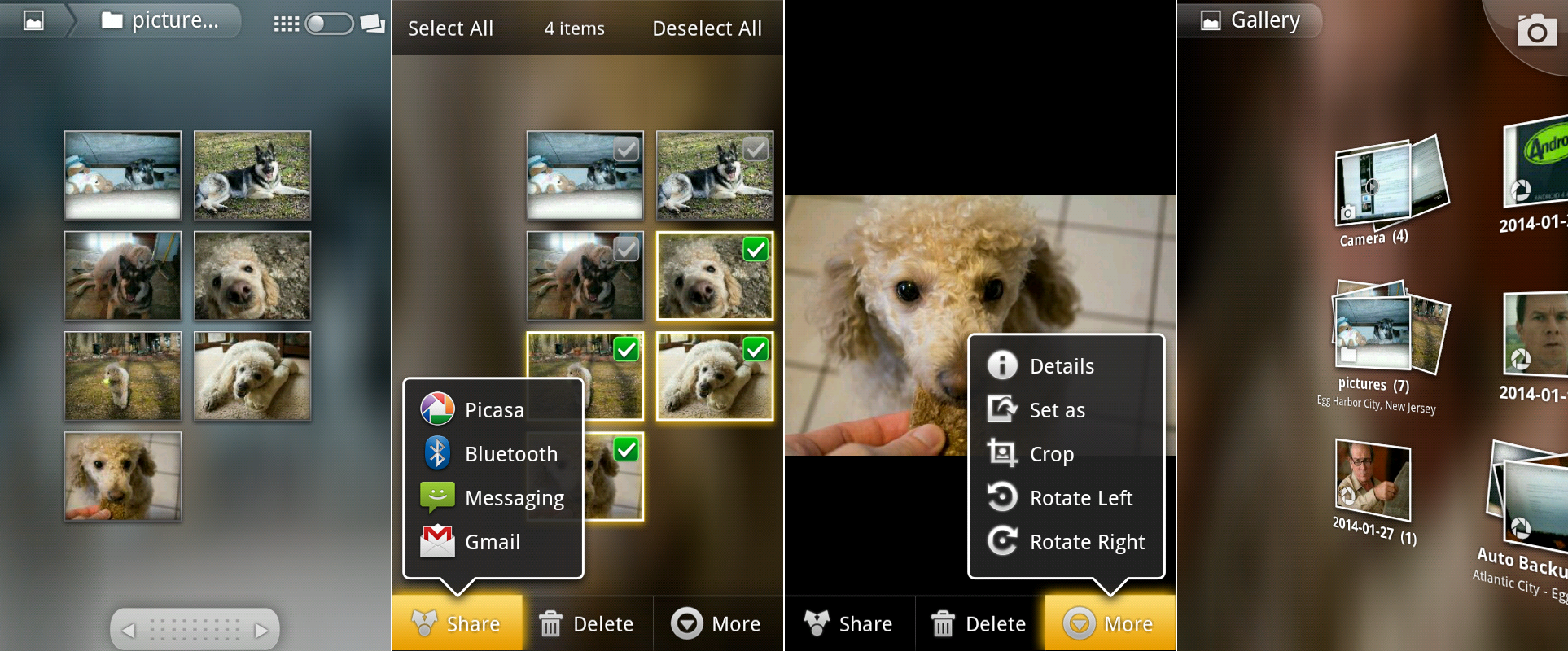
Google's desire to improve the look of Android was most evident in the 2.1 Gallery, which was all about heavy-handed animation effects and transparencies. When the app opened, individual pictures flew in from the top of the screen and shuffled into little piles that made up an album. When opening an album, the picture stack separated, and the photos slid into a grid formation. Everything you touched would pop open, squish, and stretch like a spring-loaded piece of Jell-o.
|
||
|
||
There was no "normal" background for the Gallery. It would randomly pick a picture on the screen and heavily distort it for use as a background image. When that picture scrolled off-screen, it would pick a new background image, so the tone of the background always matched your pictures.
|
||
|
||
The top left of the screen housed a breadcrumbs bar. It displayed your current location and any folders between you and the main screen—it could be thought of as an early precursor to the "Up" button that would debut in Android 3.0. In the top right was a link to the camera app, which still sported the same faux-leather design that debuted in Android 1.6—the two designs could not be more different.
|
||
|
||
While the camera was another weird, one-off design, never was the wild UI disparity between Android apps more apparent than in the new Gallery. It didn't use Android buttons, menus, or any of the existing UI paradigms. It even hid the status bar in every screen—you could barely tell you were looking at Android.
|
||
|
||
In the individual photo view, you could finally swipe between images, which removed the need for chunky left and right arrows. For some reason, the color-matched background wasn't on this screen. It was the only part of the app where the background is black. Zoom controls were in the top-right (still no pinch zoom), and commands were held in a single strip along the bottom of the screen. Hitting the "menu" button (software or hardware) didn't bring up a 2×3 grid of options like every other app—the items in the bottom strip just changed from two options to three other options.
|
||
|
||
|
||
The animation-filled Gallery app.
|
||
Photo by Ron Amadeo
|
||
|
||
The first picture, above, shows an album view. You could scroll horizontally through a large album or use the fast scroll bar at the bottom of the screen. Long pressing on a picture (or, bizarrely, pressing the hardware menu button) would bring up a "checkbox" interface, where you could tap on several pictures to select them. After you've selected pictures, you could then batch share, delete, or rotate them.
|
||
|
||
The menus on this screen and the next individual picture screen were semi-transparent speech bubbles that would spring out of their respective buttons when tapped on. Again, this was about as far away from the normal Android conventions as you could get. The Gallery was also one of the first apps to have an overscroll effect. When you hit the end of the photo wall, the entire surface would skew in the direction of the scrolling.
|
||
|
||
The 2.1 Gallery was the first photo client to show your cloud-stored Picasa photos along with local pictures. These were marked with a white camera shutter icon in the bottom left corner of a thumbnail. This would later become Google+ Photos.
|
||
|
||
No Android app before or since had looked like the gallery. There was good reason for that—it wasn’t made by Google! The app was farmed out to Cooliris, who didn't bother following a single existing Android UI paradigm. While the app was usable, all the animations and effects made it seem like a case of style over substance.
|
||
|
||

|
||
The "News and Weather" app showing... the news and weather.
|
||
Photo by Ron Amadeo
|
||
|
||
Compare the Gallery to the other new Android 2.1 app: News And Weather. While the Gallery was a transparency-filled animation fest, News And Weather was all about dark gradients and contrasting colors. This app powered the weather display on the desk clock app, and it even came with a home screen widget. The first screen just showed the weather and a six-day forecast for your current location. Along the top of the screens were tabs, next to the city name was a small "i" button that would bring up a temperature and precipitation graph. You could slide your finger along the graph to get exact temperatures and precipitation for any given minute.
|
||
|
||
The big innovation in this app was swipeable tabs, an idea that would eventually become a standard Android UI convention. After the weather were a bunch of user configurable news tabs, and besides tapping on the tabs to switch to them, you could just swipe horizontally across the screen and the tab would change. The news tabs all showed a list of news headlines that were almost always truncated to the point that you had no idea what the story was about. When opening a webpage from this app, it didn't load the browser. Instead, it opened the story within the app complete with a weird white border.
|
||
|
||
|
||
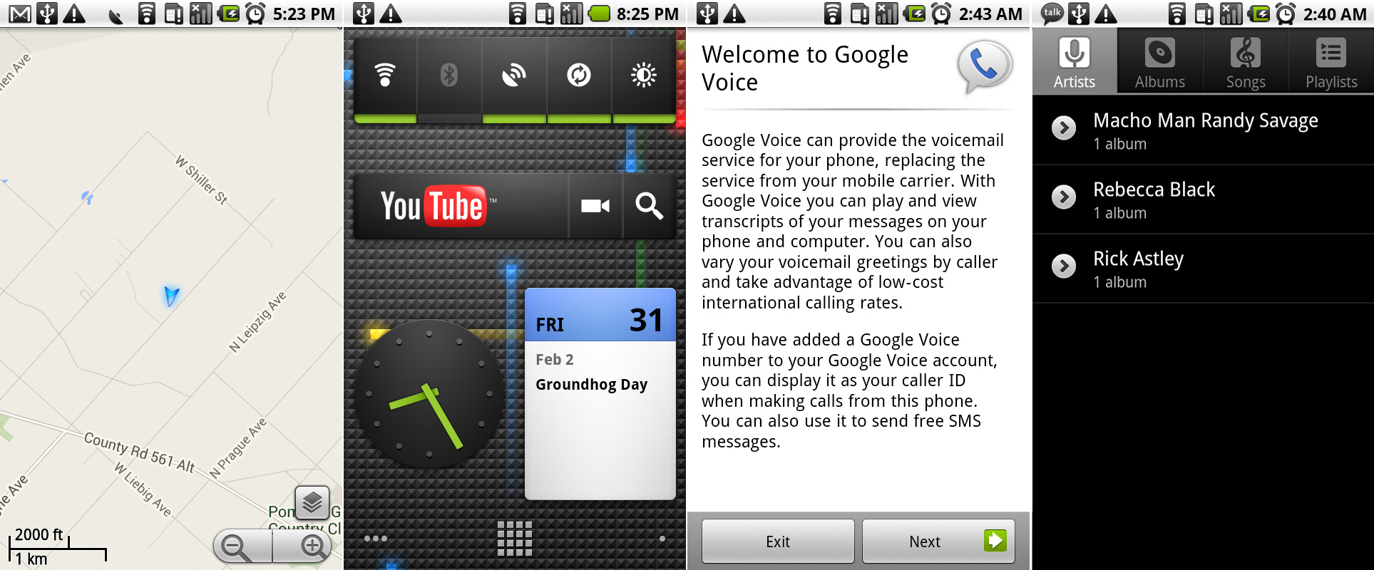
Google Maps showing off some Labs features, the new widget designs, the only screen we can access in Google Voice, and the new tabbed music design.
|
||
Photo by Ron Amadeo
|
||
|
||
Widgets in 2.1 were all redesigned, with almost everything receiving a black gradient, and made better use of the available space. The clock changed back to a circle, and the calendar got a blue top, which matched the app a little more closely. Google Voice will start up, but the sign-in is broken—this is as far as you can get.
|
||
|
||
The oft-neglected Music app got a minor update. The four-button home screen was removed completely, and tabs for each music display mode were added to the top of the screen. This meant when opening the app, you were immediately presented with a list of music, instead of a navigational page. Unlike the News and Weather app, these newly installed tabs here could not be swiped between.
|
||
|
||
----------
|
||
|
||

|
||
|
||
[Ron Amadeo][a] / Ron is the Reviews Editor at Ars Technica, where he specializes in Android OS and Google products. He is always on the hunt for a new gadget and loves to rip things apart to see how they work.
|
||
|
||
[@RonAmadeo][t]
|
||
|
||
--------------------------------------------------------------------------------
|
||
|
||
via:
|
||
|
||
译者:[译者ID](https://github.com/译者ID) 校对:[校对者ID](https://github.com/校对者ID)
|
||
|
||
本文由 [LCTT](https://github.com/LCTT/TranslateProject) 原创翻译,[Linux中国](http://linux.cn/) 荣誉推出
|
||
|
||
[a]:http://arstechnica.com/author/ronamadeo
|
||
[t]:https://twitter.com/RonAmadeo |