11 KiB
The history of Android
注:youtube视频地址
Android 2.0, Éclair—blowing up the GPS industry
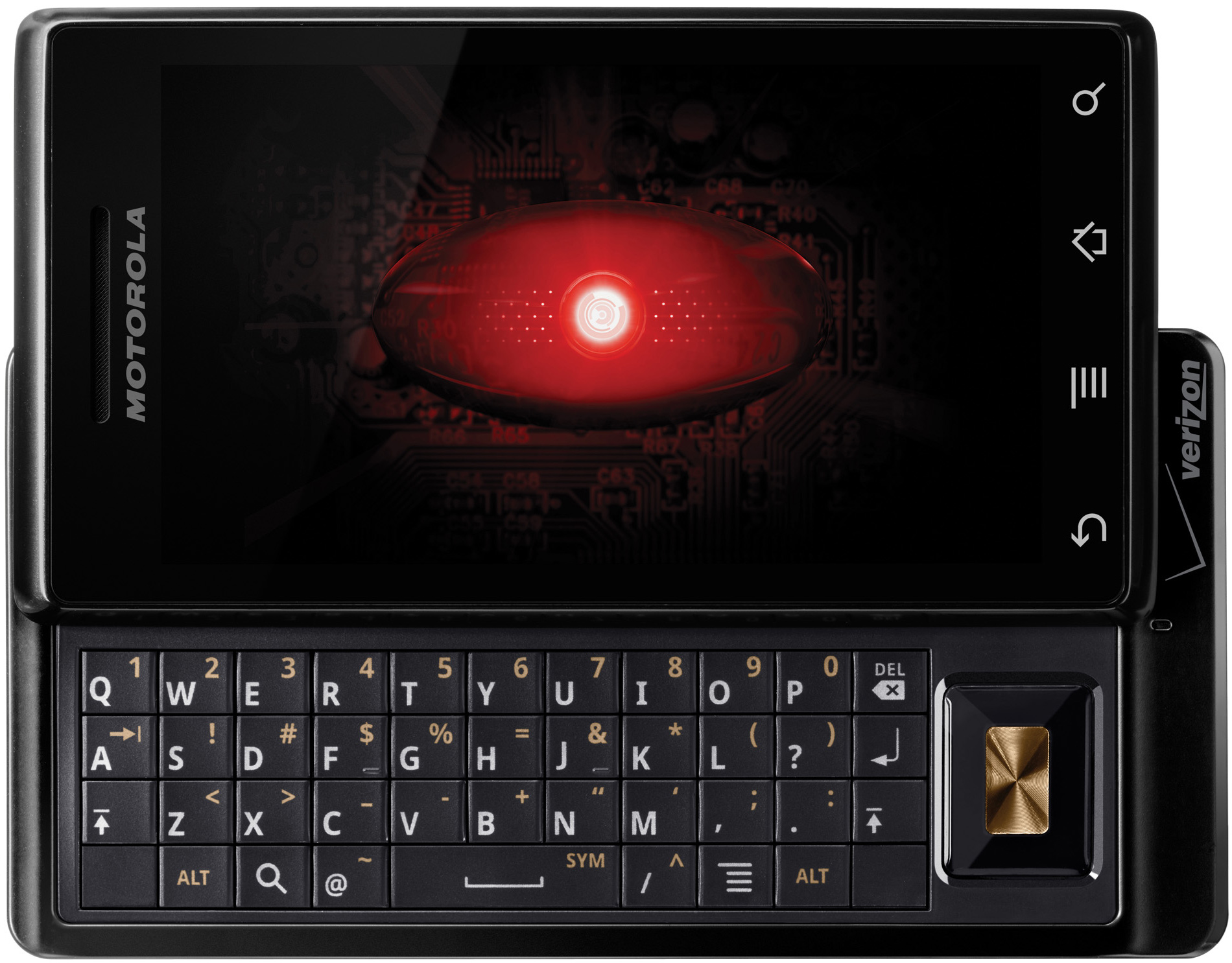
Forty-one days—that was how much time passed between Android 1.6 and 2.0. The first big version number bump for Android launched in October 2009 on the Motorola Droid, the first "second generation" Android device. The Droid offered huge hardware upgrades over the G1, starting with the massive (at the time) 3.7 inch, 854×480 LCD. It brought a lot more power, too: a (still single-core) 600Mhz TI OMAP Cortex A8 with 256MB of RAM.
 The Motorola Droid stares into your soul.
The most important part of the Droid, though, was the large advertising campaign around it. The Droid was the flagship device for Verizon Wireless in the US, and with that title came a ton of ad money from America's biggest carrier. Verizon licensed the word "droid" from Lucasfilm and started up the "Droid Does" campaign—a shouty, explosion-filled set of commercials that positioned the device (and by extension, Android) as the violent, ass-kicking alternative to the iPhone. The press frequently declared the T-Mobile G1 as trying to be an “iPhone Killer," but the Droid came out and owned it.
Like the G1, the Droid had a hardware keyboard that slid out from the side of the phone. The trackball was gone, but some kind of d-pad was still mandatory, so Motorola placed a five-way d-pad on the right side of the keyboard. On the front, the Droid switched from hardware buttons to capacitive touch buttons, which were just paint on the glass touchscreen. Android 2.0 also finally allowed devices to do away with the “Call" and “End" buttons. So together with the demotion of the d-pad to the keyboard tray, the front buttons could all fit in a nice, neat strip. The result of all this streamlining was the best-looking Android device yet. The T-Mobile G1 looked like a Fisher-Price toy, but the Motorola Droid looked like an industrial tool that you could cut someone with.
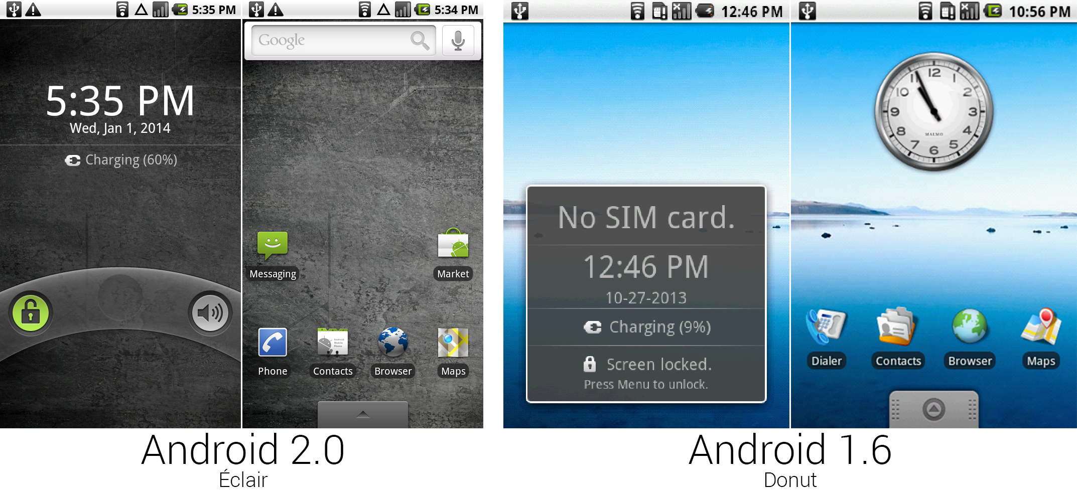
 The lock and home screens from 2.0 and 1.6.
Photo by Ron Amadeo
Some of Verizon's grungy ad campaign leaked over to the software, where the default wallpaper was changed from a calm, watery vista to a picture of dirty concrete. The boot animation used a pulsing, red, Hal 9000 eyeball and the default notification tone shouted "DRRRRROOOOIIIIDDDD" every time you received an e-mail. Éclair was Android’s angsty teenager phase.
One of the first things Android 2.0 presented to the user was a new lock screen. Slide-to-unlock was patented by Apple, so Google went with a rotary-phone-inspired arc unlock gesture. Putting your finger on the lock icon and sliding right would unlock the device, and sliding left from the volume icon would silence the phone. A thumb naturally moves in an arc, so this felt like an even more natural gesture than sliding in a straight line.
The default homescreen layout scrapped the redundant analog clock widget and introduced what is now an Android staple: a search bar at the top of the home screen. SMS Messaging and the Android Market were also given top billing in the new layout. The app drawer tab was given a sharp redesign, too.
![]() The app drawers and pictures of the “Add to Home" menus.
Photo by Ron Amadeo
The app drawers and pictures of the “Add to Home" menus.
Photo by Ron Amadeo
Android was developed at such a breakneck pace in the early days that the Android Team could never really plan for future devices when making interface art. The Motorola Droid—with its 854×480 LCD—was a huge bump up in resolution over the 320×480 G1-era devices. Nearly everything needed to be redrawn. Starting from scratch with interface art would pretty much be the main theme of Android 2.0.
Google took this opportunity to redesign almost every icon in Android, going from a cartoony look with an isometric perspective to straight-on icons done in a more serious style. The only set of icons that weren't redrawn were the status bar icons, which now look very out of place compared to the rest of the OS. These icons would hang around from Android 0.9 until 2.3.
There were a few changes to the app lineup as well. Camcorder was merged into the camera, the IM app was killed, and two new Google-made apps were added: Car Home, a launcher with big buttons designed for use while driving, and Corporate Calendar, which is identical to the regular calendar except it supports Exchange instead of Google Calendar. Weirdly, Google also included two third-party apps out of the box: Facebook and Verizon's Visual VM app. (Neither works today.) The second set of pictures displays the “Add to Home screen" menu, and it received all new art, too.
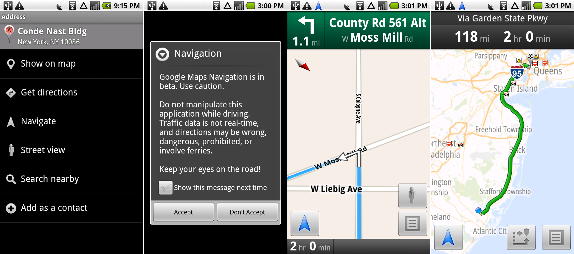
 A Places page, showing the “Navigate" option, the Navigation disclaimer, the actual Navigation screen, and the traffic info screen.
Photo by Ron Amadeo
Beyond a redesign, the clear headline feature of Android 2.0 was Google Maps Navigation. Google updated Maps to allow for free turn-by-turn navigation, complete with a point of interest search and text to speech, which could read the names of streets aloud just like a standalone GPS unit. Turning GPS navigation from a separate product into a free smartphone feature pretty much destroyed the standalone GPS market overnight. TomTom’s stock dropped almost 40 percent during the week of Android 2.0’s launch.
But navigation was pretty hard to get to at first. You had to open the search box, type in a place or address, and tap on the search result. Next, after tapping on the "Navigate" button, Google showed a warning stating that Navigation was in beta and should not be trusted. After tapping on "accept," you could jump in a car, and a harsh-sounding robot voice would guide you to your destination. Hidden behind the menu button was an option to check out the traffic and accidents for the entire route. This design of Navigation hung around forever. Even when the main Google Maps interface was updated in Android 4.0, the Android 2.0 stylings in the Navigation section hung around until almost Android 4.3.
Maps would also show a route overview, which contained traffic data for your route. At first it was just licensed by the usual traffic data provider, but later, Google would use information from Android and iOS phones running Google Maps to crowd source traffic data. It was the first step in Google's dominance of the mobile map game. After all, real-time traffic monitoring is really just a matter of how many points of data you have. Today, with hundreds of millions of Google Maps users across iOS and Android, Google has become the best provider of traffic data in the world.
With Maps Navigation, Android finally found its killer app. Google was offering something no one else could. There was finally an answer to the "Why should I buy this over an iPhone?" question. Google Maps didn't require PC-based updating like many GPS units did, either. It was always up-to-date thanks to the cloud, and all of those updates were free. The only downside was that you needed an Internet connection to use Google Maps.
As was greatly publicized during the Apple Maps fiasco, accurate maps have become one of the most important features of a smartphone, even if no one really appreciates them when they work. Mapping the world is really only solvable with tons of person power, and today, Google’s “Geo" division is the largest in the company with more than 7,000 employees. For most of these people, their job is to literally drive down every road in the world with the company’s camera-filled Street View cars. After eight years of data collection, Google has more than five million miles of 360-degree Street View imagery, and Google Maps is one of the biggest, most untouchable pillars of the company.
 The Car Home screen, and, because we have room, a horizontal version of Navigation.
Photo by Ron Amadeo
Along with Google Maps Navigation came "Car Home," a large-buttoned home screen designed to help you use your phone while driving. It wasn't customizable, and each button was just a shortcut to a standard app. The Motorola Droid and its official car dock accessory had special magnets that would automatically trigger Car Home. While docked, pressing the hardware home button on the Droid would open Car Home instead of the normal home screen, and an on-screen home button led to the normal home screen.
Car Home, while useful, didn’t last long—it was cut in Android 3.0 and never came back. GPS systems are almost entirely used in cars while driving, but encouraging users to do so with options like “search," which would bring up a keyboard, is something that Google’s lawyers probably weren’t very fond of. With Apple’s CarPlay and Google’s Open Automotive Alliance, car computers are seeing a resurgence these days. This time, though, there is more of a focus on safety, and government organizations like the National Highway Traffic Safety Administration are on board to help out.
Ron Amadeo / Ron is the Reviews Editor at Ars Technica, where he specializes in Android OS and Google products. He is always on the hunt for a new gadget and loves to rip things apart to see how they work.
