8.8 KiB
安卓编年史
安卓 3.0 蜂巢—平板和设计复兴
尽管姜饼中做了许多改变,安卓仍然是移动世界里的丑小鸭。相比于 iPhone,它的优雅程度和设计完全抬不起头。另一方面来说,为数不多的能与 iOS 的美学智慧相当的操作系统之一是 Palm 的 WebOS。WebOS 有着优秀的整体设计,创新的功能,而且被寄予期望能够从和 iPhone 的长期竞争中拯救公司。
尽管如此,一年之后,Palm 资金链断裂。Palm 公司从未看到 iPhone 的到来,到 WebOS 就绪的时候已经太晚了。2010年4月,惠普花费10亿美元收购了 Palm。尽管惠普收购了一个拥有优秀用户界面的产品,界面的首席设计师,Matias Duarte,并没有加入惠普公司。2010年5月,就在惠普接手 Palm 之前,Duarte 加入了谷歌。惠普买下了面包,但谷歌雇佣了它的烘培师。
在谷歌,Duarte 被任命为安卓用户体验主管。这是第一次有人公开掌管安卓的外观。尽管 Matias 在安卓 2.2 发布时就来到了谷歌,第一个真正受他影响的安卓版本是 3.0 蜂巢,它在2011年2月发布。
按谷歌自己的说法,蜂巢是匆忙问世的。10个月前,苹果发布了 iPad,让平板变得更加现代,谷歌希望能够尽快做出回应。蜂巢就是那个回应,一个运行在10英寸触摸屏上的安卓版本。悲伤的是,将这个系统推向市场是如此优先的事项,以至于边边角角都被砍去了以节省时间。
新系统只用于平板——手机不能升级到蜂巢,这加大了谷歌让系统运行在差异巨大的不同尺寸屏幕上的难度。但是,仅支持平板而不支持手机使得蜂巢源码没有泄露。之前的安卓版本是开源的,这使得黑客社区能够将其最新版本移植到所有的不同设备之上。谷歌不希望应用开发者在支持不完美的蜂巢手机移植版本时感到压力,所以谷歌将源码留在自己手中,并且严格控制能够拥有蜂巢的设备。匆忙的开发还导致了软件问题。在发布时,蜂巢不是特别稳定,SD卡不能工作,Adobe Flash——安卓最大的特色之一——还不被支持。
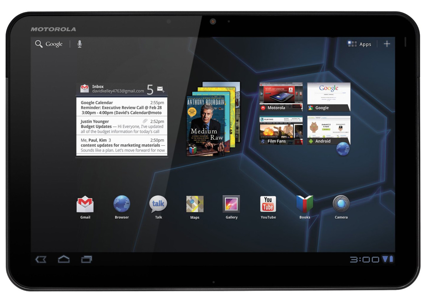
摩托罗拉 Xoom是为数不多的拥有蜂巢的设备之一,它是这个新系统的旗舰产品。Xoom 是一个10英寸,16:9 的平板,拥有 1GB 内存和 1GHz Tegra 2 双核处理器。尽管是由谷歌直接控制更新的新版安卓发布设备,它并没有被叫做“Nexus”。对此最可能的原因是谷歌对它没有足够的信心称其为旗舰。
尽管如此,蜂巢是安卓的一个里程碑。在一个体验设计师的主管之下,整个安卓用户界面被重构,绝大多数奇怪的应用设计都得到改进。安卓的默认应用终于看起来像整体的一部分,不同的界面有着相似的布局和主题。然而重新设计安卓会是一个跨版本的项目——蜂巢只是将安卓塑造成型的开始。这第一份草稿为安卓未来版本的样子做了基础设计,但它也用了过多的科幻主题,谷歌将花费接下来的数个版本来淡化它。
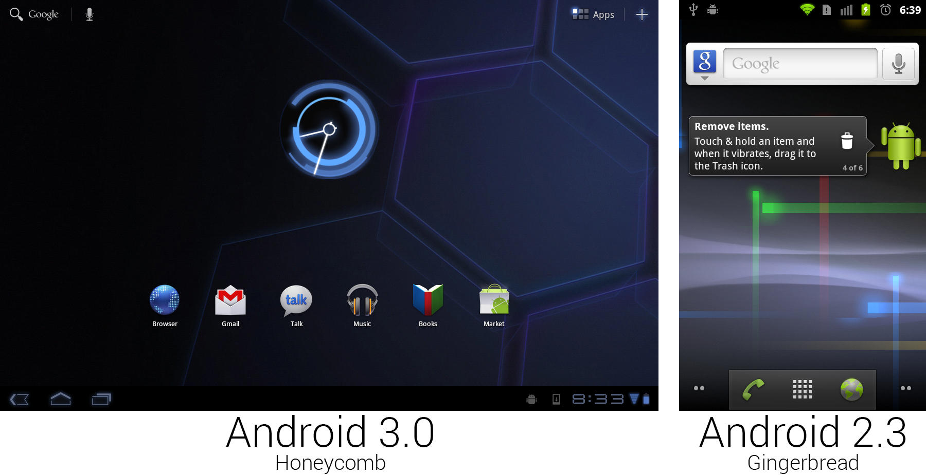
姜饼只是在它的量子壁纸上试验了科幻外观,蜂巢整个系统的以电子为灵感的主题让它充满科幻意味。所有东西都是黑色的,如果你需要对比色,你可以从一些不同色调的蓝色中挑选。所有蓝色的东西还有“光晕”效果,让整个系统看起来像是外星科技创造的。默认背景是个六边形的全息方阵(一个蜂巢!明白了吗?),看起来像是一艘飞船上的传送阵的地板。
The most important change of Honeycomb was the addition of the system bar. The Motorola Xoom had no hardware buttons other than power and volume, so a large black bar was added along the bottom of the screen that housed the navigational buttons. This meant the default Android interface no longer needed specialized hardware buttons. Previously, Android couldn't function without hardware Back, Menu, and Home keys. Now, with the software supplying all the necessary buttons, anything with a touch screen was able to run Android.
The biggest benefit of the new software buttons was flexibility. The new app guidelines stated that apps should no longer require a hardware menu button, but for those that do, Honeycomb detects this and adds a fourth button to the system bar that allows these apps to work. The other flexibility attribute of software buttons was that they could change orientation with the device. Other than the power and volume buttons, the Xoom's orientation really wasn't important. The system bar always sat on the "bottom" of the device from the user's perspective. The trade off was that a big bar along the bottom of the screen definitely sucked up some screen real estate. To save space on 10-inch tablets, the status bar was merged into the system bar. All the usual status duties lived on the right side—there was battery and connectivity status, the time, and notification icons.
The whole layout of the home screen changed, placing UI pieces in each of the four corners of the device. The bottom left housed the previously discussed navigational buttons, the bottom right was for status and notifications, the top left displayed text search and voice search, and the top right had buttons for the app drawer and adding widgets.
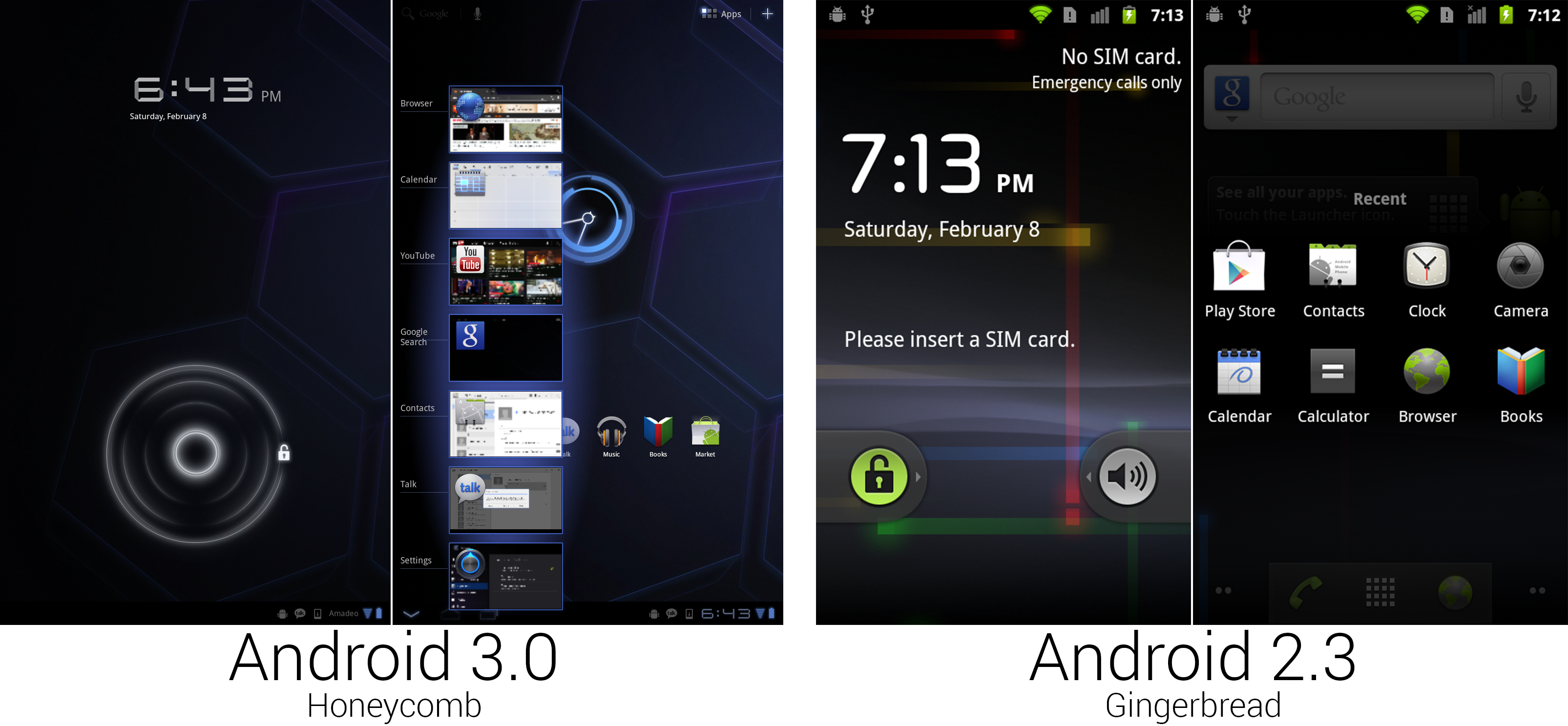
 The new lock screen and Recent Apps interface.
Photo by Ron Amadeo
(Since the Xoom was a [heavy] 10-inch, 16:9 tablet, it was primarily meant to be used horizontally. Most apps also supported portrait mode, though, so for the sake of our formatting, we're using mostly portrait mode shots. Just keep in mind the Honeycomb shots come from a 10-inch tablet, and the Gingerbread shots come from a 3.7-inch phone. The densities of information are not directly comparable.)
The unlock screen—after switching from a menu button to a rotary dial to slide-to-unlock—removed any required accuracy from the unlock process by switching to a circle unlock. Swiping from the center outward in any direction would unlock the device. Like the rotary unlock, this was much nicer ergonomically than forcing your finger to follow a perfectly straight path.
The strip of thumbnails in the second picture was the interface brought up by the newly christened "Recent Apps" button, now living next to Back and Home. Rather than the group of icons brought up in Gingerbread by long-pressing on the home button, Honeycomb showed app icons and thumbnails on the screen, which made it a lot easier to switch between tasks. Recent Apps was clearly inspired by Duarte's "card" multitasking in WebOS, which used full-screen thumbnails to switch tasks. This design offered the same ease-of-recognition as WebOS's task switcher, but the smaller thumbnails allowed more apps to fit on screen at once.
While this implementation of Recent Apps may look like what you get on a current device, this version was very early. The list didn't scroll, meaning it showed seven apps in portrait mode and only five apps in horizontal mode. Anything beyond that was bumped off the list. You also couldn't swipe away thumbnails to close apps—this was just a static list.
Here we see the Tron influence in full effect: the thumbnails had blue outlines and an eerie glow around them. This screenshot also shows a benefit of software buttons—context. The back button closed the list of thumbnails, so instead of the normal arrow, this pointed down.
Ron Amadeo / Ron is the Reviews Editor at Ars Technica, where he specializes in Android OS and Google products. He is always on the hunt for a new gadget and loves to rip things apart to see how they work.


