9.2 KiB
alim0x translating
The history of Android
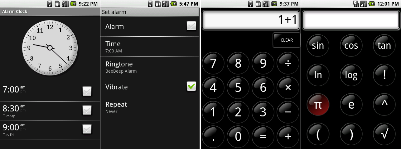 The main alarm screen, setting an alarm, the calculator, and the calculator advanced functions screen.
Photo by Ron Amadeo
Android 0.9 gave us the first look at the Alarm and Calculator apps. The alarm app featured a plain analog clock with a scrolling list of alarms on the bottom. Rather than some kind of on/off switch, alarms were set with a checkbox. Alarms could be set to repeat at certain days of the week, and there was a whole list of selectable, unique alarm sounds.
The calculator was an all-black app with glossy, round buttons. Through the menu, it was possible to bring up an additional panel with advanced functions. Again consistency was not Google’s strong suit. The on-press highlight on the pi key was red—in the rest of Android 0.9, the on-press highlight was usually orange. In fact, everything used in the calculator was 100 percent custom artwork limited to only the calculator.
 Google Maps with the menu open and the new directions interface.
Photo by Ron Amadeo
Google Maps actually worked in Android 0.9—the client could connect to the Google Maps server and pull down tiles. (For our images, remember that Google Maps is cloud based. Even the oldest of clients will still pull down modern map tiles, so ignore the actual map tiles pictured.) The Maps menu got the same all-gray treatment as the browser menu, and the zoom controls were the same as the browser too. The all-important "My Location" button finally arrived, meaning this version of Maps supported GPS location.
The directions interface was revamped. The weird speech bubbles with misaligned plus buttons were swapped out for a more communicative bookmark icon, the swap field button moved to the left, and the go button was now labeled "Route."
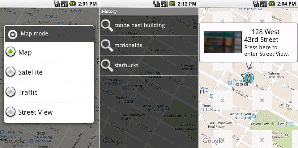 The Google Maps layers selector, search history, and the now-broken street view mode.
Photo by Ron Amadeo
"Layers" was renamed "Map Mode" and switched to a radio button list. Only one map type was available at a time—you couldn't see traffic on the satellite view, for instance. Buried in the menu was a hastily thrown together search history screen. History seemed like only a proof-of-concept, with giant, blurry search icons that rammed up against search terms on a transparent background.
Street View used to be a separate app (although it was never made available to the public), but in 0.9 it was integrated into Google Maps as a Map Mode. You could drag the little pegman around, and it would display a popup bubble showing the thumbnail for Street View. Tapping on the thumbnail would launch Street View for that area. At the time, Street View showed nothing other than a scrollable 360 degree image—there was no UI on the interface at all.
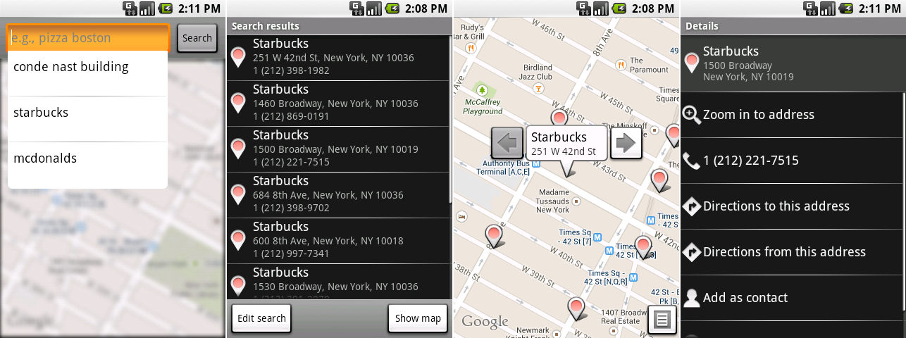 Our first look at the Google Maps search interface. These shots show the search bar, the results in a list, the results in a map, and a business page.
Photo by Ron Amadeo
Android 0.9 also gave us our first look at the texting app, called "Messaging." Like many early Android designs, Messaging wasn't sure if it should be a dark app or a light app. The first visible screen was the message list, a stark black void of nothingness that looked like it was built on top of the settings interface. After tapping on “New Message" or one of the existing conversations, though, you were taken to a white and blue scrolling list of text messages. The two connected screens couldn’t be more different.
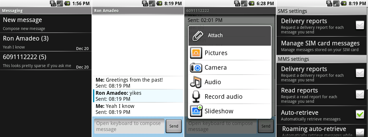 The SMS app’s chat window, attachment screen, chat list, and setting.
Photo by Ron Amadeo
Messaging supported a range of attachments: you could tack on pictures, audio, or a slideshow to your message. Pictures and audio could be recorded on the fly or pulled from phone storage. Another odd UI choice was that Android already had an established icon for almost everything in the attach menu, but Messaging used all-custom art instead.
Messaging was one of the first apps to have its own settings screen. Users could request read and delivery reports and set download preferences.
 The slideshow creator. The right picture shows the menu options.
Photo by Ron Amadeo
The "slideshow" option in attachments would actually launch a fully featured slideshow creator. You could add pictures, choose the slide order, add music, change the duration of each slide, and add text. This was complicated enough to have its own app icon, but amazingly it was buried in the menu of the SMS app. This was one of the few Android apps that was completely unusable in portrait mode—the only way to see the picture and the controls was in landscape. Strangely, it would still rotate to portrait, but the layout just became a train wreck.
 The Music player’s main navigation page, song list, album list, and “now playing" screen.
Photo by Ron Amadeo
Android 0.9 was the first to bring a music app to Android. The primary screen was mostly just four big, chunky navigation buttons that would take you to each music view. At the bottom of the app was a "now playing" bar that only contained the track name, artist, and a play/pause button. The song list had only a bare minimum interface, only showing the song name, artist, album and runtime. Album art was the only hope of seeing any color in this app. It was displayed as a tiny thumbnail in the album view and as a big, quarter-screen image in the Now Playing view.
Like most parts of Android in this era, the interface may not have been much to look at, but the features were there. The Now Playing screen had a button for a playlist queue that allowed you to drag songs around, shuffle, repeat, search, and choose background audio.
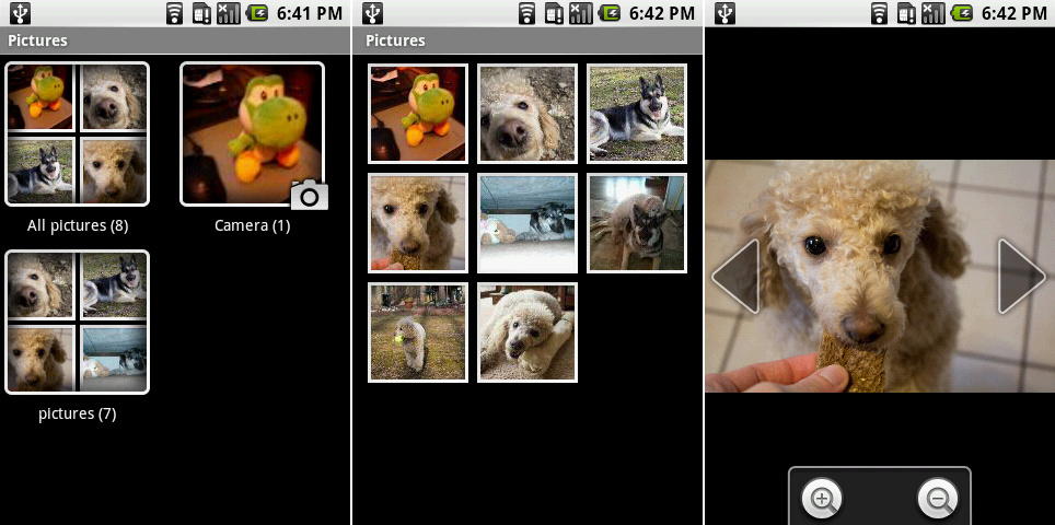 The “Pictures" all album view, individual album view, and a single picture view.
Photo by Ron Amadeo
The photo gallery was simply called "Pictures." The initial view showed all your albums. The two default ones were "Camera" and a large unified album called "All pictures." The thumbnail for each album was made up of a 2x2 grid of pictures, and every picture got a thick, white frame.
The individual album view was about what you would expect: a scrolling grid of pictures. You couldn't swipe through individual pictures—large left and right arrows flanking the individual picture had to be tapped on to move through an album. There was no pinch-zoom either; you had to zoom in and out with buttons.
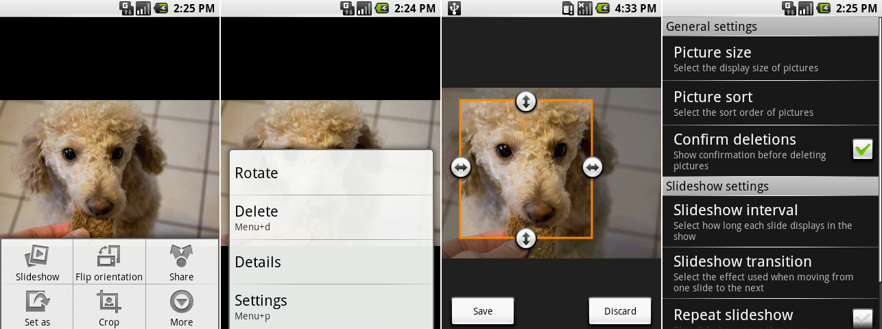 Picture editing! These screenshots show an open menu, the “more" menu, cropping, and the settings.
Photo by Ron Amadeo
"Pictures" looked simple until you hit the menu button and suddenly accessed a myriad of options. Pictures could be cropped, rotated, deleted, or set as a wallpaper or contact icon. Like the browser, all of this was accomplished through a clumsy double-menu system. But again, why do two related menus look completely different?
Android 0.9 came out a mere two months before the first commercial release of Android. That was just enough time for app developers to make sure their apps worked—and for Google to do some testing and bug squashing before the big release.
Ron Amadeo / Ron is the Reviews Editor at Ars Technica, where he specializes in Android OS and Google products. He is always on the hunt for a new gadget and loves to rip things apart to see how they work.
via: http://arstechnica.com/gadgets/2014/06/building-android-a-40000-word-history-of-googles-mobile-os/5/
