11 KiB
The history of Android
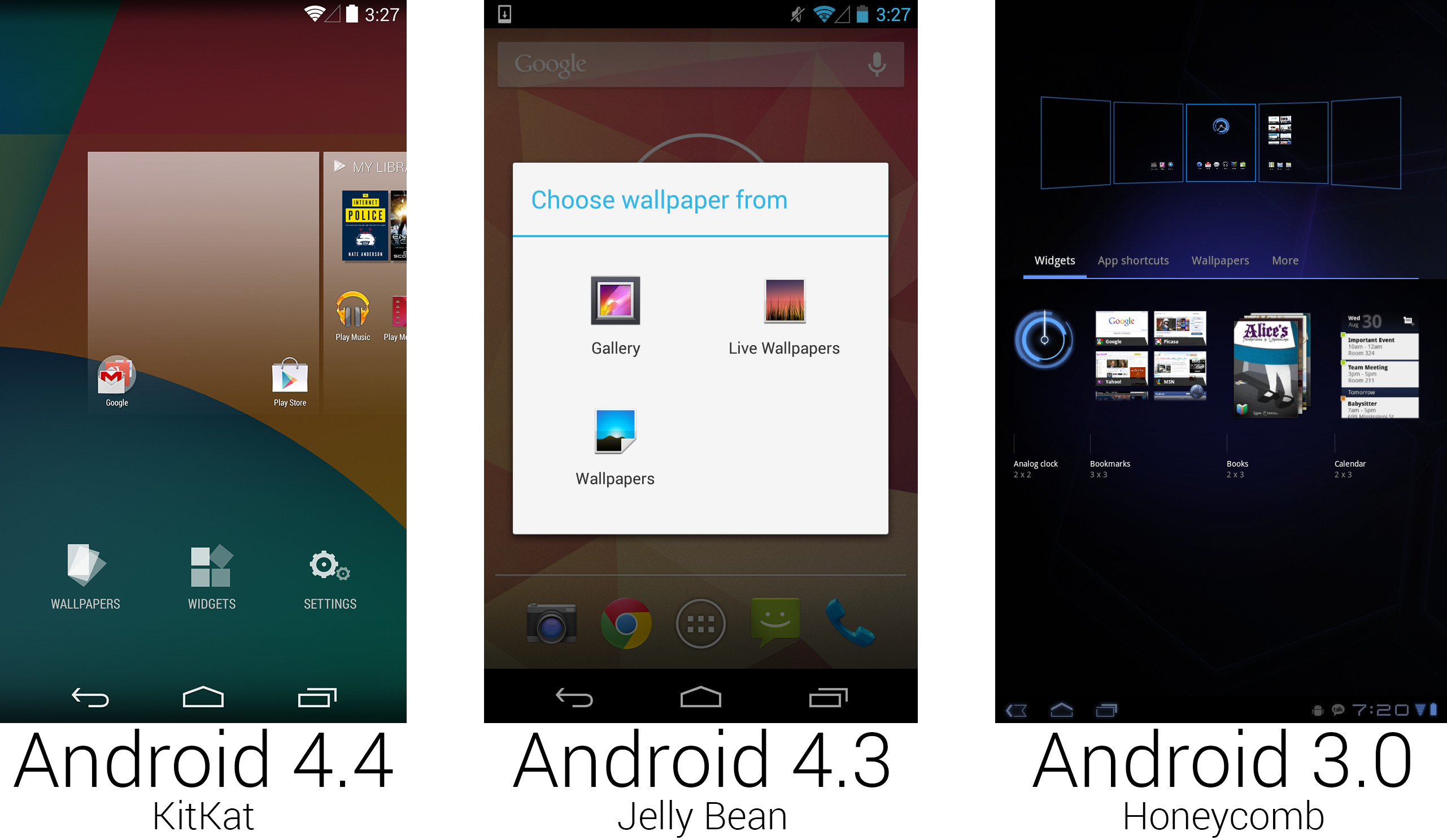 The new "add to home screen" interface was definitely inspired by Honeycomb.
Photo by Ron Amadeo
KitKat added a nice throwback to Honeycomb with the home screen configuration screen. On the massive 10-inch screen of a Honeycomb tablet (right picture, above), long pressing on the home screen background would present you with a zoomed-out view of all your home screens. Widgets could be dragged from the bottom widget drawer into any home screen—it was very handy. When it came time to bring the Honeycomb interface to phones, from Android 4.0 all the way to 4.3, Google skipped this design and left it to the larger screened devices, presenting only a list of options after a long press (center picture).
For KitKat though, Google finally came up with a solution. After a long press, 4.4 presented a slightly zoomed out view—you could see the current home screen and the screens to the left and right of it. Tapping on the “widgets" button would open a full screen list of widget thumbnails, but after long-pressing on a widget, you were thrown back into the zoomed-out view and could scroll through home screen pages and place the icon where you wanted. By dragging an icon or widget all the way past the rightmost home page, you could create a new home page.
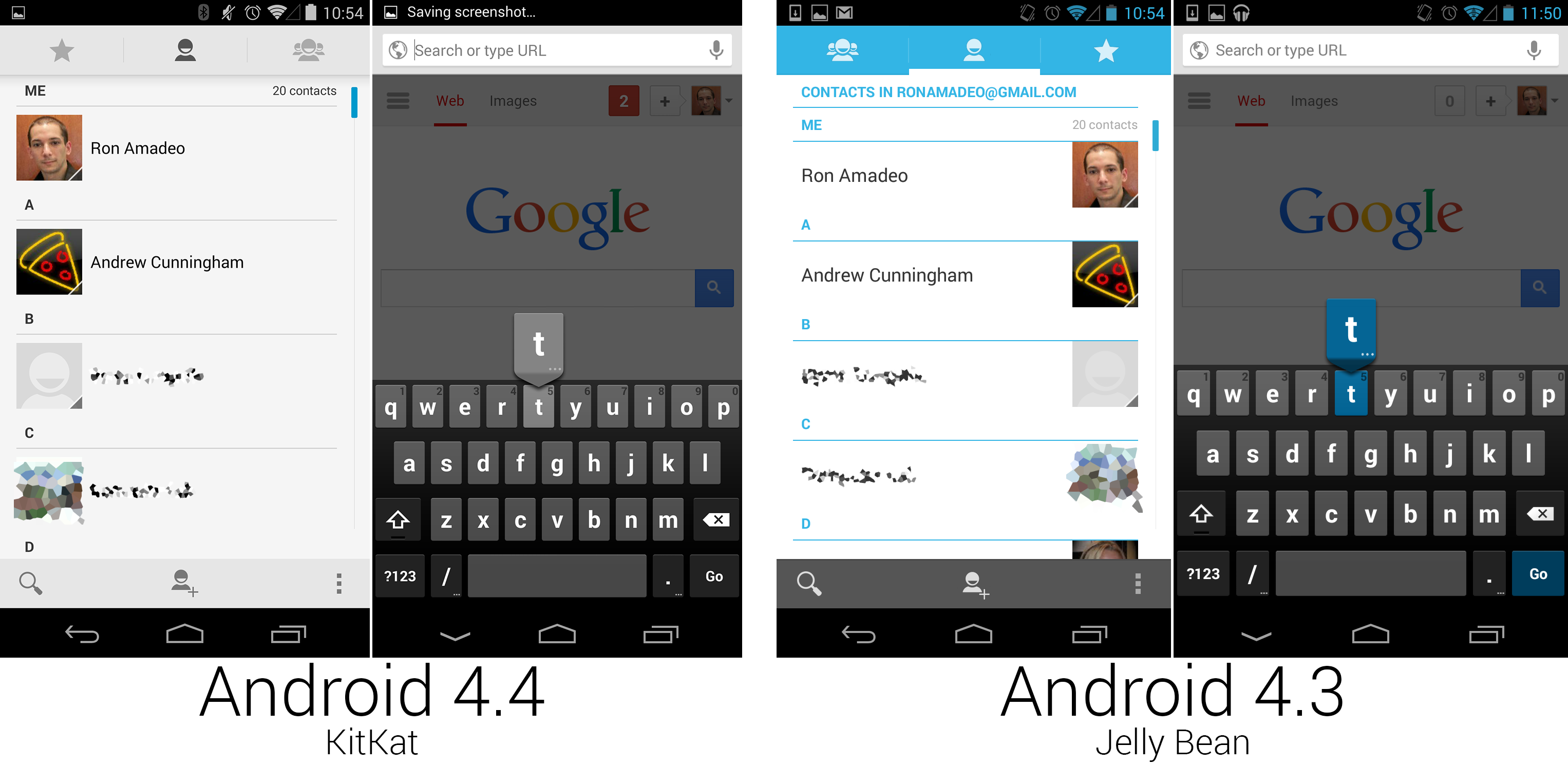 Contacts and the Keyboard both removed any trace of blue.
Photo by Ron Amadeo
KitKat was the end of the line for the Tron design. In most parts of the OS, any remaining blue highlights were removed in favor of gray. In the People app, blue was sucked out of the header and the letter separators in the contact list. The pictures swapped sides and the bottom bar was changed to a light gray to match the top. The Keyboard, which injected the color blue into nearly every app, was changed to gray-on-gray-on-gray. That wasn't a bad thing. Apps should be allowed to have their own color scheme—forcing a potentially clashing color on them via the keyboard wasn’t good design.
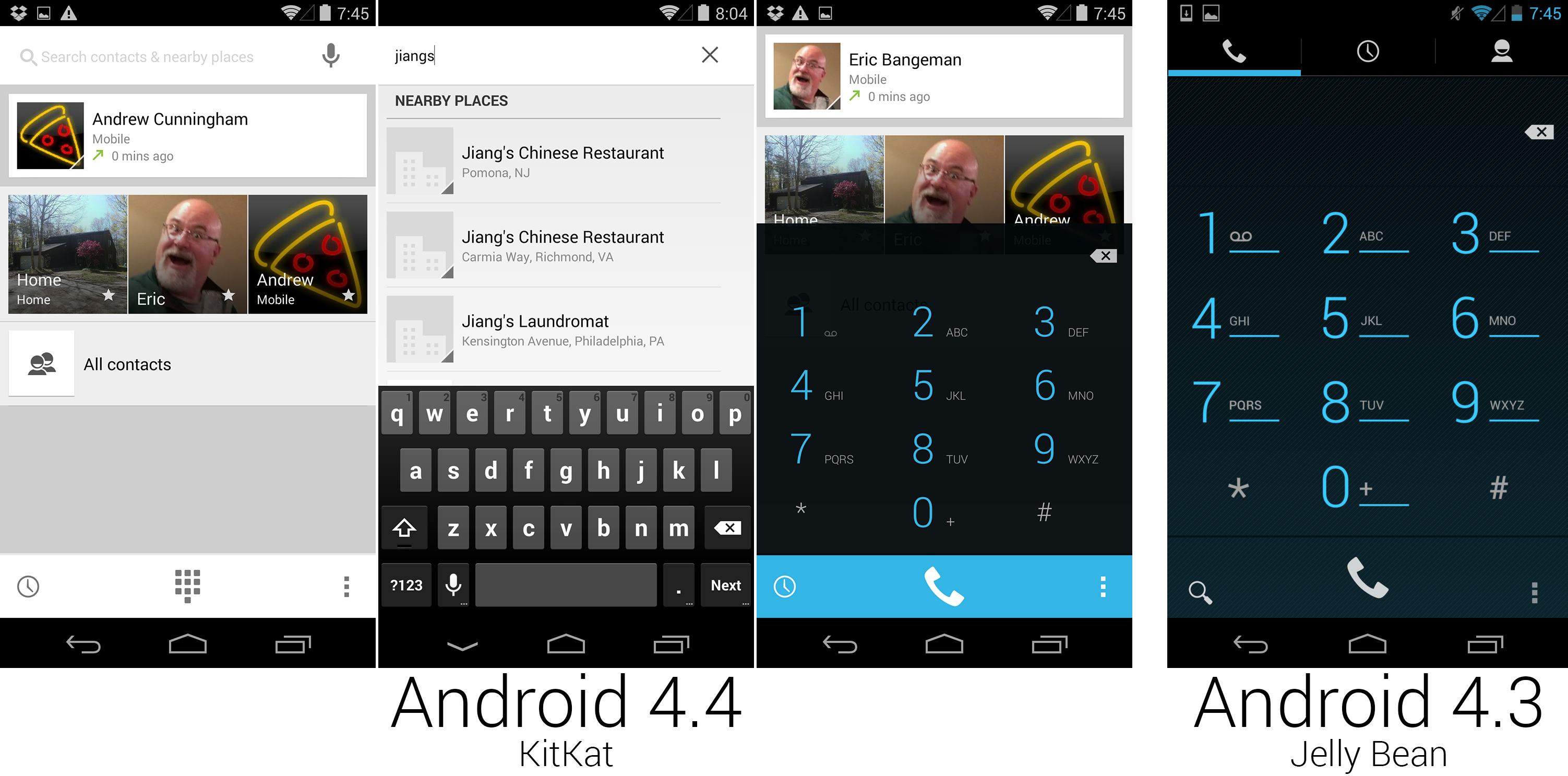 The first three screenshots show KitKat's dialer, and the last one is 4.3.
Photo by Ron Amadeo
Google completely revamped the dialer in KitKat, creating a wild new design that changed the way users thought about a phone. Actual numbers in the new dialer were hidden as much as possible—there wasn’t even a dial pad on the main screen. The primary interface for making a phone call was now a search bar! If you wanted to call someone in your contacts, just type their name in; if you wanted to call a business, just type the business name in and the dialer would search through Google Maps’ extensive database of phone numbers. It worked incredibly well and was something only Google could pull off.
If searching for numbers wasn’t your thing, the app also intelligently displayed a listing for the previous phone call, your most-contacted people, and a link to all contacts. At the bottom were links to your call history, the now old school number pad, and the usual overflow button containing a settings page.
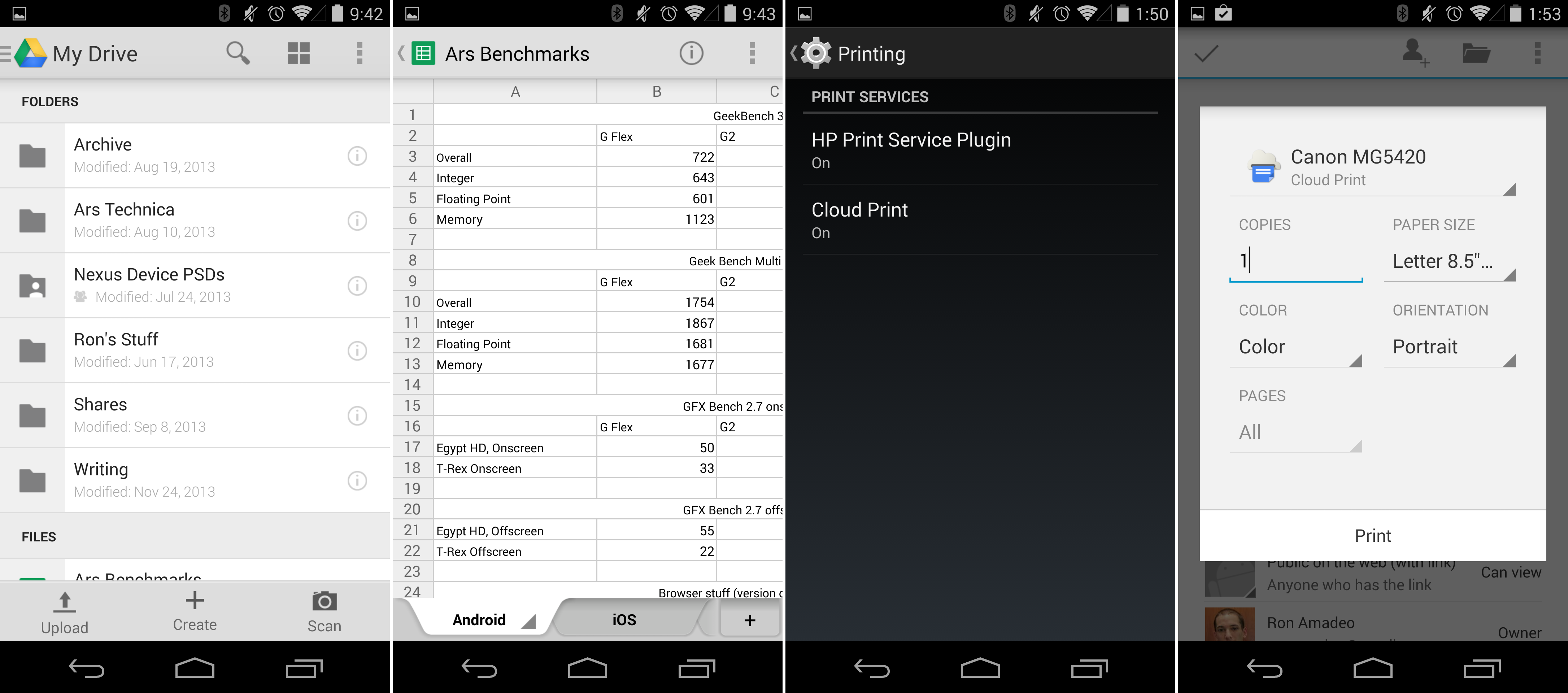 Office stuff: Google Drive, which was now packed in, and the printing support.
Photo by Ron Amadeo
It was amazing it took this long, but in KitKat, Google Drive was finally included as a default app. Drive allowed users to create and edit Google Docs spreadsheets and documents, scan documents with the camera and upload them as PDFs, or view (but not edit) presentations. Drive, by this point, had a great, modern design with a slide-out navigation drawer and a Google Now-style card design.
For even more mobile office fun, KitKat included an OS-level printing framework. At the bottom of the settings was a "Printing" screen, and any printer OEM could make a plugin for it. Google Cloud Print was, of course, one of the first supporters. Once your printer was hooked up to Cloud Print, either natively or through a computer with Chrome installed, you could print to it over the Internet. Apps needed to support the printing framework, too. Pressing the little "i" button on Google Drive would show information about the document and give you the option to print it. Just like a desktop OS, a print dialog would pop up with settings like copies, paper size, and page selection.
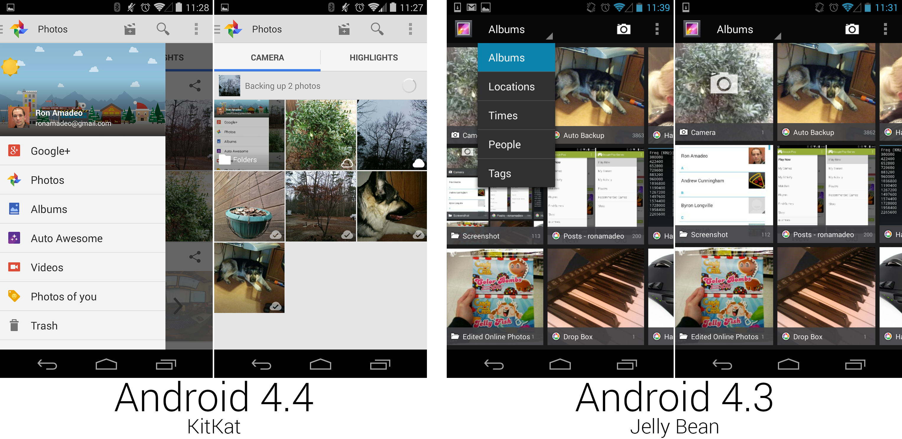 The "Photos" section of the Google+ app, which replaced the Gallery.
Photo by Ron Amadeo
Google+ Photos and the Gallery initially shipped together on the Nexus 5, but in a later build of KitKat on Google Play devices, the Gallery was axed and Google+ completely took over photo duties. The new app changed the photo app from a light theme to a dark theme, and Google+ Photos brought a modern navigation drawer design.
Android had long included an instant upload feature, which would automatically backup all pictures on Google’s cloud storage, first on Picasa and later on Google+. The big benefit of G+ Photos over the Gallery was that it could finally manage those cloud-stored photos. Little cloud icons in the lower right of a photo indicated backup status, and it would fill from right to left to indicate an upload-in-progress. G+ photos brought its own photo editor along with support for a million of other Google+ photo features, like highlights, auto awesome, and, of course, sharing to Google+.
 Tweaks to the Clock app, which added an alarms tab and changed the time input dialog.
Photo by Ron Amadeo
Google changed the excellent time picker that was introduced in 4.2 to this strange clock interface, which was both slower and less precise than the old interface. First you were presented with a one-handed clock which you used to choose the hour, then that clock went away and another one-handed clock allowed you to choose the minute. Having to spin the minute hand or tap a spot on the clock face made it very difficult to pick times in non-five-minute increments. Unlike the old time picker, which required you to pick a time period, this just defaulted to AM (again making it possible to accidentally be off by 12 hours).
Today—Android everywhere
 Photo by Google/Sony/Motorola/Ron Amadeo
What started out as a curious BlackBerry clone from a search engine company became the most popular OS in the world from one of the biggest titans in the tech industry. Android has become Google's de-facto consumer operating system, and it powers phones, tablets, Google Glass, Google TV, and more. Parts of it are even used in the Chromecast. In the future, Google will be bringing Android to watches and wearables with Android Wear, and the Open Automotive Alliance will be bringing Android to cars. Google will be making a renewed commitment to the living room soon, too, with Android TV. The OS is such a core pillar of Google, that events that are supposed to cover company-wide products, like Google I/O, end up becoming Android launch parties.
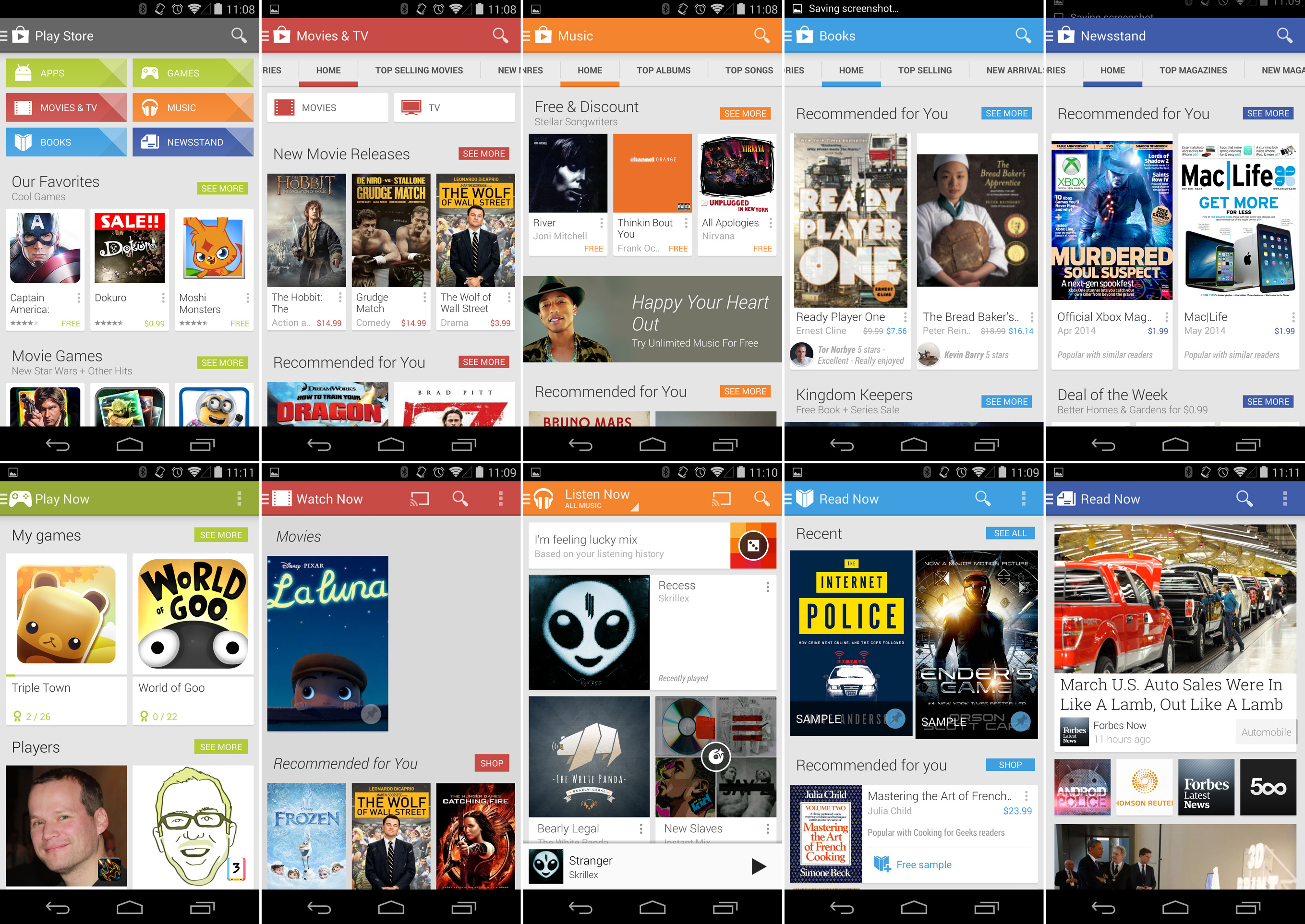 Top row: the Google Play content stores. Bottom row: the Google Play Apps.
Photo by Ron Amadeo
What was once the ugly duckling of the mobile industry has transformed so much it now wins design awards for its user interface. The design of things like Google Now have affected everything the company produces, with even the desktop sites like Search, Google+, YouTube, and Maps getting in on the card design unity. The design keeps evolving as well. Google's next plan is to unify design across not just Android, but all of its products. The goal is to take something like Gmail and make it feel the same, whether you're using it on Android, a desktop browser, or a watch.
Google outsourced so many pieces of Android to the Play Store, that version releases are becoming less and less necessary. Google decided the best way to beat carrier and OEM update issues was to sidestep those roadblocks completely. From here on out, there isn't much left to include in an Android update other than core under-the-hood changes—but even many APIs have been pushed to Google Play Services. If you just look at version releases, it seems like Android development has slowed down from the peak 2.5-month release cycle. But the reality is Google can now continually push out improvements to the Play Store in a never-ending, somewhat subtler stream of updates.
With 1.5 million activations per day, Android has no where to go but up. In the future, Android will be headed from phones and tablets to cars and watches, and the lower system requirements of KitKat will drive phones to even lower prices in the developing world. The bottom line? More and more people will get online. And for many of those people, Android will be not just their phone but their primary computing device. With Android leading the charge for Google in so many areas, the OS that started off as a tiny acquisition has become one of Google's most important products.
Ron Amadeo / Ron is the Reviews Editor at Ars Technica, where he specializes in Android OS and Google products. He is always on the hunt for a new gadget and loves to rip things apart to see how they work.
