9.6 KiB
The history of Android
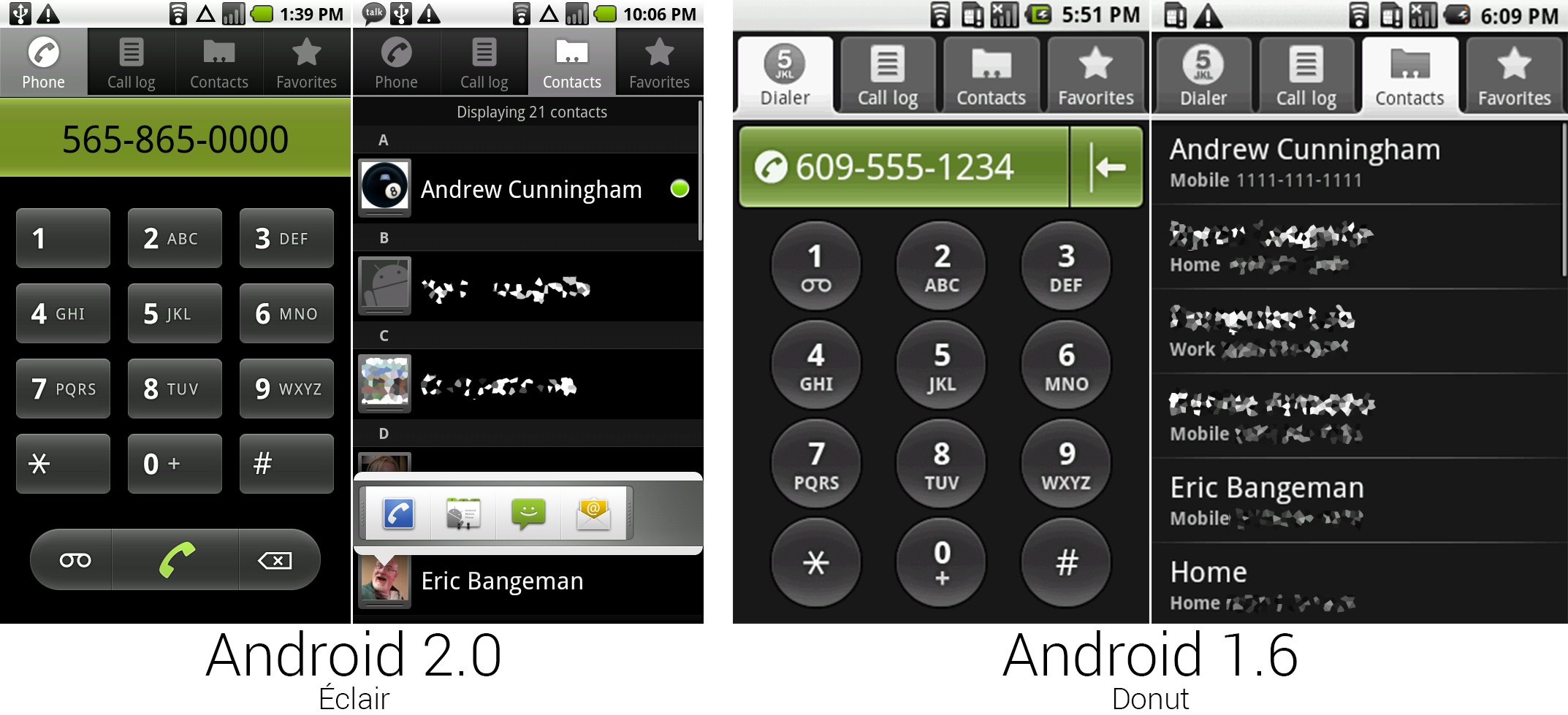 The redesigned Dialer and Contacts pages.
Photo by Ron Amadeo
The rounded tabs in the contacts/dialer app were changed to a sharper, more mature-looking design. The dialer changed its name to "Phone" and the dial pad buttons changed from circles to rounded rectangles. Buttons for voicemail, call, and delete were placed at the bottom. This screen is a great example of Android’s lack of design consistency in the pre-3.0 days. Just on this screen, the tabs used sharp-cornered rectangles, the dial pad used rounded rectangles, and the sides of the bottom buttons were complete circles. It was a grab bag of UI widgets where no one ever tried to make anything match anything else.
One of the new features in Android 2.0 was "Quick Contacts," which took the form of contact thumbnails that were added all over the OS. Tapping on them would bring up a list of shortcuts to contact that person through other apps. This didn't make as much sense in the contacts app, but in something like Google Talk, being able to tap on the contact thumbnail and call the person was very handy.
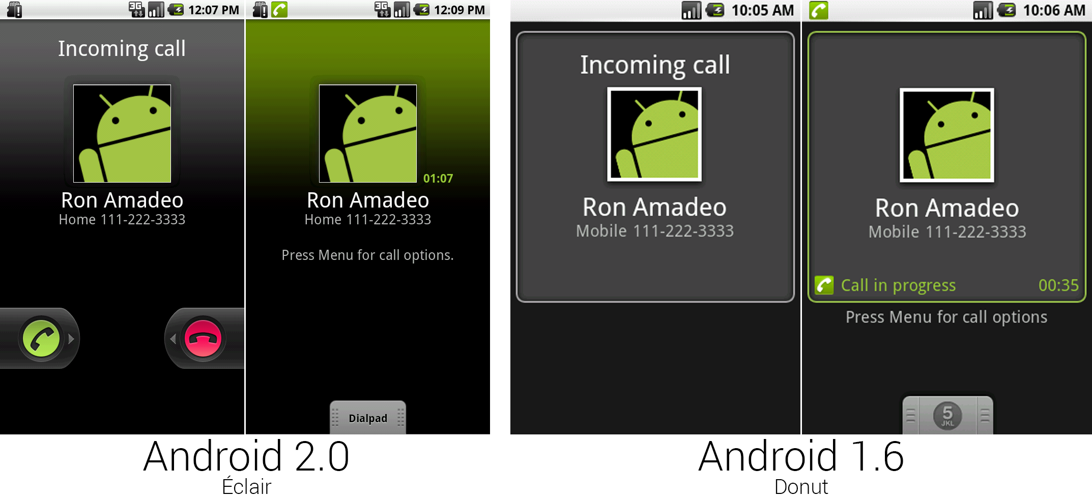
Android 2.0 was finally equipped with all the on-screen buttons needed to answer and hang up a call without needing a hardware button, and the Droid took advantage of this and removed the now-redundant buttons from its design. Android’s solution to accept or reject calls was these left and right pull tabs. They work a lot like slide-to-unlock (and would later be used for slide-to-unlock)—a slide from the green button to the right would answer, and a slide from the red button to the left would reject the call. Once inside a call, it looked a lot like Android 1.6. All the options were still hidden behind the menu button.
Someone completely phoned-in the art for the dialpad drawer. Instead of redrawing the number "5" button from Android 1.6, they just dropped in bold text that said "Dialpad" and called it a day.
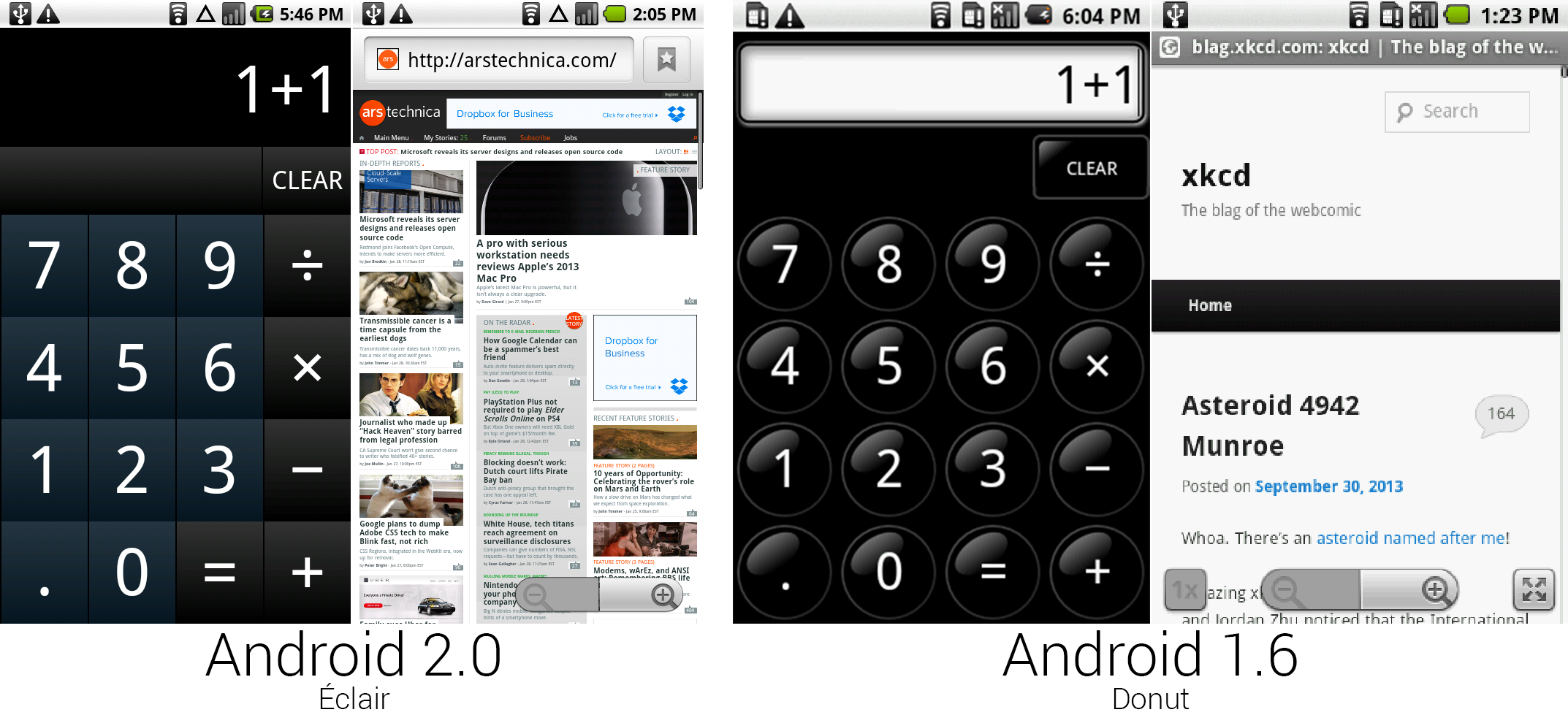 The Calculator and Browser.
Photo by Ron Amadeo
The calculator was revamped for the first time since its introduction in Android 0.9. The black glass balls were replaced with gradiented blue and black buttons. The crazy red on-press highlight of the old calculator was replaced with a more normal looking white outline.
The browser's tiny website name bar grew into a full, functional address bar, along with a button for bookmarks. To save on screen real estate, the address bar was attached to the page, so the bar scrolled up with the rest of the page and left you with a full screen for reading. Android 1.6's unique magnifying rectangle zoom control and its associated buttons were tossed in favor of a much simpler double-tab-to-zoom gesture, and the browser could once again render arstechnica.com without crashing. There still wasn't pinch zoom.
 The camera with the settings drawer open, the flash settings, and the menu over top of the photo review screen.
Photo by Ron Amadeo
The camera app gained an entire drawer on the left side, which opened to reveal a ton of settings. The Motorola Droid was one of the first Android phones with an LED flash, so there was a setting for flash control, along with settings like scene mode, white balance, effects, picture size, and storage location (SD or Internal).
On the photo review screen, Google pared down the menu button options. They were no longer redundant when compared to the on-screen options. With the extra room in the menu, all the options fit in the menu bar without needing a "more" button.
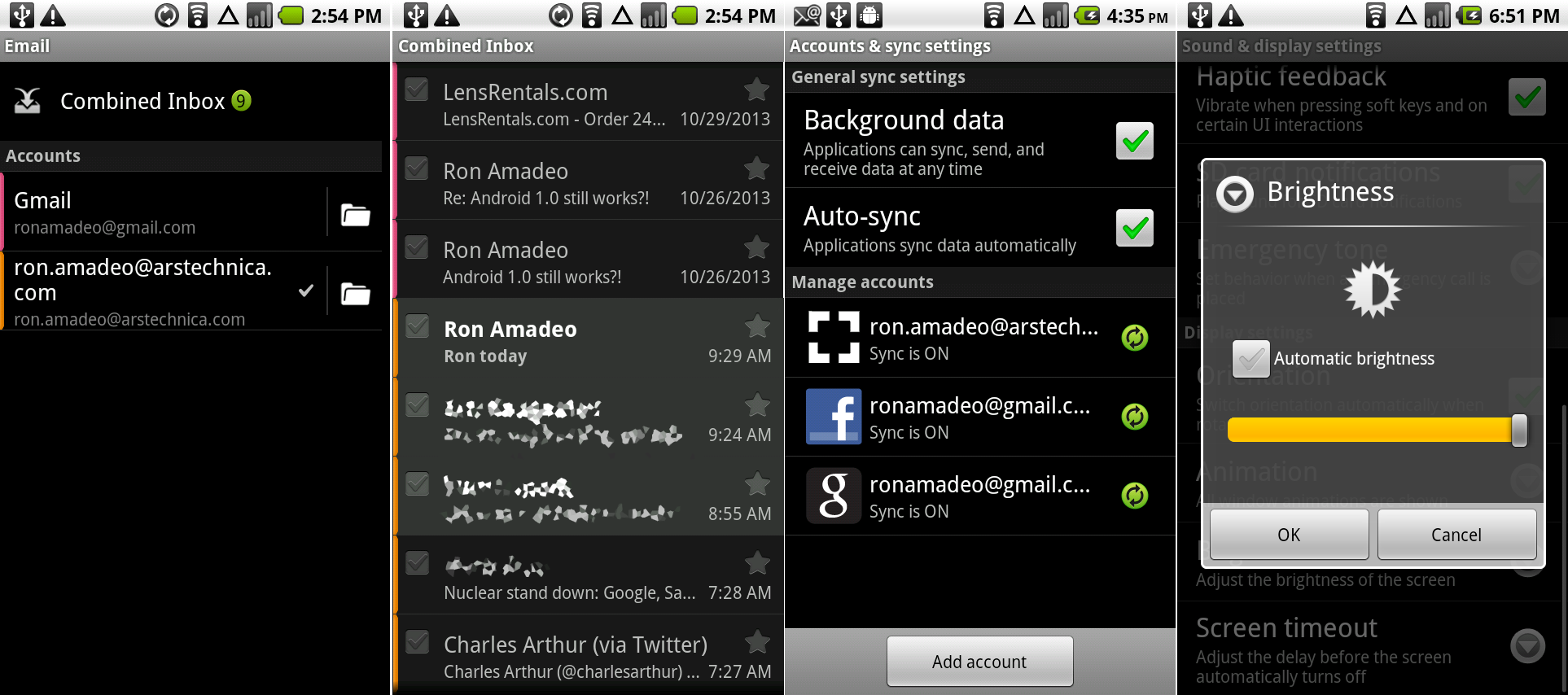 The “accounts" page of the e-mail app, the new combined inbox, the account & sync page from the system settings, and the auto brightness setting.
Photo by Ron Amadeo
The e-mail app got a big functionality boost. The most important of which is that it finally supported Microsoft Exchange. The Android 2.0 version of Email finally separated the inbox and folder views instead of using the messy mashed-together view introduced in Android 1.0. Email even had a unified inbox that would weave all your messages together from different accounts.
The inbox view put the generic Email app on even ground with the Gmail app. Combined inbox even trumped Gmail's functionality, which was an extremely rare occurrence. Email still felt like the unwanted stepchild to Gmail, though. It used the Gmail interface to view messages, which meant the inbox and folders used a black theme, and the message view oddly used a light theme.
The bundled Facebook app had an awesome account sync feature, which would download contact pictures and information from the social network and seamlessly integrate it into the contacts app. Later down the road when Facebook and Google stopped being friends, Google removed this feature. The company said it didn't like the idea of sharing information with Facebook when Facebook wouldn't share information back, thus a better user experience lost out to company politics.
(Sadly, we couldn't show off the Facebook app because it is yet another client that died at the hands of OAuth updates. It's no longer possible to sign in from a client this old.)
The last picture shows the auto brightness control, which Android 2.0 was the first version to support. The Droid was equipped with an ambient light sensor, and tapping on the checkbox would make the brightness slider disappear and allow the device to automatically control the screen brightness.
As the name would imply, Android 2.0 was Google's biggest update to date. Motorola and Verizon brought Android a slick-looking device with tons of ad dollars behind it, and for a time, “Droid" became a household name.
The Nexus One—enter the Google Phone
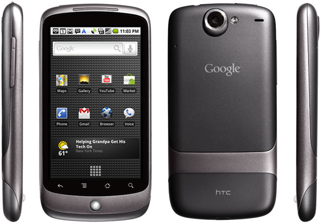
In January 2010, the first Nexus device launched, appropriately called the "Nexus One". The device was a huge milestone for Google. It was the first phone designed and branded by the company, and Google planned to sell the device directly to consumers. The HTC-manufactured Nexus One had a 1GHz, single-core Qualcomm Snapdragon S1 SoC, 512MB of RAM, 512MB of storage, and a 3.7-inch AMOLED display.
The Nexus One was meant to be a pure Android experience free of carrier meddling and crapware. Google directly controlled the updates. It was able to push software out to users as soon as it was done, rather than having to be approved by carriers, who slowed the process down and were not always eager to improve a phone customers already paid for.
Google sold the Nexus One directly over the Web, unlocked, contract-free, and at the full retail price of $529.99. While the Nexus One was also sold at T-Mobile stores on-contract for $179.99, Google wanted to change the way the cell phone industry worked in America with its online store. The idea was to pick the phone first and the carrier second, breaking the control the wireless oligarchy had over hardware in the United States.
Google's retail revolution didn't work out though, and six months after the opening on the online phone store, Google shut the service down. Google cited the primary problem as low sales. In 2010, Internet shopping wasn't the commonplace thing it is today, and consumers weren't ready to spend $530 on a device they couldn’t first hold in their hands. The high price was also a limiting factor; smartphone shoppers were more used to paying $200 up front for devices and agreeing to a two-year contract. There was also the issue of the Motorola Droid, which came out only three months earlier and was not significantly slower. With the Droid’s huge marketing campaign and "iPhone Killer" hype, it already captured much of the same Android enthusiast market that the Nexus One was gunning for.
While the Nexus One online sales experiment could be considered a failure, Google learned a lot. In 2012, it relaunched its online store as the "Devices" section on Google Play.
Ron Amadeo / Ron is the Reviews Editor at Ars Technica, where he specializes in Android OS and Google products. He is always on the hunt for a new gadget and loves to rip things apart to see how they work.
