16 KiB
The history of Android
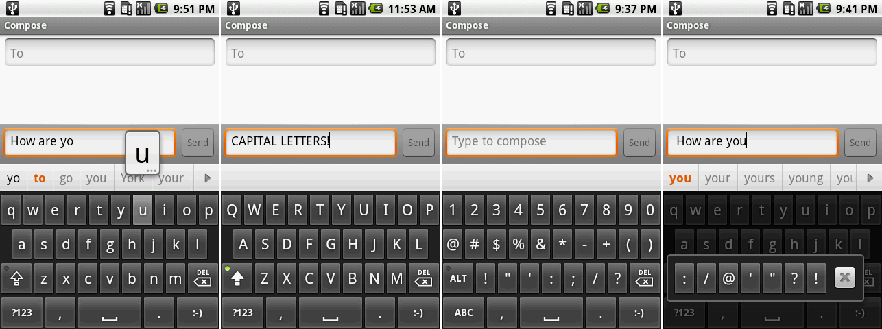 Android 1.5’s on-screen keyboard showing the suggestion bar while typing, the capital letters keyboard, the number and symbols screen, and an additional key popup.
Photo by Ron Amadeo
Android 1.5, Cupcake—a virtual keyboard opens up device design
In April 2009, almost three months after the release of 1.1, Android 1.5 was released. It was the first Android version to have a public, marketed code name: Cupcake. From here on out, Android releases would have alphabetical, snack-themed names.
The most important Cupcake addition was easily the on-screen keyboard. For the first time, it was possible for OEMs to build a slate-style Android device without a thousand hardware keyboard keys and a complicated slide mechanism.
Android's key labels could switch between uppercase and lowercase, depending on if caps lock was on or not. While it was off by default, there was an option to turn on the suggestion bar, which appeared along the top edge of the keyboard. Keys with ellipses in the popup, like the "u," above, could be held down to input diacritical marks, which would display in a popup. The keyboard could switch to numbers and alternate characters, and long pressing on the period key would bring up even more punctuation.
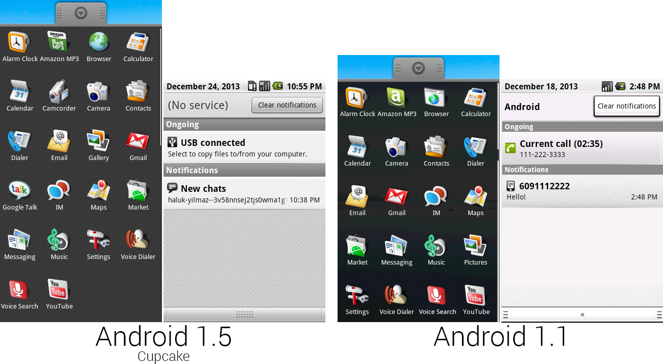 Composite images of the app lineup in 1.5 and 1.1 and the notification panels from each version.
Photo by Ron Amadeo
New icons were added for the new "Camcorder" functionality, and Google Talk was broken out from IM into its own separate app. The Amazon MP3 and Browser icons were redesigned, too. The Amazon MP3 icon was changed primarily because Amazon was planning on launching other Android apps soon, and the "A" icon was far too generic. The browser icon was easily the worst in Android 1.1, so it was changed and no longer resembled a desktop OS dialog box. The last app drawer change was to "Pictures," which was renamed to "Gallery."
The notification panel was redesigned again as well. The panel background got a weave texture, and the gradients on notifications were smoothed out. Android 1.5 had a lot of little design changes to core OS pieces that affected all apps. On the "Clear notifications" button, you could see the new system-wide button style, which had a gradient, a thinner outline, and less shadowing than the old version.
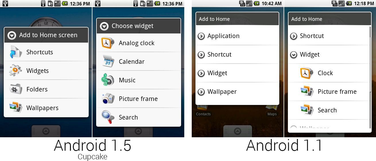 The “Add to Home" dialog boxes in 1.5 and 1.1.
Photo by Ron Amadeo
Third-party widgets were another headline feature of Cupcake, and they still remain one of Android's defining features. Developers could bundle a home screen widget along with their apps that would either control or display information from that app. Google showed off a few new widgets of its own, too, with the Calendar and Music apps.
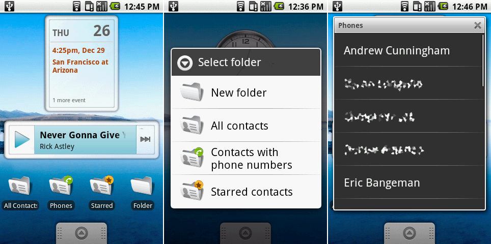 Left: a screenshot of the calendar widget, music widget, and a row of live folders. Center: the folder list. Right: an open view of the “contacts with phone numbers" live folder.
Photo by Ron Amadeo
On the left screenshot, above, you can see the new Calendar and Music icons. The Calendar widget could only show a single event for the day, and tapping it would open the calendar. It wouldn't let you choose what calendars to display, and widgets weren't resizable—it only ever looked like this. The music widget was blue—despite the music app not having a drop of blue in it—and showed the song and artist name, along with play and next buttons.
Also in the left shot, the first three folders on the bottom row were a new feature called "Live Folders." These were accessible under the new top-level "Folders" section in the "Add to Home" menu, which you can see in the center picture. Live Folders showed the content of an application without having to open that application. The ones that came with Cupcake were all contacts-related, showing all of the user's contacts, contacts with phone numbers, or starred contacts.
Rather than icons, Live Folders used a simple list view that popped up over the home screen. Contacts were just for starters, Live Folders was a whole API that developers could use. Google demoed a folder of books from the Google Books app, and it was possible to have an RSS feed or top stories from a website as a live folder. Live folders were one of the few Android ideas that didn't work out, and the feature was shut down in Honeycomb.
 The camcorder and camera UI, with on-screen shutter buttons.
Photo by Ron Amadeo
If you couldn't tell from the new "Camcorder" icon, video recording was added to Android in 1.5. The two icons, camera and camcorder, were actually the same app, and you could jump between the two of them with an option in the menu labeled "Switch to camera" and "Switch to camcorder." Video quality on the T-Mobile G1 was not that great. A test video on "High" quality output; a .3GP video file with a resolution of 352 x 288 and a lagtastic frame rate of 4 FPS.
Along with the new video feature, the Camera app saw a few much-needed UI tweaks. A thumbnail in the top left showed the last picture that was taken, and tapping on it would jump to the camera roll in the Gallery. The circle icon on the top right of both screens was an on-screen shutter button, meaning that, post 1.5, Android devices no longer required a hardware camera button.
This interface was actually much closer to the Android 4.2 design than many of the subsequent camera apps. While later designs would add silly leather textures and more controls to the camera, Android went back to basics with later designs, and that 4.2 redesign shares a lot in common with this. What was a primitive layout in Android 1.5 became a minimal, full-screen viewfinder in Android 4.2.
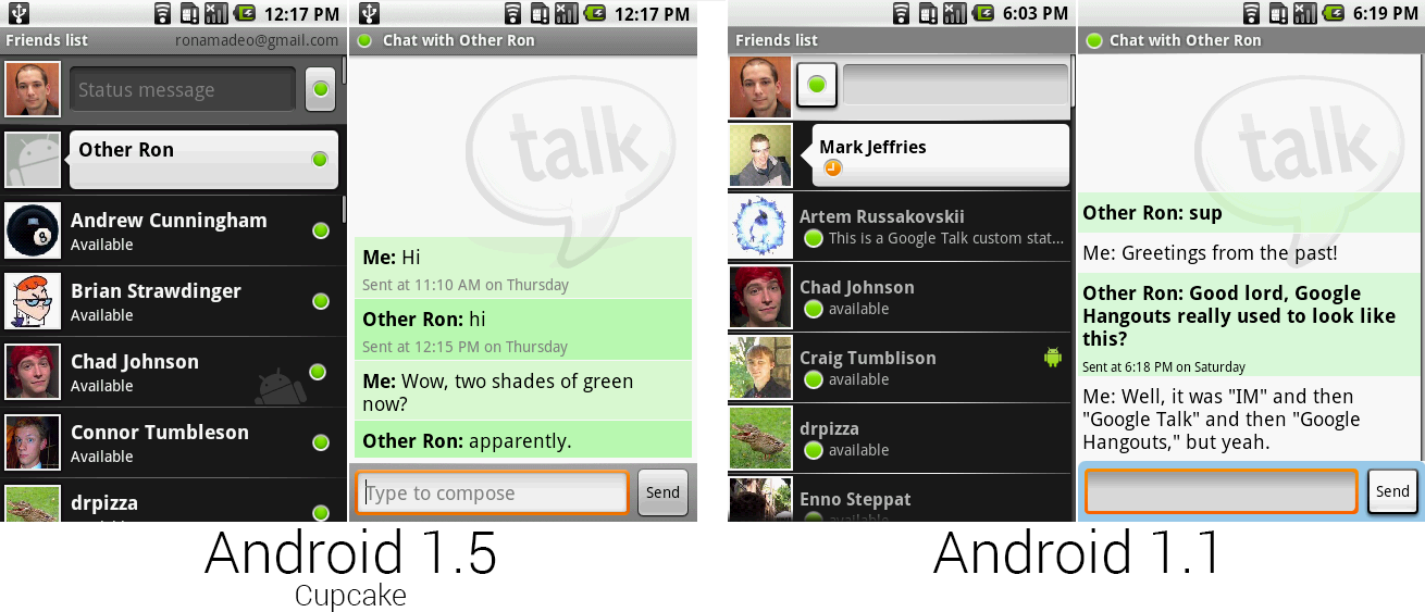 Google Talk running in the Google Talk app versus Google Talk running in the IM app.
Photo by Ron Amadeo
Android 1.0's IM app was used for Google Talk functionality, but in Android 1.5, Google Talk was broken off into its own app. Support for it in the IM app was removed. Google Talk (above, left) was clearly based on the IM app (above, right), but as soon as the stand alone app was released in 1.5, work on the IM app was abandoned.
The new Google Talk app had a redesigned status bar, presence lights on the right side, and a redesigned mobile icon, which was a gray monogram of the bugdroid. The blue compose bar switched to a more sensible gray in the chat view, and the message backgrounds changed from light green and white to light green and green. With a stand alone app, Google could add Gtalk-only features like chatting "off the record," which would stop Gmail from saving a copy of every chat.
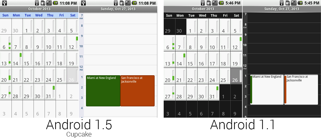 The calendar in Android 1.5 got a lot lighter.
Photo by Ron Amadeo
The calendar dumped the ugly white squares on a black background and changed to an all-light app. The background of everything became white, and day-of-the-week headers were changed to blue. The individual appointment blocks switched from a small color strip to entirely colored, and the text changed to white. This will be the last time the calendar is touched for a long time.
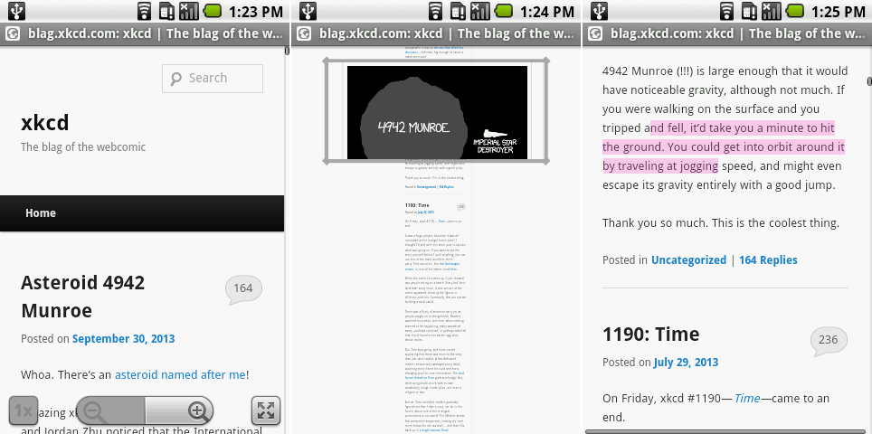 From left to right: the browser’s new controls, the zoomed-out magnifying view, and highlighting text for copy/pasting.
Photo by Ron Amadeo
Android 1.5 changed the zoom controls system-wide. Instead of two big circles, the zoom controls became two halves of a rectangle with rounded corners. These new controls applied to the browser, Google Maps, and the gallery.
The browser had lots of work done on the zoom functionality. After zooming in or out, the "1x" button would return you to the standard zoom level. The button in the bottom right corner would zoom all the way out of the page and display a magnifying rectangle over the page, which you can see in the center image. Grabbing the rectangle and releasing it would zoom that part of the page to a "1x" view. Android didn't have acceleratable scrolling, which made the max scrolling speed pretty slow—this was Google's solution for navigating a long webpage.
Another addition to the browser was the ability to copy text on a webpage—previously you could only copy text from an input box. Selecting "copy text" from the menu would activate highlight mode, and dragging your finger over text in a Web page would highlight it. The G1’s trackball was very handy for super-precise movement like this and could control the mouse cursor. There were no draggable handles, and as soon as you lifted your finger off the screen, Android would copy the text and remove the highlight, so you had to be ridiculously precise to get any use out of the copy feature.
The browser in Android 1.5 would crash a lot—much more than in previous versions. Just viewing Ars Technica in desktop mode would crash the browser, as did many other sites.
The default lock screen and pattern lock screen both changed their empty, black backgrounds to the same wallpaper as the home screen.
The lighter background on the pattern unlock screen revealed the sloppy job Google did on the alignment of the circles. The white circles were nowhere near centered inside the black circles—basic alignment issues like this continued to be a frequent problem for Android in these early days.
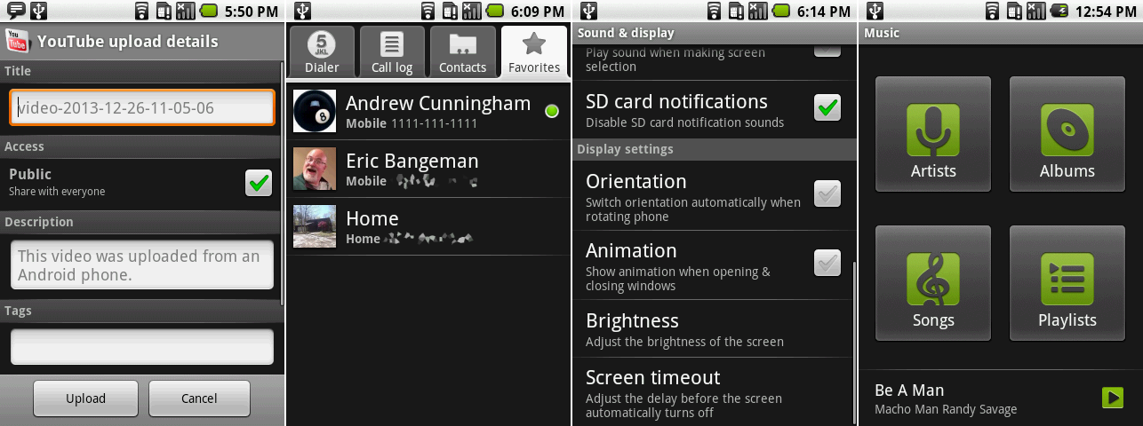 The YouTube uploader, contacts thumbnails, the auto rotate setting, and the new music design.
Photo by Ron Amadeo
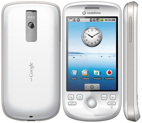 The HTC Magic, the second Android device, and the first without a hardware keyboard.
Photo by HTC
Google Maps is the first built-in app to hit the Android Market
While this article is (mostly) organizing app updates by Android version for simplicity's sake, there are a few outliers that deserve special recognition. On June 14, 2009, Google Maps was the first packed-in Android app to be updated via the Android Market. While every other app required a full system release to be updated, Maps was broken out of the OS, free to receive out-of-cycle updates whenever a new feature was ready.
Moving apps out of the core OS and onto the Android Market would be a big focus for Google going forward. In general, OTA updates were a big initiative—they required the cooperation of the OEM and the carrier, both of which could drag their feet. Updates also didn’t make it to every device. Today, the Android Market gives Google a direct line to every Android phone with no such interference from outside parties.
These were problems for a later date, though. In 2009, Google had only two unskinned phones to support, and the early Android carriers were seemingly responsive to Google’s update needs. This early move would prove to be a very proactive decision on Google’s part. At first, the company went this route only with its most important properties—Maps and Gmail—but later it would port the majority of the packed-in apps to the Android Market. Later initiatives like Google Play Services even brought app APIs out of the OS and into Google’s store.
As for the new Maps at the time, it gained a new directions interface, along with the ability to give mass transit and walking directions. For now, directions were given on a plain black list—turn-by-turn-style navigation would come later.
June 2009 was also the time Apple launched the third iPhone—the 3GS—and the third version of iPhone OS. iPhone OS 3's headline features were mostly catch-up items like copy/paste and MMS support. Apple's hardware was still nicer, and the software was smoother, more cohesive, and better designed. Google's insane pace of development was putting it on a path to parity though. iPhone OS 2 launched just before the Milestone 5 build of Android 0.5, which makes five Android releases in the span of the yearly iOS release cycle.
Android 1.5 gave the YouTube app the ability to upload videos to the site. Uploading was accomplished by sharing a video from the Gallery to the YouTube app, or by opening a video directly from the YouTube app. This would bring up an upload screen, where the user would set things like the video title, tags, and access rights. Photos could be uploaded to Picasa, Google's original photo site, in a similar fashion.
There were little tweaks all over the OS. Favorite contacts now showed a picture in the contacts list (although regular contacts were still pictureless). The third picture shows the new auto-rotate option in the settings—this was also the first version to support automatically switching orientations based on readings from the devices’ internal sensors.
Cupcake did a great job of improving Android, particularly in terms of hardware options. The on-screen keyboard meant a hardware keyboard was no longer necessary. Auto rotate brought the OS a little closer to the iPhone, and an on-screen camera shutter button meant that hardware camera buttons were now optional, too. Shortly after the release of 1.5, a second Android device came out that would show the future direction of the platform: the HTC Magic. The Magic (right) didn’t have a hardware keyboard or a camera button. It was a solid, slider-less slate device that relied on Android’s on-screen buttons to get the job done.
Android flagships started with the most buttons possible—a hardware qwerty phone—and slowly began whittling the button count down over time. While the Magic was a big step, eliminating an entire keyboard and a camera button, it still used start and end call buttons, four system buttons, and a trackball.
Ron Amadeo / Ron is the Reviews Editor at Ars Technica, where he specializes in Android OS and Google products. He is always on the hunt for a new gadget and loves to rip things apart to see how they work.
via: http://arstechnica.com/gadgets/2014/06/building-android-a-40000-word-history-of-googles-mobile-os/8/
