9.9 KiB
The history of Android
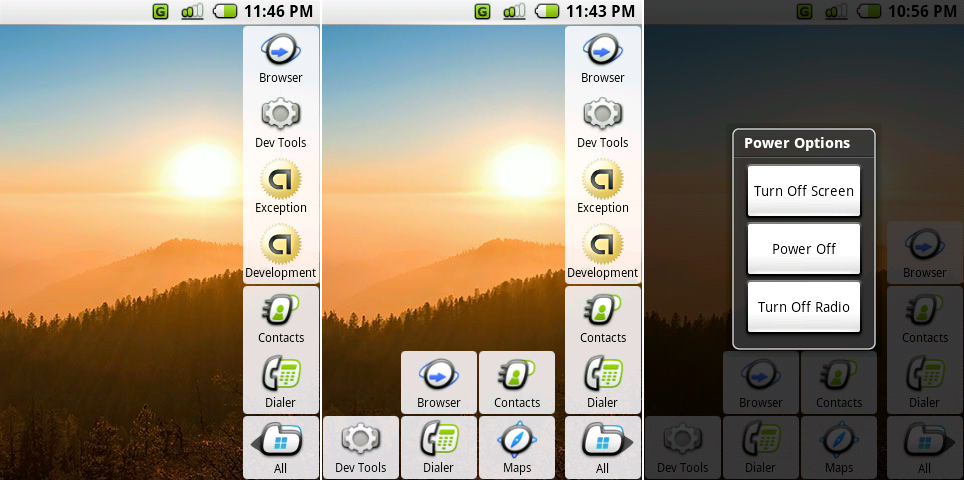 Left: the Milestone 5 home screen showing the “all" button, two dock icons, and four recent apps. Center: the home screen with the app list open. Right: the power menu.
Photo by Ron Amadeo
Android 0.5, Milestone 5—the land of scrapped interfaces
The first major Android change came three months after the first emulator release: the "m5-rc14" build. Released in February 2008, “Milestone 5" dumped the stretched-out BlackBerry interface and went with a totally revamped design—Google's first attempt at a finger-friendly interface.
This build was still identified as "Android 0.5" in the browser user agent string, but Milestone 5 couldn't be more different from the first release of Android. Several core Android features can directly trace their lineage back to this version. The layout and functionality of the notification panel was almost ready to ship, and, other than a style change, the menu was present in its final form, too. Android 1.0 was only eight months away from shipping, and the basics of an OS were starting to form.
One thing that was definitely not in its final form was the home screen. It was an unconfigurable, single-screen wallpaper with an app drawer and dock. App icons were bubbly, three-color affairs, surrounded by a square, white background with rounded corners. The app drawer consisted of an "All" button in the lower-right corner, and tapping on it expanded the list of apps out to the left. Above the "All" button was a two icon dock where "Contacts" and "Dialer" were given permanent home screen real estate. The four blocks above that were an early version of Recent Apps, showing the last apps accessed. With no left or right screens and a whole column taken up by the dock and recent apps, this layout only allowed for 21 app squares before the screen would be filled. The emulator still only sported the bare-minimum app selection, but in an actual device, this design didn't appear like it would work well.
Holding down the "end call" button brought up a super early version of the power menu, which you can see in the rightmost picture. Google didn't have the normal smartphone nomenclature down yet: "Turn Off Screen" would best be described as "Lock screen" (although there was no lock screen) and "Turn Off Radio" would be called "Airplane mode" today.
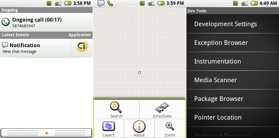 From left to right: the surprisingly modern notification panel, the menu open in Google Maps (Maps doesn't work anymore), and the new finger-friendly list view.
Photo by Ron Amadeo
All the way back in Milestone 5, Google had the basics of the notification panel nailed down. It pulled down from the top of the screen just like it does on any modern smartphone. Current notifications displayed in a list. The first version of the notification panel was an opaque white sheet with a ribbed “handle" on the bottom and an orange dot in the center. Notifications were pressable, opening the appropriate app for that notification. No one bothered to vertically align the app icons in this list, but that's OK. This was gone in the next update.
Sticky notifications went into an "ongoing" section at the top of the panel. In this build, that seemed to only include phone calls. The "Latest Event" notifications were clearable only after opening the appropriate app. Users surprisingly managed to sign in to Google Talk over the built-in XMPP connection. But while the notification panel displayed "new chat message," there wasn't actually an instant messaging app.
The artwork in Milestone 5 was all new. The app icons were redrawn, and the menu switched from a boring BlackBerry-style text list to full-color, cartoony icons on a large grid. The notification panel icons switched from simple, sharp, white icons to a bubbly green design. There was now a strange black line under the signal bar indicator with no apparent purpose. The tiny list view from earlier builds really wasn't usable with a finger, so Milestone 5 came with an overall beefier layout.
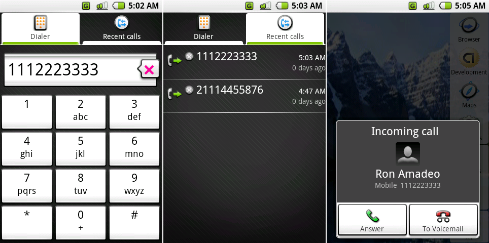 The dialer, recent calls, and an incoming call.
Photo by Ron Amadeo
M5 was the first build to have a dialer, albeit a fairly ugly one. Numbers were displayed in a gradient-filled bar containing a bizarre speech-bubble-styled backspace button that looked like it was recycled from some other interface. Alignment issues were everywhere. The numbers on the buttons weren't vertically aligned correctly, and the “X" in the backspace button wasn’t aligned with the speech bubble. You couldn't even start a call from the dialer—with no on-screen “dial" button, a hardware button was mandatory.
Milestone 5 had a few tabbed interfaces, all of which demonstrated an extremely odd idea of how tabs should work. The active tab was white, and the background tabs were black with a tiny strip of white at the bottom. Were background tabs supposed to "shrink" downward? There was no animation when switching tabs. It wasn't clear what the design tried to communicate.
Recent Calls, shown in the second picture, was downgraded from a top-tier app to a tab on the dialer. It ditched the crazy crosshair UI from earlier builds and, thanks to the chunkier list view, now displayed all the necessary information in a normal list.
Unlike the dialer, the incoming call screen had on-screen buttons for answering and ending a call. Bizarrely, the incoming call screen was stuck to the bottom of the display, rather than the top or center. It was possibly left over from the old 4:3 BlackBerry screens.
 An active call, the disabled touchscreen error message, and the call screen with a second call on hold.
Photo by Ron Amadeo
The in-call interface looked normal but made zero sense in practice. Today, to stop your face from pressing buttons while on a call, phones have proximity sensors that turn the screen off when the sensor detects something. Milestone 5 didn’t support proximity sensors, though. Google’s haphazard solution was to disable the entire touch screen during a call. At the same time, the in-call screen was clearly overhauled for touch. There were big, finger-friendly buttons; you just couldn't touch anything.
M5 featured a few regressions here from the old Milestone 3 build. Many decent-looking icons from the old interface were replaced with text. Buttons like "mute" no longer offered on-screen feedback that they were active. Merging calls was cut completely.
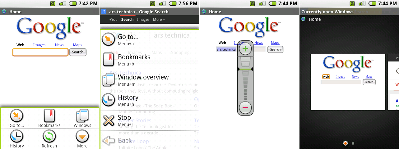 The browser’s primary menu, the browser’s secondary menu, the crazy zoom control, and the window interface.
Photo by Ron Amadeo
The browser menu got the usual touch overhaul, and for the first time a "more" button appeared. It functioned as an extra menu for your menu. Rather than turning the 3x2 grid into a 3x4 grid, Milestone 5 (and many successive versions of Android) used a long, scrolling list for the additional options. Pinch zoom wasn't supported (supposedly a concession to Apple), so Android went with the ridiculous looking zoom control in the third picture above. Rather than something sensible like a horizontal, bottom-aligned zoom control, Google stuck it smack in the middle of the screen. The last picture shows the Browser’s "window" interface, which allowed you to open multiple webpages and semi-easily switch between them.
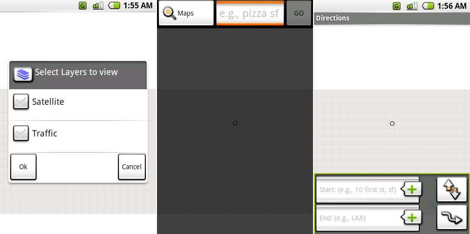 Google Maps’ layers section screen, search interface, and directions screen.
Photo by Ron Amadeo
Google Maps still didn't work, but the little UI we accessed saw significant updates. You could pick map layers, although there were only two to choose from: Satellite and Traffic. The top-aligned search interface strangely hid the status bar, while the bottom-aligned directions didn't hide the status bar. Direction's enter button was labeled with "Go," and Search's enter button was labeled with a weird curvy arrow. The list goes on and demonstrates old school Android at its worst: two functions in the same app that should look and work similarly, but these were implemented as complete opposites.
Ron Amadeo / Ron is the Reviews Editor at Ars Technica, where he specializes in Android OS and Google products. He is always on the hunt for a new gadget and loves to rip things apart to see how they work.
via: http://arstechnica.com/gadgets/2014/06/building-android-a-40000-word-history-of-googles-mobile-os/2/
