mirror of
https://github.com/LCTT/TranslateProject.git
synced 2025-01-16 22:42:21 +08:00
75 lines
8.5 KiB
Markdown
75 lines
8.5 KiB
Markdown
The history of Android
|
||
================================================================================
|
||

|
||
Android 0.9 showing off a horizontal home screen—a feature that wouldn’t make it to later versions.
|
||
Photo by Ron Amadeo
|
||
|
||
While it's hard to separate emulator and OS functionality, Android 0.9 was the first version to show off horizontal support. Surprisingly, almost everything supported horizontal mode, and 0.9 even outperforms KitKat in some respects. In KitKat, the home screen and dialer are locked to portrait mode and cannot rotate. Here, though, horizontal support wasn't a problem for either app. (Anyone know how to upgrade a Nexus 5 from KitKat to 0.9?)
|
||
|
||
This screenshot also shows off the new volume design used in 0.9. It dumped the old bell-style control that debuted in Milestone 3. It was a massive, screen-filling interface. Eventually, the redesign in Android 4.0 made it a bit smaller, but it remained an issue. (It's extremely annoying to not be able to see a video just because you want to bump up the volume.)
|
||
|
||
|
||
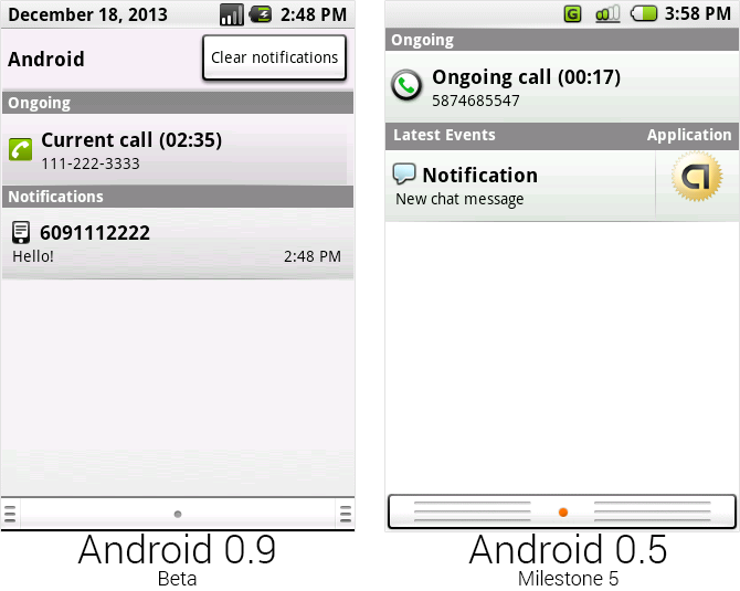
The new notification panel, which ditched the application shortcut and added a top section.
|
||
Photo by Ron Amadeo
|
||
|
||
In just about every Android version, the notification panel gets tweaked, and 0.9 was no exception. The battery indicator was redrawn and changed to a darker shade of green, and the other status bar icons switched to black, white, and gray. The left area of the status bar was brilliantly repurposed to show the date when the panel was open.
|
||
|
||
A new top section was added to the notification panel that would display the carrier name ("Android" in the case of the emulator) and a huge button labeled "Clear notifications," which allowed you to finally remove a notification without having to open it. The application button was canned and replaced with the time the notification arrived, and the "latest events" text was swapped out for a simpler "notifications." The empty parts of the panel were now gray instead of white, and the bottom gripper was redesigned. The pictures seem misaligned on the bottom, but that was because Milestone 5's notification panel had white space around the bottom of the panel. Android 0.9 goes all the way to the edge.
|
||
|
||
|
||
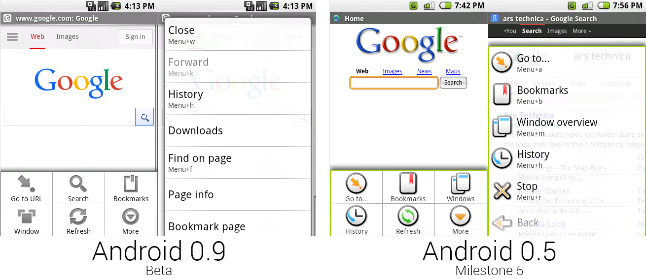
The browsers of 0.9 and 0.5, showing the new, colorless menus.
|
||
Photo by Ron Amadeo
|
||
|
||
The browser now loaded an actual website for the home page instead of the locally stored faux-Google of Milestone 5. The WebKit version rose up to 525.10, but it didn't seem to render the modern Google.com search button correctly. All throughout Android 0.9, the menu art from Milestone 5 was trashed and redrawn as gray icons. The difference between these screens is pretty significant, as all the color has been sucked out.
|
||
|
||
The "more" list-style menu grew a little taller, and it was now just a plain list with no icons. Android 0.9 gained yet another search method, this time in the browser menu. Along with the home screen widget, home screen menu button, and browser homepage, that made four search boxes. Google never hid what its prime business was, even in its OS.
|
||
|
||
|
||
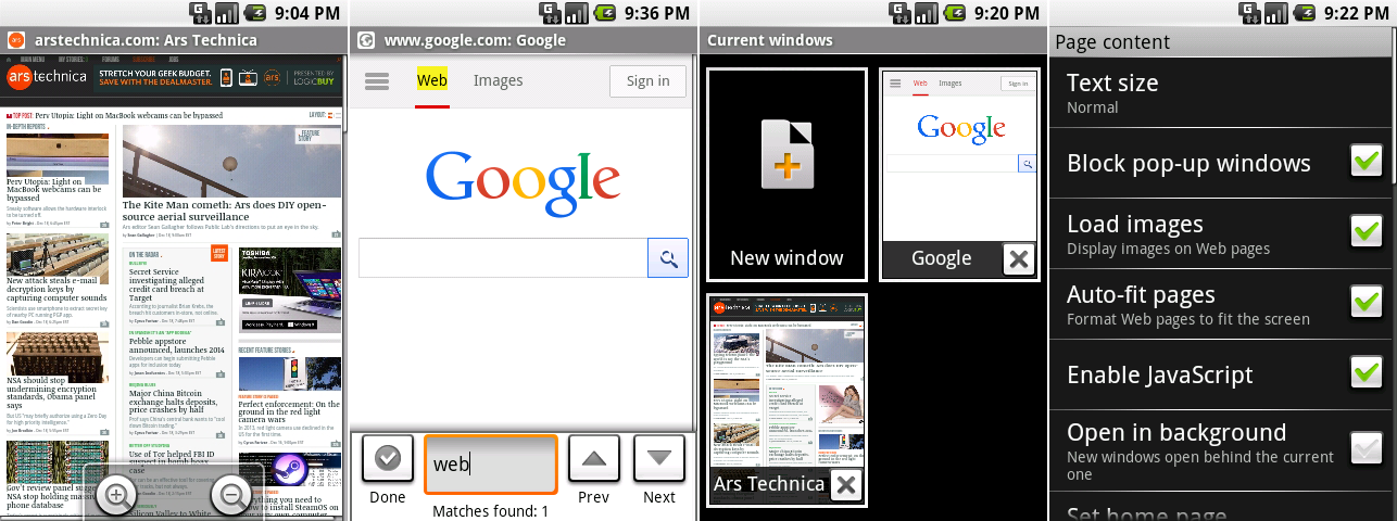
From left to right: Android 0.9’s browser showing off the zoom controls, find-in-page interface, browser windows, and the settings.
|
||
Photo by Ron Amadeo
|
||
|
||
Android 0.9 brought tons of browser improvements. The zoom controls were thankfully reworked from the crazy vertical controls to simpler plus and minus buttons. Google made the common-sense decision of moving the controls from the center of the screen to the bottom. In these zoom controls, the Android struggle with consistency became apparent. These appeared to be the only round buttons in the OS.
|
||
|
||
0.9's new "find in page" feature could highlight words in the page. But overall, the UI was still very rough—the text box was much taller than it should be, and the "done" button with a checkbox was a one-of-a-kind icon for this screen. "Done" was basically a "close" button, which means it should probably have been a right-aligned "X" button.
|
||
|
||
The main OS didn't have a settings screen in this build, but the browser finally had its own settings screen. It featured desktop-style options for pop ups, javascript, privacy and cookies, saved passwords and form data. There was even Google Gears integration (remember [Google Gears?][1]).
|
||
|
||
|
||
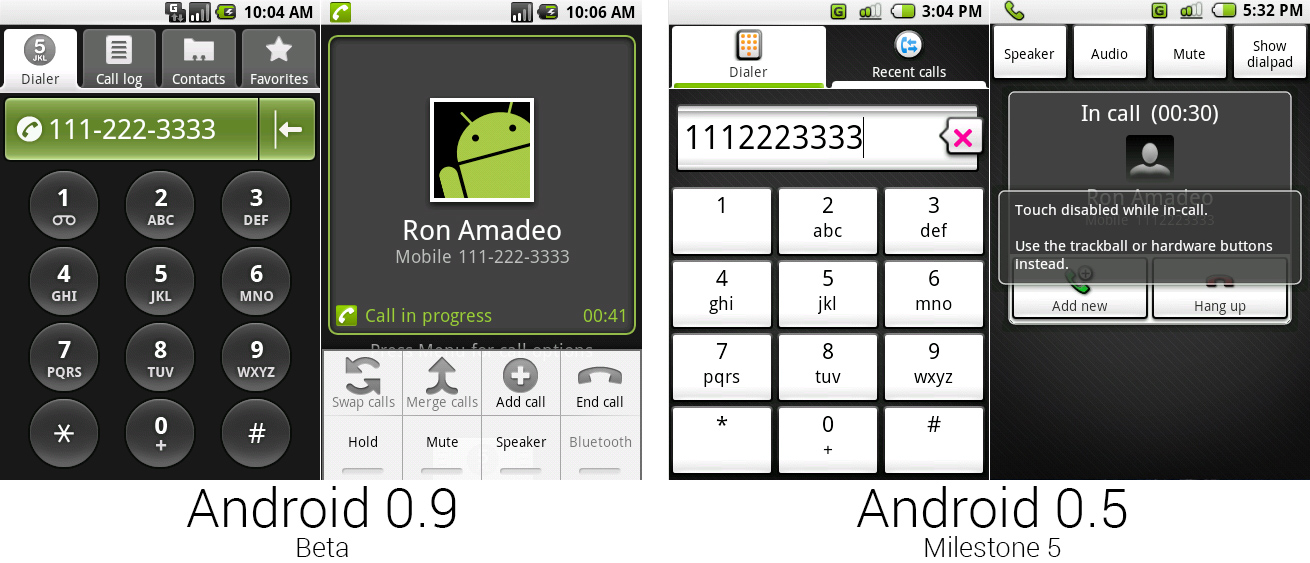
The dialer and in-progress call screen with the menu open.
|
||
Photo by Ron Amadeo
|
||
|
||
Dialer and Contacts in Android 0.9 were actually the same app—the two icons just opened different tabs. Attaching contacts to the dialer like this suggested the primary purpose of a smartphone contact was still for calls, not to text, e-mail, IM, or look up an address. Eventually Google would fully embrace alternative smartphone communications and split up contacts and dialer into separate apps.
|
||
|
||
Most of the dialer weirdness in Milestone 5 was wiped out in Android 0.9. The "minimizing" tabs were replaced with a normal set of dark/light tabs. The speech bubble backspace button was changed to a normal backspace icon and integrated into the number display. The number buttons were changed to circles despite everything else in the OS being a rounded rectangle (at least the text was vertically aligned this time). The company also fixed the unbalanced "one," "star," and "pound" keys from Milestone 5.
|
||
|
||
Tapping on the number display in Android 0.9 would start a call. This was important, as it was a big step in getting rid of the hardware "Call" and "End" keys on Android devices. The incoming call screen, on the other hand, went in the complete opposite direction and removed the on-screen “Answer" and “Decline" buttons present in Android 0.5. Google would spend the next few versions fumbling around between needing and not needing hardware call buttons on certain screens. With Android 2.0 and the Motorola Droid, though, call buttons were finally made optional.
|
||
|
||
All of the options for the in-call screen were hidden under the menu button. Milestone 5 didn't support a proximity sensor, so it took the brute force route of disabling the touch screen during a call. 0.9 was developed for the G1, which had a proximity sensor. Finally, Google didn't have to kill the touch sensor during a call.
|
||
|
||
|
||
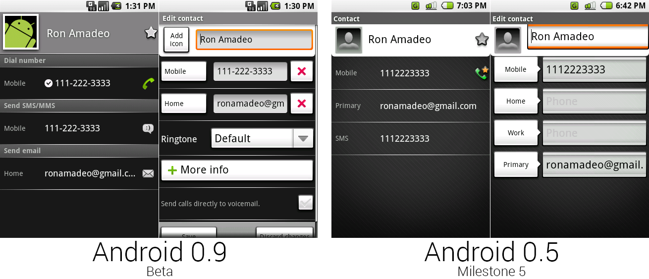
The individual contacts screen and edit contacts screen for Android 0.9 and 0.5.
|
||
Photo by Ron Amadeo
|
||
|
||
Milestone 5 had confusing labels for some contact information, like e-mail only being labeled "primary" instead of something like “primary e-mail." Android 0.9 corrected this with horizontal headers for each section. There were now action icons for each contact type on the left side, too.
|
||
|
||
The edit contact screen was now a much busier place. There were delete buttons for every field, per-contact ringtones, an on-screen "more info" button for adding fields, a checkbox to send calls directly to voicemail, and "Save and "discard changes" buttons at the bottom of the list. Functionally, it was a big improvement over the old version, but it still looked very messy.
|
||
|
||
----------
|
||
|
||

|
||
|
||
[Ron Amadeo][a] / Ron is the Reviews Editor at Ars Technica, where he specializes in Android OS and Google products. He is always on the hunt for a new gadget and loves to rip things apart to see how they work.
|
||
|
||
[@RonAmadeo][t]
|
||
|
||
--------------------------------------------------------------------------------
|
||
|
||
via: http://arstechnica.com/gadgets/2014/06/building-android-a-40000-word-history-of-googles-mobile-os/4/
|
||
|
||
译者:[译者ID](https://github.com/译者ID) 校对:[校对者ID](https://github.com/校对者ID)
|
||
|
||
本文由 [LCTT](https://github.com/LCTT/TranslateProject) 原创翻译,[Linux中国](http://linux.cn/) 荣誉推出
|
||
|
||
[1]:http://www.tat.se/
|
||
[a]:http://arstechnica.com/author/ronamadeo
|
||
[t]:https://twitter.com/RonAmadeo |