6.9 KiB
alim0x translating
The history of Android
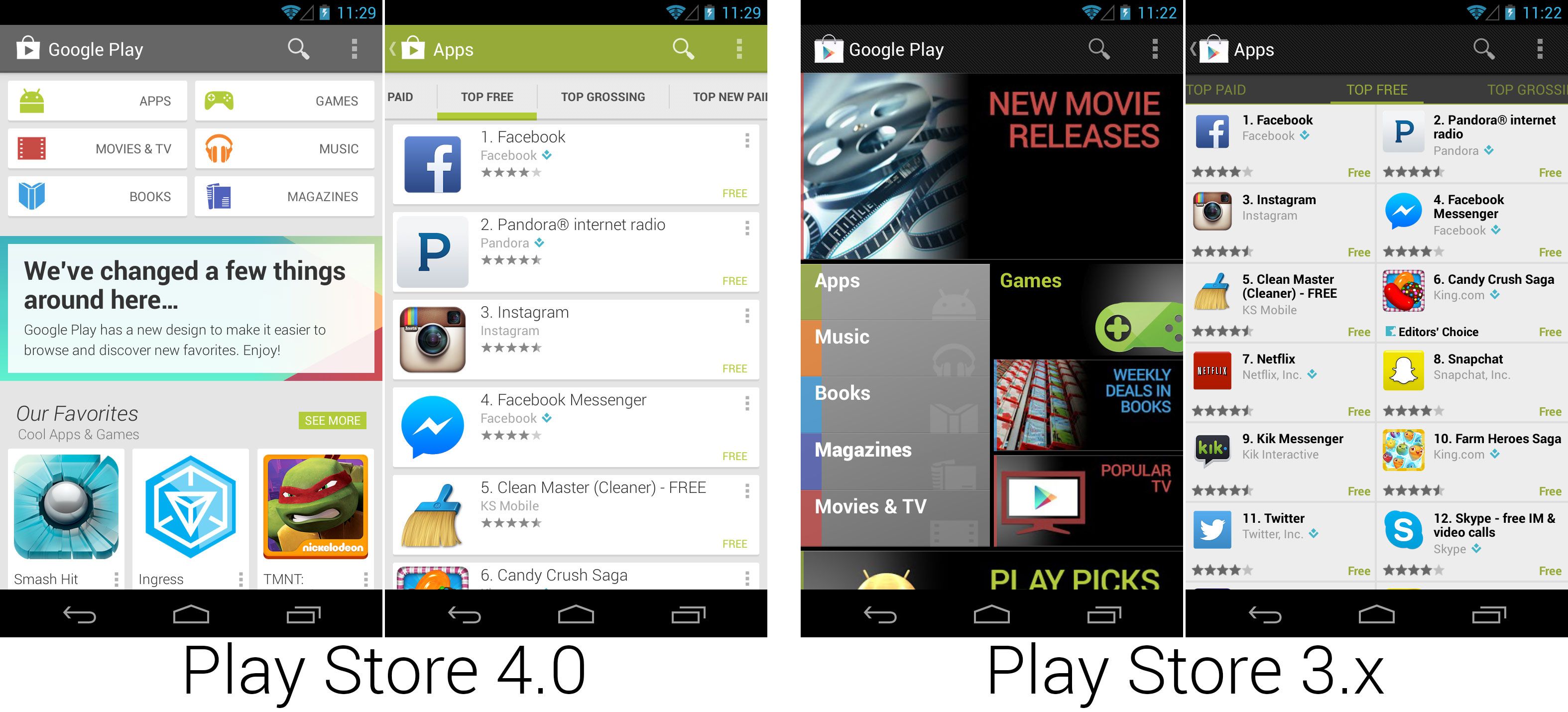
 Another Play Store redesign! This one is very close to the current design and uses cards that make layout changes a piece of cake.
Photo by Ron Amadeo
Out-of-cycle updates—who needs a new OS?
In between Android 4.2 and 4.3, Google went on an out-of-cycle update tear and showed just how much Android could be improved without having to fire up the arduous OTA update process. Thanks to the Google Play Store and Play Services, all of these updates were able to be delivered without updating any core system components.
In April 2013, Google released a major redesign to the Google Play Store. Like most redesigns from here on out, the new Play Store fully adopted the Google Now aesthetic, with white cards on a gray background. The action bar changed color based on the current content section, and since the first screen featured content from all sections of the store, the action bar was a neutral gray. Buttons to navigate to the content sections were now given top billing, and below that was usually a promotional block or rows of recommended apps.
In April 2013, Google released a major redesign to the Google Play Store. Like most redesigns from here on out, the new Play Store fully adopted the Google Now aesthetic, with white cards on a gray background. The action bar changed color based on the current content section, and since the first screen featured content from all sections of the store, the action bar was a neutral gray. Buttons to navigate to the content sections were now given top billing, and below that was usually a promotional block or rows of recommended apps.
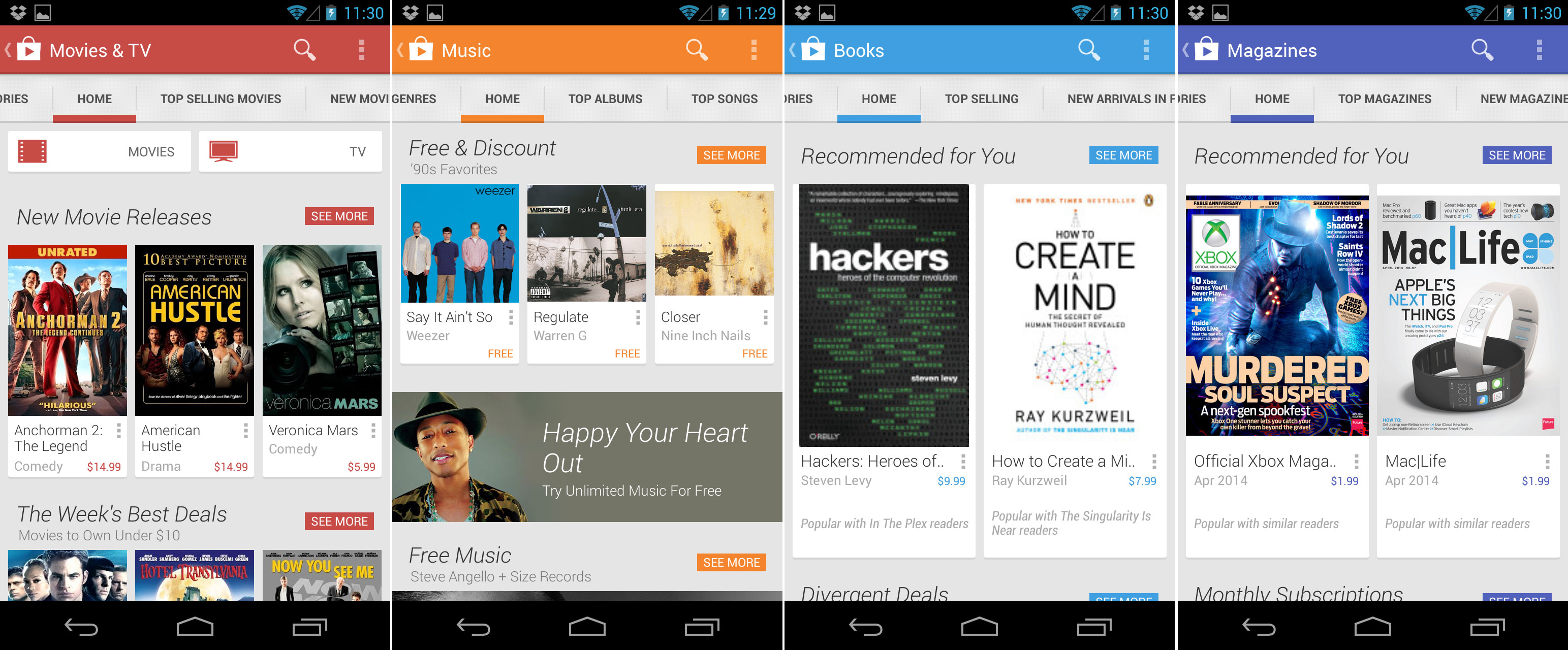
 The individual content sections are beautifully color-coded.
Photo by Ron Amadeo
The new Play Store showed off the real power of Google’s card design language, which enabled a fully responsive layout across all screen sizes. One large card could be stuck next to several little cards, larger-screened devices could show more cards, and rather than stretch things in horizontal mode, more cards could just be added to a row. The Play Store content editors were free to play with the layout of the cards, too; a big release that needed to be highlighted could get a larger card. This design would eventually trickle down to the other Google Play content apps, finally resulting in a unified design.
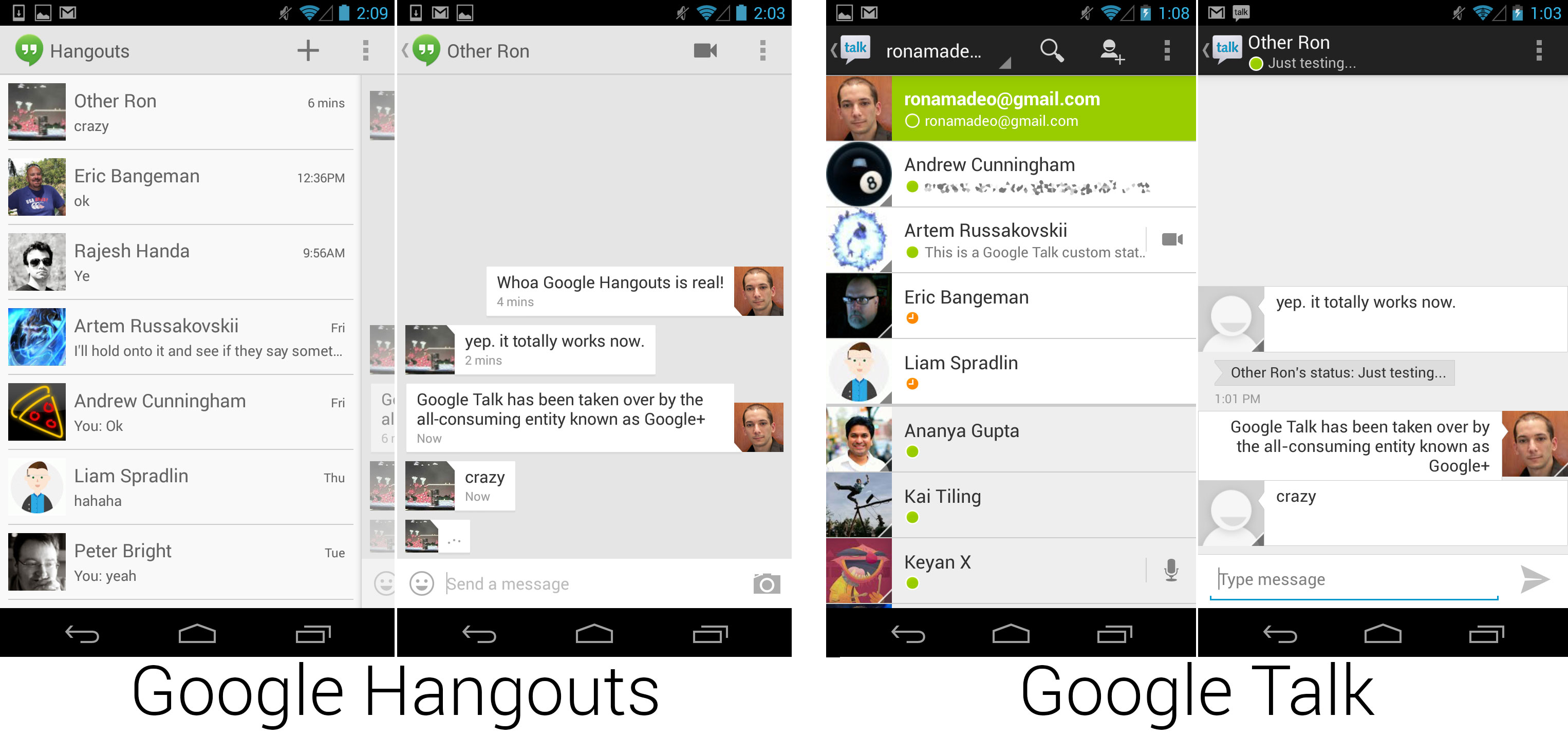
 Hangouts replaced Google Talk and is now continually developed by the Google+ team.
Photo by Ron Amadeo
Google I/O, the company's annual developer conference, was usually where a new Android version was announced. But at the 2013 edition, Google made just as many improvements without having to update the OS.
One of the biggest things announced at the show was an update to Google Talk, Google's instant messaging platform. For a long time, Google shipped four text communication apps for Android: Google Talk, Google+ Messenger, Messaging (the SMS app), and Google Voice. Having four apps that accomplished the same task—sending a text message to someone—was very confusing for users. At I/O, Google killed Google Talk and started their messaging product over from scratch, creating Google Hangouts. While initially it only replaced Google Talk, the plan for Hangouts was to unify all of Google's various messaging apps into a single interface.
The layout of the Hangouts UI really wasn't drastically different from Google Talk. The main page contained your open conversations, and tapping on one opened a chat page. The design was updated, the chat page now used a card-style display for each paragraph, and the chat list was now a "drawer"-style interface, meaning you could open it with a horizontal swipe. Hangouts had read receipts and a typing status indicator, and group chat was now a primary feature.
Google+ was the center of Hangouts now, so much so that the full name of the product was actually "Google+ Hangouts." Hangouts was completely integrated with the Google+ desktop site so that video and chats could be made from one to the other. Identity and avatars were pulled from Google+, and tapping on an avatar would open that person's Google+ profile. And much like the change from Browser to Google Chrome, core Android functionality was passed off to a separate team—the Google+ team—as opposed to being a side product of the very busy Android engineers. With the Google+ takeover, Android's main IM client now became a continually developed application. It was placed into the Play Store and received fairly regular updates.
 The new navigation drawer interface.
Photo by developer.android.com
Google also introduced a new design element for the action bar: the navigation drawer. This drawer was shown as a set of three lines next to the app icon in the top-right corner. By tapping on it or dragging from the edge of the screen to the right, a side-mounted menu would appear. As the name implies, this was used to navigate around the app, and it would show several top-level locations within the app. This allowed the first screen to show content, and it gave users a consistent, easy-to-access place for navigation elements. The nav drawer was basically a super-sized version of the normal menu, scrollable and docked to the right side.
Ron Amadeo / Ron is the Reviews Editor at Ars Technica, where he specializes in Android OS and Google products. He is always on the hunt for a new gadget and loves to rip things apart to see how they work.
