6.0 KiB
Using pandas to plot data in Python
Pandas is a hugely popular Python data manipulation library. Learn how
to use its API to plot data.

In this series of articles on Python-based plotting libraries, we're going to have a conceptual look at plots using pandas, the hugely popular Python data manipulation library. Pandas is a standard tool in Python for scalably transforming data, and it has also become a popular way to import and export from CSV and Excel formats.
On top of all that, it also contains a very nice plotting API. This is extremely convenient—you already have your data in a pandas DataFrame, so why not use the same library to plot it?
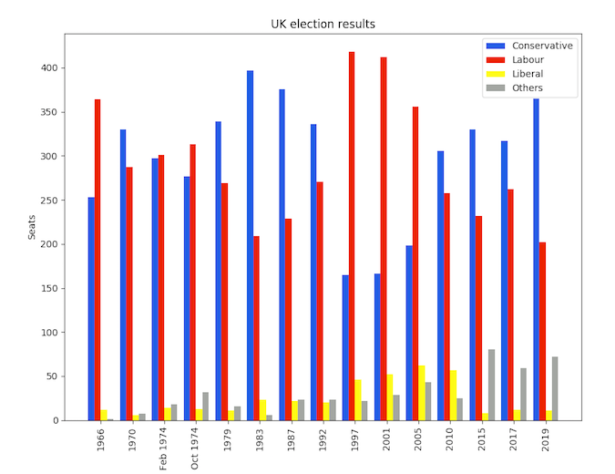
In this series, we'll be making the same multi-bar plot in each library so we can compare how they work. The data we'll use is UK election results from 1966 to 2020:
Data that plots itself
Before we go further, note that you may need to tune your Python environment to get this code to run, including the following.
- Running a recent version of Python (instructions for Linux, Mac, and Windows)
- Verify you're running a version of Python that works with these libraries
The data is available online and can be imported using pandas:
import pandas as pd
df = pd.read_csv('<https://anvil.works/blog/img/plotting-in-python/uk-election-results.csv>')
Now we're ready to go. We've seen some impressively simple APIs in this series of articles, but pandas has to take the crown.
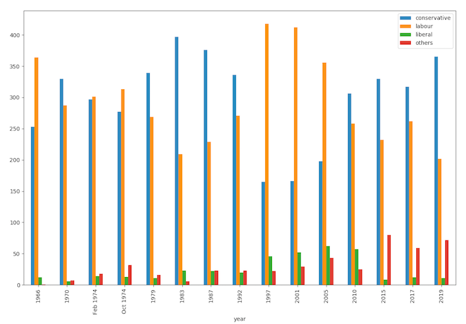
To plot a bar plot with a group for each party and year on the x-axis, I simply need to do this:
import matplotlib.pyplot as plt

ax = df.plot.bar(x='year')

plt.show()
Four lines—definitely the tersest multi-bar plot we've created in this series.
I’m using my data in wide form, meaning there’s one column per political party:
        year  conservative  labour  liberal  others
0       1966           253     364       12       1
1       1970           330     287        6       7
2   Feb 1974           297     301       14      18
..       ...           ...     ...      ...     ...
12      2015           330     232        8      80
13      2017           317     262       12      59
14      2019           365     202       11      72
This means pandas automatically knows how I want my bars grouped, and if I wanted them grouped differently, pandas makes it easy to restructure my DataFrame.
As with Seaborn, pandas' plotting feature is an abstraction on top of Matplotlib, which is why you call Matplotlib's plt.show() function to actually produce the plot.
Here's what it looks like:
Looks great, especially considering how easy it was! Let's style it to look just like the Matplotlib example.
Styling it
We can easily tweak the styling by accessing the underlying Matplotlib methods.
Firstly, we can color our bars by passing a Matplotlib colormap into the plotting function:
from matplotlib.colors import ListedColormap
cmap = ListedColormap(['#0343df', '#e50000', '#ffff14', '#929591'])
ax = df.plot.bar(x='year', colormap=cmap)
And we can set up axis labels and titles using the return value of the plotting function—it's simply a Matplotlib Axis object.
ax.set_xlabel(None)
ax.set_ylabel('Seats')
ax.set_title('UK election results')
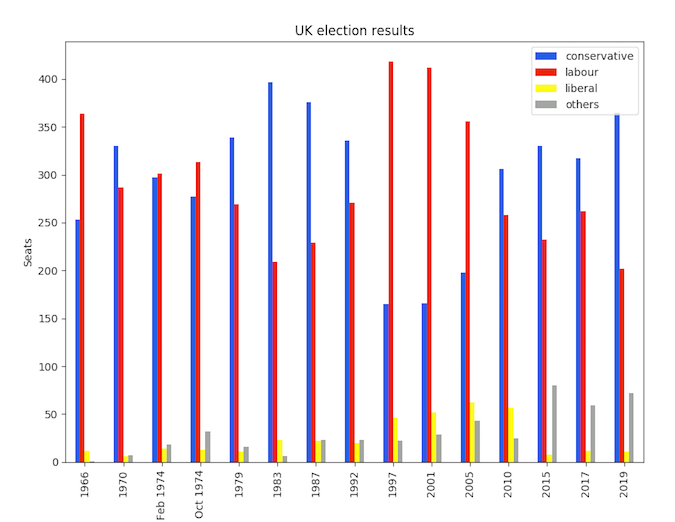
Here's what it looks like now:
That's pretty much identical to the Matplotlib version shown above but in 8 lines of code rather than 16! My inner code golfer is very pleased.
Abstractions must be escapable
As with Seaborn, the ability to drop down and access Matplotlib APIs to do the detailed tweaking was really helpful. This is a great example of giving an abstraction escape hatches to make it powerful as well as simple.
This article is based on How to make plots using Pandas on Anvil's blog and is reused with permission.
via: https://opensource.com/article/20/6/pandas-python
作者:Shaun Taylor-Morgan 选题:lujun9972 译者:译者ID 校对:校对者ID


