mirror of
https://github.com/LCTT/TranslateProject.git
synced 2025-01-16 22:42:21 +08:00
84 lines
11 KiB
Markdown
84 lines
11 KiB
Markdown
The history of Android
|
||
================================================================================
|
||
### Android 4.2, Jelly Bean—new Nexus devices, new tablet interface ###
|
||
|
||
The Android Platform was rapidly maturing, and with Google hosting more and more apps in the Play Store, there was less and less that needed to go out in the OS update. Still, the relentless march of updates must continue, and in November 2012 Android 4.2 was released. 4.2 was still called "Jelly Bean," a nod to the relatively small amount of changes that were present in this release.
|
||
|
||
|
||
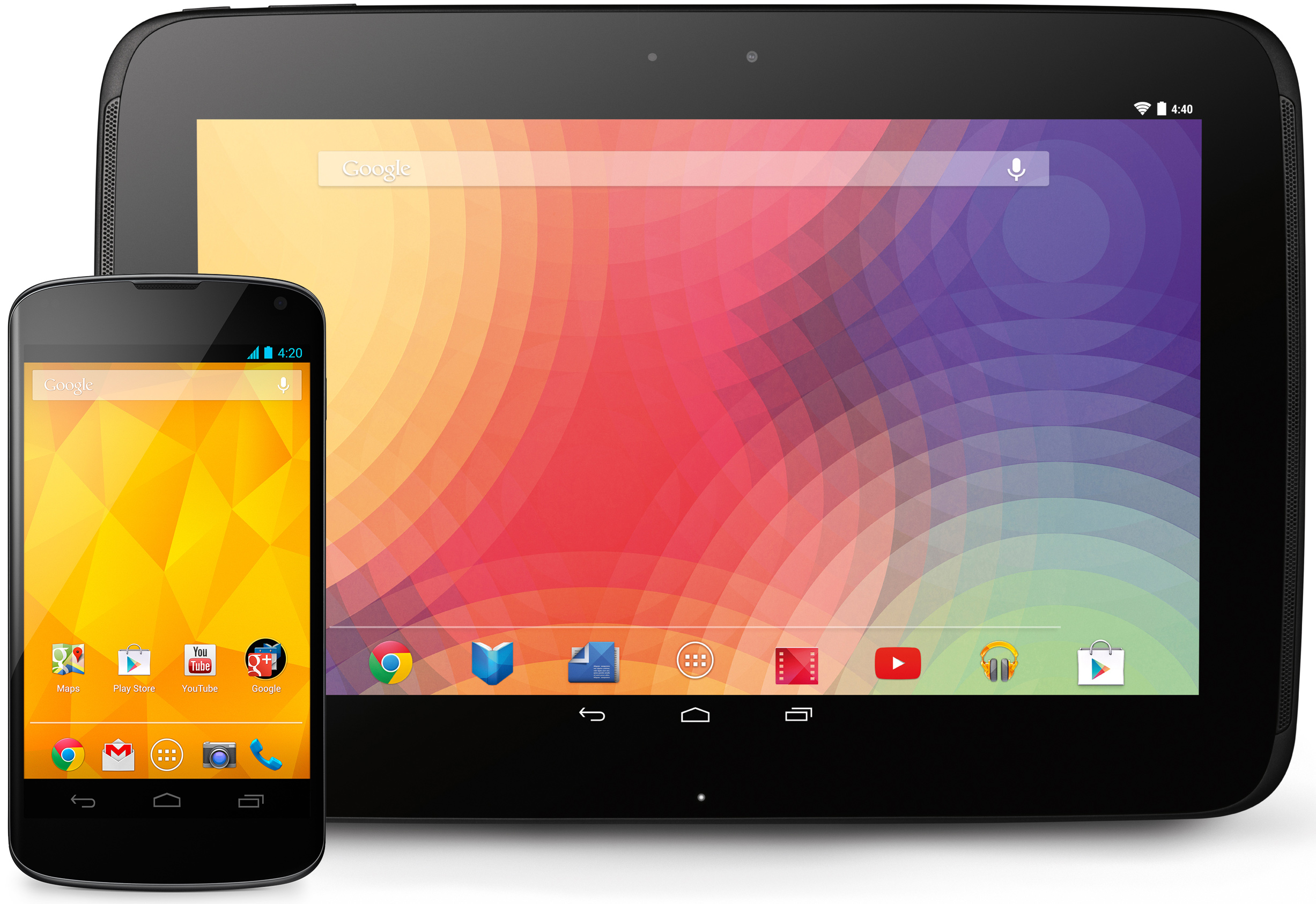
The LG-made Nexus 4 and Samsung-made Nexus 10.
|
||
Photo by Google/Ron Amadeo
|
||
|
||
Along with Android 4.2 came two flagship devices, the Nexus 4 and the Nexus 10, both of which were sold direct by Google on the Play Store. The Nexus 4 applied the Nexus 7 strategy of a quality device at a shockingly low price and sold for $300 unlocked. The Nexus 4 had a quad-core 1.5 GHz Snapdragon S4 Pro, 2GB of RAM and a 4.7-inch 1280×768 LCD. Google's new flagship phone was manufactured by LG, and with the manufacturer switch came a focus on materials and build quality. The Nexus 4 had a glass front and back, and while you couldn't drop it, it was one of the nicest-feeling Android phones to date. The biggest downside to the Nexus 4 was the lack of LTE at a time when most phones, including the Verizon Galaxy Nexus, came with the faster modem. Still, demand for the Nexus 4 greatly exceeded Google's expectations—the launch rush crashed the Play Store Web site on launch day. The device sold out in under an hour.
|
||
|
||
The Nexus 10 was Google's first 10-inch Nexus tablet. The highlight of the device was the 2560×1600 display, which was the highest resolution in its class. All those pixels were powered by a dual core, 1.7GHz Cortex A15 processor and 2GB of RAM. With each passing month, it's looking more and more like the Nexus 10 is the first and last 10-inch Nexus tablet. Usually these devices are upgraded every year, but the Nexus 10 is now 16 months old, and there's no sign of the new model on the horizon. Google is doing well with smaller-sized 7-inch tablets, and it seems content to let partners [like Samsung][1] explore the larger end of the tablet spectrum.
|
||
|
||
|
||
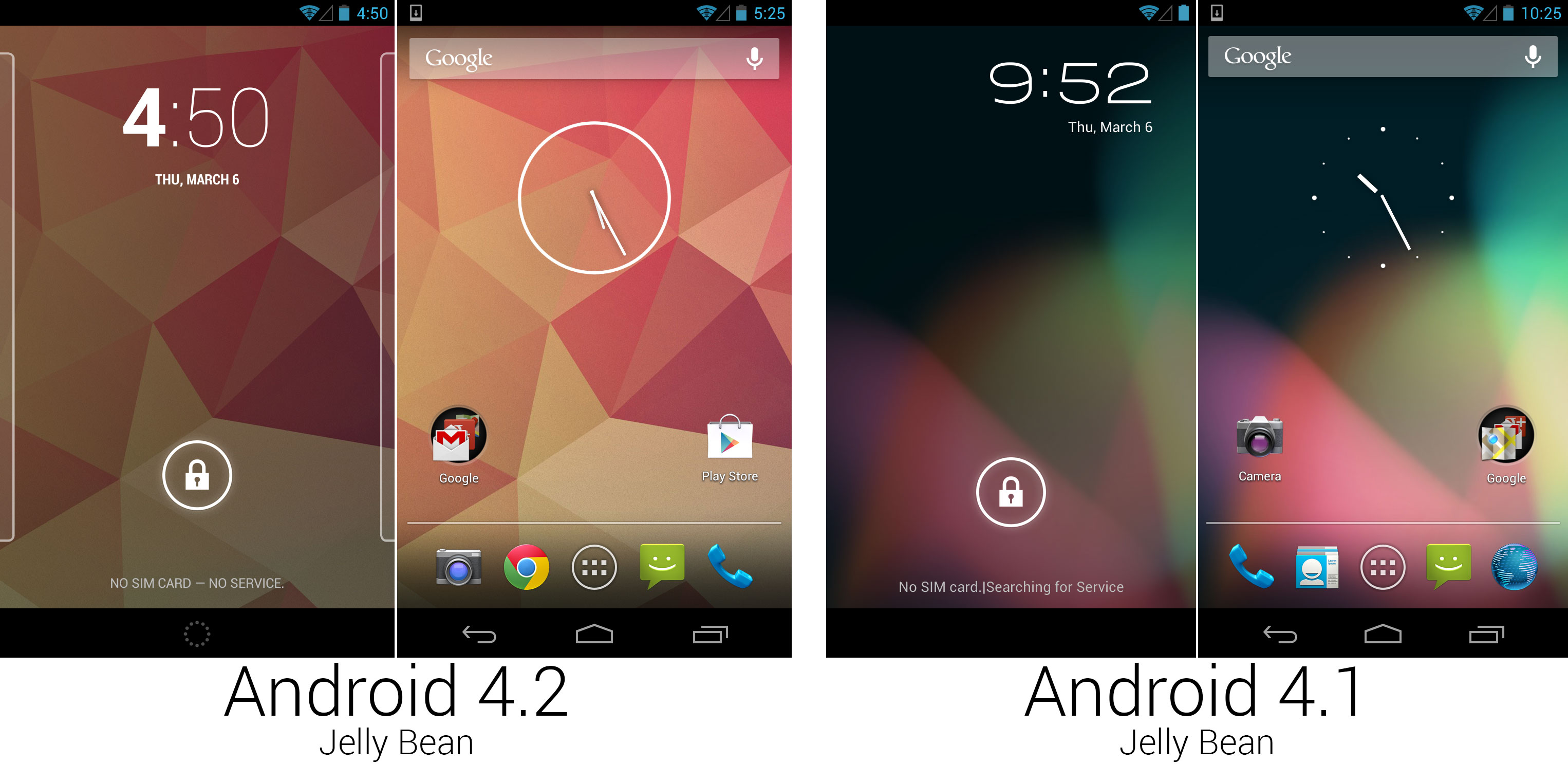
The new lock screen, wallpaper, and clock widget design.
|
||
Photo by Ron Amadeo
|
||
|
||
4.2 brought lots of changes to the lock screen. The font was centered and used an extremely thick weight for the hour and a thin font for the minutes. The lock screen was now paginated and could be customized with widgets. Rather than a simple clock on the lock screen, users could replace it with another widget or add extra pages to the lock screen for more widgets.
|
||
|
||
|
||
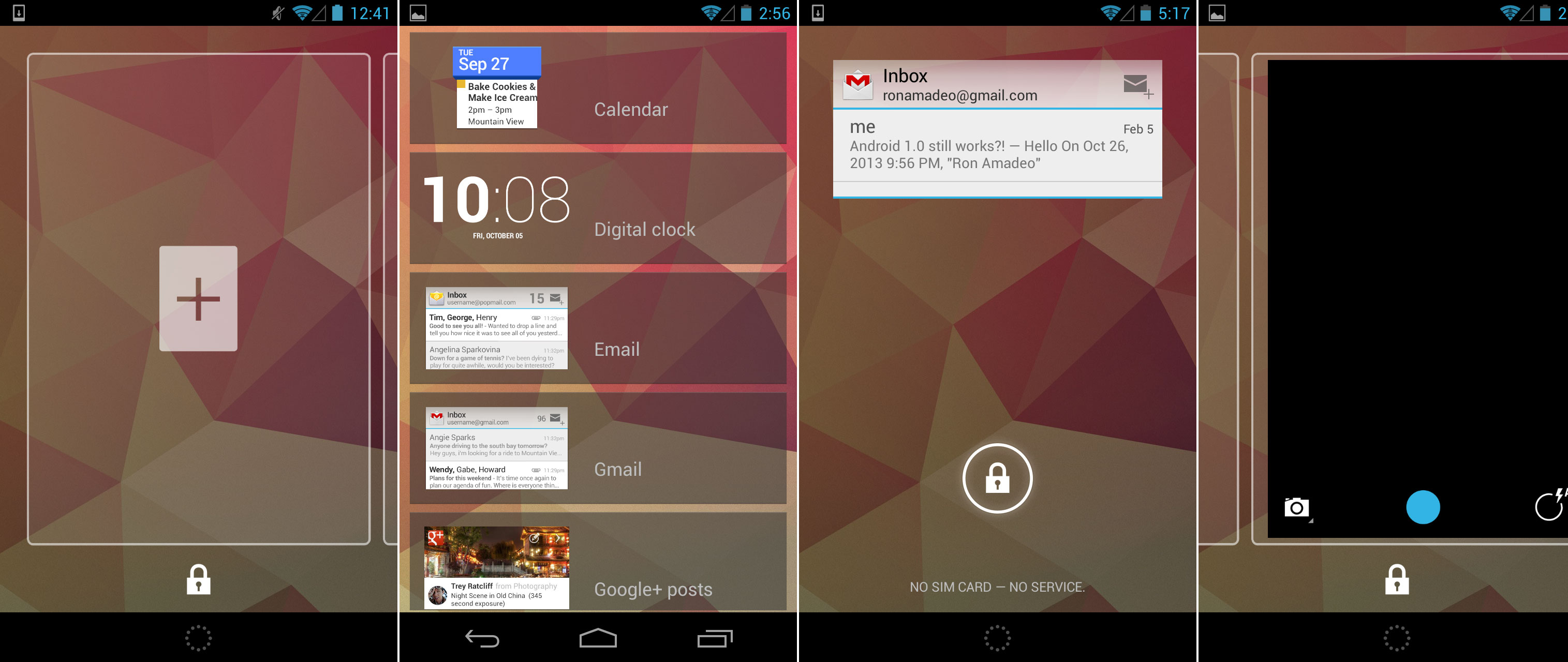
The lock screen's add widget page, the list of widgets, the Gmail widget on the lock screen, and swiping over to the camera.
|
||
Photo by Ron Amadeo
|
||
|
||
The lock screen now worked like a stripped-down version of the home screen. Page outlines would pop up on the left and right sides of the lock screen to hint to users that they could swipe to other pages with other widgets. Swiping to the left would show a simple blank page with a plus sign in the center, and tapping on it would bring up a list of widgets that were compatible with the lock screen. Lock screens were limited to one widget per page and could be expanded or collapsed by dragging up or down on the widget. The right-most page was reserved for the camera—a simple over would open the camera interface, but you weren't able to swipe back.
|
||
|
||
|
||
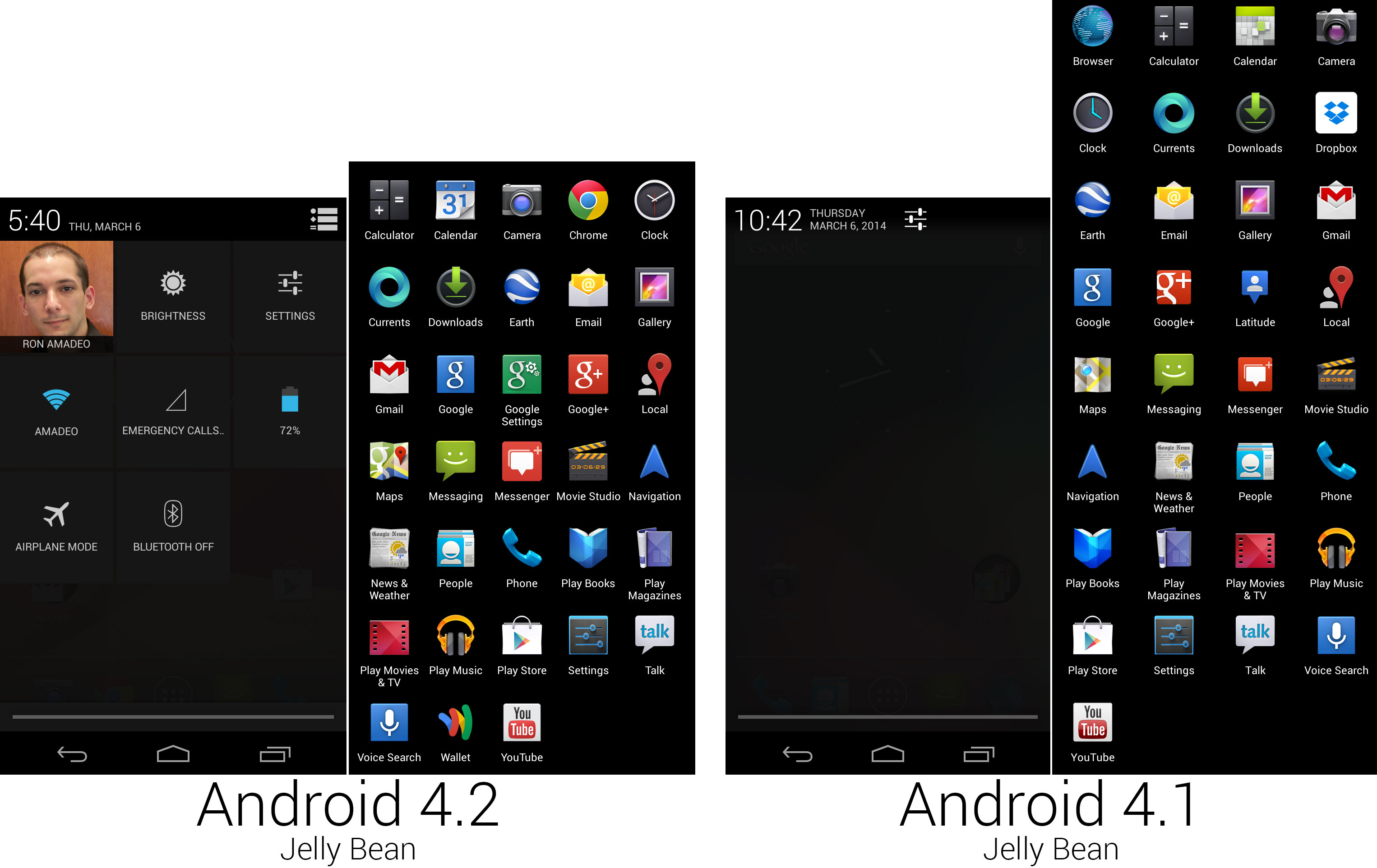
The new Quick Settings panel and a composite image of the app lineup.
|
||
Photo by Ron Amadeo
|
||
|
||
One of the biggest additions to 4.2 was the new "Quick Settings" panel. Android 3.0 brought a way to quickly change power settings to tablets, and 4.2 finally brought that ability to phones. A new icon was added to the top right corner of the notification panel that would switch between the normal list of notifications and the new quick settings screen. Quick Settings offered faster access to screen brightness, network connections, and battery and data usage without having to dig through the full settings screen. The top level settings button in Android 4.1 was removed, and a square was added to the Quick Settings screen for it.
|
||
|
||
There were lots of changes to the app drawer and 4.2's lineup of apps and icons. Thanks to the wider aspect ratio of the Nexus 4 (5:3 vs 16:9 on the Galaxy Nexus), the app drawer on that device could now show a five-wide grid of icons. 4.2 replaced the stock browser with Google Chrome and the stock calendar with Google Calendar, both of which brought new icon designs. The Clock and Camera apps were revamped in 4.2, and new icons were part of the deal. "Google Settings" was a new app that offered shortcuts to all the existing Google Account settings around the OS, and it had a unified look with Google Search and the new Google+ icon. Google Maps got a new icon, and Google Latitude, which was part of Google Maps, was retired in favor of Google+ location.
|
||
|
||
|
||
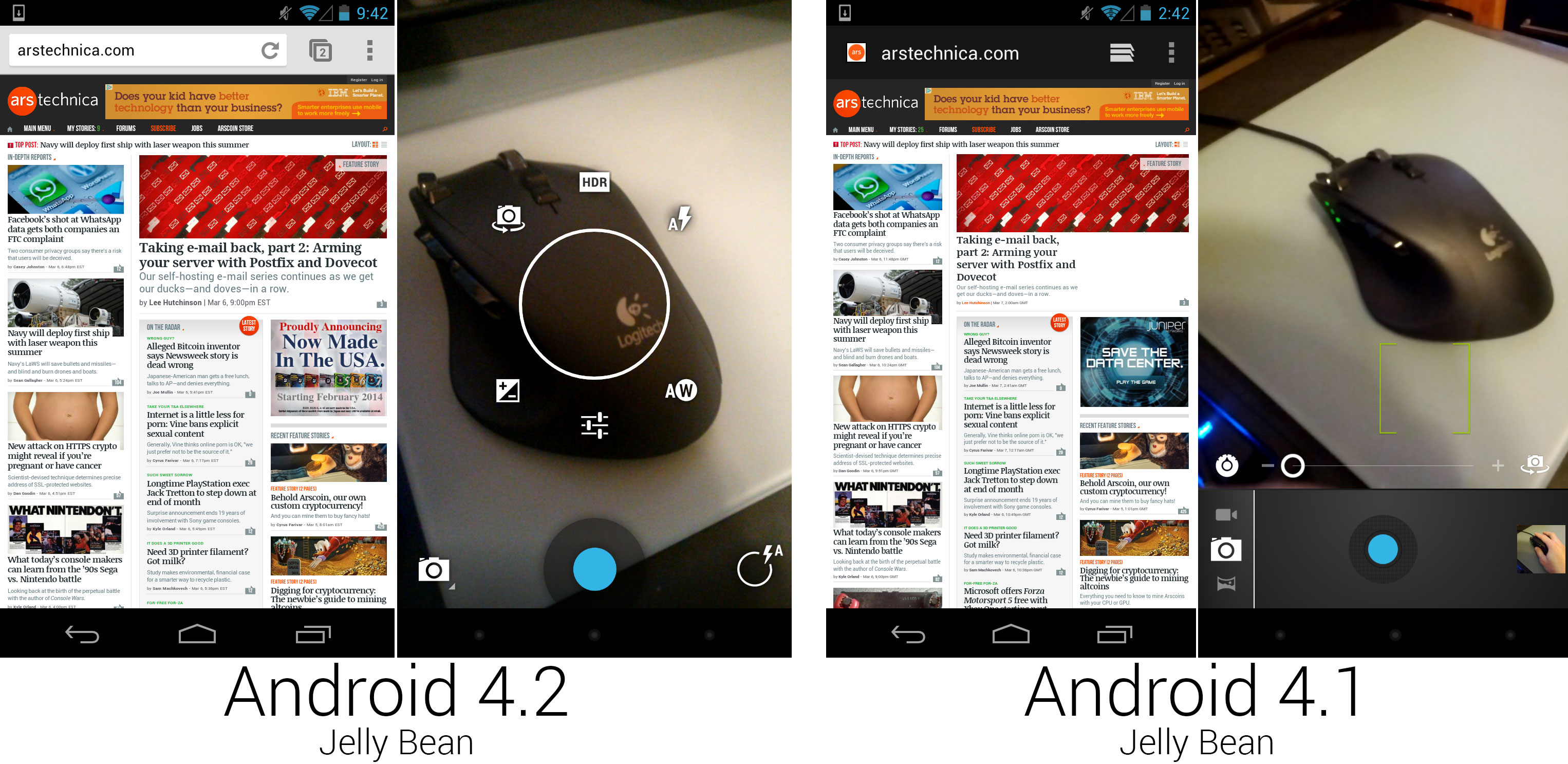
The browser was replaced with Chrome, and the new camera interface with a full screen viewfinder.
|
||
Photo by Ron Amadeo
|
||
|
||
The stock browser did its best Chrome imitation for a while—it took many cues from Chrome’s interface, many Chrome features, and was even using Chrome’s javascript engine—but by the time Android 4.2 rolled around, Google deemed the Android version of Chrome ready to replace the imitator. On the surface, it didn't seem like much of a difference; the interface looked different, and early versions of Chrome for Android didn't scroll as smoothly as the stock browser. Under the hood, though, everything was different. Development of Android's main browser was now handled by the Google Chrome team instead of being a side project of the Android team. Android's default browser moved from being a stagnant app tied to Android releases to a Play Store app that was continually updated. Today there is even a beta channel that receives several updates per month.
|
||
|
||
The camera interface was redesigned. It was now a completely full-screen app, showing a live view of the camera and places controls on top of it. The layout aesthetic had a lot in common with the [camera design][2] of Android 1.5: minimal controls with a focus on the viewfinder output. The circle of controls in the center appeared when you either held your finger on the screen or pressed the circle icon in the bottom right corner. When holding your finger down, you could slide around to pick the options around the circle, often expanding out into a sub-menu. Releasing over a highlighted item would select it. This was clearly inspired by the Quick Controls in the Android 4.0 browser, but arranging the options in a circle meant your finger was almost always blocking part of the interface.
|
||
|
||
|
||
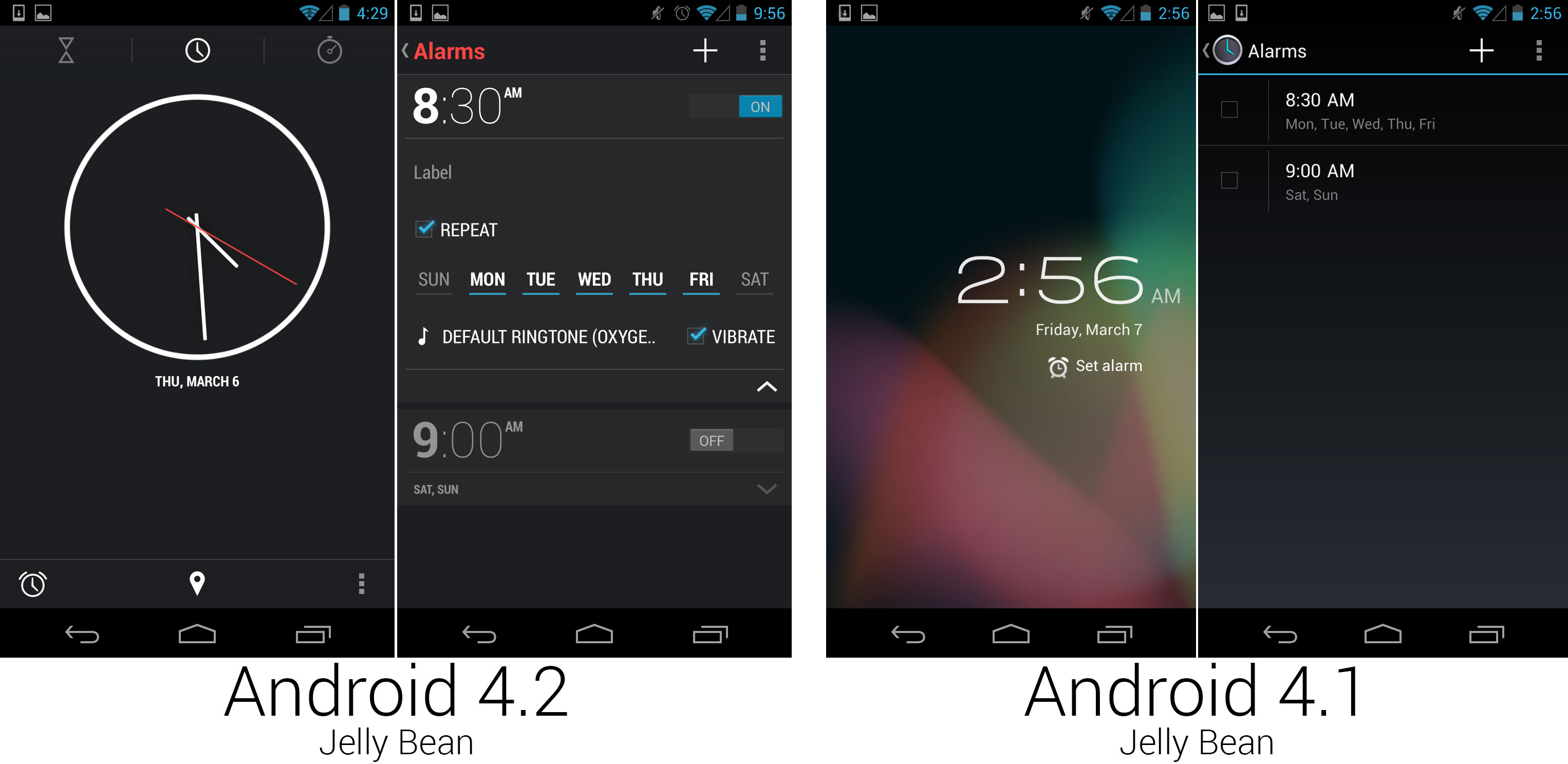
The clock app, which went from a two-screen app to a feature-packed, useful application.
|
||
Photo by Ron Amadeo
|
||
|
||
The clock application was completely revamped, going from a simple two-screen alarm clock to a world clock, alarm, timer, and stopwatch. The clock app design was like nothing Google introduced before, with an ultra-minimal aesthetic and red highlights. It seemed to be an experiment for Google. Even several versions later, this design language seemed to be confined only to this app.
|
||
|
||
The clock's time picker was particularly well-designed. It showed a simple number pad, and it would intelligently disable numbers that would result in an invalid time. It was also impossible to set an alarm time without implicitly selecting AM or PM, forever solving the problem of accidentally setting an alarm for 9pm instead of 9am.
|
||
|
||
|
||
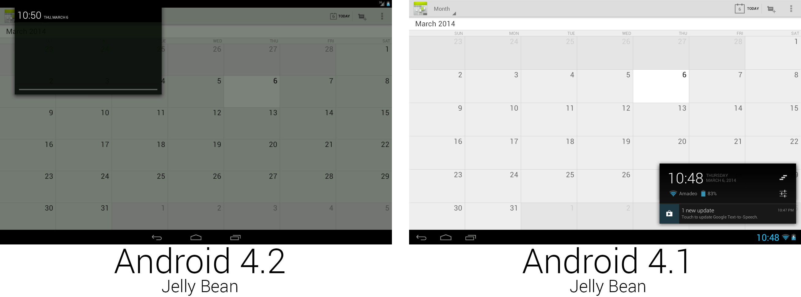
The new system UI for tablets used a stretched-out phone interface.
|
||
Photo by Ron Amadeo
|
||
|
||
The most controversial change in Android 4.2 was made to the tablet UI, which switched from a unified single bottom system bar to a two-bar interface with a top status bar and bottom system bar. The new design unified the phone and tablet interfaces, but critics said it was a waste of space to stretch the phone interface to a 10-inch landscape tablet. Since the navigation buttons had the whole bottom bar to themselves now, they were centered, just like the phone interface.
|
||
|
||
|
||
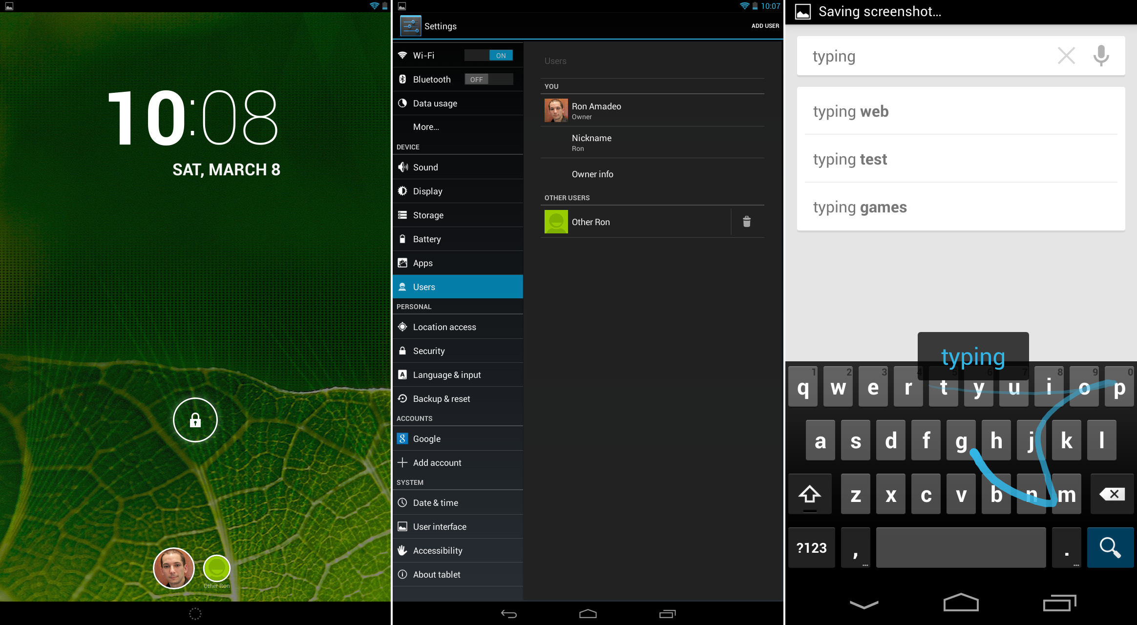
Multiple users on a tablet, and the new gesture-driven keyboard.
|
||
Photo by Ron Amadeo
|
||
|
||
On tablets, Android 4.2 brought support for multiple users. In the settings, a "Users" section was added, where you could manage users on a device. Setup was done from within each user account, where Android would keep separate settings, home screens, apps, and app data for each user.
|
||
|
||
4.2 also added a new keyboard with swiping abilities. Rather than just tapping each individual letter, users could now keep a finger on the screen the whole time and just slide from letter to letter to type.
|
||
|
||
----------
|
||
|
||

|
||
|
||
[Ron Amadeo][a] / Ron is the Reviews Editor at Ars Technica, where he specializes in Android OS and Google products. He is always on the hunt for a new gadget and loves to rip things apart to see how they work.
|
||
|
||
[@RonAmadeo][t]
|
||
|
||
--------------------------------------------------------------------------------
|
||
|
||
via: http://arstechnica.com/gadgets/2014/06/building-android-a-40000-word-history-of-googles-mobile-os/22/
|
||
|
||
译者:[译者ID](https://github.com/译者ID) 校对:[校对者ID](https://github.com/校对者ID)
|
||
|
||
本文由 [LCTT](https://github.com/LCTT/TranslateProject) 原创翻译,[Linux中国](http://linux.cn/) 荣誉推出
|
||
|
||
[1]:http://arstechnica.com/gadgets/2014/01/hands-on-with-samsungs-notepro-and-tabpro-new-screen-sizes-and-magazine-ui/
|
||
[2]:http://cdn.arstechnica.net/wp-content/uploads/2013/12/device-2013-12-26-11016071.png
|
||
[a]:http://arstechnica.com/author/ronamadeo
|
||
[t]:https://twitter.com/RonAmadeo |