11 KiB
alim0x translating
The history of Android
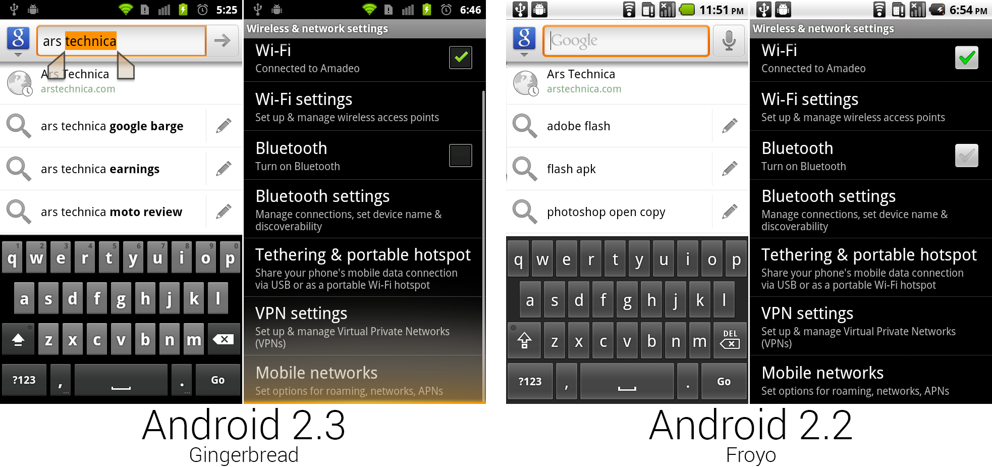 Gingerbread's new keyboard, text selection UI, overscroll effect, and new checkboxes.
Photo by Ron Amadeo
One of the most important additions to Android 2.3 was the system-wide text selection interface, which you can see in the Google search bar in the left screenshot. Long pressing a word would highlight it in orange and make draggable handles appear on either side of the highlight. You could then adjust the highlight using the handles and long press on the highlight to bring up options for cut, copy, and paste. Previous methods used tiny controls that relied on a trackball or D-Pad, but with this first finger-driven text selection method, the Nexus S didn’t need the extra hardware controls.
The right set of images shows the new checkbox design and overscroll effect. The Froyo checkbox worked like a light bulb—it would show a green check when on and a gray check when off. Gingerbread now displayed an empty box when an option is turned off—which made much more sense. Gingerbread was the first version to have an overscroll effect. An orange glow appeared when you hit the end of a list and grew larger as you pulled more against the dead end. Bounce scrolling would probably have made the most sense, but that was patented by Apple.
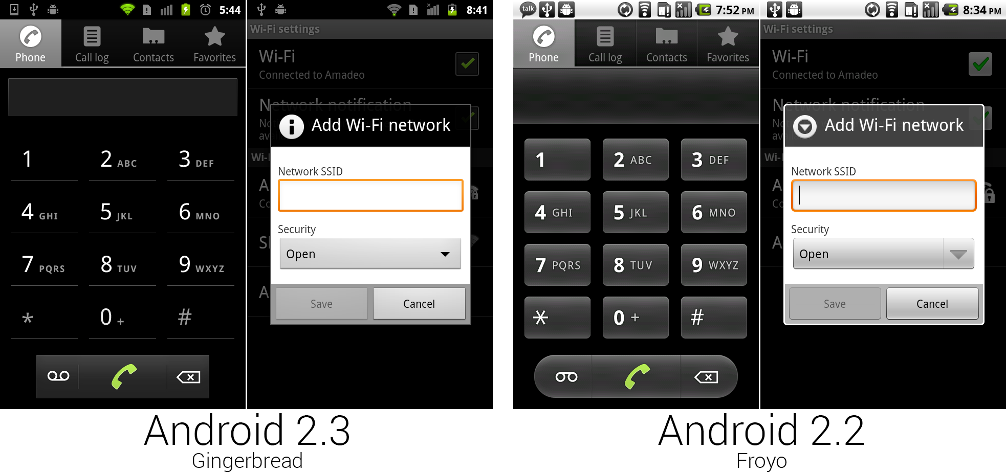 The new dialer and dialog box design.
Photo by Ron Amadeo
The dialer received a little more love in Gingerbread. It became darker, and Google finally addressed the combination of sharp corners, rounded corners, and complete circles that it had going on. Now every corner was a sharp right angle. All the dial pad buttons were replaced with a weird underline, like some faint leftovers of what used to be a button. You were never really sure if you were supposed to see a button or not—our brains wanted to imagine the rest of the square.
The Wi-Fi network dialog is pictured to show off the rest of the system-wide changes. All the dialog box titles were changed from gray to black, every dialog box, dropdown, and button corner was sharpened up, and everything was a little bit darker. All these system-wide changes made all of Gingerbread look a lot less bubbly and more mature. The "all black everything" look wasn't necessarily the most welcoming color palette, but it certainly looked better than Android's previous gray-and-beige color scheme.
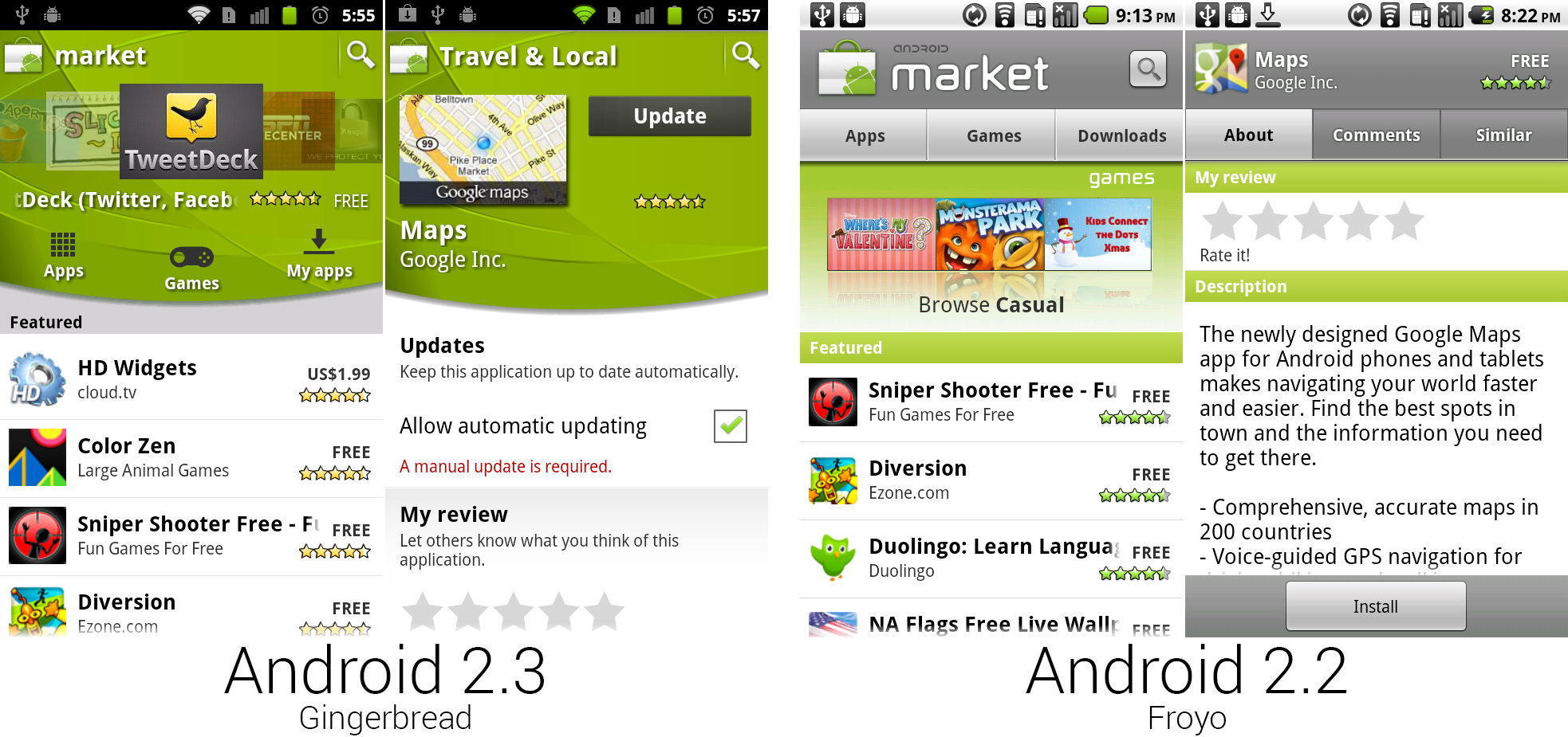 The new Market, which added a massive green header.
Photo by Ron Amadeo
While not exclusive to Gingerbread, with the launch of the new OS came "Android Market 2.0." Most of the list design was the same, but Google covered the top third of the screen with a massive green banner that was used for featured apps and navigation. The primary design inspiration here was probably the green Android mascot—the color is a perfect match. At a time when the OS was getting a darker design, the neon green banner and white list made the Market a lot brighter.
However, the same green background image was used across phones, which meant on lower resolution devices, the green banner was even bigger. Users complained so much about the wasted screen space that later updates would make the green banner scroll up with the content. At the time, horizontal mode was even worse—it would fill the left half of the screen with the static green banner.
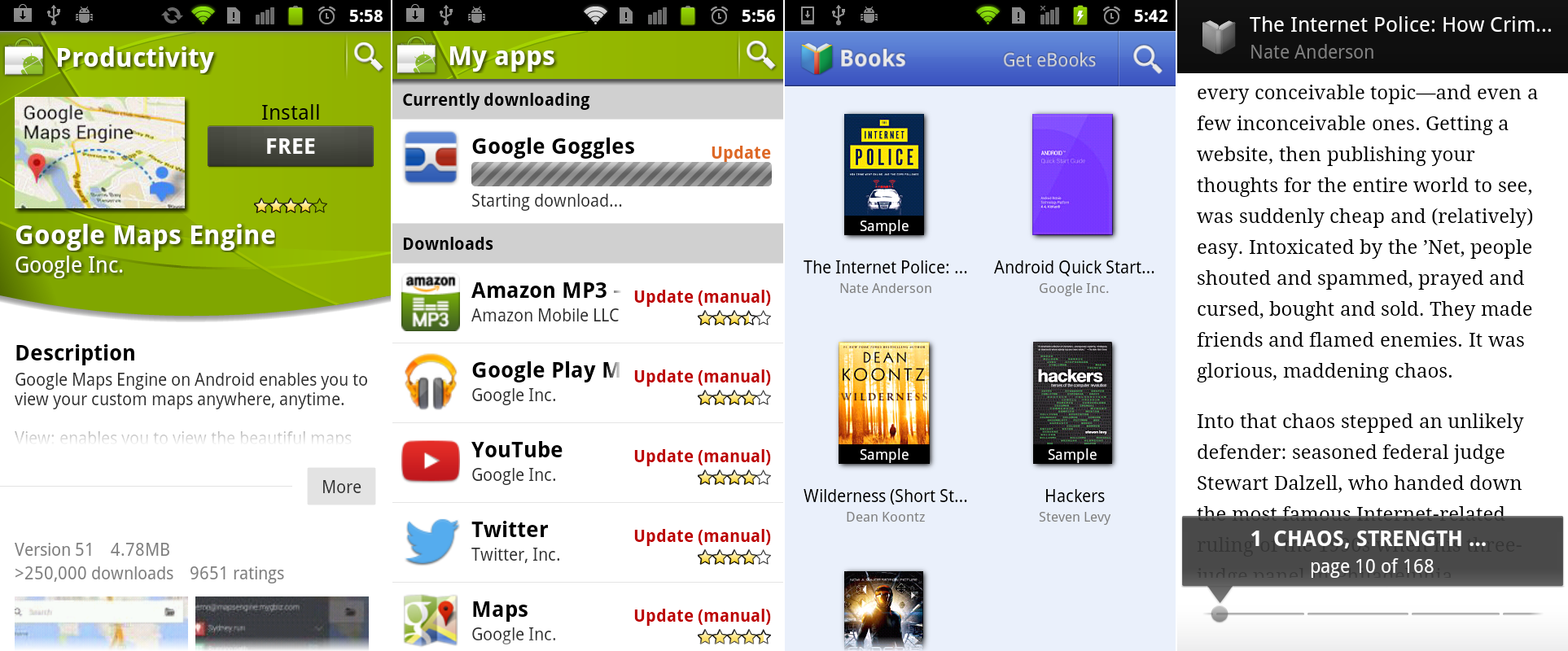 An app page from the Market showing the collapsible text section, the "My apps" section, and Google Books screenshots.
Photo by Ron Amadeo
App pages were redesigned with collapsible sections. Rather than having to scroll through a thousand-line description, text boxes were truncated to only the first few lines. After that, a "more" button needed to be tapped. This allowed users to easily scroll through the list and find things like pictures and "contact developer," which would usually be farther down the page.
The other parts of the Android homescreen wisely toned down the green monster. The rest of the app was mostly just the old Market with new green navigational elements. Any of the old tabbed interfaces were upgraded to swipeable tabs. In the right Gingerbread image, swiping right-to-left would switch from "Top Paid" to "Top Free," which made navigation a little easier.
Gingerbread came with the first of what would become the Google Play content stores: Google Books. The app was a basic book reader that would display books in a simple thumbnail grid. The "Get eBooks" link at the top of the screen opened the browser and loaded a mobile website where you could buy books.
Google Books and the “My Apps" page of the Market were both examples of early precursors to the Action Bar. Just like the current guidelines, a stickied top bar featured the app icon, the name of the screen within the app, and a few controls. The layout of these two apps was actually pretty modern looking.
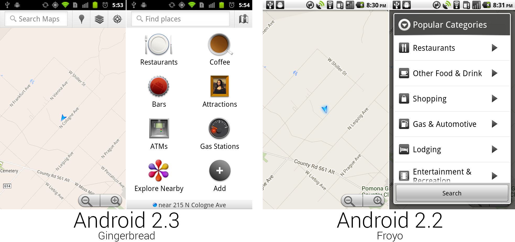 The new Google Maps.
Photo by Ron Amadeo
Google Maps (which, again, at this point was on the Android Market and not exclusive to this version of Android) now featured another action bar precursor in the form of a top-aligned control bar. This version of an early action bar featured a lot of experimenting. The majority of the bar was taken up with a search box, but you could never type into the bar. Tapping on it would open the old search interface from Android 1.x, with a totally different bar design and bubbly buttons. This 2.3 bar wasn't anything more than a really big search button.
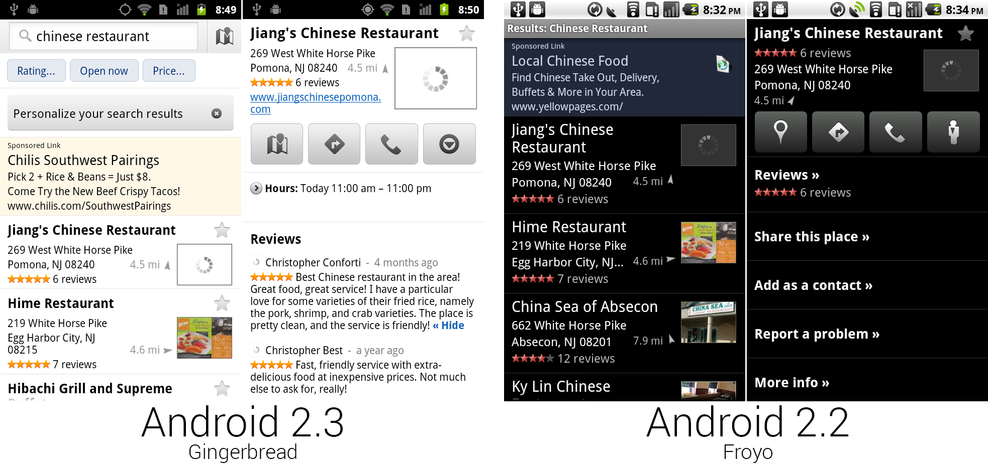 The new business pages, which switched from black to white.
Photo by Ron Amadeo
Along with Places' new top billing in the app drawer came a redesigned interface. Unlike the rest of Gingerbread, this switched from black to white. Google also kept the old buttons with rounded corners. This new version of Maps helpfully displayed the hours of operation of a business, and it offered advanced search options like places that were currently open or thresholds for ratings and price. Reviews were brought to the surface, allowing a user to easily get a feel for the current business. It was now also possible to "star" a location from the search results and save it for later.
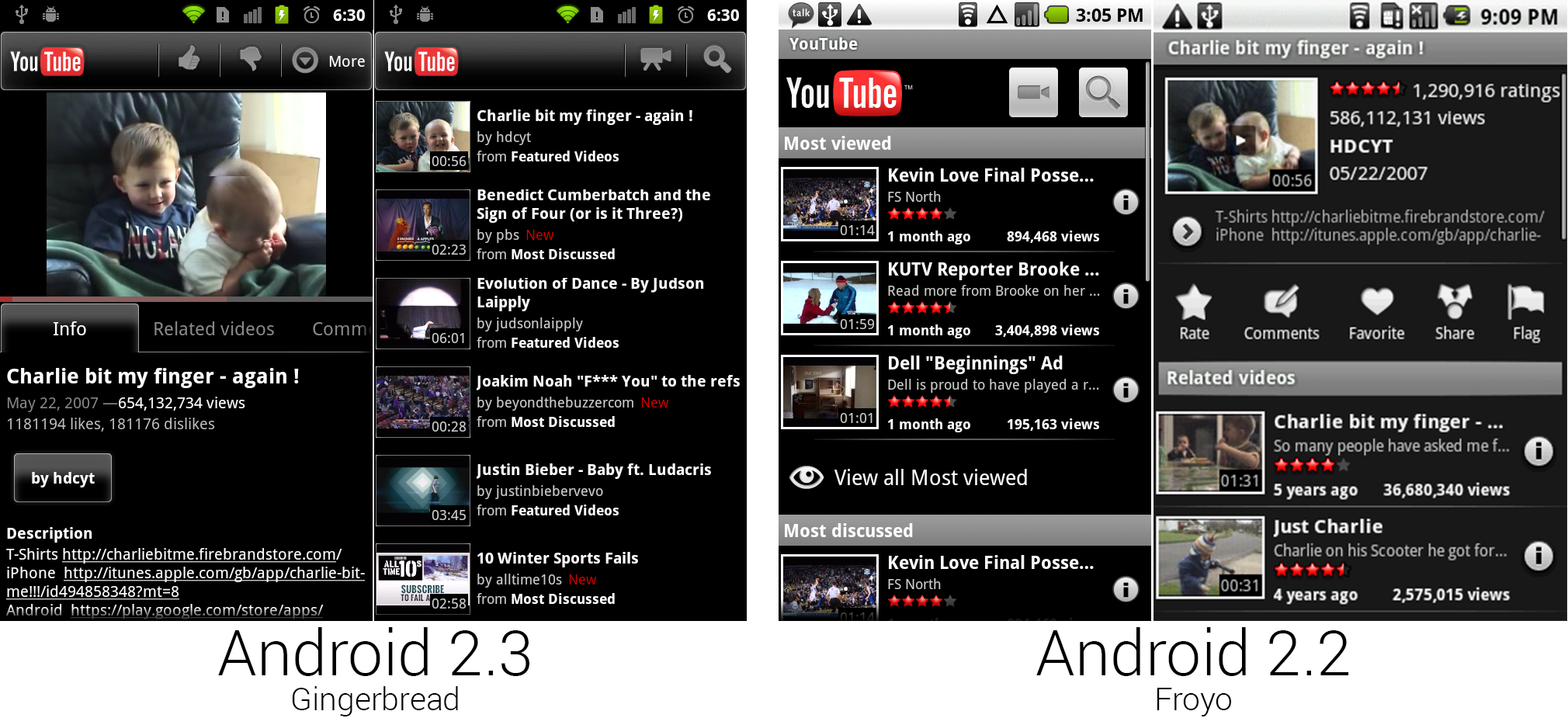 The new YouTube design, which, amazingly, sort of matches the old Maps business page design.
Photo by Ron Amadeo
The YouTube app seemed completely separate from the rest of Android, as if whoever designed this had no idea what Gingerbread would end up looking like. Highlights were red and gray instead of green and orange, and rather than the flat black of Gingerbread, YouTube featured bubbly buttons, tabs, and bars with rounded corners and heavy gradients. The new app did get a few things right, though. All the tabs could be horizontally swiped through, and the app finally added a vertical viewing mode for videos. Android seemed like such an uncoordinated effort at this stage. It’s like someone told the YouTube team “make it black," and that was all the direction they were given. The only Android entity this seemed to match was the old Google Maps business page design.
Despite the weird design choices, the YouTube app had the best approximation yet of an action bar. Besides the bar at the top with an app logo and a few buttons, the rightmost button was labeled “more" and would bring up options that didn’t fit in the bar. Today, this is called the “Overflow" button, and it's a standard UI piece.
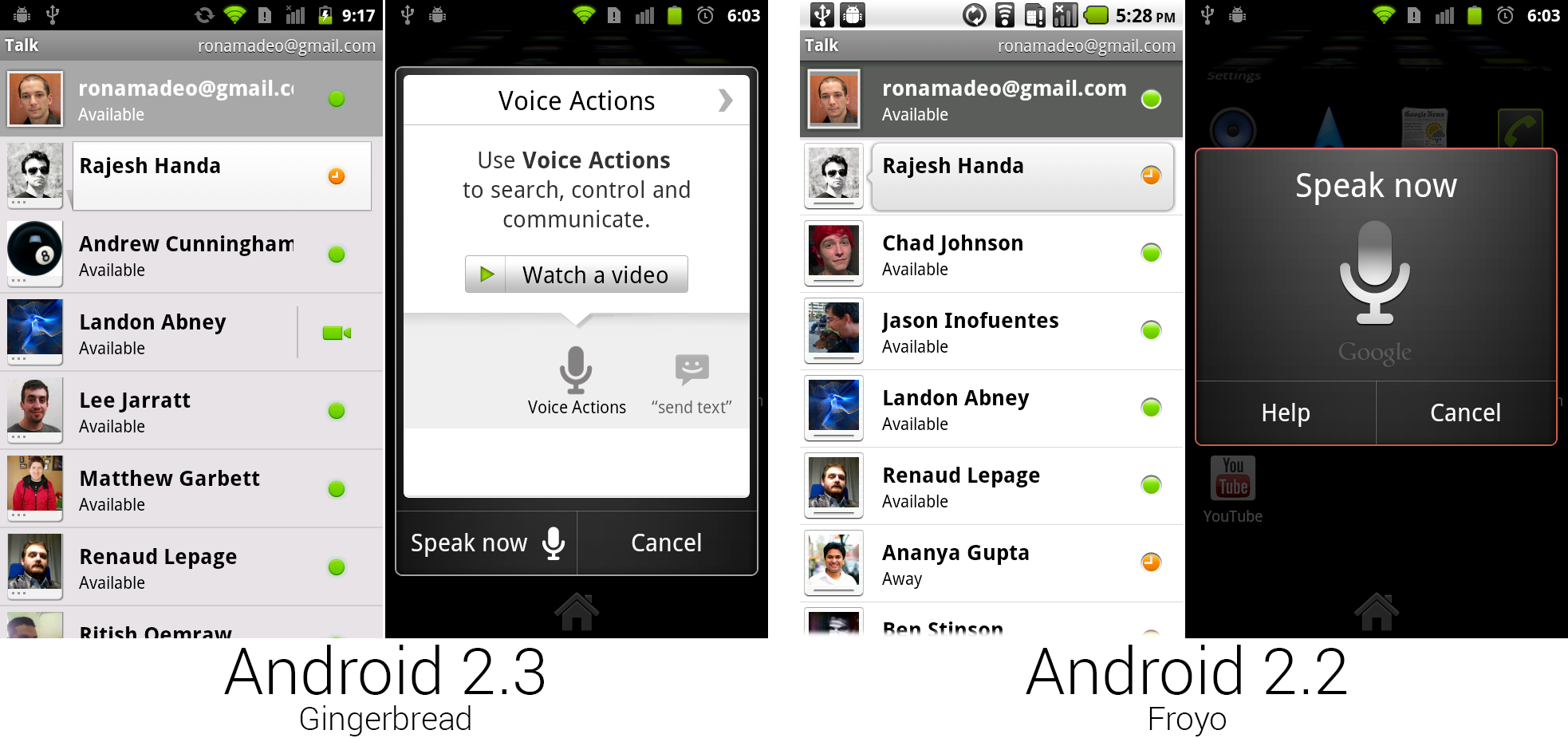 The new Google Talk, which supported voice and video calls, and the new Voice Actions interface.
Photo by Ron Amadeo
One last update for Gingerbread came with Android 2.3.4, which brought a new version of Google Talk. Unlike the Nexus One, the Nexus S had a front-facing camera—and the redesigned version of Google Talk had voice and video calling. The colored indicators on the right of the friends list were used to indicate not only presence, but voice and video availability. A dot was text only, a microphone was text or voice, and a camera was text, voice, or video. If available, tapping on a voice or video icon would immediately start a call with that person.
Gingerbread is the oldest version of Android still supported by Google. Firing up a Gingerbread device and letting it sit for a few minutes will result in a ton of upgrades. Gingerbread will pull down Google Play Services, resulting in a ton of new API support, and it will upgrade to the very newest version of the Play Store. Open the Play Store and hit the update button, and just about every single Google app will be replaced with a modern version. We tried to keep this article authentic to the time Gingerbread was released, but a real user stuck on Gingerbread today will be treated to a flood of anachronisms.
Gingerbread is still supported because there are a good number of users still running the now ancient OS. Gingerbread's staying power is due to the extremely low system requirements, making it the go-to choice for slow, cheap phones. The next few versions of Android were much more exclusive and/or demanding on hardware. For instance, Android 3.0 Honeycomb is not open source, meaning it could only be ported to a device with Google's cooperation. It was also only for tablets, making Gingerbread the newest phone version of Android for a very long time. 4.0 Ice Cream Sandwich was the next phone release, but it significantly raised Android’s systems requirements, cutting off the low-end of the market. Google is hoping to get cheaper phones back on the update track with 4.4 KitKat, which brings the system requirements back down to 512MB of RAM. The passage of time helps, too—by now, even cheap SoCs have caught up to the demands of a 4.0-era version of Android.
Ron Amadeo / Ron is the Reviews Editor at Ars Technica, where he specializes in Android OS and Google products. He is always on the hunt for a new gadget and loves to rip things apart to see how they work.
