4.7 KiB
Style your data plots in Python with Pygal
An introduction one of the more stylish Python plotting libraries.

Python is full of libraries that can visualize data. One of the more interactive options comes from Pygal, which I consider the library for people who like things to look good. It generates beautiful SVG (Scalable Vector Graphics) files that users can interact with. SVG is a standard format for interactive graphics, and it can lead to rich user experiences with only a few lines of Python.
Using Pygal for stylish Python plots
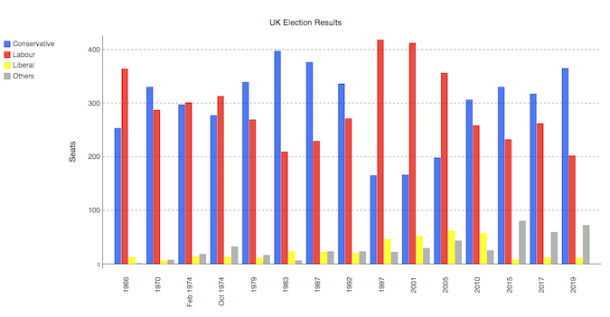
In this introduction, we want to recreate this multi-bar plot, which represents the UK election results from 1966 to 2020:
Before we go further, note that you may need to tune your Python environment to get this code to run, including the following.
- Running a recent version of Python (instructions for Linux, Mac, and Windows)
- Verify you're running a version of Python that works with these libraries
The data is available online and can be imported using pandas:
import pandas as pd
df = pd.read_csv('<https://anvil.works/blog/img/plotting-in-python/uk-election-results.csv>')
Now we're ready to go. The data looks like this:
        year  conservative  labour  liberal  others
0       1966           253     364       12       1
1       1970           330     287        6       7
2   Feb 1974           297     301       14      18
..       ...           ...     ...      ...     ...
12      2015           330     232        8      80
13      2017           317     262       12      59
14      2019           365     202       11      72
Plotting this in Pygal builds up in a way that I find easy to read. First, we define the style object in a way that will simplify our bar chart definition. Then we pass the custom style along with other metadata to a Bar object:
import pygal
from pygal.style import Style

custom_style = Style(
    colors=('#0343df', '#e50000', '#ffff14', '#929591'),
    font_family='Roboto,Helvetica,Arial,sans-serif',
    background='transparent',
    label_font_size=14,
)

c = pygal.Bar(
    title="UK Election Results",
    style=custom_style,
    y_title='Seats',
    width=1200,
    x_label_rotation=270,
)
Then, we add our data into the Bar object:
c.add('Conservative', df['conservative'])
c.add('Labour', df['labour'])
c.add('Liberal', df['liberal'])
c.add('Others', df['others'])

c.x_labels = df['year']
Finally, we save the plot as an SVG file:
`c.render_to_file('pygal.svg')`
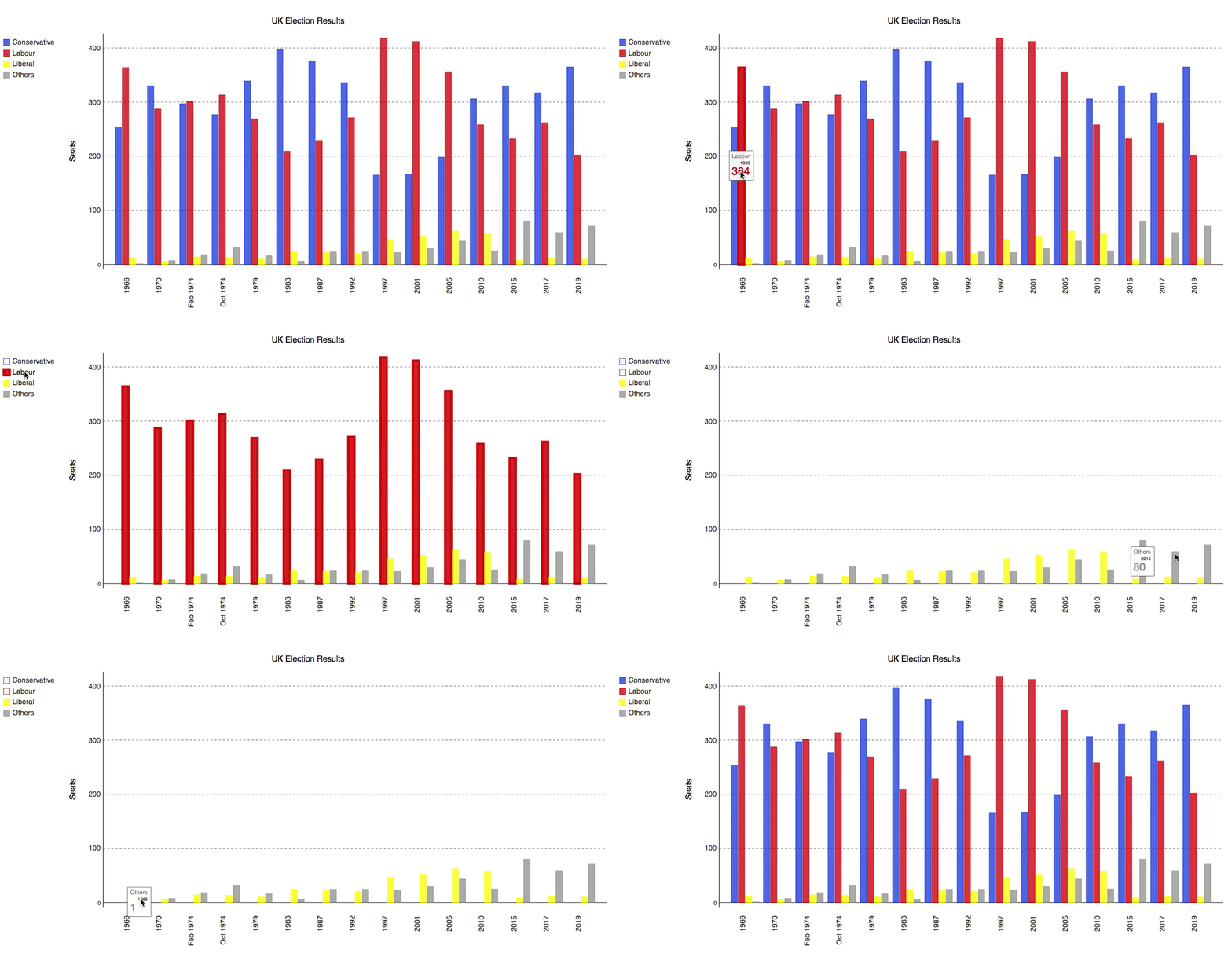
The result is an interactive SVG plot you can see in this gif:
Beautifully simple, and with beautiful results.
Conclusion
Some plotting options in Python require building every object in great detail, and Pygal gives you that functionality from the start. Give Pygal a go if you have data on hand and you want to make a clean, beautiful, and simple plot for user interaction.
---
This article was first shared here and is edited and republished with permission.
via: https://opensource.com/article/20/6/pygal-python
作者:Shaun Taylor-Morgan 选题:lujun9972 译者:译者ID 校对:校对者ID

