mirror of
https://github.com/LCTT/TranslateProject.git
synced 2025-01-25 23:11:02 +08:00
86 lines
13 KiB
Markdown
86 lines
13 KiB
Markdown
|
|
The history of Android
|
|||
|
|
================================================================================
|
|||
|
|
|
|||
|
|
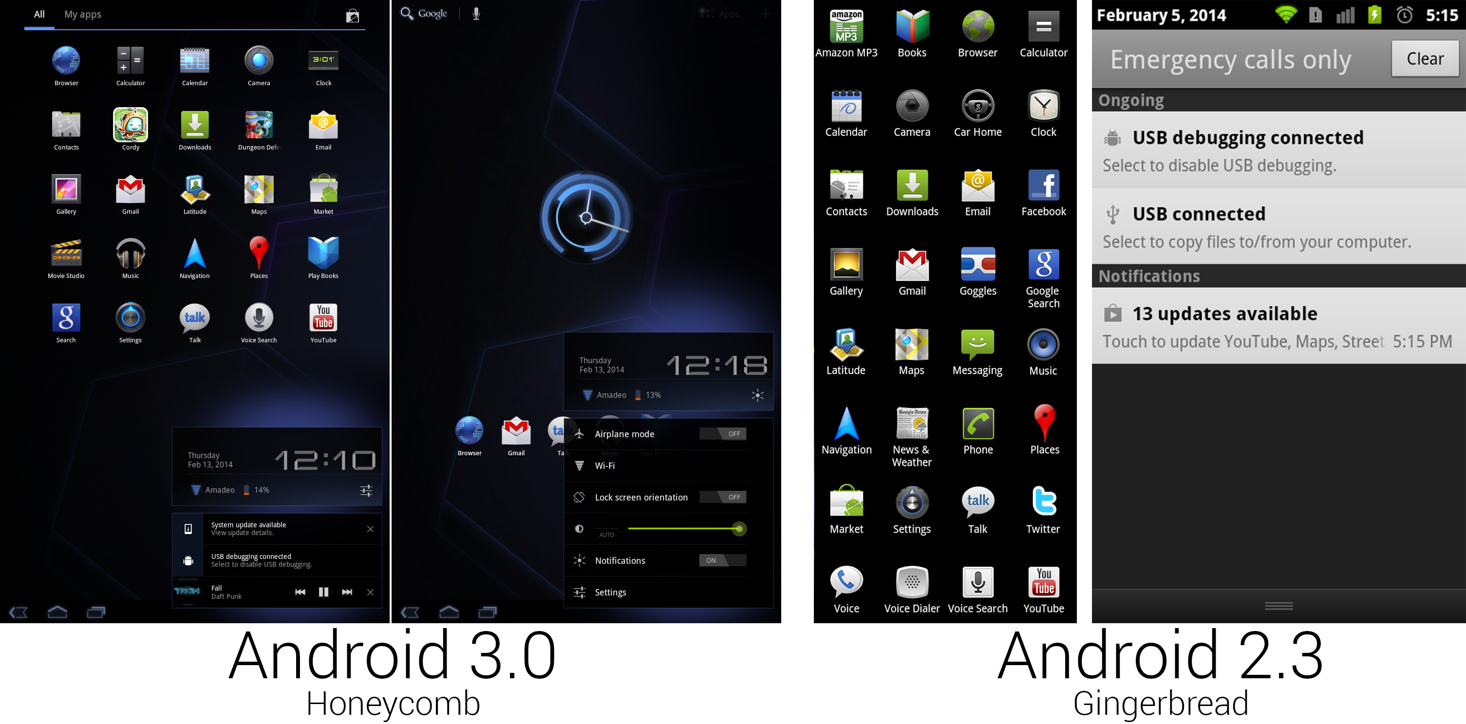
The Honeycomb app lineup lost a ton of apps. This also shows the notification panel and the new quick settings.
|
|||
|
|
Photo by Ron Amadeo
|
|||
|
|
|
|||
|
|
The default app icons were slashed from 32 to 25, and two of those were third-party games. Since Honeycomb was not for phones and Google wanted the default apps to all be tablet-optimized, a lot of apps didn't make the cut. We lost the Amazon MP3 store, Car Home, Facebook, Google Goggles, Messaging, News and Weather, Phone, Twitter, Google Voice, and Voice Dialer. Google was quietly building a music service that would launch soon, so the Amazon MP3 store needed to go anyway. Car Home, Messaging, and Phone made little sense on a non-phone device, Facebook and Twitter still don't have tablet Android apps, and Goggles, News and Weather, and Voice Dialer were barely supported applications that most people wouldn't miss.
|
|||
|
|
|
|||
|
|
Almost every app icon was new. Just like the switch from the G1 to the Motorola Droid, the biggest impetus for change was probably the bump in resolution. The Nexus S had an 800×480 display, and Gingerbread came with art assets to match. The Xoom used a whopping 1280×800 10-inch display, which meant nearly every piece of art had to go. But again, this time a real designer was in charge, and things were a lot more cohesive. Honeycomb marked the switch from a vertically scrolling app drawer to paginated horizontal drawer. This change made sense on a horizontal device, but on phones it was still much faster to navigate the app drawer with a flingable, vertical list.
|
|||
|
|
|
|||
|
|
The second Honeycomb screenshot shows the new notification panel. The gray and black Gingerbread design was tossed for another straight-black panel that gave off a blue glow. At the top was a block showing the time, date, connection status, battery, and a shortcut to the notification quick settings, and below that were the actual notifications. Non-permanent notifications could now be dismissed by tapping on an "X" on the right side of the notification. Honeycomb was the first version to enable controls within a notification. The first (and at the launch of Honeycomb, only) app to take advantage of this was the new Google Music app, which placed previous, play/pause, and next buttons in its notification. These new controls could be accessed from any app and made controlling music a breeze.
|
|||
|
|
|
|||
|
|
|
|||
|
|
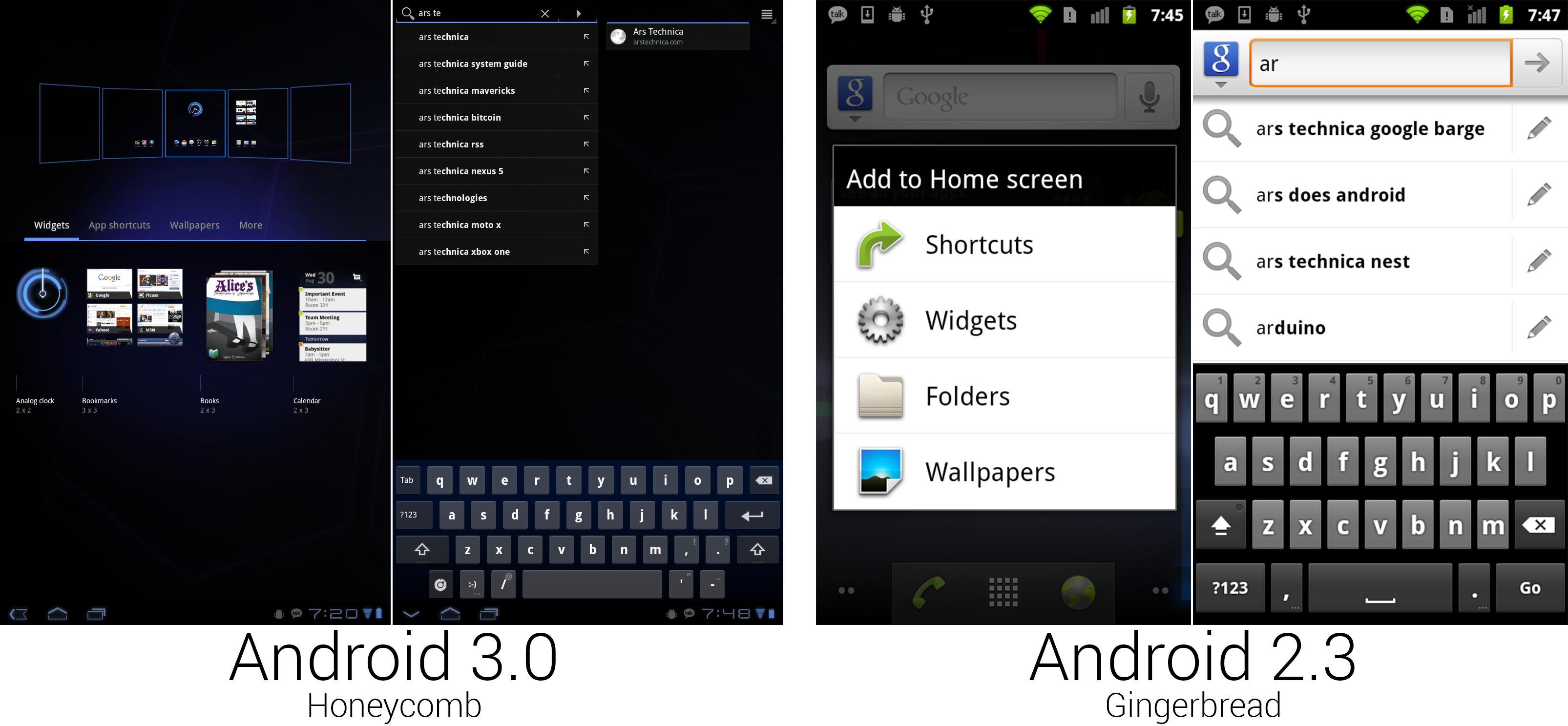
"Add to home screen" was given a zoomed-out interface for easy organizing. The search interface split auto suggest and universal search into different panes.
|
|||
|
|
Photo by Ron Amadeo
|
|||
|
|
|
|||
|
|
Pressing the plus button in the top right corner of the home screen or long pressing on the background would open the new home screen configuration interface. Honeycomb showed a zoomed-out view of all the home screens along the top of the screen, and it filled the bottom half of the screen with a tabbed drawer containing widgets and shortcuts. Items could be dragged out of the bottom drawer and into any of the five home screens. Gingerbread would just show a list of text, but Honeycomb showed full thumbnail previews of the widgets. This gave you a much better idea of what a widget would look like instead of an app-name-only description like "calendar."
|
|||
|
|
|
|||
|
|
The larger screen of the Motorola Xoom allowed the keyboard to take on a more PC-style layout, with keys like backspace, enter, shift, and tab put in the traditional locations. The keyboard took on a blueish tint and gained even more spacing between the keys. Google also added a dedicated smiley-face button. :-)
|
|||
|
|
|
|||
|
|
|
|||
|
|
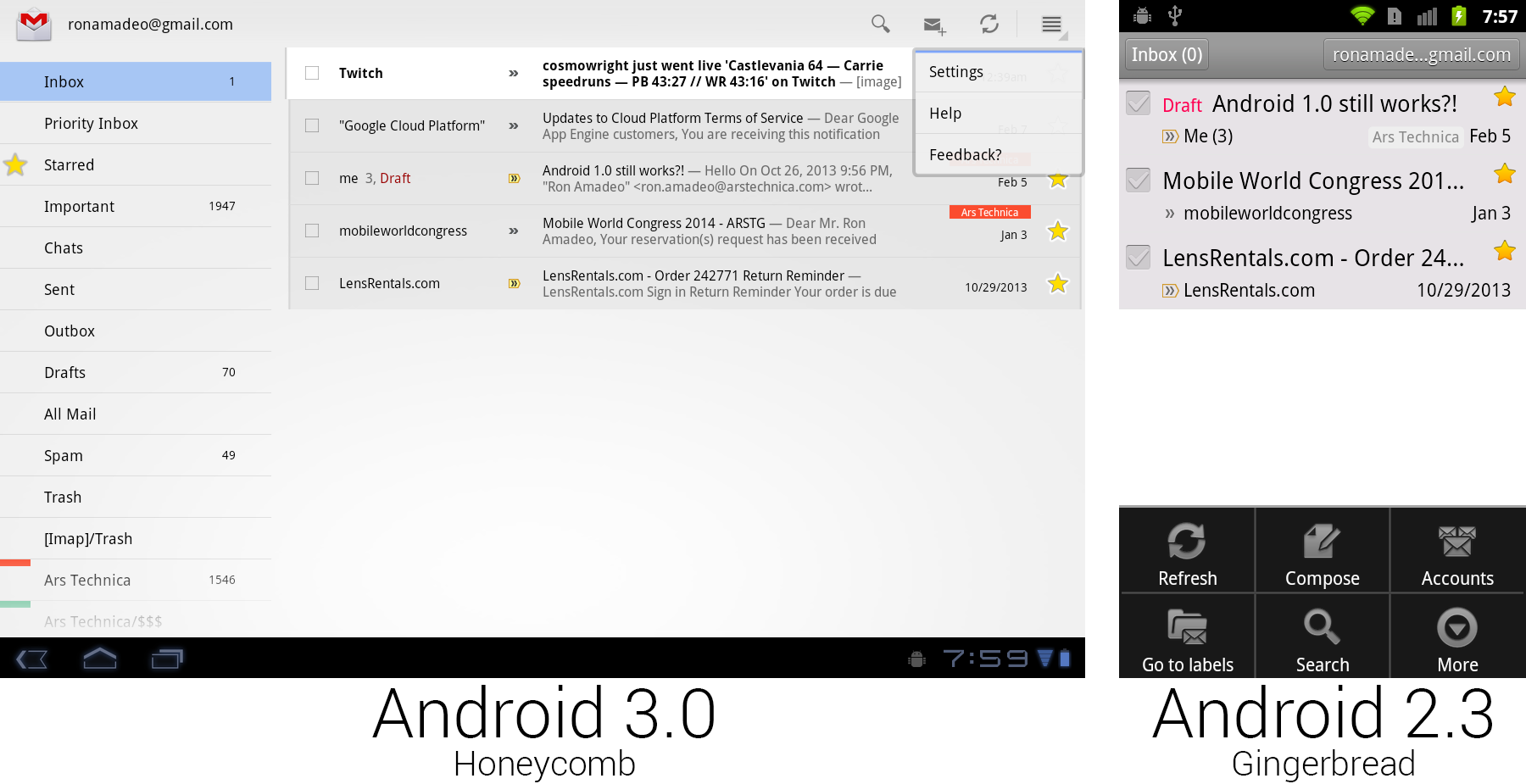
Gmail on Honeycomb versus Gmail on Gingerbread with the menu open. Buttons were placed on the main screen for easier discovery.
|
|||
|
|
Photo by Ron Amadeo
|
|||
|
|
|
|||
|
|
Gmail demonstrated all the new UI concepts in Honeycomb. Android 3.0 did away with hiding all the controls behind a menu button. There was now a strip of icons along the top of the screen called the Action Bar, which lifted many useful controls to the main screen where users could see them. Gmail showed buttons for search, compose, and refresh, and it put less useful controls like settings, help, and feedback in a dropdown called the "overflow" button. Tapping checkboxes or selecting text would cause the entire action bar to change to icons relating to those actions—for instance, selecting text would bring up cut, copy, and select all buttons.
|
|||
|
|
|
|||
|
|
The app icon displayed in the top left corner doubled as a navigation button called "Up." While "Back" worked similarly to a browser back button, navigating to previously visited screens, "Up" would navigate up the app hierarchy. For instance, if you were in the Android Market, pressed the "Email developer" button, and Gmail opened, "Back" would take you back to the Android Market, but "Up" would take you to the Gmail inbox. "Back" might close the current app, but "Up" never would. Apps could control the "Back" button, and they usually reprogrammed it to replicate the "Up" functionality. In practice, there was rarely a difference between the two buttons.
|
|||
|
|
|
|||
|
|
Honeycomb also introduced the "Fragments" API, which allowed developers to use a single app for tablets and phones. A "Fragment" was a single pane of a user interface. In the Gmail picture above, the left folder list was one fragment and the inbox was another fragment. Phones would show one fragment per screen, and tablets could show two side-by-side. The developer defined the look of individual fragments, and Android would decide how they should be displayed based on the current device.
|
|||
|
|
|
|||
|
|
|
|||
|
|
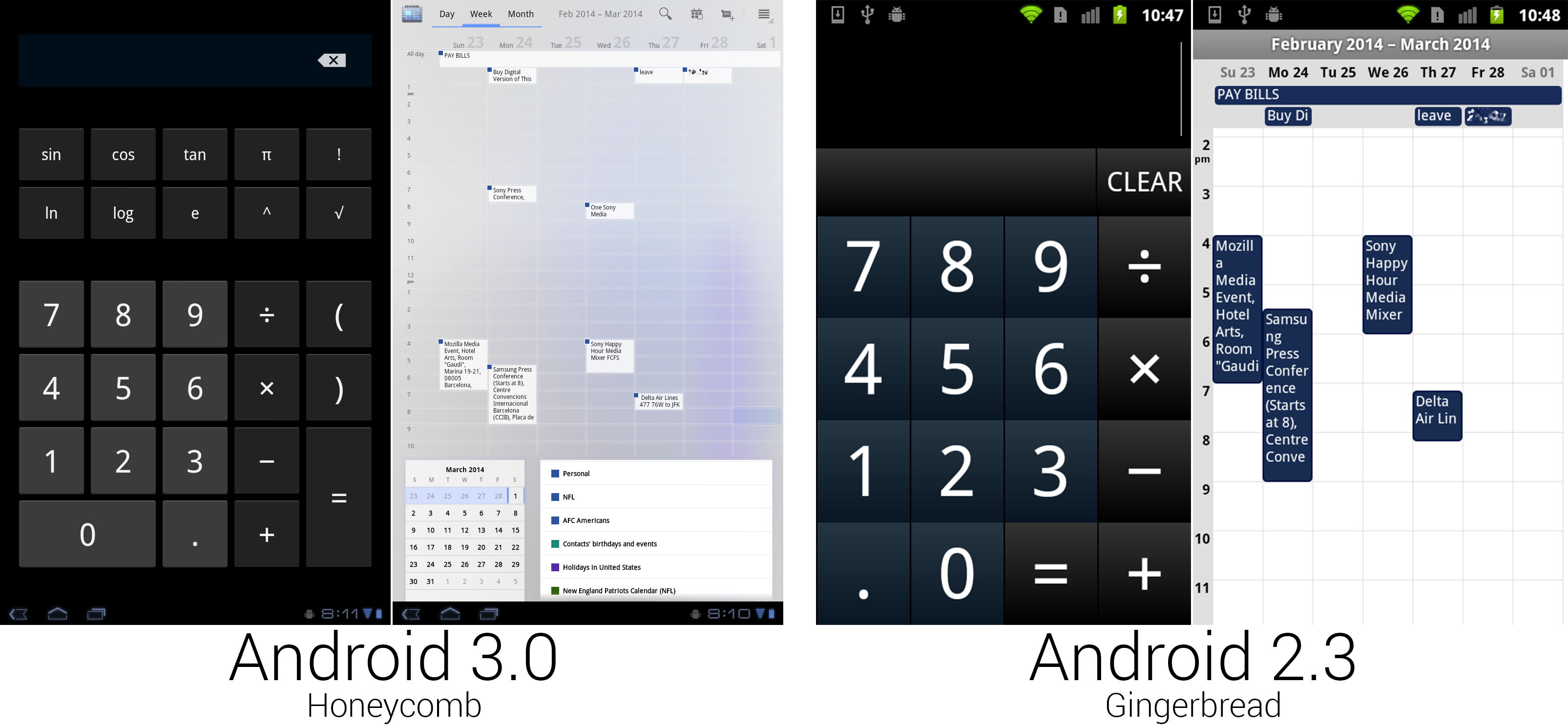
The calculator finally used regular Android buttons, but someone spilled blue ink on the calendar.
|
|||
|
|
Photo by Ron Amadeo
|
|||
|
|
|
|||
|
|
For the first time in Android's history, the calculator got a makeover with non-custom buttons, so it actually looked like part of the OS. The bigger screen made room for more buttons, enough that all the calculator functionality could fit on one screen. The calendar greatly benefited from the extra space, gaining much more room for appointment text and controls. The action bar at the top of the screen held buttons to switch views, along with showing the current time span and common controls. Appointment blocks switched to a white background with the calendar corner only showing in the top right corner. At the bottom (or side, in horizontal view) were boxes showing the month calendar and a list of displayed calendars.
|
|||
|
|
|
|||
|
|
The scale of the calendar could be adjusted, too. By performing a pinch zoom gesture, portrait week and day views could show between five and 19 hours of appointments on a single screen. The background of the calendar was made up of an uneven blue splotch, which didn't look particularly great and was tossed on later versions.
|
|||
|
|
|
|||
|
|
|
|||
|
|
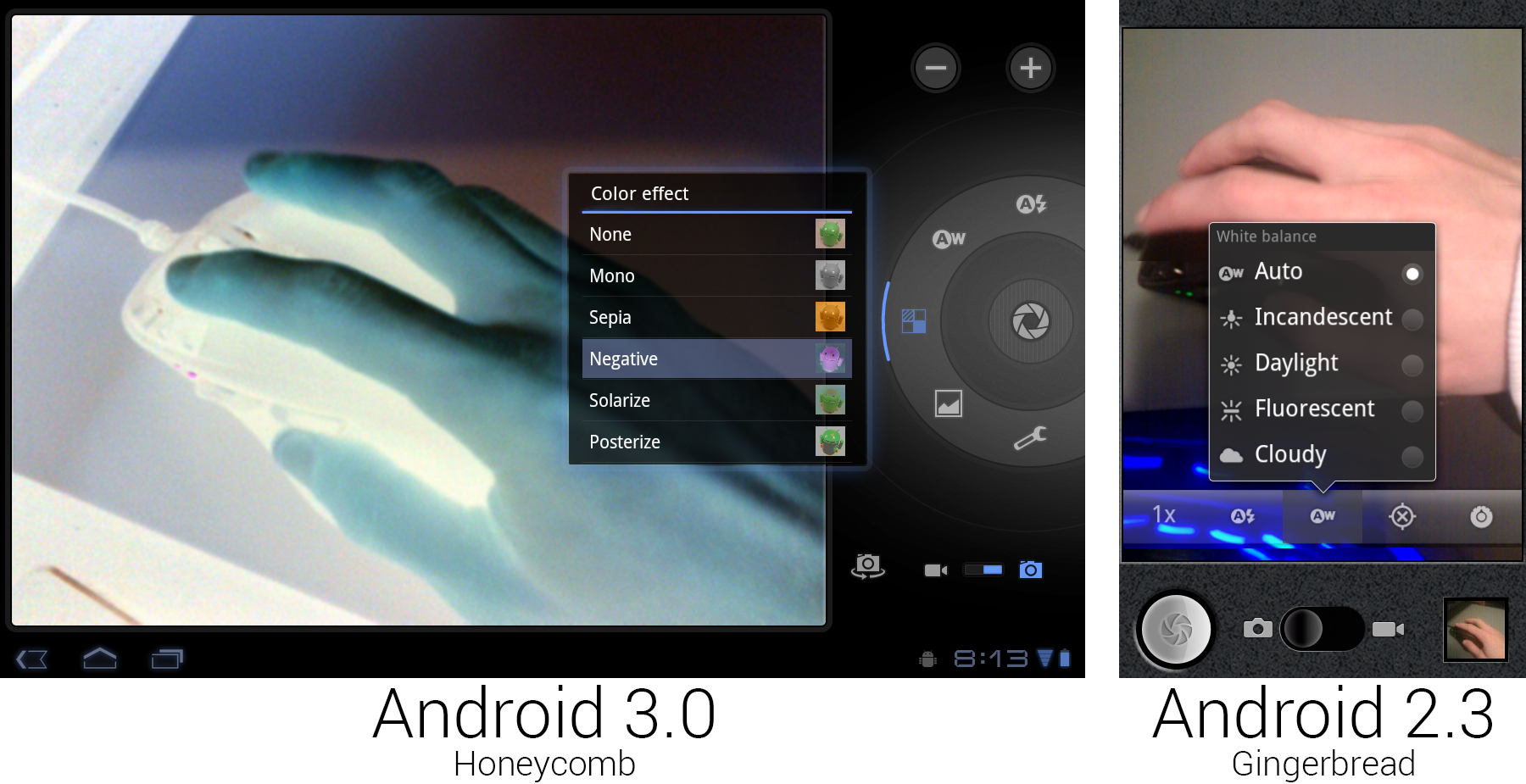
The new camera interface, showing off the live "Negative" effect.
|
|||
|
|
Photo by Ron Amadeo
|
|||
|
|
|
|||
|
|
The giant 10-inch Xoom tablet did have a camera, which meant that it also had a camera app. The Tron redesign finally got rid of the old faux-leather look that Google came up with in Android 1.6. The controls were laid out in a circle around the shutter button, bringing to mind the circular controls and dials on a real camera. The Cooliris-derived speech bubble popups were changed to glowing, semi-transparent black boxes. The Honeycomb screenshot shows the new "color effect" functionality, which applied a filter to the viewfinder in real time. Unlike the Gingerbread camera app, this didn't support a portrait orientation—it was limited to landscape only. Taking a portrait picture with a 10-inch tablet doesn't make much sense, but then neither does taking a landscape one.
|
|||
|
|
|
|||
|
|
|
|||
|
|
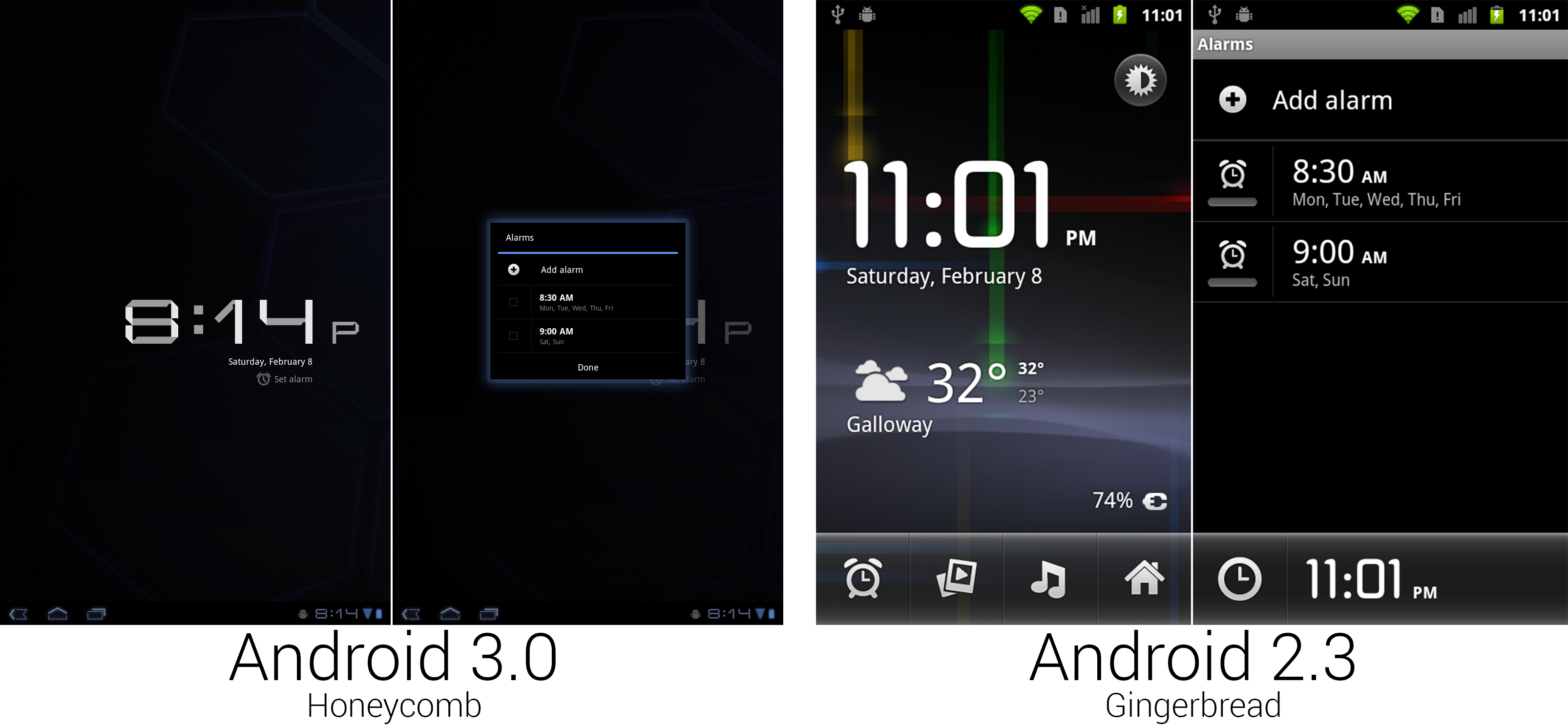
The clock app didn't get quite as much love as other areas. Google just threw it into a tiny box and called it a day.
|
|||
|
|
Photo by Ron Amadeo
|
|||
|
|
|
|||
|
|
Tons of functionality went out the door when it came time to remake the clock app. The entire "Deskclock" concept was kicked out the door, replaced with a simple large display of the time against a plain black background. The ability to launch other apps and view the weather was gone, as was the ability of the clock app to use your wallpaper. Google sometimes gave up when it came time to design a tablet-sized interface, like here, where it just threw the alarm interface into a tiny, centered dialog box.
|
|||
|
|
|
|||
|
|
|
|||
|
|
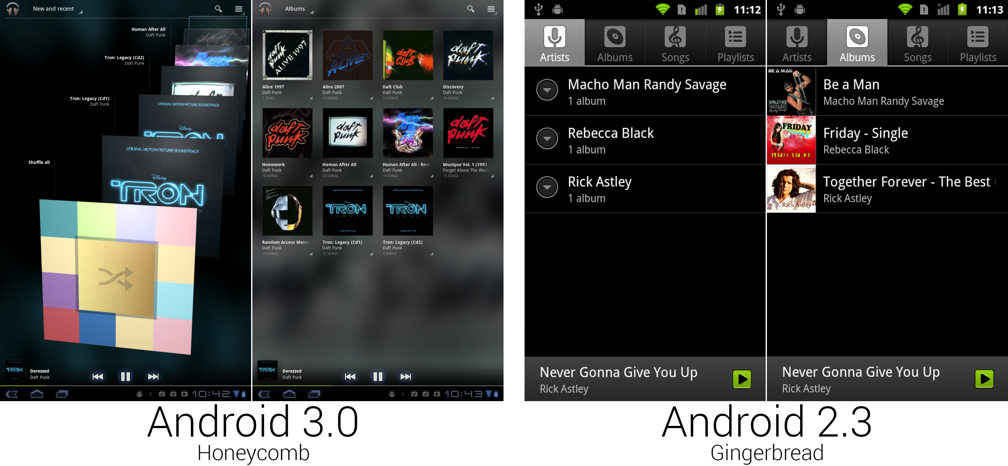
The Music app finally got the ground-up redesign it has needed forever.
|
|||
|
|
Photo by Ron Amadeo
|
|||
|
|
|
|||
|
|
While music received a few minor additions during its life, this was really the first time since Android 0.9 that it received serious attention. The highlight of the redesign was a don't-call-it-coverflow scrolling 3D album art view, called "New and Recent." Instead of the tabs added in Android 2.1, navigation was handled by a Dropbox box in the Action Bar. While "New and Recent" had 3D scrolling album art, "Albums" used a flat grid of albums thumbnails. The other sections had totally different designs, too. "Songs" used a vertically scrolling list of text, and "Playlists," "Genres," and "Artists" used stacked album art.
|
|||
|
|
|
|||
|
|
In nearly every view, every single item had its own individual menu, usually little arrows in the bottom right corner of an item. For now, these would only show "Play" and "add to Playlist," but this version of Google Music was built for the future. Google was launching a Music service soon, and those individual menus would be needed for things like viewing other content from that artist in the Music Store and managing the cloud storage versus local storage options.
|
|||
|
|
|
|||
|
|
Just like the Cooliris Gallery in Android 2.1, Google Music would blow up one of your thumbnails and use it as a background. The bottom "Now Playing" bar now displayed the album art, playback controls, and a song progress bar.
|
|||
|
|
|
|||
|
|
|
|||
|
|
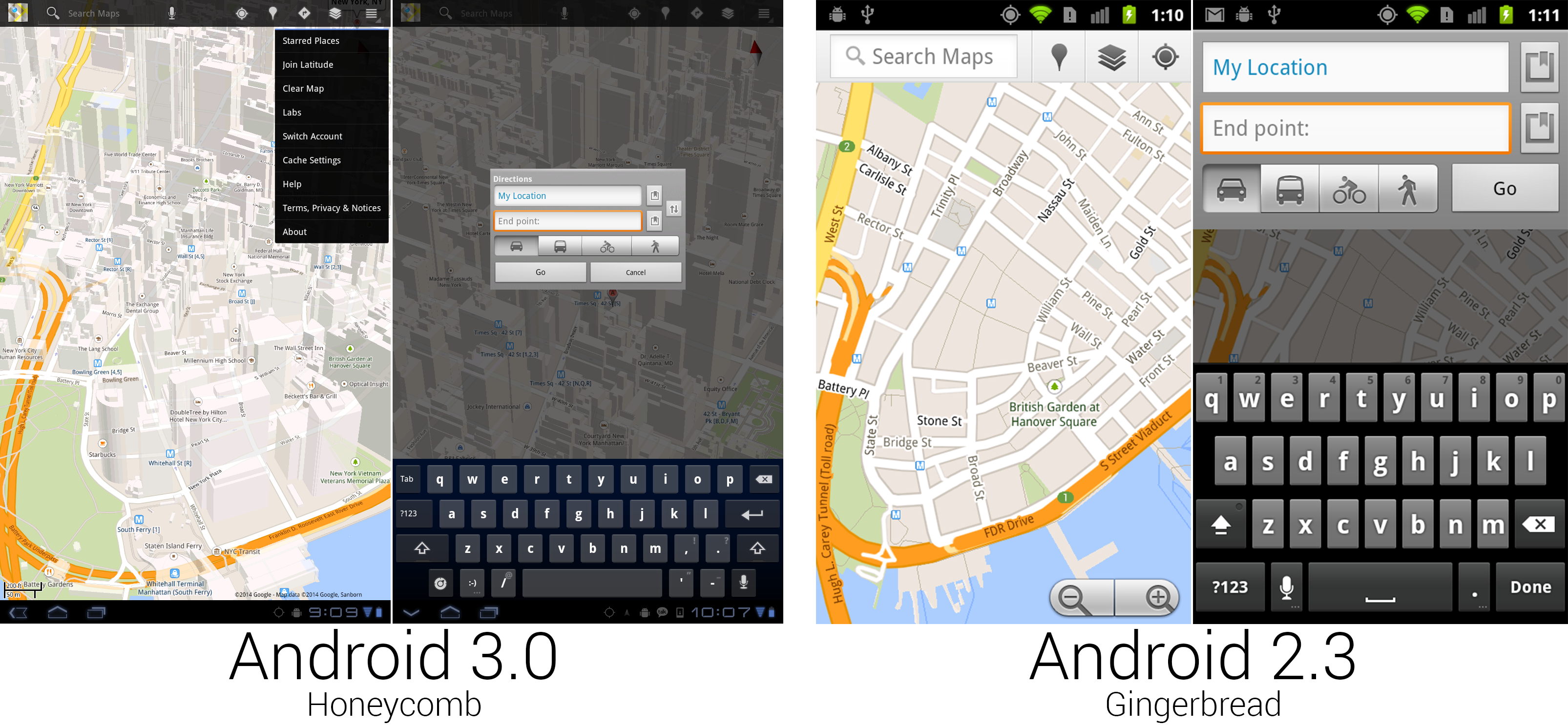
Some of the new Google Maps was really nice, and some of it was from Android 1.5.
|
|||
|
|
Photo by Ron Amadeo
|
|||
|
|
|
|||
|
|
Google Maps received another redesign for the big screen. This one would stick around for a while and used a semi-transparent black action bar for all the controls. Search was again the primary function, given the first spot in the action bar, but this time it was an actual search bar you could type in, instead of a search bar-shaped button that launched a completely different interface. Google finally gave up on dedicating screen space to actual zoom buttons, relying on only gestures to control the map view. While the feature has since been ported to all old versions of Maps, Honeycomb was the first version to feature 3D building outlines on the map. Dragging two fingers down on the map would "tilt" the map view and show the sides of the buildings. You could freely rotate and the buildings would adjust, too.
|
|||
|
|
|
|||
|
|
Not every part of Maps was redesigned. Navigation was untouched from Gingerbread, and some core parts of the interface, like directions, were pulled straight from Android 1.6 and centered in a tiny box.
|
|||
|
|
|
|||
|
|
----------
|
|||
|
|
|
|||
|
|

|
|||
|
|
|
|||
|
|
[Ron Amadeo][a] / Ron is the Reviews Editor at Ars Technica, where he specializes in Android OS and Google products. He is always on the hunt for a new gadget and loves to rip things apart to see how they work.
|
|||
|
|
|
|||
|
|
[@RonAmadeo][t]
|
|||
|
|
|
|||
|
|
--------------------------------------------------------------------------------
|
|||
|
|
|
|||
|
|
via: http://arstechnica.com/gadgets/2014/06/building-android-a-40000-word-history-of-googles-mobile-os/17/
|
|||
|
|
|
|||
|
|
译者:[译者ID](https://github.com/译者ID) 校对:[校对者ID](https://github.com/校对者ID)
|
|||
|
|
|
|||
|
|
本文由 [LCTT](https://github.com/LCTT/TranslateProject) 原创翻译,[Linux中国](http://linux.cn/) 荣誉推出
|
|||
|
|
|
|||
|
|
[a]:http://arstechnica.com/author/ronamadeo
|
|||
|
|
[t]:https://twitter.com/RonAmadeo
|