mirror of
https://github.com/LCTT/TranslateProject.git
synced 2025-01-07 22:11:09 +08:00
103 lines
15 KiB
Markdown
103 lines
15 KiB
Markdown
|
|
The history of Android
|
||
|
|
================================================================================
|
||
|
|

|
||
|
|
Photo by Ron Amadeo
|
||
|
|
|
||
|
|
### Google Play and the return of direct-to-consumer device sales ###
|
||
|
|
|
||
|
|
On March 6, 2012, Google unified all of its content offerings under the banner of "Google Play." The Android Market became the Google Play Store, Google Books became Google Play Books, Google Music became Google Play Music, and Android Market Movies became Google Play Movies & TV. While the app interfaces didn't change much, all four content apps got new names and icons. Content purchased in the Play Store would be downloaded to the appropriate app, and the Play Store and Play content apps all worked together to provide a fairly organized content experience.
|
||
|
|
|
||
|
|
The Google Play update was Google's first big out-of-cycle update. Four packed-in apps were all changed without having to issue a system update—they were all updated through the Android Market/Play Store. Enabling out-of-cycle updates to individual apps was a big focus for Google, and being able to do an update like this was the culmination of an engineering effort that started in the Gingerbread era. Google had been working on "decoupling" the apps from the operating system and making everything portable enough to be distributed through the Android Market/Play Store.
|
||
|
|
|
||
|
|
While one or two apps (mostly Maps and Gmail) had previously lived on the Android Market, from here on you'll see a lot more significant updates that have nothing to do with an operating system release. System updates require the cooperation of OEMs and carriers, so they are difficult to push out to every user. Play Store updates are completely controlled by Google, though, providing the company a direct line to users' devices. For the launch of Google Play, the Android Market updated itself to the Google Play Store, and from there, Books, Music, and Movies were all issued Google Play-flavored updates.
|
||
|
|
|
||
|
|
The design of the Google Play apps was still all over the place. Each app looked and functioned differently, but for now, a cohesive brand was a good start. And removing "Android" from the branding was necessary because many services were available in the browser and could be used without touching an Android device at all.
|
||
|
|
|
||
|
|
In April 2012, Google started [selling devices though the Play Store again][1], reviving the direct-to-customer model it had experimented with for the launch of the Nexus One. While it was only two years after ending the Nexus One sales, Internet shopping was now more common place, and buying something before you could hold it didn't seem as crazy as it did in 2010.
|
||
|
|
|
||
|
|
Google also saw how price-conscious consumers became when faced with the Nexus One's $530 price tag. The first device for sale was an unlocked, GSM version of the Galaxy Nexus for $399. From there, price would go even lower. $350 has been the entry-level price for the last two Nexus smartphones, and 7-inch Nexus tablets would come in at only $200 to $220.
|
||
|
|
|
||
|
|
Today, the Play Store sells eight different Android devices, four Chromebooks, a thermostat, and tons of accessories, and the device store is the de-facto location for a new Google product launch. New phone launches are so popular, the site usually breaks under the load, and new Nexus phones sell out in a few hours.
|
||
|
|
|
||
|
|
### Android 4.1, Jelly Bean—Google Now points toward the future ###
|
||
|
|
|
||
|
|
|
||
|
|
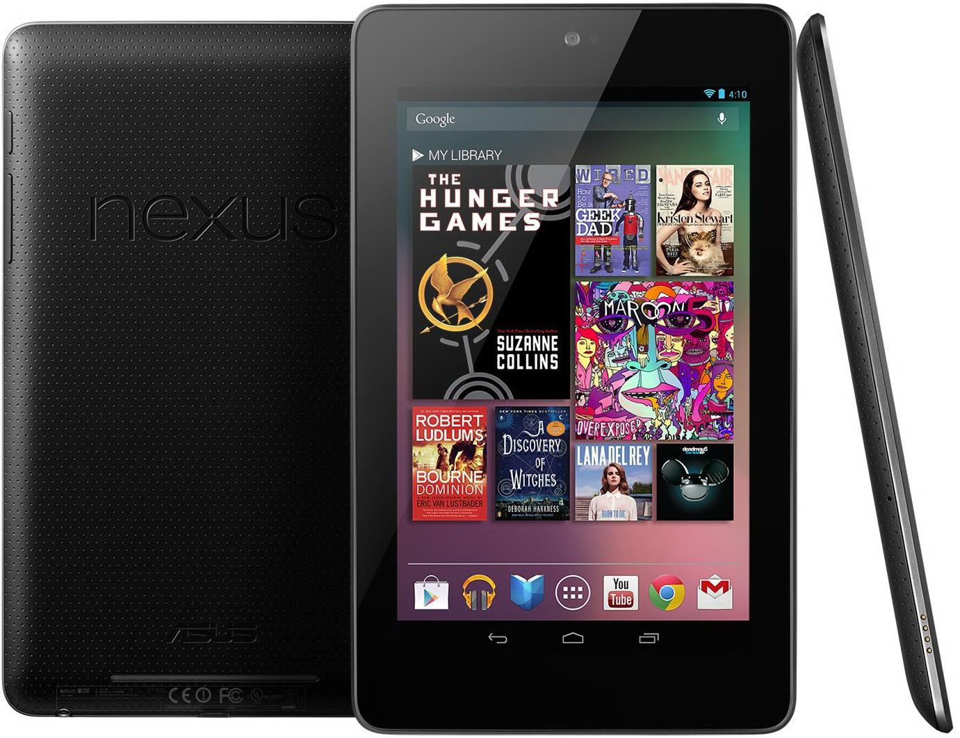
The Asus-made Nexus 7, Android 4.1's launch device.
|
||
|
|
|
||
|
|
With the release of Android 4.1, Jelly Bean in July 2012, Google settled into an Android release cadence of about every six months. The platform matured to the point where a release every three months was unnecessary, and the slower release cycle gave OEMs a chance to catch their breath. Unlike Honeycomb, point releases were now fairly major updates, with 4.1 bringing major UI and framework changes.
|
||
|
|
|
||
|
|
One of the biggest changes in Jelly Bean that you won't be able to see in screenshots is "Project Butter," the name for a concerted effort by Google's engineers to make Android animations run smoothly at 30FPS. Core changes were made, like Vsync and triple buffering, and individual animations were optimized so they could be drawn smoothly. Animation and scrolling smoothness had always been a weak point of Android when compared to iOS. After some work on both the core animation framework and on individual apps, Jelly Bean brought Android a lot closer to iOS' smoothness.
|
||
|
|
|
||
|
|
Along with Jelly Bean came the [Nexus][2] 7, a 7-inch tablet manufactured by Asus. Unlike the primarily horizontal Xoom, the Nexus 7 was meant to be used in portrait mode, like a large phone. The Nexus 7 showed that, after almost a year-and-a-half of ecosystem building, Google was ready to commit to the tablet market with a flagship device. Like the Nexus One and GSM Galaxy Nexus, the Nexus 7 was sold online directly by Google. While those earlier devices had shockingly high prices for consumers that were used to carrier subsidies, the Nexus 7 hit a mass market price point of only $200. The price bought you a device with a 7-inch, 1280x800 display, a quad core, 1.2 GHz Tegra 3 processor, 1GB of RAM, and 8GB of storage. The Nexus 7 was such a good value that many wondered if Google was making any money at all on its flagship tablet.
|
||
|
|
|
||
|
|
This smaller, lighter, 7-inch form factor would be a huge success for Google, and it put the company in the rare position of being an industry trendsetter. Apple, which started with a 10-inch iPad, was eventually forced to answer the Nexus 7 and tablets like it with the iPad Mini.
|
||
|
|
|
||
|
|

|
||
|
|
4.1's new lock screen design, wallpaper, and the new on-press highlight on the system buttons.
|
||
|
|
Photo by Ron Amadeo
|
||
|
|
|
||
|
|
The Tron look introduced in Honeycomb was toned down a little in Ice Cream Sandwich, and Jelly Bean took things a step further. It started removing blue from large chunks of the operating system. The hint was the on-press highlights on the system buttons, which changed from blue to gray.
|
||
|
|
|
||
|
|
|
||
|
|
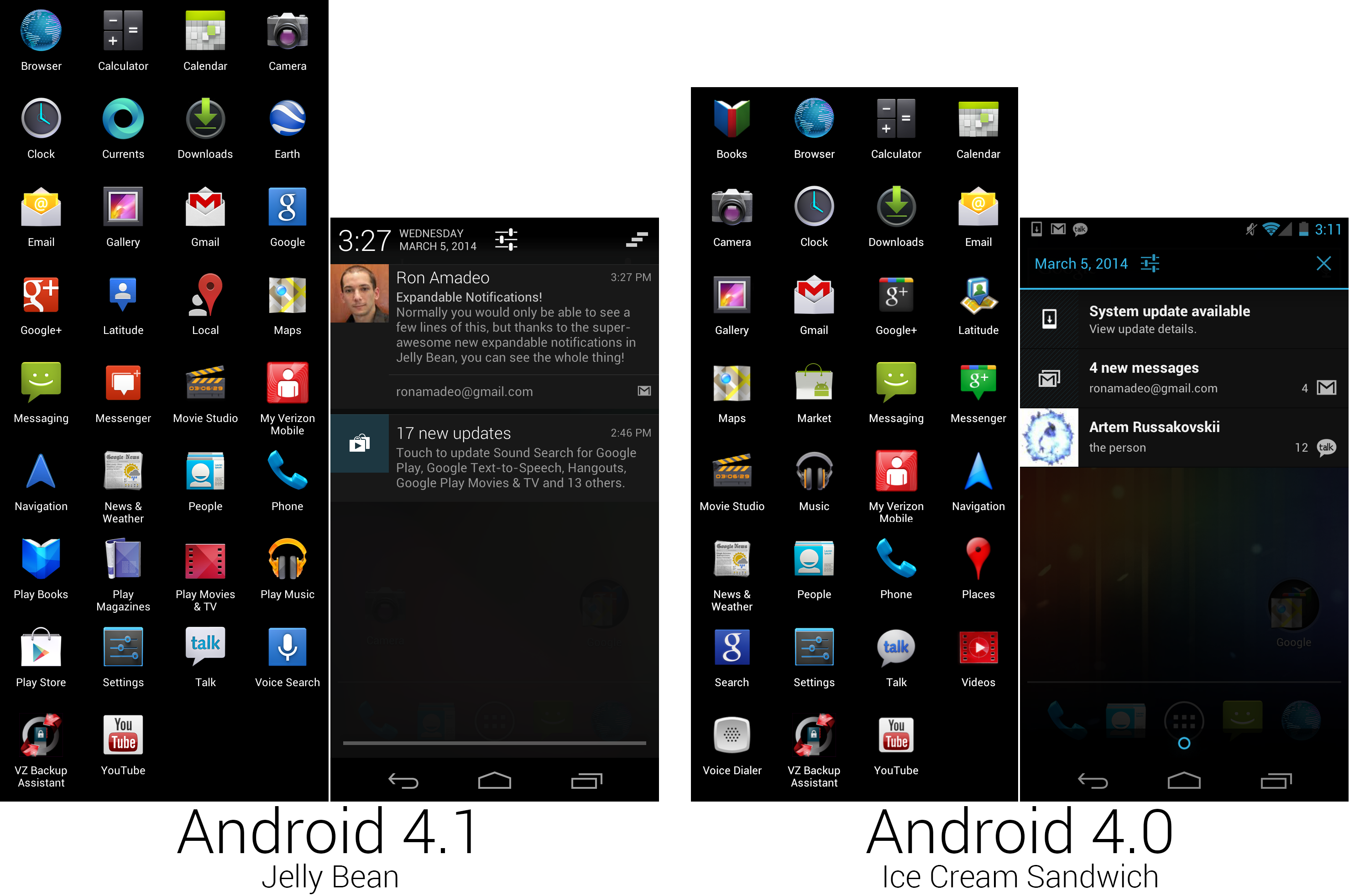
A composite image of the new app lineup and the new notification panel with expandable notifications.
|
||
|
|
Photo by Ron Amadeo
|
||
|
|
|
||
|
|
The Notification panel was completely revamped, and we've finally arrived at the design used today in KitKat. The new panel extended to the top of the screen and covered the usual status icons, meaning the status bar was no longer visible when the panel was open. The time was prominently displayed in the top left corner, along with the date and a settings shortcut. The clear all notions button, which was represented by an "X" in Ice Cream Sandwich, changed to a stairstep icon, symbolizing the staggered sliding animation that cleared the notification panel. The bottom handle changed from a circle to a single line that ran the length of the notification panel. All the typography was changed—the notification panel now used bigger, thinner fonts for everything. This was another screen where the blue introduced in Ice Cream Sandwich and Honeycomb was removed. The notification panel was entirely gray now except for on-touch highlights.
|
||
|
|
|
||
|
|
There was new functionality in the panel, too. Notifications were now expandable and could show much more information than the previous two-line design. It now showed up to eight lines of text and could even show buttons at the bottom of the notification. The screenshot notification had a share button at the bottom, and you could call directly from a missed call notification, or you could snooze a ringing alarm all from the notification panel. New notifications were expanded by default, but as they piled up they would collapse back to the traditional size. Dragging down on a notification with two fingers would expand it.
|
||
|
|
|
||
|
|
|
||
|
|
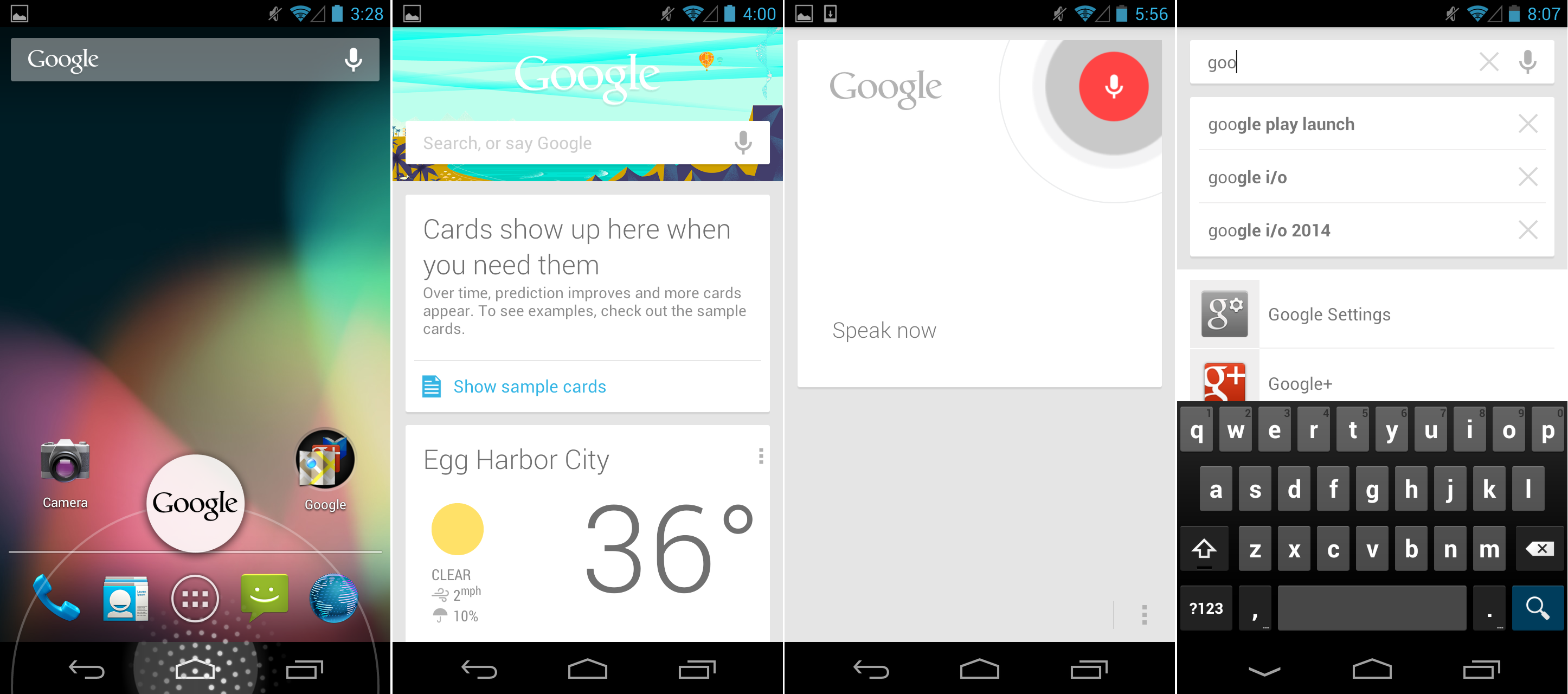
The new Google Search app, with Google Now cards, voice search, and text search.
|
||
|
|
Photo by Ron Amadeo
|
||
|
|
|
||
|
|
The biggest feature addition to Jelly Bean for not only Android, but for Google as a whole, was the new version of the Google Search application. This introduced "Google Now," a predictive search feature. Google Now was displayed as several cards that sit below the search box, and it would offer results to searches Google thinks you care about. These were things like Google Maps searches for places you've recently looked at on your desktop computer or calendar appointment locations, the weather, and time at home while traveling.
|
||
|
|
|
||
|
|
The new Google Search app could, of course, be launched with the Google icon, but it could also be accessed from any screen with a swipe up from the system bar. Long pressing on the system bar brought up a ring that worked similarly to the lock screen ring. The card section scrolled vertically, and cards could be a swipe away if you didn't want to see them. Voice Search was a big part of the updates. Questions weren't just blindly entered into Google; if Google knew the answer, it would also talk back using a text-To-Speech engine. And old-school text searches were, of course, still supported. Just tap on the bar and start typing.
|
||
|
|
|
||
|
|
Google frequently called Google Now "the future of Google Search." Telling Google what you wanted wasn't good enough. Google wanted to know what you wanted before you did. Google Now put all of Google's data mining knowledge about you to work for you, and it was the company's biggest advantage against rival search services like Bing. Smartphones knew more about you than any other device you own, so the service debuted on Android. But Google slowly worked Google Now into Chrome, and eventually it will likely end up on Google.com.
|
||
|
|
|
||
|
|
While the functionality was important, it became clear that Google Now was the most important design work to ever come out of the company, too. The white card aesthetic that this app introduced would become the foundation for Google's design of just about everything. Today, this card style is used in the Google Play Store and in all of the Play content apps, YouTube, Google Maps, Drive, Keep, Gmail, Google+, and many others. It's not just Android apps, either. Many of Google's desktop sites and iOS apps are inspired by this design. Design was historically one of Google's weak areas, but Google Now was the point where the company finally got its act together with a cohesive, company-wide design language.
|
||
|
|
|
||
|
|
|
||
|
|
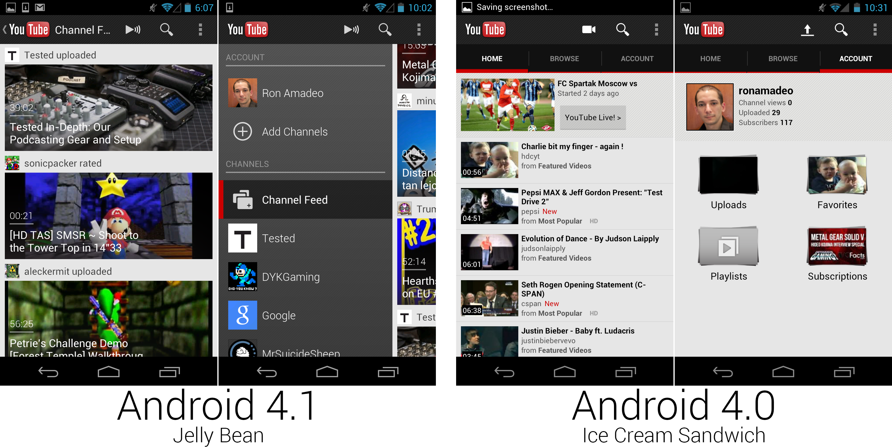
Yet another YouTube redesign. Information density went way down.
|
||
|
|
Photo by Ron Amadeo
|
||
|
|
|
||
|
|
Another version, another YouTube redesign. This time the list view was primarily thumbnail-based, with giant images taking up most of the screen real estate. Information density tanked with the new list design. Before YouTube would display around six items per screen, now it could only display three.
|
||
|
|
|
||
|
|
YouTube was one of the first apps to add a sliding drawer to the left side of an app, a feature which would become a standard design style across Google's apps. The drawer has links for your account and channel subscriptions, which allowed Google to kill the tabs-on-top design.
|
||
|
|
|
||
|
|
|
||
|
|
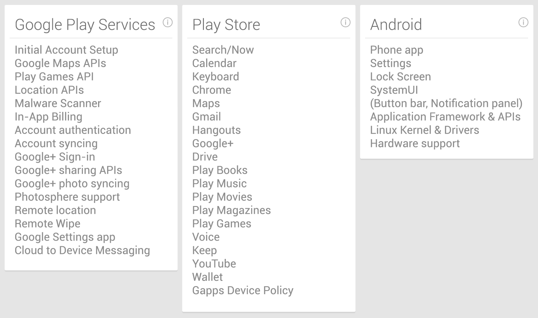
Google Play Service's responsibilities versus the rest of Android.
|
||
|
|
Photo by Ron Amadeo
|
||
|
|
|
||
|
|
### Google Play Services—fragmentation and making OS versions (nearly) obsolete ###
|
||
|
|
|
||
|
|
It didn't seem like a big deal at the time, but in September 2012, Google Play Services 1.0 was automatically pushed out to every Android phone running 2.2 and up. It added a few Google+ APIs and support for OAuth 2.0.
|
||
|
|
|
||
|
|
While this update might sound boring, Google Play Services would eventually grow to become an integral part of Android. Google Play Services acts as a shim between the normal apps and the installed Android OS, allowing Google to update or replace some core components and add APIs without having to ship out a new Android version.
|
||
|
|
|
||
|
|
With Play Services, Google had a direct line to the core of an Android phone without having to go through OEM updates and carrier approval processes. Google used Play Services to add an entirely new location system, a malware scanner, remote wipe capabilities, and new Google Maps APIs, all without shipping an OS update. Like we mentioned at the end of the Gingerbread section, thanks to all the "portable" APIs implemented in Play Services, Gingerbread can still download a modern version of the Play Store and many other Google Apps.
|
||
|
|
|
||
|
|
The other big benefit was compatibility with Android's user base. The newest release of an Android OS can take a very long time to get out to the majority of users, which means APIs that get tied to the latest version of the OS won't be any good to developers until the majority of the user base upgrades. Google Play Services is compatible with Froyo and above, which is 99 percent of active devices, and the updates pushed directly to phones through the Play Store. By including APIs in Google Play Services instead of Android, Google can push a new API out to almost all users in about a week. It's [a great solution][3] to many of the problems caused by version fragmentation.
|
||
|
|
|
||
|
|
----------
|
||
|
|
|
||
|
|

|
||
|
|
|
||
|
|
[Ron Amadeo][a] / Ron is the Reviews Editor at Ars Technica, where he specializes in Android OS and Google products. He is always on the hunt for a new gadget and loves to rip things apart to see how they work.
|
||
|
|
|
||
|
|
[@RonAmadeo][t]
|
||
|
|
|
||
|
|
--------------------------------------------------------------------------------
|
||
|
|
|
||
|
|
via: http://arstechnica.com/gadgets/2014/06/building-android-a-40000-word-history-of-googles-mobile-os/21/
|
||
|
|
|
||
|
|
译者:[译者ID](https://github.com/译者ID) 校对:[校对者ID](https://github.com/校对者ID)
|
||
|
|
|
||
|
|
本文由 [LCTT](https://github.com/LCTT/TranslateProject) 原创翻译,[Linux中国](http://linux.cn/) 荣誉推出
|
||
|
|
|
||
|
|
[1]:http://arstechnica.com/gadgets/2012/04/unlocked-samsung-galaxy-nexus-can-now-be-purchased-from-google/
|
||
|
|
[2]:http://arstechnica.com/gadgets/2012/07/divine-intervention-googles-nexus-7-is-a-fantastic-200-tablet/
|
||
|
|
[3]:http://arstechnica.com/gadgets/2013/09/balky-carriers-and-slow-oems-step-aside-google-is-defragging-android/
|
||
|
|
[a]:http://arstechnica.com/author/ronamadeo
|
||
|
|
[t]:https://twitter.com/RonAmadeo
|