mirror of
https://github.com/LCTT/TranslateProject.git
synced 2025-01-07 22:11:09 +08:00
71 lines
8.8 KiB
Markdown
71 lines
8.8 KiB
Markdown
|
|
The history of Android
|
|||
|
|
================================================================================
|
|||
|
|
|
|||
|
|
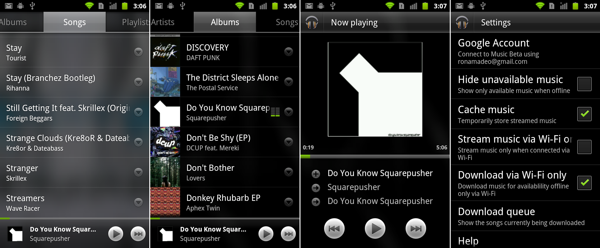
Google Music Beta running on Gingerbread.
|
|||
|
|
Photo by Ron Amadeo
|
|||
|
|
|
|||
|
|
### Google Music Beta—cloud storage in lieu of a content store ###
|
|||
|
|
|
|||
|
|
While Honeycomb revamped the Google Music interface, the Music app didn't go directly from the Honeycomb design to Ice Cream Sandwich. In May 2011, Google launched "[Google Music Beta][1]," an online music locker that came along with a new Google Music app.
|
|||
|
|
|
|||
|
|
The new Google Music app for 2.2 and up took a few design cues from the Cooliris Gallery, of all things, going with a changing, blurry image for the background. Just about everything was transparent: the pop-up menus, the tabs at the top, and the now-playing bar at the bottom. Individual songs or entire playlists could be downloaded to the device for offline playback, making Google Music an easy way to make sure your music was on all your devices. Besides the mobile app, there was also a Webapp, which allowed Google Music to work on any desktop computer.
|
|||
|
|
|
|||
|
|
Google didn't have content deals in place with the record companies to start a music store yet, so its stop-gap solution was to allow users to store songs online and stream them to a device. Today, Google has content deals for individual song purchases and all-you-can-eat subscription modes, along with the music locker service.
|
|||
|
|
|
|||
|
|
### Android 4.0, Ice Cream Sandwich—the modern era ###
|
|||
|
|
|
|||
|
|
|
|||
|
|
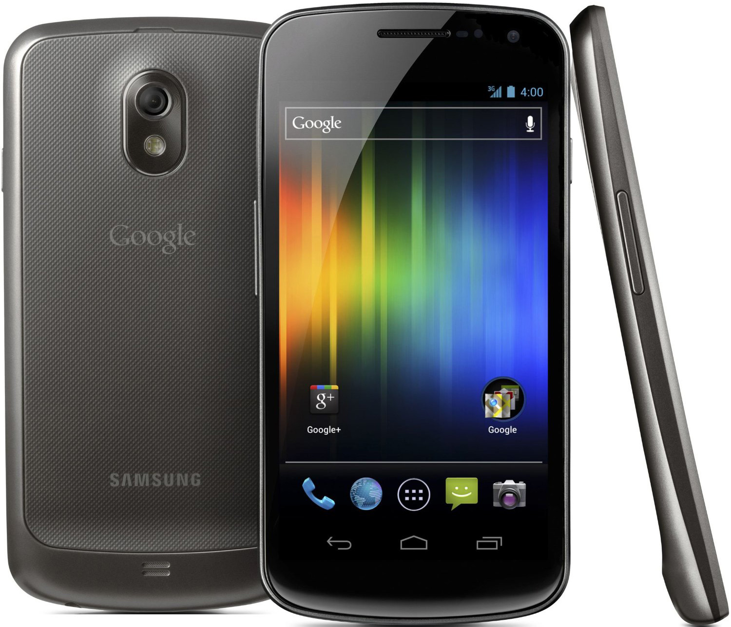
The Samsung Galaxy Nexus, Android 4.0's launch device.
|
|||
|
|
|
|||
|
|
Released in October 2011, Android 4.0, Ice Cream Sandwich, got the OS back on track with a release spanning phones and tablets, and it was once again open source. It was the first update to come to phones since Gingerbread, which meant the majority of Android's user base went almost a year without seeing an update. 4.0 was all about shrinking the Honeycomb design to smaller devices, bringing on-screen buttons, the action bar, and the new design language to phones.
|
|||
|
|
|
|||
|
|
Ice Cream Sandwich debuted on the Samsung Galaxy Nexus, one of the first Android phones with a 720p screen. Along with the higher resolution, the Galaxy Nexus pushed phones to even larger sizes with a 4.65-inch screen—almost a full inch larger than the original Nexus One. This was called "too big" by many critics, but today many Android phones are even bigger. (Five inches is "normal" now.) Ice Cream Sandwich required a lot more power than Gingerbread did, and the Galaxy Nexus delivered with a dual core, 1.2Ghz TI OMAP processor and 1GB of RAM.
|
|||
|
|
|
|||
|
|
In the US, the Galaxy Nexus debuted on Verizon with an LTE modem. Unlike previous Nexus devices, the most popular model—the Verizon version—was under the control of a carrier, and Google's software and updates had to be approved by Verizon before the phone could be updated. This led to delays in updates and the removal of software Verizon didn't like, namely Google Wallet.
|
|||
|
|
|
|||
|
|
Thanks to the software improvements in Ice Cream Sandwich, Google finally achieved peak button removal on a phone. With the on-screen navigation buttons, the capacitive buttons could be removed, leaving the Galaxy Nexus with only power and volume buttons.
|
|||
|
|
|
|||
|
|
|
|||
|
|
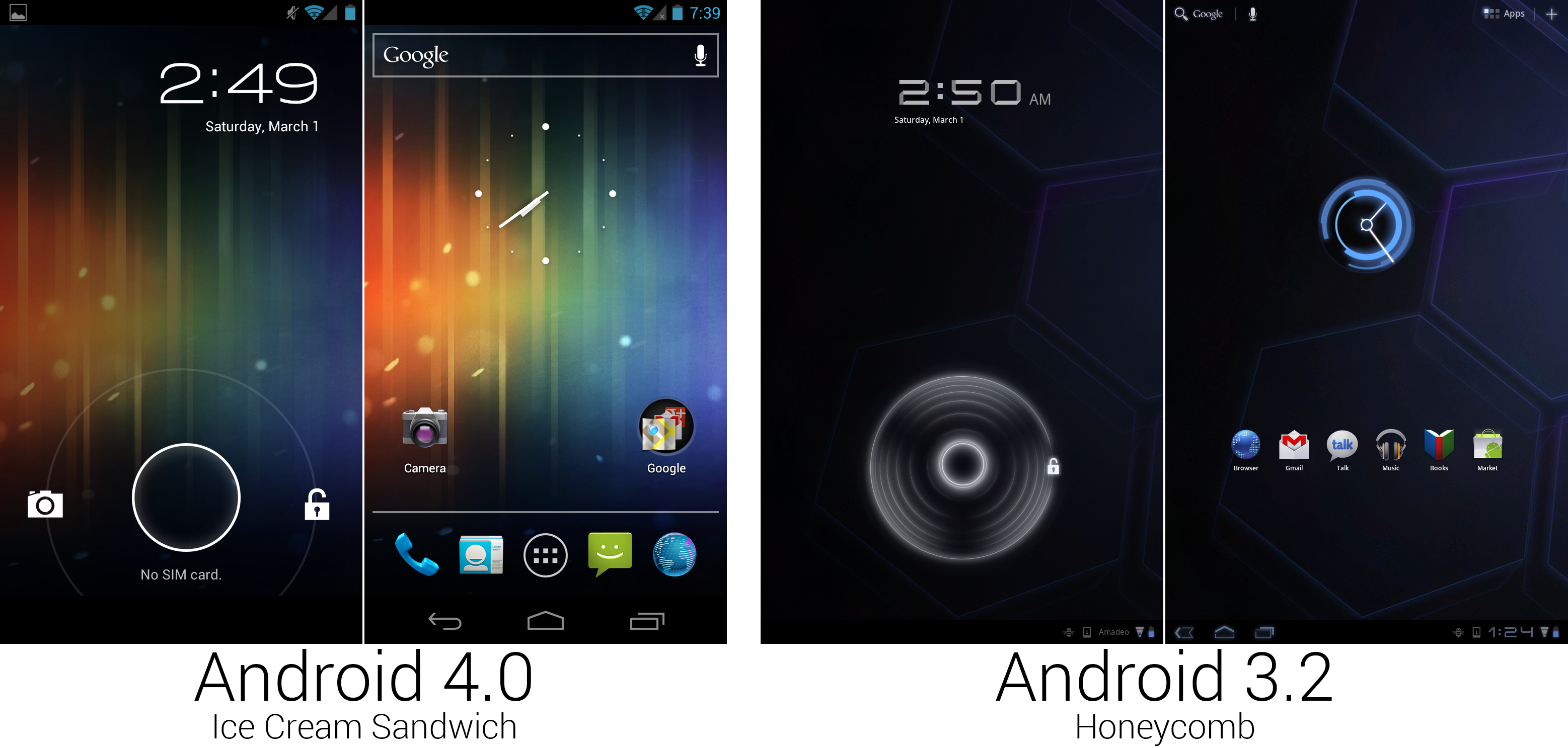
Android 4.0 shrunk down a lot of the Honeycomb design.
|
|||
|
|
Photo by Ron Amadeo
|
|||
|
|
|
|||
|
|
The Tron aesthetic in Honeycomb was a little much. Immediately in Ice Cream Sandwich, Google started turning down some of the more sci-fi aspects of the design. The sci-fi clock font changed from a folded over semi-transparent thing to a thin, elegant, normal-looking font. The water ripple touch effect on the unlock circle was removed, and the alien Honeycomb clock widget was scrapped in favor of a more minimal design. The system buttons were redesigned, too, changing from blue outlines with the occasional thick side to thin, even, white outlines. The default wallpaper changed from the blue Honeycomb spaceship interior to a streaky, broken rainbow, which added some much-needed color to the default layout.
|
|||
|
|
|
|||
|
|
The Honeycomb system bar features were split into a two-bar design for phones. At the top was the traditional status bar, and at the bottom was the new system bar, which housed the three system buttons: Back, Home, and Recent. A permanent search bar was added to the top of the home screen. The bar persisted on the screen the same way the dock did, so over the five home screens, it took up 20 icon spots. On the Honeycomb unlock screen, the small inner circle could be moved anywhere outside the larger circle to unlock the device. In Ice Cream Sandwich, you had to actually hit the unlock icon with the inner circle. This new accuracy requirement allowed Google to add another option to the lock screen: a camera shortcut. Dragging the inner circle to the camera icon would directly launch the camera, skipping the home screen.
|
|||
|
|
|
|||
|
|
|
|||
|
|
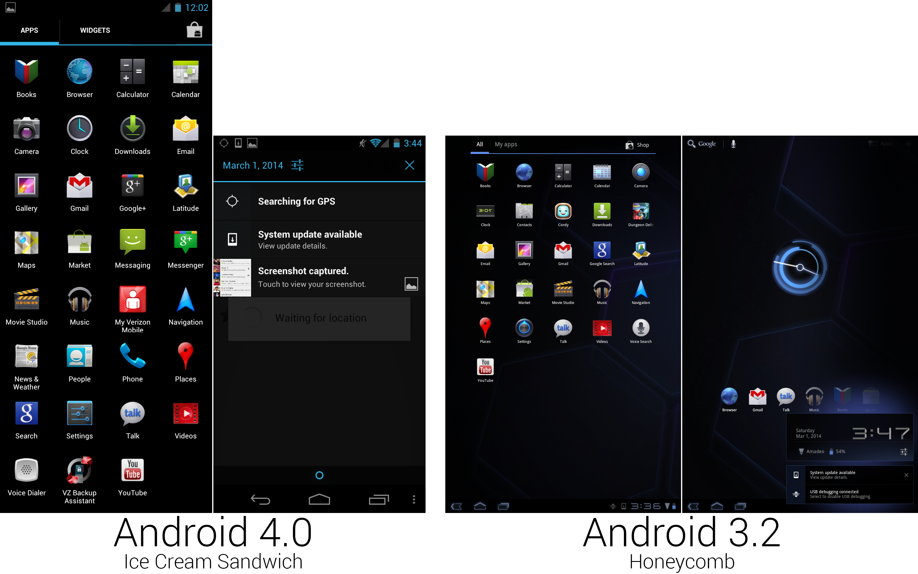
A Phone OS meant a ton more apps, and the notification panel became a full-screen interface again.
|
|||
|
|
Photo by Ron Amadeo
|
|||
|
|
|
|||
|
|
The App drawer was still tabbed, but the "My Apps" tab from Honeycomb was replaced with "Widgets," which was a simple 2×3 thumbnail view of widgets. Like Honeycomb, this app drawer was paginated and had to be swiped through horizontally. (Android still uses this app drawer design today.) New in the app drawer was an Android Google+ app, which existed separately for some time. Along with it came a shortcut to "Messenger," the Google+ private messaging service. ("Messenger" is not to be confused with "Messaging," the stock SMS app.)
|
|||
|
|
|
|||
|
|
Since we're back to a phone now, Messaging, News and Weather, Phone, and Voice Dialer returned, and Cordy, a tablet game, was removed. Our screenshots are from the Verizon variant, which, despite being a Nexus device, was sullied by crapware like "My Verizon Mobile," and "VZ Backup Assistant." In keeping with the de-Tronification theme of Ice Cream Sandwich, the Calendar and Camera icons now looked more like something from Planet Earth rather than alien artifacts. Clock, Downloads, Phone, and Android Market got new icons, too, and "Contacts" got a new icon and a new name, becoming "People."
|
|||
|
|
|
|||
|
|
The Notification panel got a big overhaul, especially when compared to the [previous Gingerbread design][2]. There was now a top header featuring the date, a settings shortcut, and a "clear all." While first Honeycomb allowed users to dismiss individual notifications by tapping on an "X" in the notification, Ice Cream Sandwich's implementation was much more elegant: just swipe the individual notifications to the left or right and they cleared. Honeycomb had blue highlights, but the blue tone was all over the place. Ice Cream Sandwich unified almost everything to a single blue (hex code #33B5E5, if you want to get specific). The background of the notification panel was made transparent, and the "handle" at the bottom changed to a minimal blue circle with an opaque black background.
|
|||
|
|
|
|||
|
|
|
|||
|
|
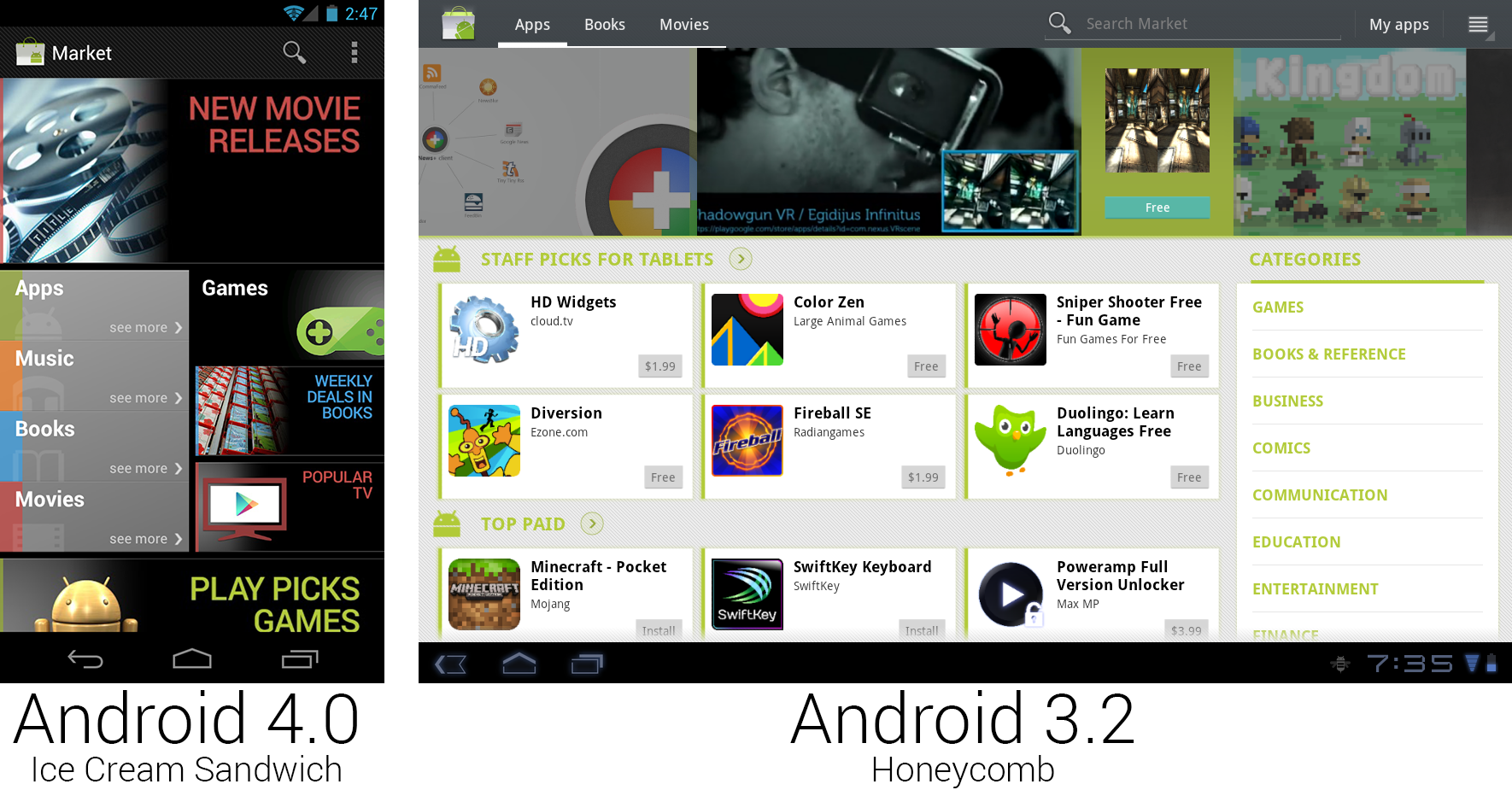
The main page of the Android Market changed back to black.
|
|||
|
|
Photo by Ron Amadeo
|
|||
|
|
|
|||
|
|
The Market got yet another redesign. It finally supported portrait mode again and added Music to the lineup of content you can buy in the store. The new Market extended the cards concept that debuted in Honeycomb and was the first version to use the same application on tablets and phones. The cards on the main page usually didn't link to apps, instead pointing to special promotional pages like "staff picks" or seasonal promotions.
|
|||
|
|
|
|||
|
|
----------
|
|||
|
|
|
|||
|
|

|
|||
|
|
|
|||
|
|
[Ron Amadeo][a] / Ron is the Reviews Editor at Ars Technica, where he specializes in Android OS and Google products. He is always on the hunt for a new gadget and loves to rip things apart to see how they work.
|
|||
|
|
|
|||
|
|
[@RonAmadeo][t]
|
|||
|
|
|
|||
|
|
--------------------------------------------------------------------------------
|
|||
|
|
|
|||
|
|
via: http://arstechnica.com/gadgets/2014/06/building-android-a-40000-word-history-of-googles-mobile-os/19/
|
|||
|
|
|
|||
|
|
译者:[译者ID](https://github.com/译者ID) 校对:[校对者ID](https://github.com/校对者ID)
|
|||
|
|
|
|||
|
|
本文由 [LCTT](https://github.com/LCTT/TranslateProject) 原创翻译,[Linux中国](http://linux.cn/) 荣誉推出
|
|||
|
|
|
|||
|
|
[1]:http://arstechnica.com/gadgets/2011/05/hands-on-grooving-on-the-go-with-impressive-google-music-beta/
|
|||
|
|
[2]:http://cdn.arstechnica.net/wp-content/uploads/2014/02/32.png
|
|||
|
|
[a]:http://arstechnica.com/author/ronamadeo
|
|||
|
|
[t]:https://twitter.com/RonAmadeo
|