mirror of
https://github.com/LCTT/TranslateProject.git
synced 2025-01-16 22:42:21 +08:00
64 lines
6.6 KiB
Markdown
64 lines
6.6 KiB
Markdown
|
|
The history of Android
|
|||
|
|
================================================================================
|
|||
|
|

|
|||
|
|
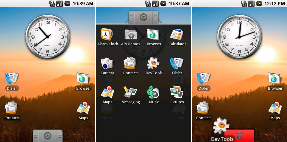
From left to right: Android 0.9’s home screen, add drawer, and shortcut deletion interfaces.
|
|||
|
|
Photo by Ron Amadeo
|
|||
|
|
|
|||
|
|
### Android 0.9, Beta—hey, this looks familiar! ###
|
|||
|
|
|
|||
|
|
Six months after Milestone 5, in August 2008, [Android 0.9 was released][1]. While the Android 0.5 milestone builds were "early looks," by now 1.0 was only two months away. Thus, Android 0.9 was labeled "beta." On the other side of the aisle, Apple already released its second version of the iPhone—the iPhone 3G—a month prior. The second-gen iPhone brought a second-gen iPhone OS. Apple also launched the App Store and was already taking app submissions. Google had a lot of catching up to do.
|
|||
|
|
|
|||
|
|
Google threw out a lot of the UI introduced in Milestone 5. All the artwork was redone again in full-color, and the white square icon backgrounds were tossed. While still an emulator build, 0.9 offered something that looked familiar when compared to a released version of Android. Android 0.9 had a working desktop-style home screen, a proper app drawer, multiple home screens, a lot more apps, and fully functional (first-party only) widgets.
|
|||
|
|
|
|||
|
|
Milestone 5 seemingly had no plan for someone installing more than 21 apps, but Android 0.9 had a vertically scrolling app drawer accessible via a gray tab at the bottom of the screen. Back then, the app drawer was actually a drawer. Besides acting as a button, the gray tab could be pulled up the screen and would follow your finger, just like how the notification panel can be pulled down. There were additional apps like Alarm Clock, Calculator, Music, Pictures, Messaging, and Camera.
|
|||
|
|
|
|||
|
|
This was the first build with a fully customizable home screen. Long pressing on an app or widget allowed you to drag it around. You could drag an app out of the app drawer and make a home screen shortcut or long press on an existing home screen shortcut to move it.
|
|||
|
|
|
|||
|
|
0.9 is a reminder that Google was not the design powerhouse it is today. In fact, some of the design work for Android was farmed out to other companies at the time. You can see one sign of this in the clock widget, which contains the text “MALMO," the home town of design firm [The Astonishing Tribe][2].
|
|||
|
|
|
|||
|
|

|
|||
|
|
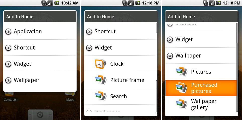
The “Add to Home" dialog in Android 0.9.
|
|||
|
|
Photo by Ron Amadeo
|
|||
|
|
|
|||
|
|
There were only three widgets: Clock, Picture frame, and Search. The Search widget didn't even have a proper icon in the list—it used the Picture icon. Perhaps the most interesting item here was a "Purchased pictures" option in the wallpaper choices—a leftover from the days when purchasing ringtones on a dumbphone was a common occurrence. Google was either planning on selling wallpapers, or it was already adding a carrier at some point. The company never went through with the plan.
|
|||
|
|
|
|||
|
|

|
|||
|
|
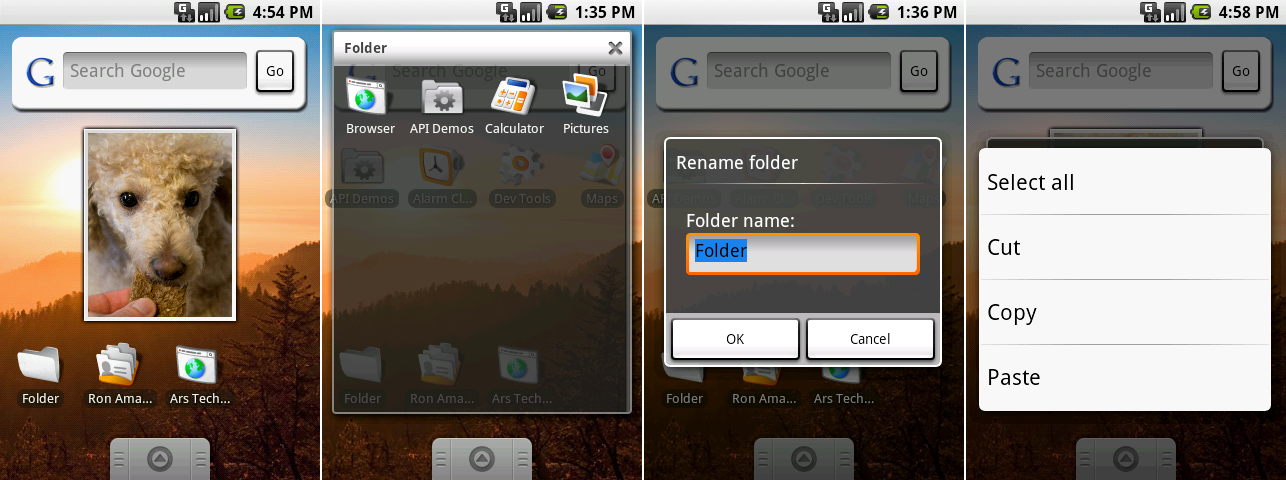
A collection of widgets, an open folder, renaming a folder, and the copy/paste menu.
|
|||
|
|
Photo by Ron Amadeo
|
|||
|
|
|
|||
|
|
The left screen, above, shows the widgets for Google Search and pictures. Search didn't do anything other than give you a box to type in—there was no auto complete or additional UI. Typing in the box and hitting "Go" would launch the browser. The bottom row of icons revealed a few options for "shortcuts" from the long press menu, which created icons that opened an app to a certain screen. Individual contacts, browser bookmarks, and music playlists were all shortcuts that could all be added to the home screen in 0.9.
|
|||
|
|
|
|||
|
|
"Folders" was an option under the shortcuts heading despite not being a shortcut to anything. Once a blank folder was created, icons could be dragged into it and rearranged. Unlike today, there was no indication of what was in a folder; it was always a plain, white, empty-looking icon.
|
|||
|
|
|
|||
|
|
0.9 was also the first Android version to have OS-level copy/paste support. Long pressing on any text box would bring up a dialog allowing you to save or recall text from the clipboard. iOS didn't support copy/paste until almost two years later, so for a while, this was one of Android's big differentiators—and the source of many Internet arguments.
|
|||
|
|
|
|||
|
|

|
|||
|
|
From left to right: Android 0.9’s new menu, recent apps, power options, and lock screen.
|
|||
|
|
Photo by Ron Amadeo
|
|||
|
|
|
|||
|
|
Android 0.9 was really starting to show its maturity. The home screen had a full set of menu items, including a settings option (although it didn't work yet) and a search button (because Google likes it when you search). The menu design was already in the final form that would last until Android 2.3 swapped it to black.
|
|||
|
|
|
|||
|
|
Long pressing on the hardware home button brought up a 3x2 grid of recent apps, a design that would stick around until the release of Android 3.0. Recent Apps blurred the exposed background, but that was strangely applied here and not on other popups like the "Add to home" dialog or the home screen folder view. The power menu was at least included in the blurry background club, and it was redesigned with icons and more commonly accepted names for functions. The power menu icons lacked padding, though, appearing cramped and awkward.
|
|||
|
|
|
|||
|
|
Android 0.9 featured a lock screen, albeit a very basic one. The black and gray lock screen had no on-screen method of unlocking—you needed to hit the hardware menu button.
|
|||
|
|
|
|||
|
|
----------
|
|||
|
|
|
|||
|
|

|
|||
|
|
|
|||
|
|
[Ron Amadeo][a] / Ron is the Reviews Editor at Ars Technica, where he specializes in Android OS and Google products. He is always on the hunt for a new gadget and loves to rip things apart to see how they work.
|
|||
|
|
|
|||
|
|
[@RonAmadeo][t]
|
|||
|
|
|
|||
|
|
--------------------------------------------------------------------------------
|
|||
|
|
|
|||
|
|
via: http://arstechnica.com/gadgets/2014/06/building-android-a-40000-word-history-of-googles-mobile-os/3/
|
|||
|
|
|
|||
|
|
译者:[译者ID](https://github.com/译者ID) 校对:[校对者ID](https://github.com/校对者ID)
|
|||
|
|
|
|||
|
|
本文由 [LCTT](https://github.com/LCTT/TranslateProject) 原创翻译,[Linux中国](http://linux.cn/) 荣誉推出
|
|||
|
|
|
|||
|
|
[1]:http://arstechnica.com/information-technology/2008/08/robotripping-hands-on-with-the-android-sdk-beta/
|
|||
|
|
[2]:http://www.tat.se/
|
|||
|
|
[a]:http://arstechnica.com/author/ronamadeo
|
|||
|
|
[t]:https://twitter.com/RonAmadeo
|