mirror of
https://github.com/LCTT/TranslateProject.git
synced 2025-01-10 22:21:11 +08:00
247 lines
9.2 KiB
Markdown
247 lines
9.2 KiB
Markdown
|
|
3 top open source JavaScript chart libraries
|
|||
|
|
======
|
|||
|
|
|
|||
|
|

|
|||
|
|
|
|||
|
|
Charts and graphs are important for visualizing data and making websites appealing. Visual presentations make it easier to analyze big chunks of data and convey information. JavaScript chart libraries enable you to visualize data in a stunning, easy to comprehend, and interactive manner and improve your website's design.
|
|||
|
|
|
|||
|
|
In this article, learn about three top open source JavaScript chart libraries.
|
|||
|
|
|
|||
|
|
### 1\. Chart.js
|
|||
|
|
|
|||
|
|
[Chart.js][1] is an open source JavaScript library that allows you to create animated, beautiful, and interactive charts on your application. It's available under the MIT License.
|
|||
|
|
|
|||
|
|
With Chart.js, you can create various impressive charts and graphs, including bar charts, line charts, area charts, linear scale, and scatter charts. It is completely responsive across various devices and utilizes the HTML5 Canvas element for rendering.
|
|||
|
|
|
|||
|
|
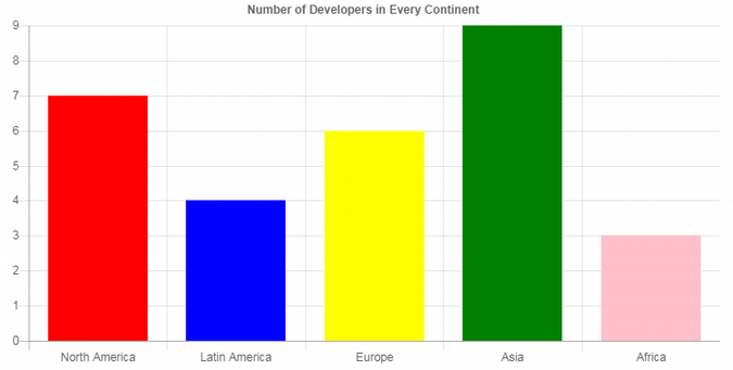
Here is example code that draws a bar chart using the library. We'll include it in this example using the Chart.js content delivery network (CDN). Note that the data used is for illustration purposes only.
|
|||
|
|
```
|
|||
|
|
<!DOCTYPE html>
|
|||
|
|
<html>
|
|||
|
|
<head>
|
|||
|
|
<script src="https://cdnjs.cloudflare.com/ajax/libs/Chart.js/2.5.0/Chart.min.js"></script>
|
|||
|
|
</head>
|
|||
|
|
|
|||
|
|
<body>
|
|||
|
|
|
|||
|
|
<canvas id="bar-chart" width=300" height="150"></canvas>
|
|||
|
|
|
|||
|
|
|
|||
|
|
<script>
|
|||
|
|
|
|||
|
|
new Chart(document.getElementById("bar-chart"), {
|
|||
|
|
type: 'bar',
|
|||
|
|
data: {
|
|||
|
|
labels: ["North America", "Latin America", "Europe", "Asia", "Africa"],
|
|||
|
|
datasets: [
|
|||
|
|
{
|
|||
|
|
label: "Number of developers (millions)",
|
|||
|
|
backgroundColor: ["red", "blue","yellow","green","pink"],
|
|||
|
|
data: [7,4,6,9,3]
|
|||
|
|
}
|
|||
|
|
]
|
|||
|
|
},
|
|||
|
|
options: {
|
|||
|
|
legend: { display: false },
|
|||
|
|
title: {
|
|||
|
|
display: true,
|
|||
|
|
text: 'Number of Developers in Every Continent'
|
|||
|
|
},
|
|||
|
|
|
|||
|
|
scales: {
|
|||
|
|
yAxes: [{
|
|||
|
|
ticks: {
|
|||
|
|
beginAtZero:true
|
|||
|
|
}
|
|||
|
|
}]
|
|||
|
|
}
|
|||
|
|
|
|||
|
|
}
|
|||
|
|
|
|||
|
|
|
|||
|
|
});
|
|||
|
|
|
|||
|
|
</script>
|
|||
|
|
|
|||
|
|
|
|||
|
|
</body>
|
|||
|
|
</html>
|
|||
|
|
```
|
|||
|
|
|
|||
|
|
As you can see from this code, bar charts are constructed by setting **type** to **bar**. You can change the direction of the bar to other types—such as setting **type** to **horizontalBar**.
|
|||
|
|
|
|||
|
|
The bars' colors are set by providing the type of color in the **backgroundColor** array parameter.
|
|||
|
|
|
|||
|
|
The colors are allocated to the label and data that share the same index in their corresponding array. For example, "Latin America," the second label, will be set to "blue" (the second color) and 4 (the second number in the data).
|
|||
|
|
|
|||
|
|
Here is the output of this code.
|
|||
|
|
|
|||
|
|

|
|||
|
|
|
|||
|
|
### 2\. Chartist.js
|
|||
|
|
|
|||
|
|
[Chartist.js][2] is a simple JavaScript animation library that allows you to create customizable and beautiful responsive charts and other designs. The open source library is available under the WTFPL or MIT License.
|
|||
|
|
|
|||
|
|
The library was developed by a group of developers who were dissatisfied with existing charting tools, so it offers wonderful functionalities to designers and developers.
|
|||
|
|
|
|||
|
|
After including the Chartist.js library and its CSS files in your project, you can use them to create various types of charts, including animations, bar charts, and line charts. It utilizes SVG to render the charts dynamically.
|
|||
|
|
|
|||
|
|
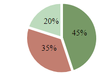
Here is an example of code that draws a pie chart using the library.
|
|||
|
|
```
|
|||
|
|
<!DOCTYPE html>
|
|||
|
|
<html>
|
|||
|
|
<head>
|
|||
|
|
|
|||
|
|
<link href="https//cdn.jsdelivr.net/chartist.js/latest/chartist.min.css" rel="stylesheet" type="text/css" />
|
|||
|
|
|
|||
|
|
<style>
|
|||
|
|
.ct-series-a .ct-slice-pie {
|
|||
|
|
fill: hsl(100, 20%, 50%); /* filling pie slices */
|
|||
|
|
stroke: white; /*giving pie slices outline */
|
|||
|
|
stroke-width: 5px; /* outline width */
|
|||
|
|
}
|
|||
|
|
|
|||
|
|
.ct-series-b .ct-slice-pie {
|
|||
|
|
fill: hsl(10, 40%, 60%);
|
|||
|
|
stroke: white;
|
|||
|
|
stroke-width: 5px;
|
|||
|
|
}
|
|||
|
|
|
|||
|
|
.ct-series-c .ct-slice-pie {
|
|||
|
|
fill: hsl(120, 30%, 80%);
|
|||
|
|
stroke: white;
|
|||
|
|
stroke-width: 5px;
|
|||
|
|
}
|
|||
|
|
|
|||
|
|
.ct-series-d .ct-slice-pie {
|
|||
|
|
fill: hsl(90, 70%, 30%);
|
|||
|
|
stroke: white;
|
|||
|
|
stroke-width: 5px;
|
|||
|
|
}
|
|||
|
|
.ct-series-e .ct-slice-pie {
|
|||
|
|
fill: hsl(60, 140%, 20%);
|
|||
|
|
stroke: white;
|
|||
|
|
stroke-width: 5px;
|
|||
|
|
}
|
|||
|
|
|
|||
|
|
</style>
|
|||
|
|
</head>
|
|||
|
|
|
|||
|
|
<body>
|
|||
|
|
|
|||
|
|
<div class="ct-chart ct-golden-section"></div>
|
|||
|
|
|
|||
|
|
<script src="https://cdn.jsdelivr.net/chartist.js/latest/chartist.min.js"></script>
|
|||
|
|
|
|||
|
|
<script>
|
|||
|
|
|
|||
|
|
var data = {
|
|||
|
|
series: [45, 35, 20]
|
|||
|
|
};
|
|||
|
|
|
|||
|
|
var sum = function(a, b) { return a + b };
|
|||
|
|
|
|||
|
|
new Chartist.Pie('.ct-chart', data, {
|
|||
|
|
labelInterpolationFnc: function(value) {
|
|||
|
|
return Math.round(value / data.series.reduce(sum) * 100) + '%';
|
|||
|
|
}
|
|||
|
|
});
|
|||
|
|
</script>
|
|||
|
|
</body>
|
|||
|
|
</html>
|
|||
|
|
```
|
|||
|
|
|
|||
|
|
Instead of specifying various style-related components of your project, the Chartist JavaScript library allows you to use various pre-built CSS styles. You can use them to control the appearance of the created charts.
|
|||
|
|
|
|||
|
|
|
|||
|
|
For example, the pre-created CSS classis used to build the container for the pie chart. And, theclass is used to get the aspect ratios, which scale with responsive designs and saves you the hassle of calculating fixed dimensions. Chartist also provides other classes of container ratios you can utilize in your project.
|
|||
|
|
|
|||
|
|
For styling the various pie slices, you can use the default . **ct-series-a** class. The letter **a** is iterated with every series count (a, b, c, etc.) such that it corresponds with the slice to be styled.
|
|||
|
|
|
|||
|
|
The **Chartist.Pie** method is used for creating a pie chart. To create another type of chart, such as a line chart, use **Chartist.Line.**
|
|||
|
|
|
|||
|
|
Here is the output of the code.
|
|||
|
|
|
|||
|
|

|
|||
|
|
|
|||
|
|
### 3\. D3.js
|
|||
|
|
|
|||
|
|
[D3.js][3] is another great open source JavaScript chart library. It's available under the BSD license. D3 is mainly used for manipulating and adding interactivity to documents based on the provided data.
|
|||
|
|
|
|||
|
|
You can use this amazing 3D animation library to visualize your data using HTML5, SVG, and CSS and make your website appealing. Essentially, D3 enables you to bind data to the Document Object Model (DOM) and then use data-based functions to make changes to the document.
|
|||
|
|
|
|||
|
|
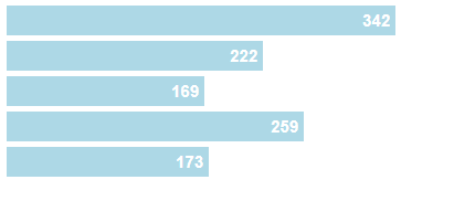
Here is example code that draws a simple bar chart using the library.
|
|||
|
|
```
|
|||
|
|
<!DOCTYPE html>
|
|||
|
|
<html>
|
|||
|
|
<head>
|
|||
|
|
|
|||
|
|
<style>
|
|||
|
|
.chart div {
|
|||
|
|
font: 15px sans-serif;
|
|||
|
|
background-color: lightblue;
|
|||
|
|
text-align: right;
|
|||
|
|
padding:5px;
|
|||
|
|
margin:5px;
|
|||
|
|
color: white;
|
|||
|
|
font-weight: bold;
|
|||
|
|
}
|
|||
|
|
|
|||
|
|
</style>
|
|||
|
|
</head>
|
|||
|
|
|
|||
|
|
<body>
|
|||
|
|
|
|||
|
|
<div class="chart"></div>
|
|||
|
|
|
|||
|
|
<script src="https://cdnjs.cloudflare.com/ajax/libs/d3/5.5.0/d3.min.js"></script>
|
|||
|
|
|
|||
|
|
<script>
|
|||
|
|
|
|||
|
|
var data = [342,222,169,259,173];
|
|||
|
|
|
|||
|
|
d3.select(".chart")
|
|||
|
|
.selectAll("div")
|
|||
|
|
.data(data)
|
|||
|
|
.enter()
|
|||
|
|
.append("div")
|
|||
|
|
.style("width", function(d){ return d + "px"; })
|
|||
|
|
.text(function(d) { return d; });
|
|||
|
|
|
|||
|
|
|
|||
|
|
</script>
|
|||
|
|
</body>
|
|||
|
|
</html>
|
|||
|
|
```
|
|||
|
|
|
|||
|
|
The main concept in using the D3 library is to first apply CSS-style selections to point to the DOM nodes and then apply operators to manipulate them—just like in other DOM frameworks like jQuery.
|
|||
|
|
|
|||
|
|
After the data is bound to a document, the . **enter()** function is invoked to build new nodes for incoming data. All the methods invoked after the . **enter()** function will be called for every item in the data.
|
|||
|
|
|
|||
|
|
Here is the output of the code.
|
|||
|
|
|
|||
|
|

|
|||
|
|
|
|||
|
|
### Wrapping up
|
|||
|
|
|
|||
|
|
[JavaScript][4] charting libraries provide you with powerful tools for implementing data visualization on your web properties. With these three open source libraries, you can enhance the beauty and interactivity of your websites.
|
|||
|
|
|
|||
|
|
Do you know of another powerful frontend library for creating JavaScript animation effects? Please let us know in the comment section below.
|
|||
|
|
|
|||
|
|
|
|||
|
|
--------------------------------------------------------------------------------
|
|||
|
|
|
|||
|
|
via: https://opensource.com/article/18/9/open-source-javascript-chart-libraries
|
|||
|
|
|
|||
|
|
作者:[Dr.Michael J.Garbade][a]
|
|||
|
|
选题:[lujun9972](https://github.com/lujun9972)
|
|||
|
|
译者:[译者ID](https://github.com/译者ID)
|
|||
|
|
校对:[校对者ID](https://github.com/校对者ID)
|
|||
|
|
|
|||
|
|
本文由 [LCTT](https://github.com/LCTT/TranslateProject) 原创编译,[Linux中国](https://linux.cn/) 荣誉推出
|
|||
|
|
|
|||
|
|
[a]: https://opensource.com/users/drmjg
|
|||
|
|
[1]: https://www.chartjs.org/
|
|||
|
|
[2]: https://gionkunz.github.io/chartist-js/
|
|||
|
|
[3]: https://d3js.org/
|
|||
|
|
[4]: https://www.liveedu.tv/guides/programming/javascript/
|