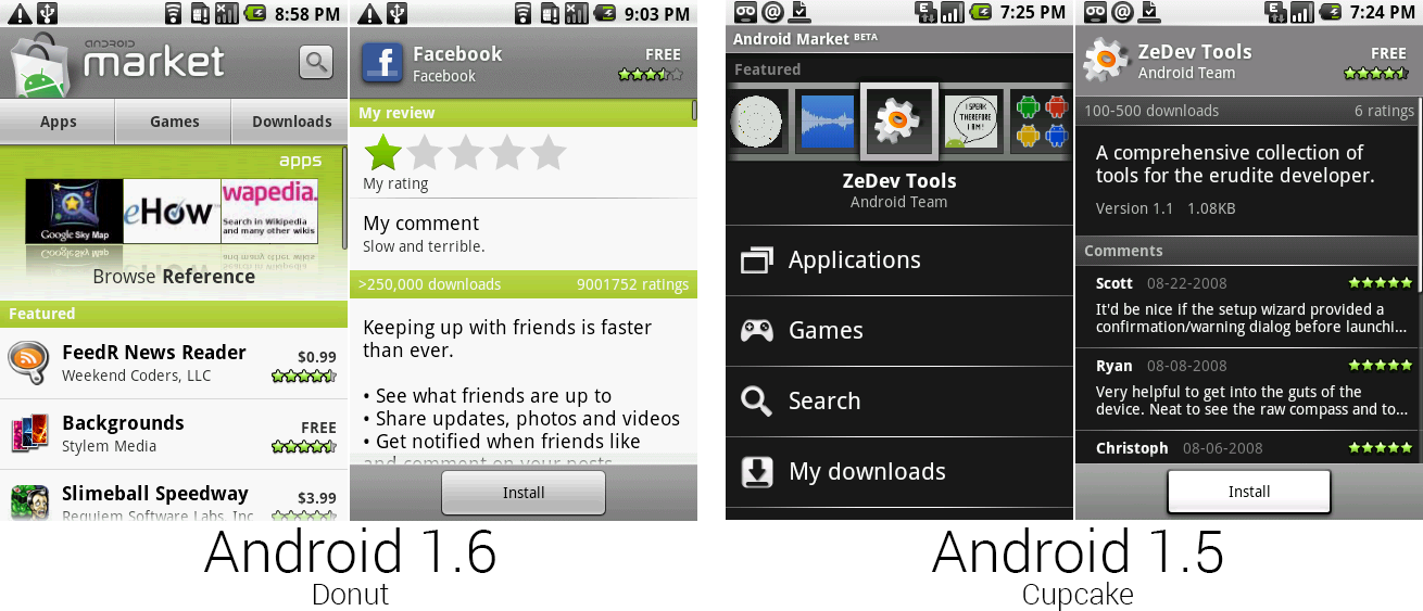
The new Android Market—less black, more white and green.
Photo by Ron Amadeo
### Android 1.6, Donut—CDMA support brings Android to any carrier ###
The fourth version of Android—1.6, Donut—launched in September 2009, five months after Cupcake hit the market. Despite the myriad of updates, Google was still adding basic functionality to Android. Donut brought support for different screen sizes, CDMA support, and a text-to-speech engine.
Android 1.6 is a great example of an update that, today, would have little reason to exist as a separate point update. The major improvements basically boiled down to new versions of the Android Market, camera, and YouTube. In the years since, apps like this have been broken out of the OS and can be updated by Google at any time. Before all this modularization work, though, even seemingly minor app updates like this required a full OS update.
The other big improvement—CDMA support—demonstrated that, despite the version number, Google was still busy getting basic functionality into Android.
The Android Market was christened as version "1.6" and got a complete overhaul. The original all-black design was tossed in favor of a white app with green highlights—the Android designers were clearly using the Android mascot for inspiration.
The new market was definitely a new style of app design for Google. The top fifth of the screen was dedicated to a banner logo announcing that this app is indeed the “Android Market." Below the banner were buttons for Apps, Games, and Downloads, and a search button was placed to the right of the banner. Below the navigation was a thumbnail display of featured apps, which could be swiped through. Below that were even more featured apps in a vertically scrolling list.

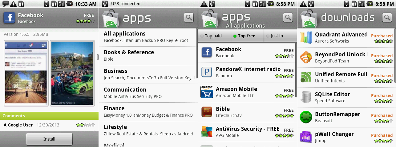
The new Market design, showing an app page with screenshots, the apps categories page, an app top list, and the downloads section.
Photo by Ron Amadeo
The biggest addition to the market was the inclusion of app screenshots. Android users could finally see what an app looked like before installing it—previously they only had a brief description and user reviews to go on. Your personal star review and comment was given top billing, followed by the description, and then finally the screenshots. Viewing the screenshots would often require a bit of scrolling—if you were looking for a well-designed app, it was a lot of work.
Tapping on App or Games would bring up a category list, which you can see in the second picture, above. After picking a category, more navigation was shown at the top of the screen, where users could see "Top paid," "Top free," or "Just in" apps within a category. While these sorta looked like buttons that would load a new screen, they were really just a clunky tabbed interface. To denote which "tab" was currently active, there were little green lights next to each button. The nicest part of this interface was that the list of apps would scroll infinitely—once you hit the bottom, more apps would load in. This made it easy to look through the list of apps, but opening any app and coming back would lose your spot in the list—you’d be kicked to the top. The downloads section would do something the new Google Play Store still can't do: simply display a list of your purchased apps.
While the new Market definitely looked better than the old market, cohesion across apps was getting worse and worse. It seemed like each app was made by a different group with no communication about how all Android apps should look.

The Camera viewfinder, photo review screen, and menu.
Photo by Ron Amadeo
For instance, the camera app was changed from a full-screen, minimal design to a boxed viewfinder with controls on the side. With the new camera app, Google tried its hand at skeuomorphism, wrapping the whole app in a leather texture roughly replicating the exterior of a classic camera. Switching between the camera and camcorder was done with a literal switch, and below that was the on-screen shutter button.
Tapping on the previous picture thumbnail no longer launched the gallery, but a custom image viewer that was built in to the camera app. When viewing a picture the leather control area changed the camera controls to picture controls, where you could delete, share a picture, or set the picture as a wallpaper or contact image. There was still no swiping between pictures—that was still done with arrows on either side of the image.
This second picture shows one of the first examples of designers reducing dependence on the menu button, which the Android team slowly started to realize functioned terribly for discoverability. Many app designers (including those within Google) used the menu as a dumping ground for all sorts of controls and navigational elements. Most users didn't think to hit the menu button, though, and never saw the commands.
A common theme for future versions of Android would be moving things out of the menu and on to the main screen, making the whole OS more user-friendly. The menu button was completely killed in Android 4.0, and it's only supported in Android for legacy apps.

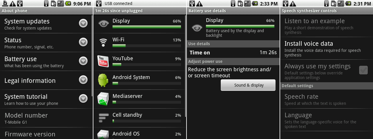
The battery and TTS settings.
Photo by Ron Amadeo
Donut was the first Android version to keep track of battery usage. Buried in the "About phone" menu was an option called "Battery use," which would display battery usage by app and hardware function as a percentage. Tapping on an item would bring up a separate page with relevant stats. Hardware items had buttons to jump directly to their settings, so for instance, you could change the display timeout if you felt the display battery usage was too high.
Android 1.6 was also the first version to support text-to-speech (TTS) engines, meaning the OS and apps would be able to talk back to you in a robot voice. The “Speech synthesizer controls" would allow you to set the language, choose the speech rate, and (critically) install the voice data from the Android market. Today, Google has its own TTS engine that ships with Android, but it seems Donut was hard coded to accept one specific TTS engine made by SVOX. But SVOX’s engine didn’t ship with Donut, so tapping on “install voice data" linked to an app in the Android Market. (In the years since Donut’s heyday, the app has been taken down. It seems Android 1.6 will never speak again.)

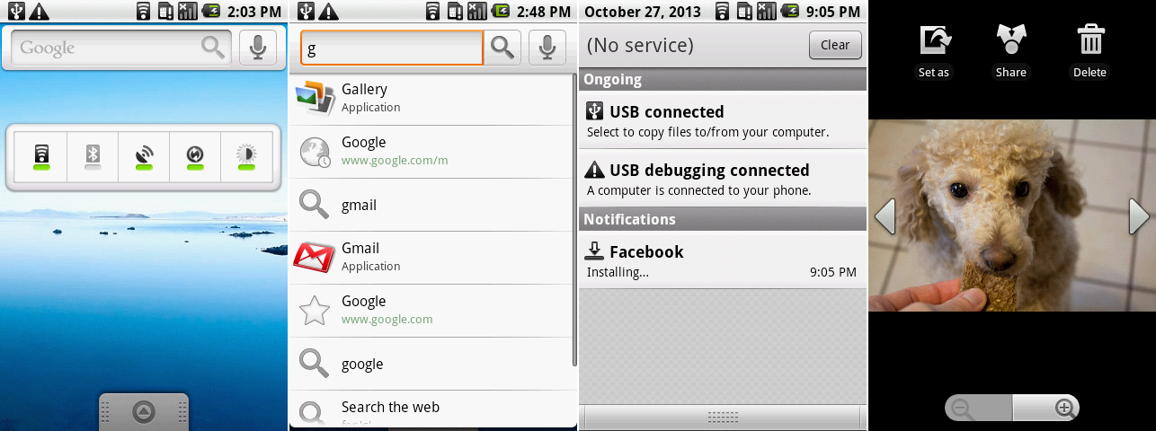
From left to right: new widgets, the search bar UI, the new notification clear button, and the new gallery controls.
Photo by Ron Amadeo
There was more work on the widget front. Donut brought an entirely new widget called "Power control." This comprised on/off switches for common power-hungry features: Wi-FI, Bluetooth, GPS, Sync (to Google's servers), and brightness.
The search widget was redesigned to be much slimmer looking, and it had an embedded microphone button for voice search. It now had some actual UI to it and did find-as-you-type live searching, which searched not only the Internet, but your applications and history too.
The "Clear notifications" button has shrunk down considerably and lost the "notifications" text. In later Android versions it would be reduced to just a square button. The Gallery continues the trend of taking functionality out of the menu and putting it in front of the user—the individual picture view gained buttons for "Set as," "Share," and "Delete."
[Ron Amadeo][a] / Ron is the Reviews Editor at Ars Technica, where he specializes in Android OS and Google products. He is always on the hunt for a new gadget and loves to rip things apart to see how they work.