mirror of
https://github.com/LCTT/TranslateProject.git
synced 2025-01-22 23:00:57 +08:00
83 lines
9.8 KiB
Markdown
83 lines
9.8 KiB
Markdown
|
|
The history of Android
|
||
|
|
================================================================================
|
||
|
|
|
||
|
|
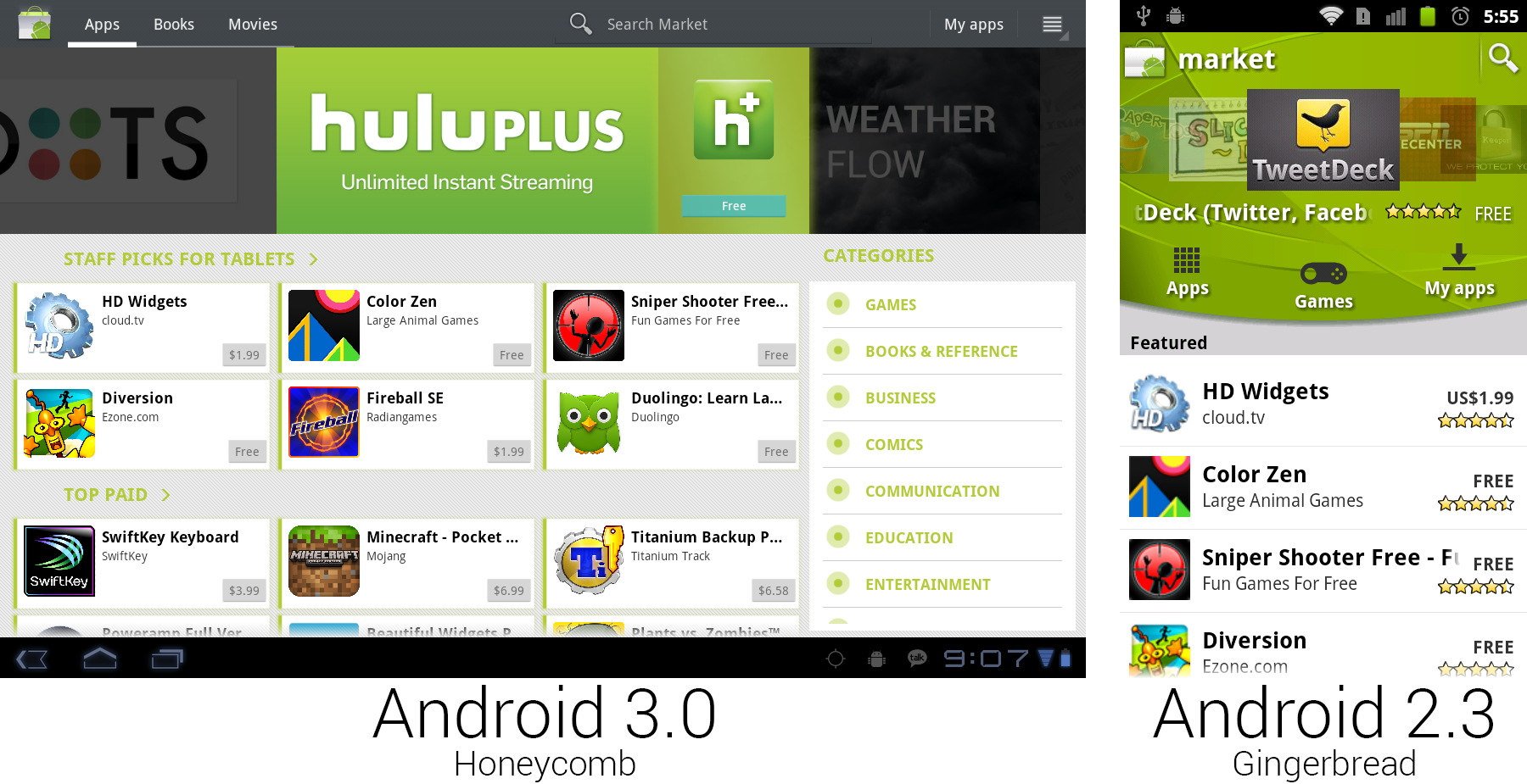
Yet another Android Market redesign dips its toe into the "cards" interface that would become a Google staple.
|
||
|
|
Photo by Ron Amadeo
|
||
|
|
|
||
|
|
The Android Market released its fourth new design in Android's two-and-a-half years on the market. This new design was hugely important as it came really close to Google's "cards" interface. By displaying Apps or other content in little blocks, Google could seamlessly transition its app design between screens of various sizes with minimal effort. Content could be displayed just like photos in a gallery app—feed the layout renderer a big list of content blocks, enable screen wrapping, and you were done. Bigger screens saw more blocks of content, and smaller screens only saw a few at a time. With the content display out of the way, Google added a "Categories" fragment to the right side and a big featured app carousel at the top.
|
||
|
|
|
||
|
|
While the design was ready for an easily configurable interface, the functionality was not. The original shipping version of the market was locked to a landscape orientation and was Honeycomb-exclusive.
|
||
|
|
|
||
|
|

|
||
|
|
The app page and "My Apps" interface.
|
||
|
|
Photo by Ron Amadeo
|
||
|
|
|
||
|
|
This new market sold not only apps, but brought Books and Movies rentals into the fold as well. Google was selling books since 2010; it was only ever through a Website. The new market unified all of Google's content sales in a single location and brought it one step closer to taking on Apple's iTunes juggernaut, though selling all of these items under the "Android Market" was a bit of a branding snafu, as much of the content didn't require Android to use.
|
||
|
|
|
||
|
|
|
||
|
|
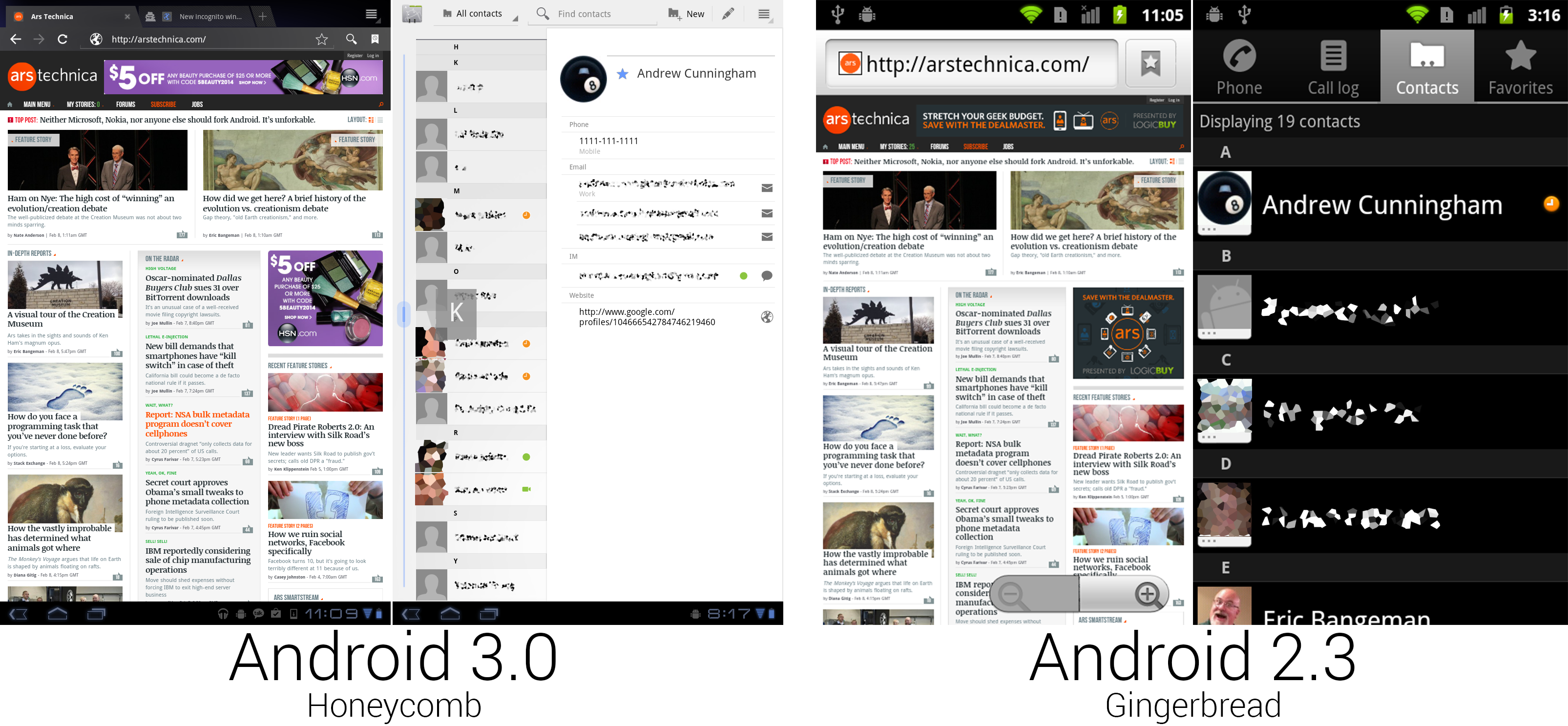
The browser did its best to look like Chrome, and Contacts used a two-pane interface.
|
||
|
|
Photo by Ron Amadeo
|
||
|
|
|
||
|
|
The new Browser added an honest-to-goodness tabs strip at the top of the interface. While this browser wasn't Chrome, it aped a lot of Chrome's design and features. Besides the pioneering tabs-on-top interface, it added Incognito tabs, which kept no history or autocomplete records. There was also an option to have a Chrome-style new tab page consisting of thumbnails of your most-viewed webpages.
|
||
|
|
|
||
|
|
The new Browser even synced with Chrome. After signing in to the browser, it would download your Chrome bookmarks and automatically sign in to Google Web pages with your account. Bookmarking a page was as easy as tapping on the star icon in the address bar. Just like Google Maps, the browser dumped the zoom buttons and went with all gesture controls.
|
||
|
|
|
||
|
|
The contacts app was finally removed from the phone app and broken out into a standalone app. The previous contacts/dialer hybrid was far too phone-centric for how people use a modern smartphone. Contacts housed information for e-mails, IM, texting, addresses, birthdays, and social networks, so tying it to the phone app makes just as much sense as trying it to Google Maps. With the telephony requirements out of the way, contacts could be simplified to a tab-less list of people. Honeycomb went with a dual pane view showing the full contact list on the left and contacts on the right. This again made use of a Fragments API; a hypothetical phone version of this app could show each panel as a single screen.
|
||
|
|
|
||
|
|
The Honeycomb version of Contacts was the first version to have a quick scroll feature. When grabbing the left scroll bar, you could quickly scroll up and down, and a letter preview showed your current spot in the list.
|
||
|
|
|
||
|
|
|
||
|
|
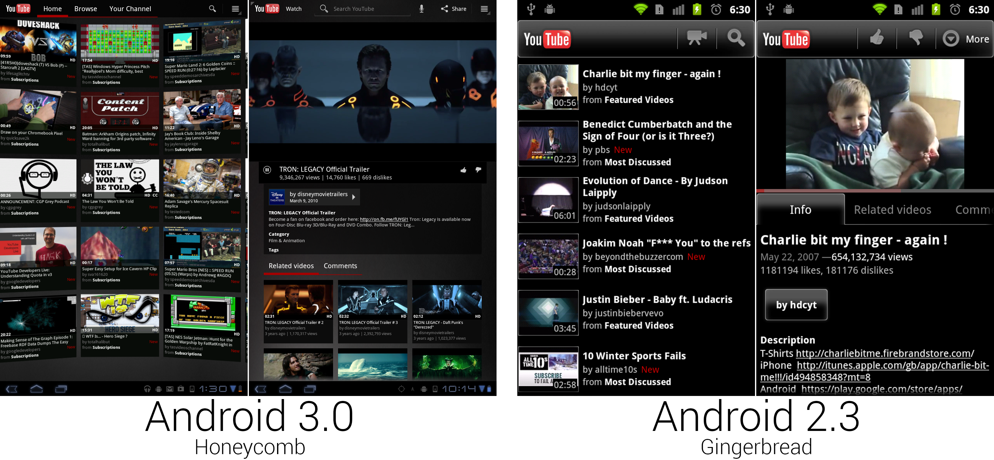
The new YouTube app looked like something out of the Matrix.
|
||
|
|
Photo by Ron Amadeo
|
||
|
|
|
||
|
|
YouTube thankfully dumped the "unique" design Google came up with for 2.3 and gave the video service a cohesive design that looked like it belonged in Android. The main screen was a horizontally scrolling curved wall of video thumbnails that showed a most popular or (when signed in) personalized selection of videos. While Google never brought this design to phones, it could be considered an easily reconfigurable card interface. The action bar shined here as a reconfigurable toolbar. When not signed it, the action bar was filled with a search bar. When you were signed in, search shrank down to a button, and tabs for "Home," "Browse," and "Your Channel" were shown.
|
||
|
|
|
||
|
|
|
||
|
|
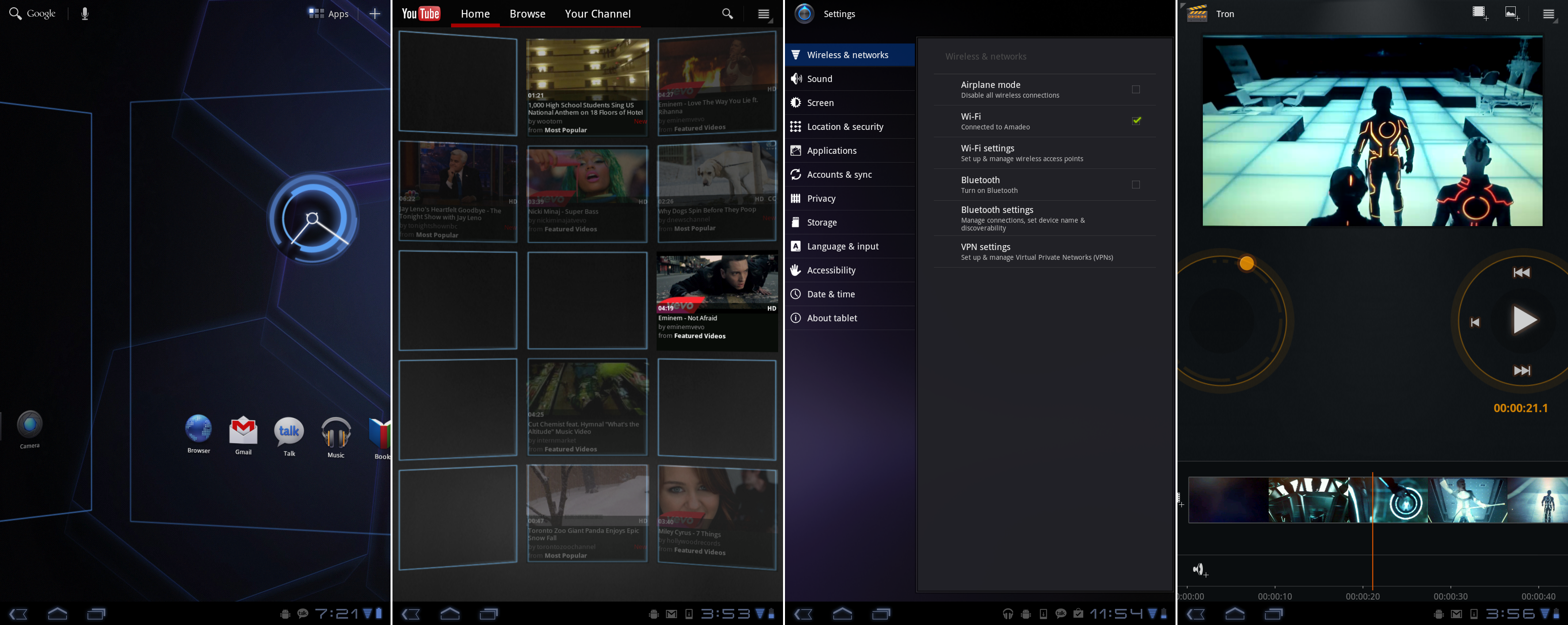
Honeycomb really liked to drive home that it was a computer interface with blue scaffolding. Movie Studio completes the Tron look with an orange theme.
|
||
|
|
Photo by Ron Amadeo
|
||
|
|
|
||
|
|
The lone new app in Honeycomb was "Movie Studio," which was not a self-explanatory app and arrived with no explanations or instructions. As far as we could tell, you could import video clips, cut them up, and add text and scene transitions. Editing video—one of the most time consuming, difficult, and processor-intensive things you can do on a computer—on a tablet felt just a little too ambitious, and Google would completely remove this app in later versions. Our favorite part of Movie Studio was that it really completed the Tron theme. While the rest of the OS used blue highlights, this was all orange. (Movie Studio is an evil program!)
|
||
|
|
|
||
|
|
|
||
|
|
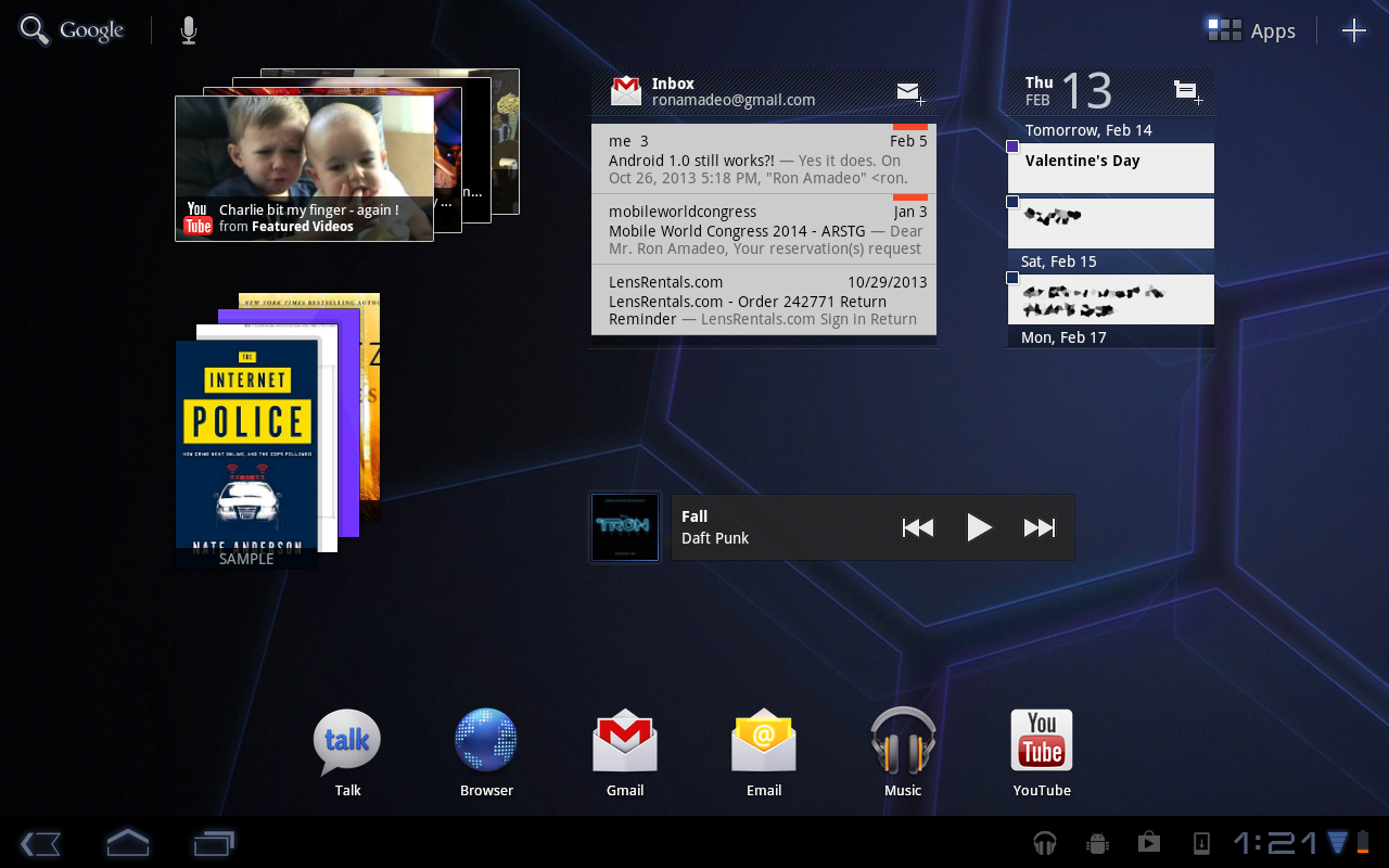
Widgets!
|
||
|
|
Photo by Ron Amadeo
|
||
|
|
|
||
|
|
Honeycomb brought a new widget framework that allowed for scrolling widgets, and the Gmail, Email, and Calendar widgets were upgraded to support it. YouTube and Books used a new widget that auto-scrolled through cards of content. By flicking up or down on the widget, you could scroll through the cards. We're not sure what the point of being constantly reminded of your book collection was, but it's there if you want it. While all of these widgets worked great on a 10-inch screen, Google never redesigned them for phones, making them practically useless on Android's most popular form factor. All the widgets had massive identifying headers and usually took up half the screen to show only a few items.
|
||
|
|
|
||
|
|
|
||
|
|
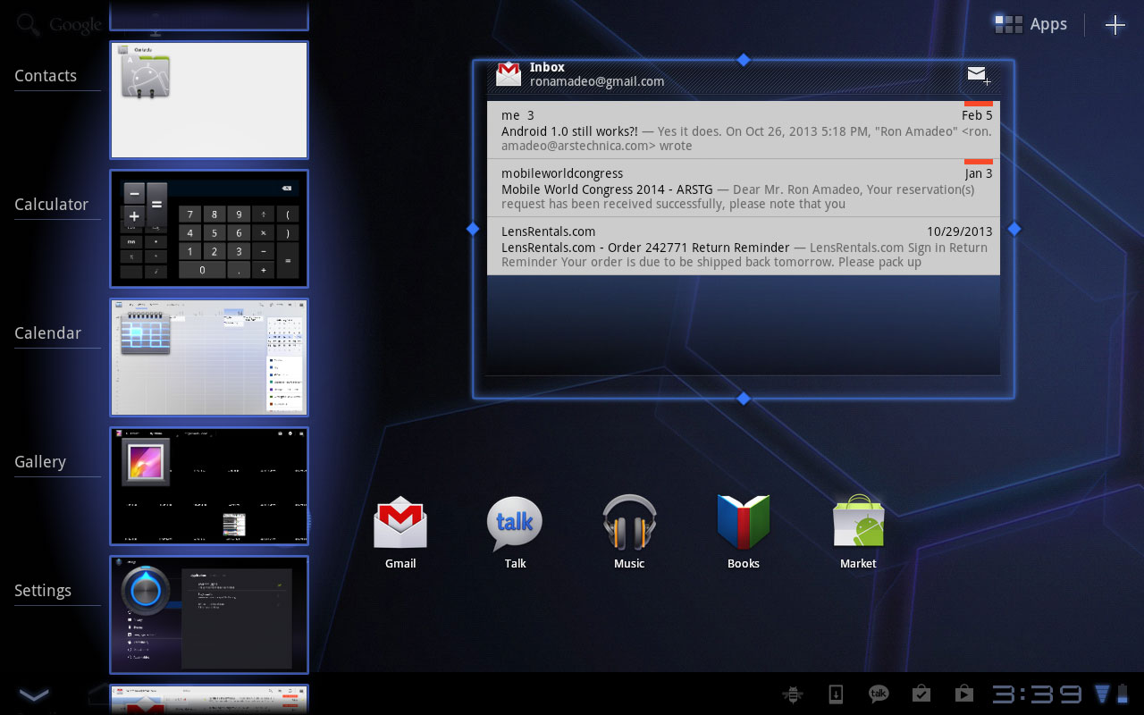
The scrollable Recent Apps and resizable widgets in Android 3.1.
|
||
|
|
Photo by Ron Amadeo
|
||
|
|
|
||
|
|
Later versions of Honeycomb would fix many of the early problems 3.0 had. Android 3.1 was released three months after the first version of Honeycomb, and it brought several improvements. Resizable widgets were one of the biggest features added. After long pressing on a widget, a blue outline with grabbable handles would pop up around it, and dragging the handles around would resize the widget. The Recent Apps panel could now scroll vertically and held many more apps. The only feature missing from it at this point was the ability to swipe away apps.
|
||
|
|
|
||
|
|
Today, an 0.1 upgrade is a major release, but in Honeycomb, point releases were considerably smaller. Besides the few UI tweaks, 3.1 added support for gamepads, keyboards, mice, and other input devices over USB and Bluetooth. It also offered a few more developer APIs.
|
||
|
|
|
||
|
|

|
||
|
|
Android 3.2's compatibility zoom and a typical stretched-out app on an Android tablet.
|
||
|
|
Photo by Ron Amadeo
|
||
|
|
|
||
|
|
Android 3.2 launched two months after 3.1, adding support for smaller sized tablets in the seven- to eight-inch range. It finally enabled SD card support, which the Xoom carried like a vestigial limb for the first five months of its life.
|
||
|
|
|
||
|
|
Honeycomb was rushed out the door in order to be an ecosystem builder. No one will want an Android tablet if the tablet-specific apps aren't there, and Google knew it needed to get something in the hands of developers ASAP. At this early stage of Android's tablet ecosystem, the apps just weren't there. It was the biggest problem people had with the Xoom.
|
||
|
|
|
||
|
|
3.2 added "Compatibility Zoom," which gave users a new option of stretching apps to the screen (as shown in the right picture) or zooming the normal app layout to fit the screen. Neither option was ideal, and without the app ecosystem to support it, Honeycomb devices sold pretty poorly. Google's tablet moves would eventually pay off though. Today, Android tablets have [taken the market share crown from iOS][1].
|
||
|
|
|
||
|
|
----------
|
||
|
|
|
||
|
|

|
||
|
|
|
||
|
|
[Ron Amadeo][a] / Ron is the Reviews Editor at Ars Technica, where he specializes in Android OS and Google products. He is always on the hunt for a new gadget and loves to rip things apart to see how they work.
|
||
|
|
|
||
|
|
[@RonAmadeo][t]
|
||
|
|
|
||
|
|
--------------------------------------------------------------------------------
|
||
|
|
|
||
|
|
via: http://arstechnica.com/gadgets/2014/06/building-android-a-40000-word-history-of-googles-mobile-os/18/
|
||
|
|
|
||
|
|
译者:[译者ID](https://github.com/译者ID) 校对:[校对者ID](https://github.com/校对者ID)
|
||
|
|
|
||
|
|
本文由 [LCTT](https://github.com/LCTT/TranslateProject) 原创翻译,[Linux中国](http://linux.cn/) 荣誉推出
|
||
|
|
|
||
|
|
[1]:http://techcrunch.com/2014/03/03/gartner-195m-tablets-sold-in-2013-android-grabs-top-spot-from-ipad-with-62-share/
|
||
|
|
[a]:http://arstechnica.com/author/ronamadeo
|
||
|
|
[t]:https://twitter.com/RonAmadeo
|