mirror of
https://github.com/LCTT/TranslateProject.git
synced 2025-01-07 22:11:09 +08:00
70 lines
9.2 KiB
Markdown
70 lines
9.2 KiB
Markdown
|
|
The history of Android
|
|||
|
|
================================================================================
|
|||
|
|

|
|||
|
|
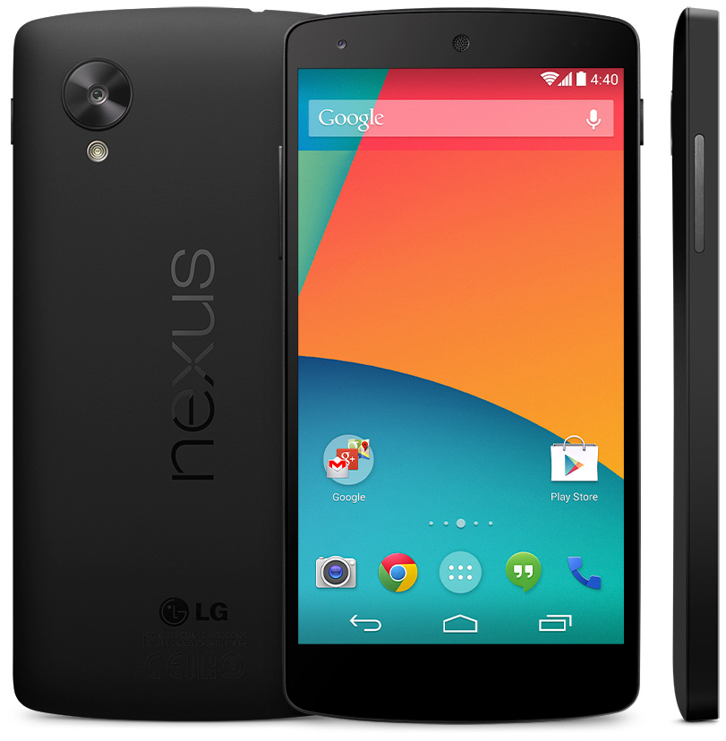
The LG-made Nexus 5, the launch device for KitKat.
|
|||
|
|
|
|||
|
|
Android 4.4, KitKat—more polish; less memory usage
|
|||
|
|
|
|||
|
|
Google got really cute with the launch of Android 4.4. The company [teamed up with Nestlé][1] to name the OS "KitKat," and it launched on Halloween, October 31, 2013. Nestlé produced limited-edition Android-shaped KitKat bars, and KitKat packaging in stores promoted the new OS while offering a chance to win a Nexus 7.
|
|||
|
|
|
|||
|
|
KitKat launched with a new Nexus device, the Nexus 5. The new flagship had the biggest display yet: a five-inch, 1920x1080 LCD. Despite the bigger screen size, LG—again the manufacturer for the device—was able to fit the Nexus 5 into the same dimensions as a Galaxy Nexus or Nexus 4.
|
|||
|
|
|
|||
|
|
The Nexus 5 was specced comparatively to the highest-end phones at the time, with a 2.3Ghz Snapdragon 800 processor and 2GB of RAM. The phone was again sold unlocked on the Play Store, but while most phones with specs like this would go for $600-$700, Google sold the Nexus 5 for only $350.
|
|||
|
|
|
|||
|
|
One of the most important improvements in KitKat was one you couldn't see: significantly lower memory usage. For KitKat, Google started a concerted effort to lower memory usage across the OS and bundled apps called "Project Svelte." After tons of optimization work and a "low memory" mode that disabled expensive graphical effects, Android could now run on as little as 340MB of RAM. Lower memory requirements were a big deal, because devices in the developing world—the biggest growth markets for smartphones—often ran on only 512MB of RAM. Ice Cream Sandwich's more advanced UI significantly raised the system requirements of Android devices, which left many low-end devices—even newly released low-end devices—stuck on Gingerbread. The lower system requirements of KitKat meant to bring these cheap devices back into the fold. With KitKat, Google hoped to finally kill Gingerbread (which, at the time of writing, is around 20 percent of the market). Just in case the lower system requirements weren't enough, there have even been reports that Google will [no longer license][2] the Google apps to Gingerbread devices.
|
|||
|
|
|
|||
|
|
Besides bringing low-end phones to a modern version of the OS, Project Svelte's lower memory requirements were to be a boon to wearable computers, too. Google Glass [announced][3] it was also switching to the slimmer OS, and [Android Wear][4] ran on KitKat, too. The lower memory requirements in Android 4.4 and the notification API and Bluetooth LE support in 4.3 came together nicely to support wearable computing.
|
|||
|
|
|
|||
|
|
KitKat also featured a lot of polish to the core OS interfaces that couldn't be updated via the Play Store. The System UI, Dialer, Clock, and Settings all saw updates.
|
|||
|
|
|
|||
|
|

|
|||
|
|
KitKat's transparent bars on the Google Now Launcher.
|
|||
|
|
Photo by Ron Amadeo
|
|||
|
|
|
|||
|
|
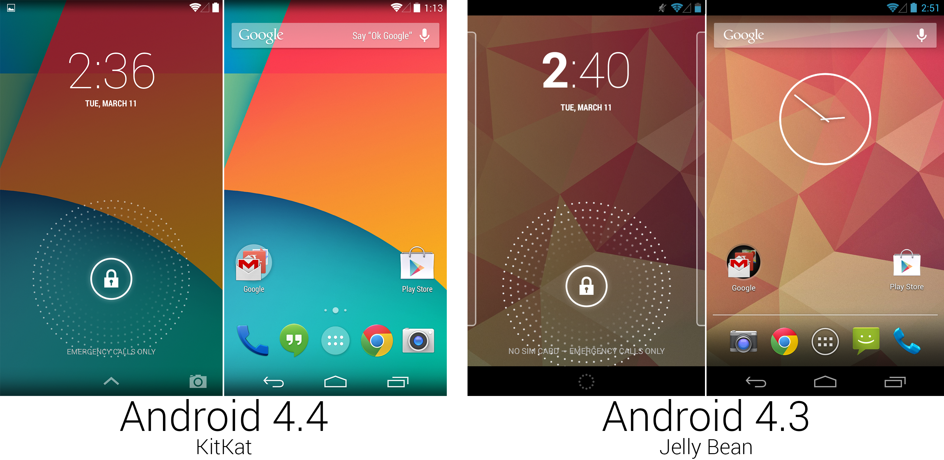
KitKat not only got rid of the unpopular lines to the left and right sides of the lock screen—it completely disabled lock screen widgets by default! Google obviously felt multiple lock screens and multiple home screens were a little to complicated for new users, so lock screen widgets now needed to be enabled in the settings. The lopsided time here and in the clock app was switched to a symmetrical weight, which looked a lot nicer.
|
|||
|
|
|
|||
|
|
In KitKat, apps had the ability to make the system and status bars transparent, which significantly changed the look of the OS. The bars now blended into the wallpaper and any other app that chose to enable transparent bars. The bars could also be completely hidden by any app via a new feature called “immersive" mode.
|
|||
|
|
|
|||
|
|
KitKat was the final nail in the “Tron" coffin, removing almost all traces of blue from the operating system. The status bar icons were changed from a blue to a neutral white. The status and system bars on the home screen weren’t completely transparent; a dark gradient was added to the top and bottom of the screen so that the white icons would still be visible on a light background.
|
|||
|
|
|
|||
|
|

|
|||
|
|
Tweaks to Google Now and the folders.
|
|||
|
|
Photo by Ron Amadeo
|
|||
|
|
|
|||
|
|
The home screen that shipped with KitKat on the Nexus 5 was actually exclusive to the Nexus 5 for a few months, but it could now be on any Nexus device. The new home screen was called the "Google Now Launcher," and it was actually [the Google Search app][5]. Yes, Google Search grew from a simple search box to an entire home screen, and in KitKat, it drew the wallpaper, icons, app drawer, widgets, home screen settings, Google Now, and, of course, the search box. Thanks to Search now running the entire home screen, any time the home screen was open and the screen was on, voice commands could be activated by saying “OK Google." This was pointed out to the user with introductory “Say 'OK Google' text in the search bar, which would fade away after a few uses.
|
|||
|
|
|
|||
|
|
Google Now was more integrated, too. Besides the usual swipe up from the system bar, Google Now was also the leftmost home screen. The new version brought some design tweaks as well. The Google logo was moved into the search bar, and the whole top area was compacted. A few card designs were cleaned up, and a new set of buttons at the bottom led to reminders, customization options, and an overflow button with settings, feedback, and help. Since Google Now was part of the home screen, it got transparent system and status bars, too.
|
|||
|
|
|
|||
|
|
Transparency and “brightening up" certain parts of the OS were design themes in KitKat. Black was removed in the status and system bars by switching to transparent, and the black background of the folders was switched to white.
|
|||
|
|
|
|||
|
|

|
|||
|
|
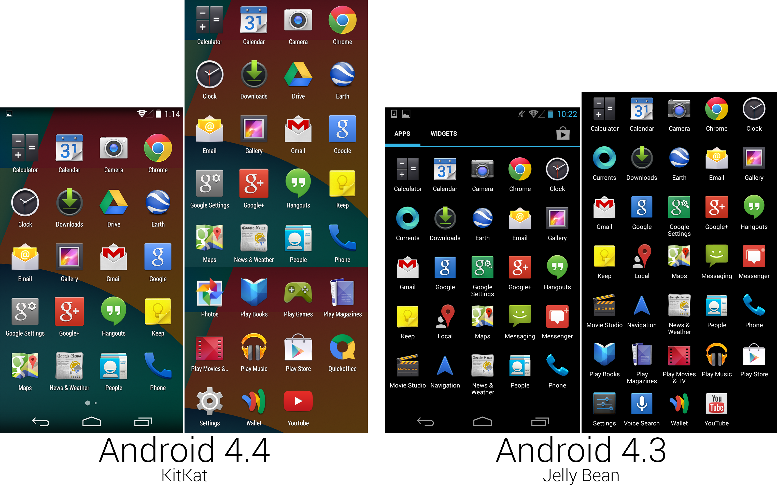
A screenshot showing the new, cleaner app screen layout, and a composite image of the app lineup.
|
|||
|
|
Photo by Ron Amadeo
|
|||
|
|
|
|||
|
|
The KitKat icon lineup changed significantly from 4.3. To be more dramatic, it was a bloodbath, with Google removing seven icons over the 4.3 loadout. Google Hangouts could handle SMS now, so the Messaging app was removed. Hangouts also took over Google+ Messenger duties, so that app shortcut was cut. Google Currents was removed as a default app, as it would soon be killed—along with Google Play Magazines—in favor of Google Play Newsstand. Google Maps was beaten back into a single icon, which meant Local and Navigation shortcuts were removed. The impossible-to-understand Movie Studio was cut, too—Google must have realized no one wants to edit movies on a phone. Thanks to the home screen “OK Google" hotword detection, the Voice Search icon was rendered redundant and removed. Depressingly, the long abandoned News & Weather app remained.
|
|||
|
|
|
|||
|
|
There was a new app called “Photos"—really the Google+ app—which took over picture management duties. On the Nexus 5, the Gallery and Google+ Photos were pretty similar, but in newer builds of KitKat present on Google Play Edition devices, the Gallery was completely replaced by Google+ photos. Play Games was an interface for Google’s back-end multiplayer service—a Googly version of Xbox Live or Apple’s Game Center. Google Drive, which existed for years as a Play Store app, was finally made a default app. Google bought Quickoffice back in June 2012, now finally deeming the app acceptable for inclusion by default. While Drive opened Google Documents, Quickoffice opened Microsoft Office Documents. If keeping track, that was two document editing apps and two photo editing apps included on most KitKat loadouts.
|
|||
|
|
|
|||
|
|
----------
|
|||
|
|
|
|||
|
|

|
|||
|
|
|
|||
|
|
[Ron Amadeo][a] / Ron is the Reviews Editor at Ars Technica, where he specializes in Android OS and Google products. He is always on the hunt for a new gadget and loves to rip things apart to see how they work.
|
|||
|
|
|
|||
|
|
[@RonAmadeo][t]
|
|||
|
|
|
|||
|
|
--------------------------------------------------------------------------------
|
|||
|
|
|
|||
|
|
via: http://arstechnica.com/gadgets/2014/06/building-android-a-40000-word-history-of-googles-mobile-os/25/
|
|||
|
|
|
|||
|
|
译者:[译者ID](https://github.com/译者ID) 校对:[校对者ID](https://github.com/校对者ID)
|
|||
|
|
|
|||
|
|
本文由 [LCTT](https://github.com/LCTT/TranslateProject) 原创翻译,[Linux中国](http://linux.cn/) 荣誉推出
|
|||
|
|
|
|||
|
|
[1]:http://arstechnica.com/gadgets/2013/09/official-the-next-edition-of-android-is-kitkat-version-4-4/
|
|||
|
|
[2]:http://www.androidpolice.com/2014/02/10/rumor-google-to-begin-forcing-oems-to-certify-android-devices-with-a-recent-os-version-if-they-want-google-apps/
|
|||
|
|
[3]:http://www.androidpolice.com/2014/03/01/glass-xe14-delayed-until-its-ready-promises-big-changes-and-a-move-to-kitkat/
|
|||
|
|
[4]:http://arstechnica.com/gadgets/2014/03/in-depth-with-android-wear-googles-quantum-leap-of-a-smartwatch-os/
|
|||
|
|
[5]:http://arstechnica.com/gadgets/2013/11/google-just-pulled-a-facebook-home-kitkats-primary-interface-is-google-search/
|
|||
|
|
[a]:http://arstechnica.com/author/ronamadeo
|
|||
|
|
[t]:https://twitter.com/RonAmadeo
|